Design Trend: Designing for Dark Mode
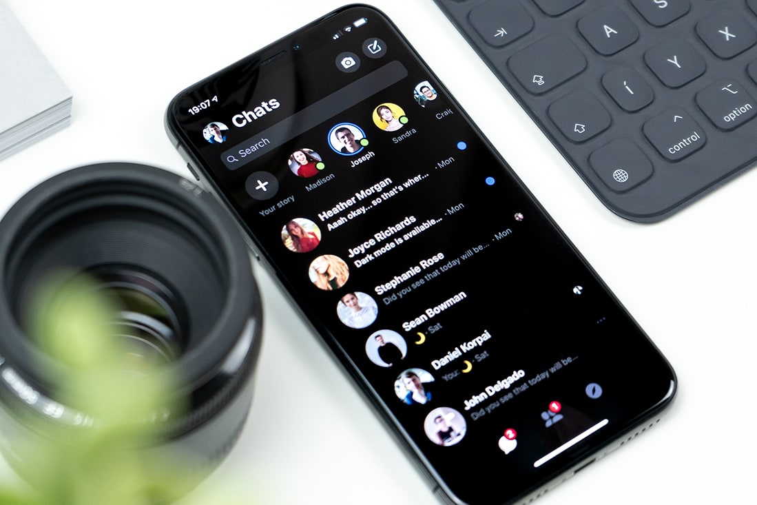
Dark mode has been growing in popularity. Most phone and tablet interfaces have the option for users to switch to a dark, rather than the standard light default, color scheme.
Most users have a distinct preference as to whether to use dark or light user interfaces.
That’s why more designers are adding a dark mode option to their projects. And while it can be a little more work and a lot to think about, it can help create a stronger connection and element of personalization for users. Here’s more about this design trend.
What Is Dark Mode?


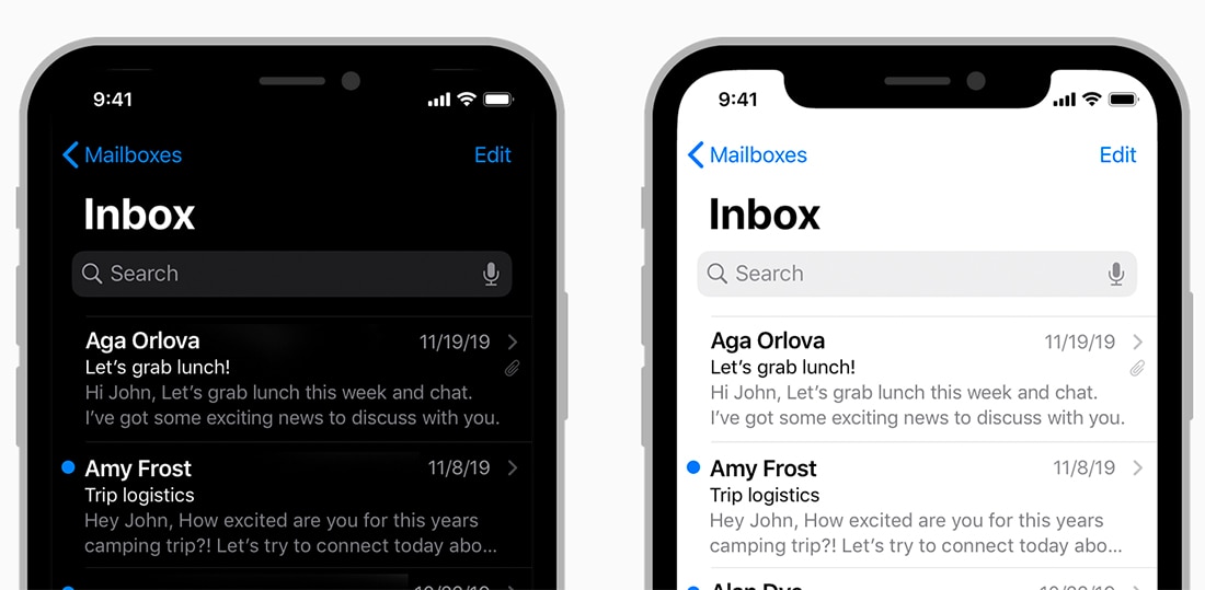
Dark Mode is a color scheme that uses a dark background and light text elements in the design. We’ve been creating dark websites and projects for a long time, but “dark mode” has become more of a thing because that’s what the toggle option is called in most user interfaces.
You can design something in dark mode without a light alternative.
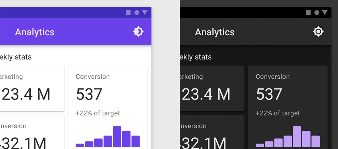
This trend is more focused on projects that include both. While the primary design has a light interface – light background with dark color text elements – the flip is dark mode. Users can toggle between light and dark modes on their devices.
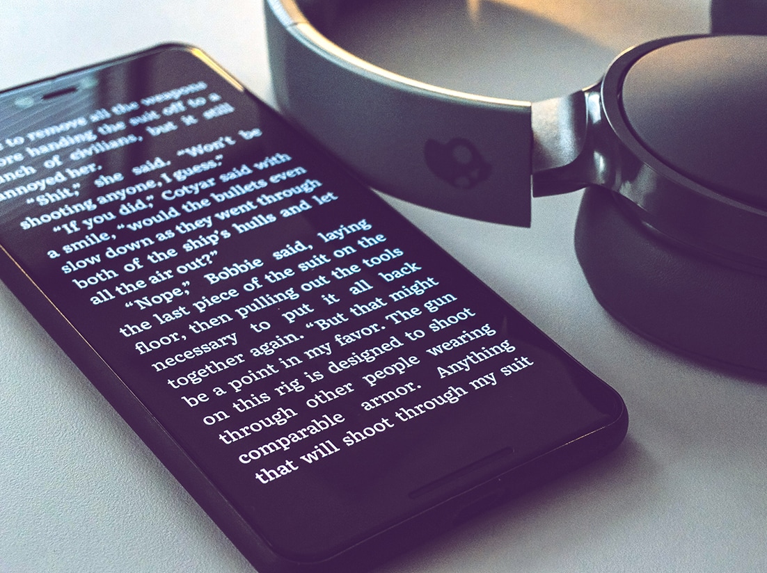
The option is wholly rooted in user preference. Some users just like dark mode better. Others say dark mode reduces eye strain and is less disruptive to use at night when they are trying to avoid as much light.
From a design perspective, dark mode seems moodier and trendier. Every website is light and bright, but only some are dark. This association can even be tied to some of the industries and brands that live in dark mode territory, such as video game services, streaming video and audio (Netflix and Spotify).
What it all comes down to is that some users prefer dark mode, and designing for them can increase users and interactions with the design. While dark mode is not a necessity, it is a trending design technique. Not only can you find it on mobile devices, but some desktops websites are offering an option as well.
Why You Should Consider Dark Mode

Dark mode comes with some benefits for users – and you. While the primary benefit is user preference and creating something that users want and will work in the way they want to interact, a residual benefit can be more users and greater interactions.
Other reasons to consider adding a dark mode design include:
- It can be easier on users’ eyes in the dark. People are becoming more accustomed to switching between dark and light modes depending on environmental conditions.
- Dark backgrounds can provide focus on visuals can bring attention to text elements.
- Dark mode might be preferable for people with some vision impairments, making the design more accessible if you have that option.
- Dark mode can increase battery life.
- It just looks cool and you want to try it.
11 Design Tips for Dark Mode Design

We aren’t going to go into the technical how-to of designing your dark mode interface option. You can find great lessons on that (with code examples) from Kirupa and UX Collective. (Both articles are recommended reading if you want to know more about dark mode.)
You can also play with this pen by Koos to get a better idea of working with the code.
If you want to implement dark mode, keep these tips in mind:
- Dark mode and light mode are not just white on black or black on white. That can actually be too much contrast. Consider a black or dark option that’s not pure black. The Material Design recommendation is #121212. Deep blues and purples also work well as a background choice for dark mode.
- Use that same concept for colors on a dark background. Pure white can be too bright in some situations and cause eyestrain. Use a bright, not quite white hue.
- For colors other than white, avoid highly saturated colors. They may not include enough contrast against dark backgrounds. Stick to lighter variants of colors from your palette. Most designers create a secondary “dark” palette for this purpose.
- Create a color hierarchy for text. (This can be a good idea even on light backgrounds.) This concept, which also stems from Material Design, notes using levels of light-colored text. A high emphasis level (transparency of 87% white) is for the biggest, most important text; a medium emphasis white (60%) is for most of the main text, including body copy; and disabled text (38% white) is lightly visible.
- Think about how elements actually look in the dark, and test the design in different levels of light. Remember that users often use dark mode in dark environments and that can impact how things appear on the screen.
- Dark mode should come with a toggle off/on switch. It’s something some users will love and others will not. Plan accordingly and use common icons to denote this function.
- Logos can present a unique situation in dark mode if you don’t have a white version or if colors don’t contain enough contrast. Put logos in a white container in dark mode to solve this problem. Make sure to create a style that looks intentional and gives the logo a little space to breathe inside the boxed element.
- A small, tight color palette is a lot easier to manage in dark mode.
- Consider emotion when creating a color palette for dark mode. It’s not as simple as changing the background color and leaving the rest alone. Dark mode innately appeals to a different emotional state in people. That can impact how you plan colors in the dark version of your website or app theme.
- Pay attention to guidelines set forth by the major players. Apple and Google both have a set of dark mode principles. You can find Apple’s Human Interface Guidelines here, and Google’s Material Design documentation here.
- Don’t forget rules of accessibility and test your dark mode color palette against common standards. You can test your colors here.
Conclusion
Dark mode can be a lot of fun to design and implement. And some users adore it. With standards for both iOS and Android, it’s one of those things that isn’t likely to go away any time soon and use will only continue to grow, making it an important design consideration.
When you first start playing with this design trend, keep it simple until you have a good handle on all the little things that need switching – and testing – as you create a dark mode. Details make all the difference here and users will be sure to notice if they are left unattended.