30+ Top Graphic Design Trends for 2025
What’s hot in graphic design? One of the things people always want to talk to me about is graphic design trends. Here’s a preview of what’s going to be hot in the coming year.
It’s such an interesting topic because there are trends that change slowly over time – just look at the long evolution of flat design to where we are now – and others that seem to flip overnight.
Should you always rush to use the latest graphic design trends in your work? Of course not. But it’s helpful to pick up new ideas, find inspiration, and see what types of techniques and styles are shaping our industry.
1. AI Surrealism
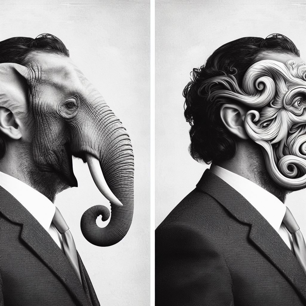
Designers have mixed feelings about the impact of AI in the design industry. However, whether you like it or not, it’s evidently clear that AI art and generative graphic design are here to stay. Even Adobe is making a huge shift to focus on generative AI by integrating more and more AI tools into its software suite.
We will surely see more AI-generated art and graphics this year and it will also give birth to new AI-themed design trends. AI Surrealism is such a trend that’s already getting popular among designers and some call it the “future of AI art”.
The world’s largest AI art exhibition, also dubbed AI Surrealism, is a great showcase of the new trend and the possibilities it holds.
This trend is mainly about creating surreal artworks with the help of generative AI tools. Back in the day, we relied on hand painting and photo manipulations to create surreal art. But with the help of AI, it’s now much easier to generate much more realistic-looking surreal art.
We are already seeing surreal AI art being integrated into various advertising materials and brand campaigns. It will surely be an interesting trend to watch.
2. Neo-Brutalism
While it’s often frowned upon, sometimes it’s okay to break the rules, think outside the box, and create designs that disregard the traditional design principles. One trend that openly welcomes you to break all those rules is Neo-Brutalism.
It’s not exactly a new trend but the neo-brutalism designs are getting much more attention these days and we hope it will make a grand return this year.
The way this design trend allows designers to go wild with their own unique ideas to create uncommon layouts that stand out is what we admire the most.
Now more than ever, we need more designers to think creatively, use color palettes that attract attention, and design typography that looks weird. Let’s face it, without those designs, the world will be a boring place.
3. Retro-Futurism

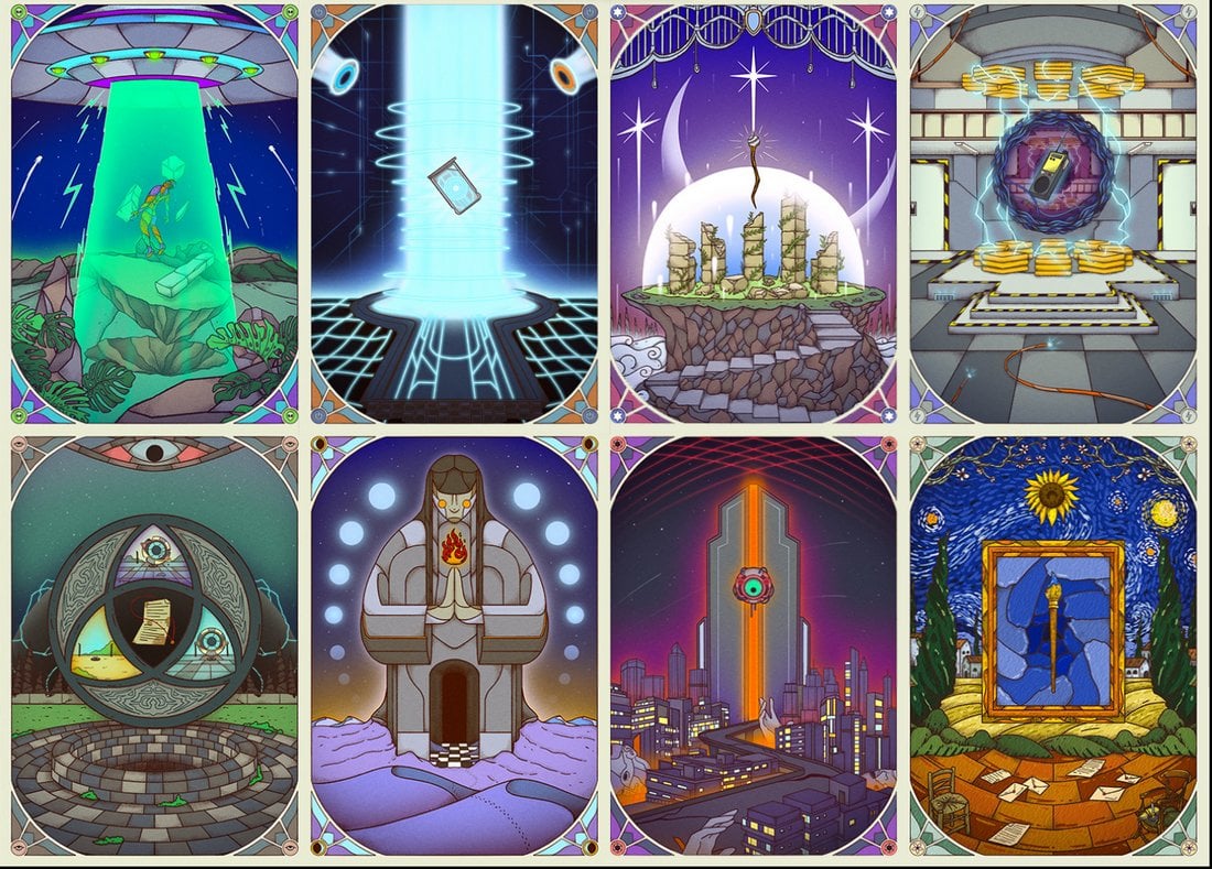
It’s remarkable how classic sci-fi novels and old movies were able to predict many of our modern technologies back in the day even before they were conceptualized. This design trend is all about capturing that retro-futurism into artworks.
The retro-futurism trend sees designs combining retro design elements from the 1980s with futuristic ideas to create unique graphic designs.
Classic retro technology is also a big part of these retro-futuristic designs. You’ll see plenty of references to things like arcade game machines, neon signs, and comic book-style color palettes as well.
This marriage between the future and the past gives birth to some truly remarkable designs across various industries, including posters, product labels, and advertising campaigns.
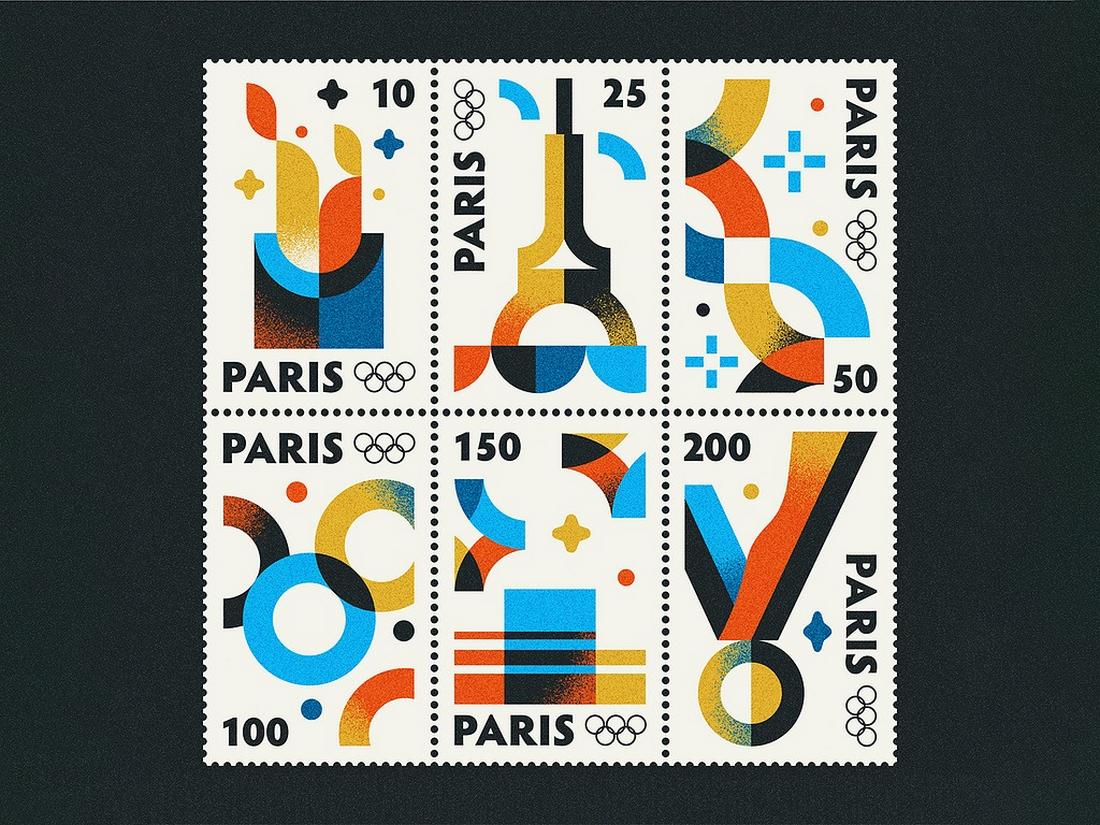
4. Geometric Patterns

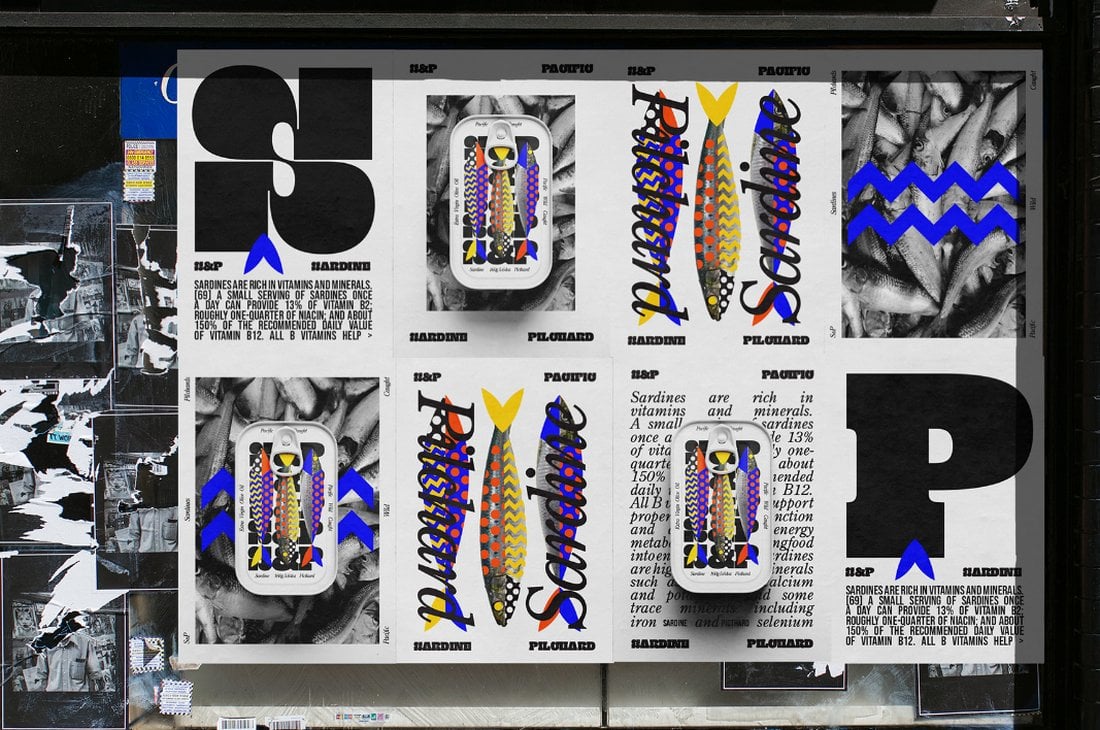
The geometric design trend went through a series of phases over the past few years. We saw geometric portraits, artworks, backgrounds, and much more. The latest in this ongoing trend to take over the design world is geometric patterns.
The use of geometric shapes in branding designs and art is fairly common these days. Those colorful geometric shapes and patterns certainly add a bit of flair to any design. They also help accentuate specific parts of a design like icons on websites and call to actions.
With geometric patterns, however, it takes a different turn. You will now see geometric patterns crossing over to different parts of your design, including the images. For example, adding layers of geometric patterns on top of images is a weird but creative approach that brings more attention to the overall design.
5. Art Deco
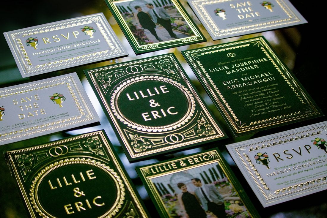

New trends will always come and go but there are some design trends that never die off. Art Deco design style is one of those trends that deserves to be classified as a timeless trend.
We saw a rise in Art Deco-style designs over the course of the last few months. Many brands have used it for product packaging, logos, and even website designs.
The use of gold colors with a mix of classic Jazzy patterns is also bringing back the old-school letterpress designs into the modern days.
We will likely see this style trending throughout this year as well. Thankfully, this is a trend that we love to see every day. The classic 1920s-inspired Jazz Age-style designs are something that never disappoints.
6. Adaptive Brand Designs
The days of using the same logo design and color palette across multiple platforms are over. Brand identities are now becoming more adaptive and dynamic. And this new trend seems to be only growing in popularity.
Adaptive brand designs see brand identities getting more flexible with color palettes, logo designs, and typography by using different colors and design elements based on context for different platforms.
The brand logo used on the website will not look the same on a poster or business card. The colors and even sometimes the shapes will change. This is all part of making brands more relatable and engaging across different audiences, regions, and cultures. It’s starting to prove effective for many brands as well.
7. Glitch Effects
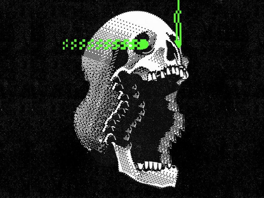
Glitch effects have been around for a while. Especially with the rise of the futuristic cyberpunk-style design trends, we’ve been seeing various forms of glitch effects over the past couple of years. The latest to join this evergrowing list of glitch effect trends is the glitched typography.
This trend completely transforms typography designs by giving them a distorted and glitched look and feel. It’s especially a popular trend used mostly by technology, AI, and science-themed graphic designs. And it fits perfectly with everything from posters to custom t-shirts and more.
The glitch text effects are perfect for showcasing innovation and disruption through your designs as they add a sense of rebellious vibe to your typography designs.
8. Algorithmic Patterns
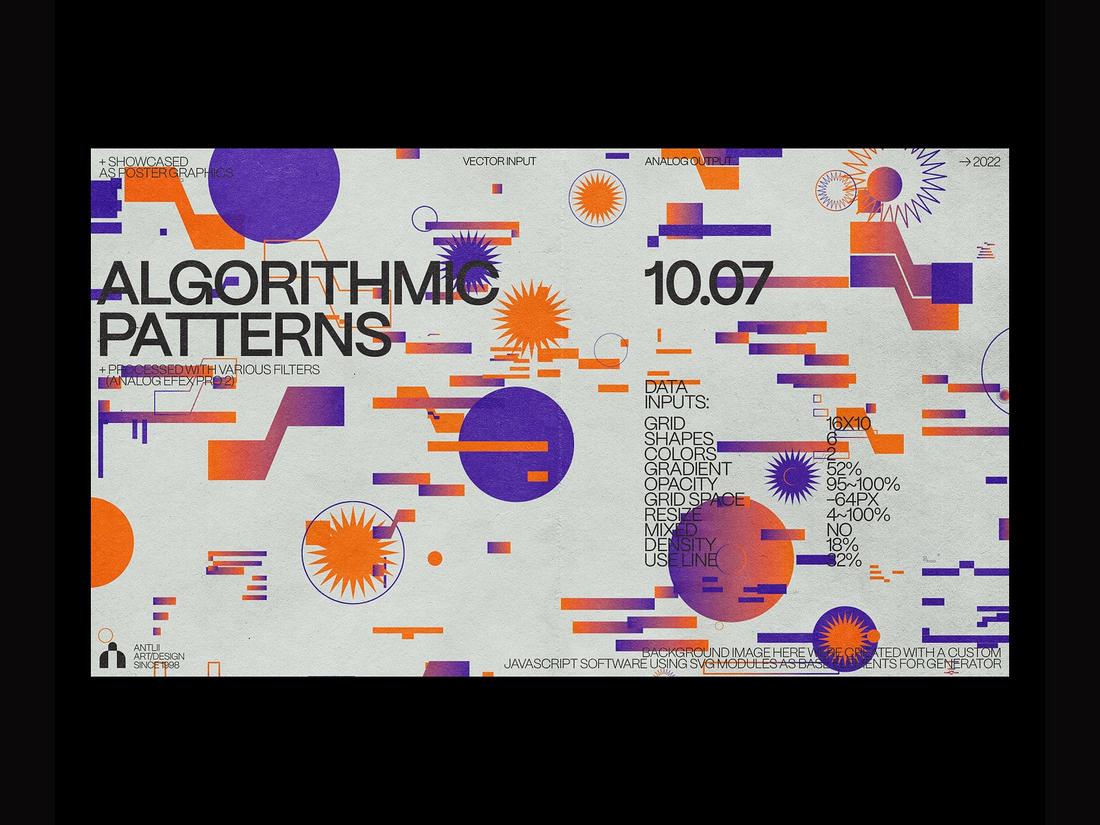
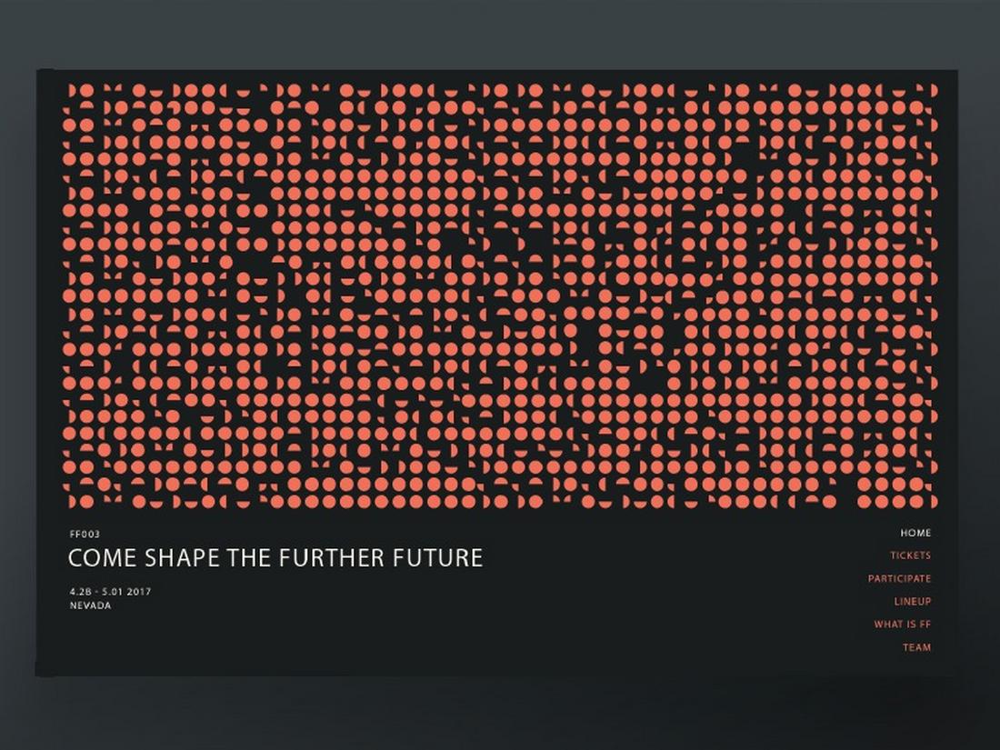
This is one of the trends that has been hidden away for quite some time but it’s slowly making its way over to the world of design.
Algorithmic design is all about using various technologies to render and generate designs. Generative AI is the most common method used for this type of creation but it’s not the only way to create algorithmic designs.
In the first example above, you see patterns generated by a custom-built Javascript program using SVG elements to render unique arrangements. You’ll notice how it creates a subtle chaotic vibe for the design with some elements overlapping one another. And it’s all part of the aesthetic of this design trend.
Pushing the boundaries of technology and using unique ways to create designs is how you can move an industry forward. Hopefully, this new trend will be more popular this year.
9. Gradient Depth of Field
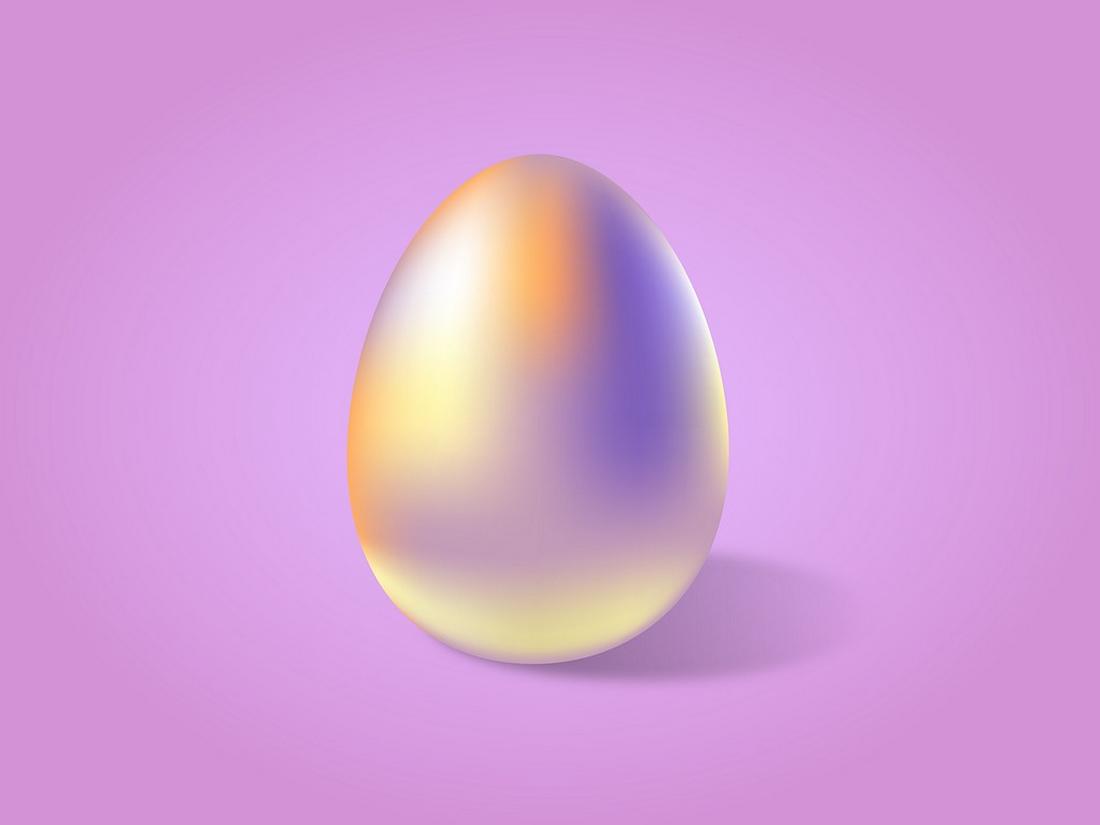
Commonly used in photography, the depth of field effect is one of the most effective ways of creating a sharp focus for the main subject in a scene. This effect is also used in the design world for making various creative graphics.
Designers have found a unique way to utilize gradients to create more engaging and dynamic graphic designs. This trend involves using gradients to create a subtle depth-of-field effect that effectively highlights the main elements of a design.
With this gradient depth of field effect, you can create bold 3D-like backgrounds and objects that bring more attention to the core elements, whether it’s a logo, title, or shape.
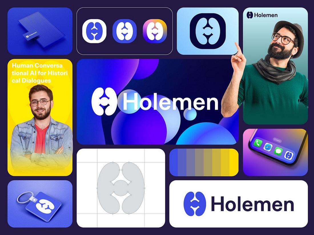
10. Mythological Logo Designs
Incorporating mythological creatures, shapes, and elements in branding designs, logo designs, and signage has been one of the hottest trends that have been on the rise over the past few months.
This trend brings back an iconic design approach used across millennia to make designs more complex, iconic, and memorable. It not only creates a personalized look but also adds character to brand identities.
After seeing overly simplified logo designs and bland signage designs over the years, this is a trend that we would love to see grow more over the coming months.
11. Classic Textures
Brands are embracing vintage textures like never before and for good reason. When it comes to adding depth and classic aesthetic to designs, vintage textures are the go-to choice.
Graphic designers have managed to use classic textures more creatively to design unique looks for logos, badges, and various other brand identity elements. It’s the perfect approach for giving a vintage feel to designs.
Using rough, weathered, stipple, dust, and even polka dot style textures and patterns offers a way to add an authentic look to separate your design from the vast majority.
12. Bubble Typography
We all love cute and chunky typography designs. This style of typography is often the best approach for giving your text a more casual and fun vibe.
Usually, we see bubble-style titles and headings in fun posters and flyers. However, we are now starting to see the bubble typography trend taking over branding designs as well.
Readability-wise, it’s not the best approach to designing better typography. However, it sure seems to fit in nicely with specific brands and projects. We might even see a strong comeback of the good old bubble graffiti-style typography this year.
13. Retro-Vintage Art

There’s a reason why either the retro or vintage design trends never seem to go away. They are here to remind us of our past and the simpler times and infuse a bit of nostalgia into our lives. Rest assured, that holds a permanent place in our hearts as well as in the design world.
The latest trend in the graphic design world is combining the two styles together to create retro-vintage art. This sees unique artworks that feature elements from both retro and vintage design styles.
Some take inspiration from retro designs such as tarot cards and comic books while mixing in some vintage typography. While other designers use the opposite approach.
Either way, these retro-vintage artworks are truly delightful to explore and we hope to see more of these throughout this year
14. Dark Design Themes
Dark graphic design themes are a big trend that looks great for digital design and can require precision for top-notch printing. This trend features dark – often black, but not always, backgrounds with a dark color palette. There’s generally just enough contrast for readability, but not too much.
This graphic design trend comes out of the use of dark mode on phones and devices because users like the shift. With many web projects, designers who opt for a dark design theme will sometimes include a “light mode” toggle so that users can choose how to view the project.
Dark design schemes take a lot of planning to get just right. Colors need tweaking to ensure there’s ample contrast and in print, reverse printing can have some challenges to consider (especially with medium type and printing).
Play with shadows and image framing to make the most of this graphic design color trend.
15. Personal Avatars
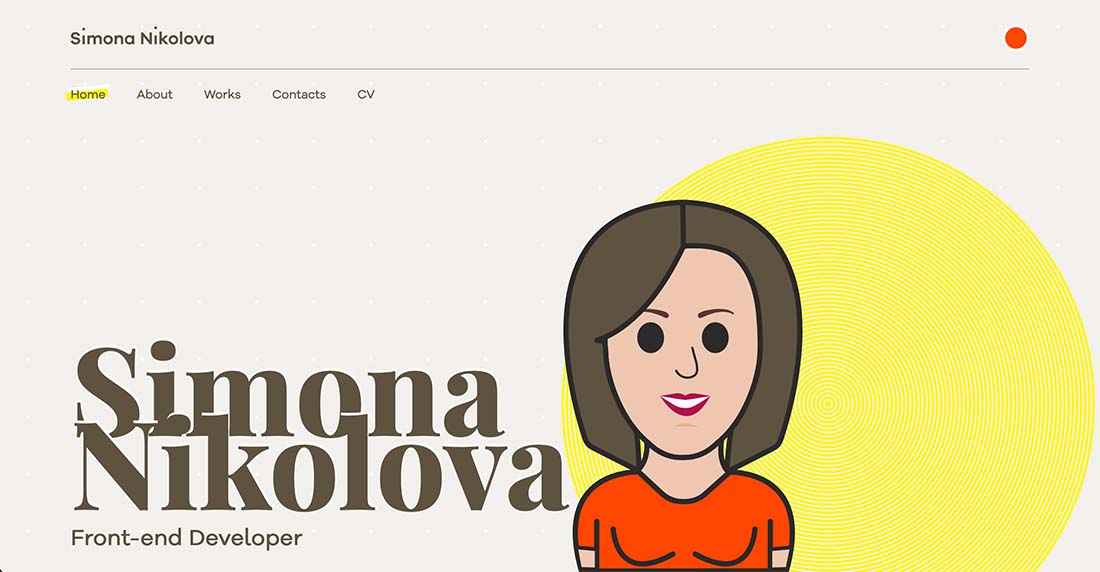
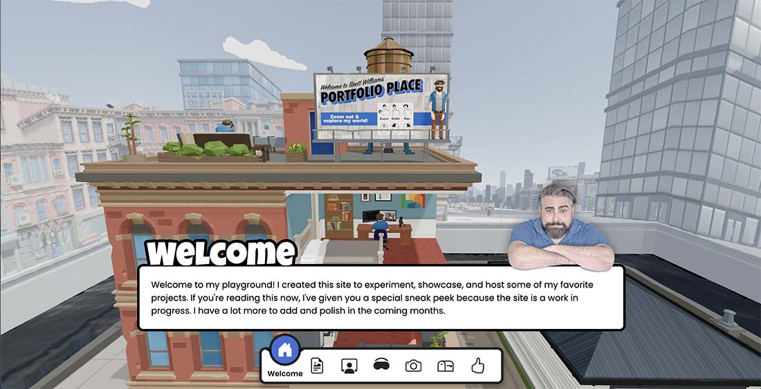
Graphic designers everywhere are creating personal avatars for everything from their portfolio sites to social media. These avatars are a stylized version of the designer and can show style, creativity, and create a connection with the user.
These avatars come in a lot of styles, but most predominantly we are seeing versions that look like the designer and are used in the place of a photo.
In the two examples here, the graphic designer takes a slightly different approach. Simona Nikolova uses a large personal avatar to help you get to know her for her portfolio site. The avatar is in a flat, cartoon style.
Brett Williams pairs his real image with a three-dimensional avatar in a gamified-style portfolio design. His avatar isn’t front and center but it includes some nifty animations.
16. Inclusive Visuals
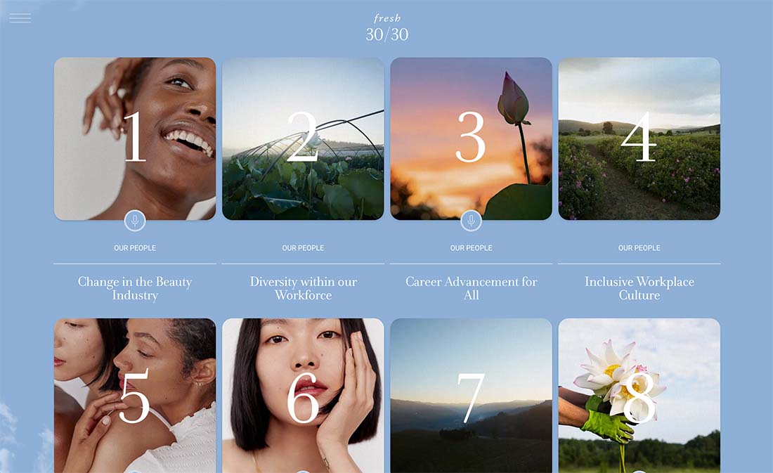
Almost every project – from website designs to print collateral to event posters – are focusing on more inclusive visuals.
This includes images, videos, illustrations, icons, and even voice and sound. What was once a default to include a seemingly white, male representation by default has expanded to include people of all races and genders, sizes, and ability levels.
This push to make projects more inclusive is part of a broader effort that has trickled into the graphic design space. What’s nice is that it expands the opportunity for projects to reach more people and wider audiences while providing a new set of design options.
This graphic design trend is visual as well as something that makes you feel good about projects and the people you are working with.
17. Bolder Background Patterns
It’s time to go a little crazy with background graphic design patterns. Forget the minimal styles that have been popular for some time and think bolder!
From colors to patterns to effects that seemingly split between the background and foreground, bold designs are trending in a major way. This graphic design trend works because it catches your attention.
Bold backgrounds (particularly with layer effects) can be quite stunning when paired with more simple typography or other design elements. Boldness may come in the form of color, pattern, size of background objects, or in the case of websites, motion.
The trick to making this trend work is to ensure that everything has a place and there’s good eye flow between elements. With a bold background, foreground elements might have to be larger or bolder to ensure there’s enough contrast for optimum readability.
18. Text Layer Effects
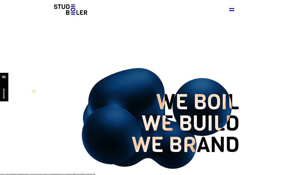
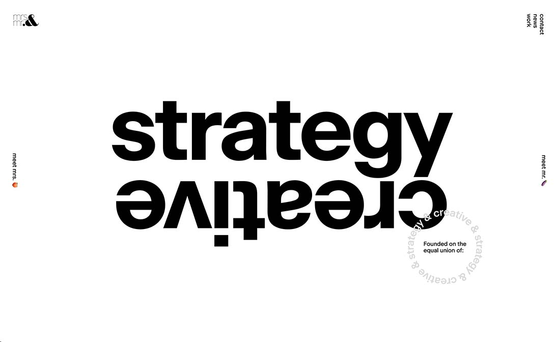
Layered text effects have long been a print graphic design technique, but now it’s beginning to trend for website projects as well.
By layering text effects including color, motion, or size; you can turn typography into the dominant visual effect in the design.
In the examples above, text layer effects are accomplished two ways, both with stunning success:
- Studio Boiler uses motion and color variation to draw the eye to a longish headline in the design. The color variation when the animated blob moves through the text is so interesting that you have to look.
- Mrs & Mr uses bold contrast with text layers to draw attention and create interest. The strong weight, size, and movement choices allow a simple design to have a lot of impact.
The challenge with layered text effects is that they can fall flat when the use of typography isn’t almost perfect. You want to ensure that all text elements are readable and help users understand the reason they are interacting with the design.
19. Faceless Imagery

To mask or not to mask in images? That’s a big concern for designers and brands. The answer seems to be more designs with “faceless” imagery.
This includes plenty of silhouettes or images that show people from behind.
It serves two purposes. For some, it allows designers to work with images that might already be in the brand library without having to retake photos and it hedges on health and society norms.
In addition to fewer images with faces, expect to see fewer images of people in groups as well.
20. Oversized Elements
Oversized design elements – from images to typography – are dominating digital and print graphic design.
With digital projects, many of these oversized elements are accompanied by animation and scroll effects that help you see the rest of the picture. Oversized use helps encourage interaction and scrolling in these instances.
Oversized elements also have another commonality – design elements that overlap, such as images over text. While this isn’t a technique that’s often recommended, it’s increasingly popular.
It works with simple typography with only a word (or two) that’s understandable while partially covered. The result can be beautiful, impactful, and impressive.
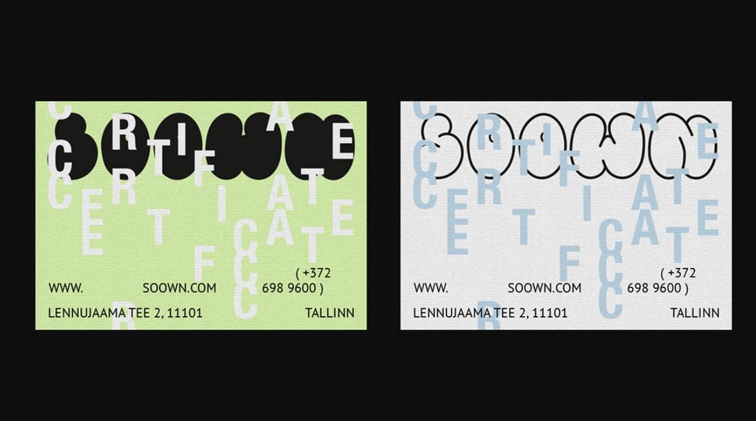
21. Experimental Typography
Experimental typefaces are in.
These specialty fonts, which come in all manner of styles and options, are adorning all types of projects with a modern style that creates a unique and personalized feel.
Experimental typefaces include anything that’s a little different, including fonts with edgy and funky lines or strokes, animation, 3D elements, color, illustrations, and variable styling. They are identifiable because you can’t look at these typefaces and pinpoint a name or exact style for them.
What’s great about experimental options is that they feel truly custom for projects.
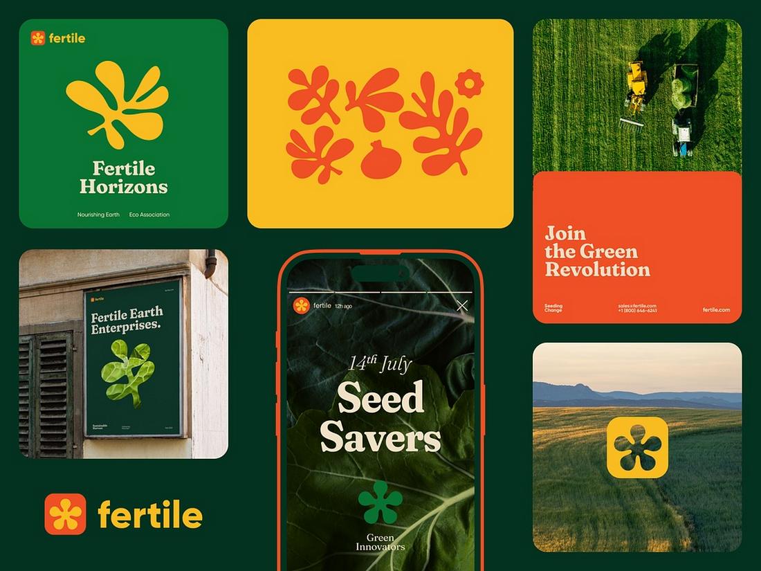
22. “Organic” Look and Feel
For the last few years, there has been a push to create more authentic graphic design elements that connect better with audiences. That has evolved into a more “organic” look and feel.
The organic look is deceiving because it looks like a simple, design-less design. But it can be a lot of work on the part of the designer that looks so organic, just sketched out, or fresh.
You’ll know these designs because they seem to mean something. They connect and resonate with audiences and have that “anyone-could-have come-up-with-this” look. (Yes, it may be annoying to hear or think, but that’s the visual aesthetic here.)
Organic graphic design uses logos without a lot of elaborate color or adoration – think of styles that are popular with startups – and tends to feature simple typography and color palettes. Products might be made from sustainable packaging or materials as everything plays together with this trend. Organic in design is organic by nature.
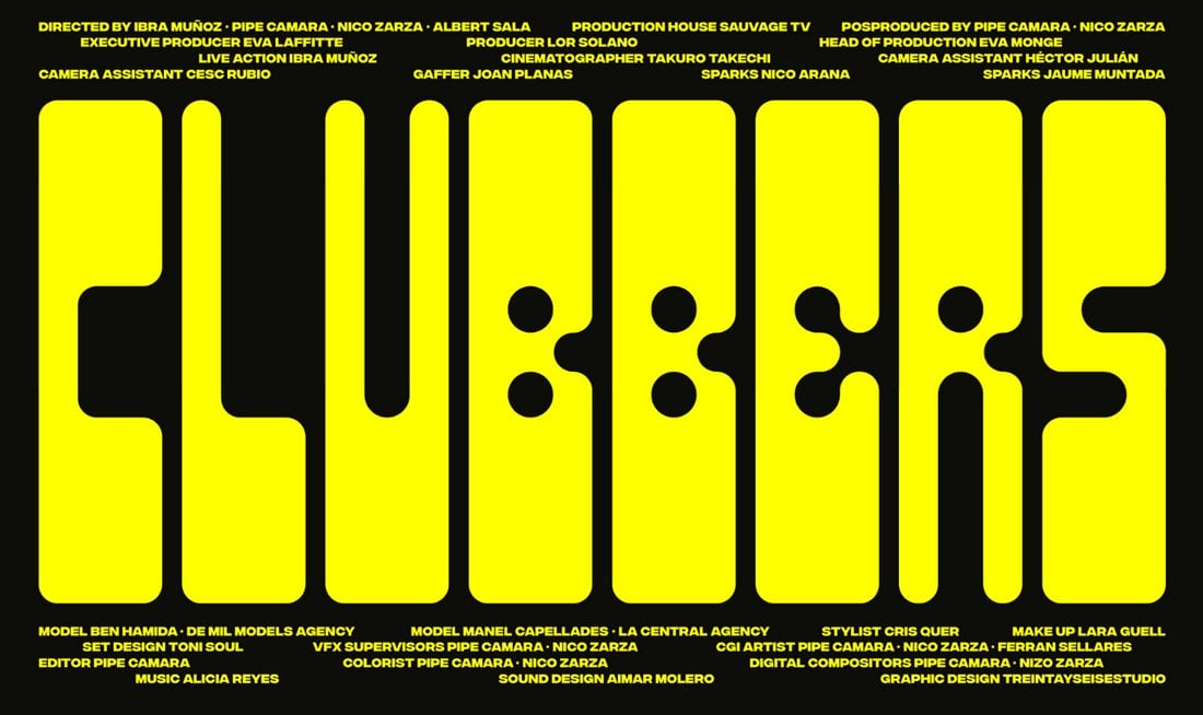
23. Heavy Typography for Impact
On the other end of the design spectrum is the next trend for 2021: Heavy typography. Big, bold, thick-stroke typefaces seem to be popping up everywhere.
In addition to bold strokes, many of these typefaces also feature funky shapes, animation, or other techniques designed for getting attention. This trend is anything but boring, and maybe most surprisingly, some of the type displays are focused less on readability than user engagement.
With that in mind, the way to make this trend work is to ensure that supporting text and art elements are easy to read and understand. They should take on a simple shape and function to support heavy, more impactful typography.
This style also works better for more established brands that have a look, feel, and voice or mood that users already know. It works like this: Even if you can’t read all the words on a website, you know what website you are on thanks to consistent brand style and feel.
24. 3D Effects and Depth
Graphic design is getting a big dose of reality.
From three-dimensional shapes and layers to depth that makes something seem to jump off the canvas, this trend seems to be growing by leaps and bounds. It’s somewhat of a throwback to skeuomorphism, but this time the graphic elements are more realistic than ever.
In the digital space, 3D effects are often paired with animation that makes elements come to life. Movement is slow, intentional, and rooted in realism. (It takes a lot of work to make something on the screen look and act that real, but the payoff can be worth it!)
The best uses of 3D and depth work in concert with the story the design is trying to convey. It shouldn’t feel forced or require too much thought to understand why elements are designed in this manner.
25. Bright Color
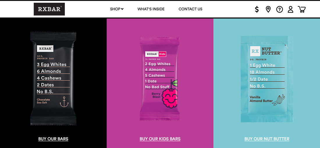
The use of bright colors for everything from backgrounds to images to user interface elements was one of the biggest graphic design trends of 2018 for sure.
Projects featuring vivid color palettes have been dominant in website projects and redesigns as well as print promotion and elements. Many of these colors take a cue from Material Design palettes, which are bright and bold featuring colors such as blue, purple, and pink.
The two places where color has shown up are in product and packaging design which carries over to other elements such as website design. RXBar, above, is a prime example of this trend in action. Every color is distinctive and the packaging and website design are perfectly married.
But that’s not the only application of the bright color graphic design trend.
Designers are also using more rainbow-inspired palettes that break the rule of using just two or three colors for the design. Palettes with lots of bright colors in interesting shapes or typography have been huge this year.
26. Three-Dimensional Still Life Elements
It seems like designers are itching to do three-dimensional design projects. That is showing up in staged elements and still-life representations of elements and objects in a 3D space – real or created.
This concept creates a highly engaging canvas and representation for product placements and shows how something might look or feel in real life. These designs are often rather elaborate, although they might not look like it at a glance, and might feature real and created objects.
This graphic design trend shows imagination in action.
27. Gradients
Gradients are everywhere – as backgrounds, as photo and video overlays, inside images, and the list goes on.
Color has been a big deal in 2018 and gradients have been a big part of that movement. The same bright colors that have been popular on their own are also trending choices for gradients.
But not all trending gradients are bold and bright. Some are more subtle with a soft color variation. They can be used with real elements or illustrations and typography.
28. Moving Shapes and Blobs
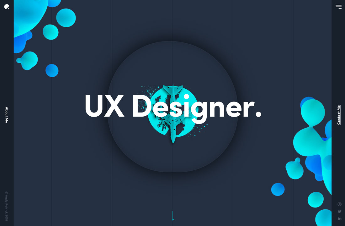
There is something majestic about animated shapes and blobs. This design trend centers around “shapeless” shapes that move slowly (or sometimes with a little more pep) in the background of a design.
Blobs can be large or small and often feature bright colors or serve as a dominant art or eye-tracking element to help users navigate a design.
But the best part is this trend is a little funky and fresh without trying too hard. You can deploy some fun animation without overthinking it and develop a design pattern that’s engaging for users even when the project might lack other imagery such as photos or video.
The biggest users of this trend seem to be startups or smaller-scale projects for that reason. And the innovative designs are worth a look.
29. Minimal Navigation
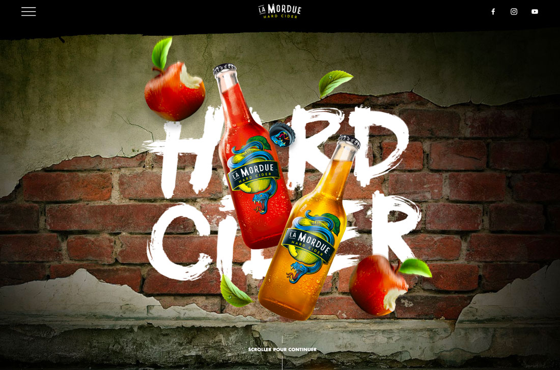
Whereas mega menus were all the rage a few years back, there’s been a shift to more minimal and even hidden navigation elements. This takes a cue from mobile (where most users are viewing websites anyway) to create a more open canvas and streamline user experiences.
While there are pros and cons to “barely there” navigation, the graphic design benefits from a clean canvas and more creative options for tucking away those “pesky” navigation elements.
Both examples above do this in different ways. Blab uses a create square menu button at the bottom left of the screen. Le Mordue doesn’t even show navigation on the home screen, it pops in as users scroll.
30. Authentic Imagery
With everyone trying to connect in a true way less polished, authentic images are dominating design projects. Even commercial photography is shifting to look more like snapshots for these projects.
And while the look is a little less polished, it works.
This trend works because it feels more real. It also crosses over to other places where design elements are used for a brand, such as social media.
You can capture this trend using stock imagery – although it can get tricky fast – but the better alternative is to have a conversation with your photographer/videographer about what you want to do visually. More authentic imagery is not amateurish; it’s just a different style.
Higher screen resolutions are making it more important than ever to have high-quality images and—even if the trending style is a little laxer—the quality of the photography should not be.
Conclusion
What new design ideas are you most looking forward to using in graphic design projects this year?
The thing I love about these concepts is that they are usable. There’s nothing better than merging beautiful design with a highly usable experience.