Design Trend: Large Typography Scales
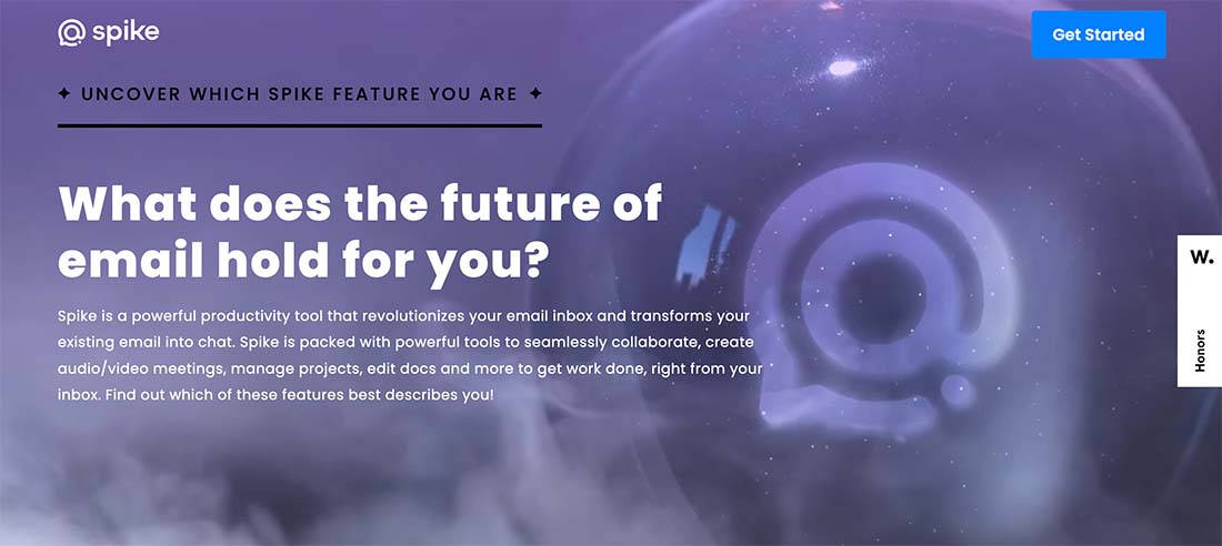
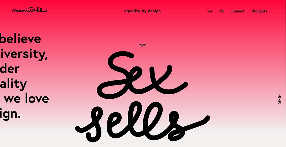
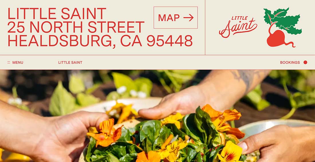
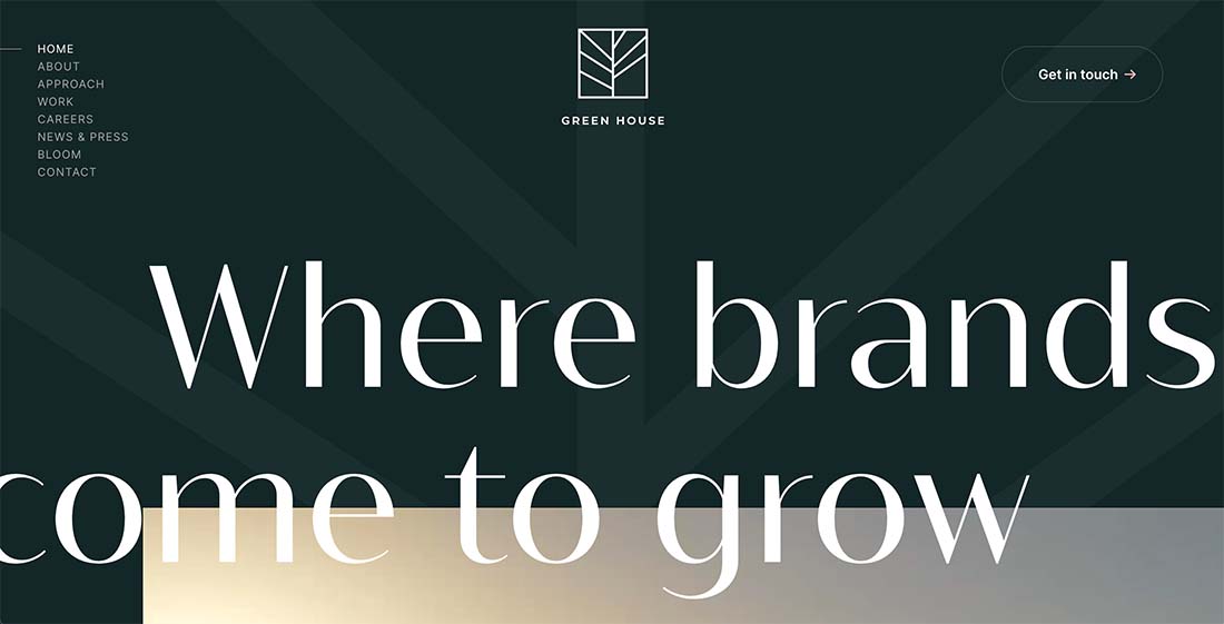
Words on the web just keep getting bigger and bigger. And that might be a good thing.
One of the biggest trends in website design right now is large typography scales. We’re not just talking bigger text in the hero image anymore. We are seeing larger type options for every part of the website design.
The result? Maybe a more readable web experience, and one that works in a better way, more often, for more people.
Here’s a look at the trend, with several examples to help you see large type in action!
What is a Typography Scale?
Before we dive in too deep, it is important to answer this question: What is a typography scale?
A typography scale is a set of rules or guidelines that determines how type elements in a design will interact based on some sort of commonality, such as a ratio or percentage increase. Most designers will start with the body text size and proportionality increase sizes (scale) for each additional element in the design or CSS.
Most scales have set sizes for everything from H1 to H6, body text, and any other text elements that are set in the design. A good typographic scale is logical, often modular, and helps create consistency and contrast in the design.
Learn more about responsive typography and sizing in our guide.
If you are looking to experiment with type scales or create one for your project, this tool is one of the best. Start with a base size, pick a scale variable, and font, and see how it will look on the screen before you get deep into the design. (Plus all the scalable values are right there for you!)
Identifying the Large Typography Scale Design Trend
This design trend can kind of fall into the visual category of some others until you look closely. Unlike other trends with singular large or oversized text elements, these designs feature a full scale of larger typography.
Often the base body type size is 18 points or greater, bold, or has a thicker weight.
The display sizes can get to the level of enormous, but everything feels like it goes together. There’s not an unbalanced feel between the body text and header and subheader elements.
Key Characteristics
The key characteristic of the larger typography scale design trend is an almost visual stairstep feel to text elements. Different elements are obvious and easy to identify by size, and nothing in the design would be considered small if it stood alone.
Often these designs feature typefaces that are heavier than you might expect, include serifs or typefaces that might be more difficult to read at smaller sizes, and fewer words than counterpart designs.
The element of text contrast is high, making these projects easy to scan, and text size should encourage scrolling and mobile browsing.
How to Make it Work for You
So how do you make larger typographic scales work for you? Some designers will feel a bit uncomfortable with larger sizes at first because they aren’t what you may be visually accustomed to. But working with large-scale text can work great for certain projects.
Consider a larger typography scale if your design:
- Has strong accessibility requirements
- Will have a predominant mobile userbase
- Uses more difficult typefaces when it comes to readability
- Has succinct text blocks
- Needs to encourage scrolling
- For any text that needs strong contrasting elements
- Should stand out
Here’s the nice thing about this trend: It can actually work with practically anything. Use it with strong imagery (video or photos) or use it minimally with a few other elements.
Scales can start at almost any level based on your content needs. How you create the scale really is based on your comfort level with size and content.
For the first project that you consider a larger scale, start with a body font that is just one or two points larger than what you might typically use and go from there.
It’s also important to think about actual content and words when you create the scale. A larger type scale for a headline that contains a long word might be more limited than if your headlines are shorter. You can only go so big with certain character counts and maintain device consistency. Otherwise, you might have to make other types of design decisions about word breaks or hyphenation.
Either way, to maximize the visual impact of this design trend and make it work as well as possible, use some of your actual content when creating the typography scale early in the design process. This can help you figure out what sizing is right for the content and project.
3 Examples We Love
This is one of those design trends that really gets our attention – and for good reason. It’s hard not to look at designs with bigger, bolder, more readable typography.
Emmaus
Emmaus shows that the typography scale doesn’t have to be huge to be larger and effective. This example highlights how a strong, and larger, type scale can facilitate readability on mobile devices.
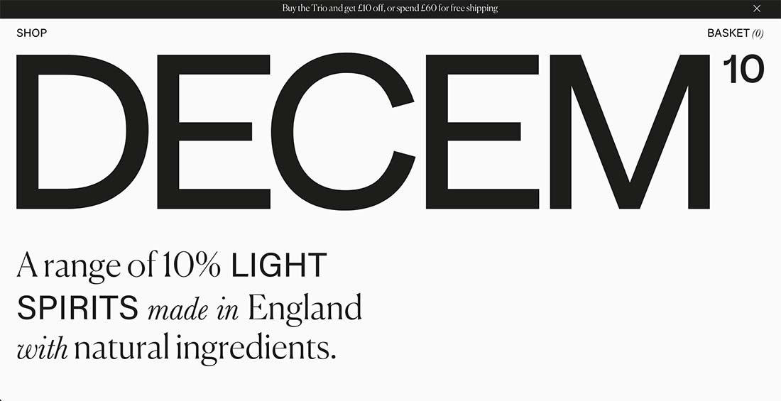
Decem Drinks
Decem Drinks is refreshingly bold with a minimal design that seems to break a number of typography rules. But you want to keep scrolling and reading. The larger type scale is great for fonts that might be a little more challenging to read, such as the body serif used here.
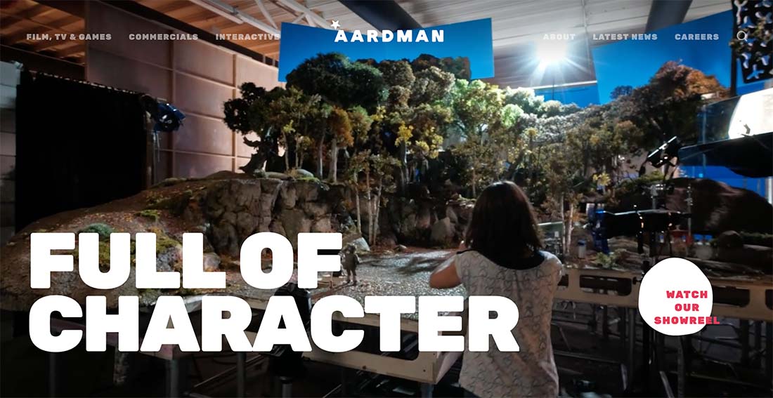
Aardman
The typography choices for Aardman are large from the navigation elements to the footer. The scale in this example is interesting because of the contrasting weights of the display font and body font. They are so different but work well with the larger scale as a whole.
Conclusion
The large type scale design trend is more than visual; it’s functional as well. A strong type scale creates consistency and contrast in a design to make it easier for people to read and scan.
Larger scales can help with accessibility, mobile reading, and be visually pleasing.
