Design Trend: Mixing Realism and Illustrations
There’s a trend afoot in website design that mixes real images with illustrations and art elements in interesting ways. And it’s quirky, unique, and beautiful!
It’s a mashup of visual elements that don’t seem like they go together at first, but when done well can create a stunning aesthetic that is highly engaging and delightful.
Here, we’re going to look at examples of this design trend and different ways of mixing realism and illustrations for maximum impact. Some of these sit within fairly corporate designs, and others are completely playful and entertaining. It’s a wide range of applications of a thoroughly unique and interesting trend.
Mixing Visual Elements in Cards
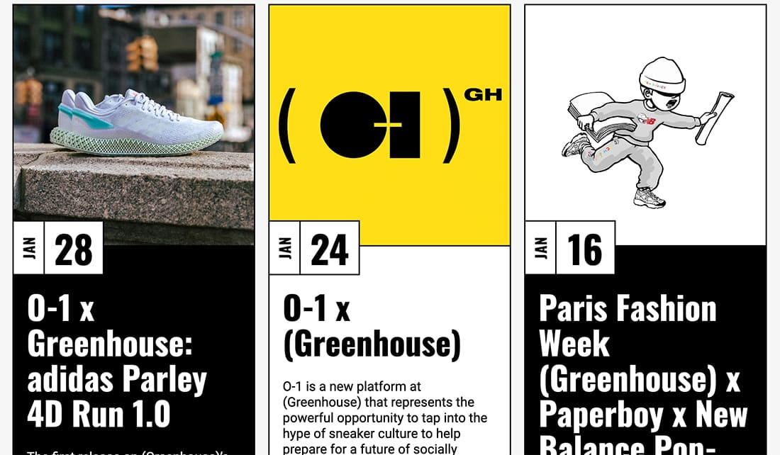
Greenhouse features a blog-style format that uses cards for each content block. Within the cards are visual elements – some photos, some illustrations.
The result is a beautiful mix of content types and visual styles that keeps the page fresh and interesting. Bold use of color for illustrated blocks is equally eye-catching, almost forcing users to scroll through content.
It works because the framework is simple and mixed elements seem to match perfectly, while providing ample contrast for engagement.
Illustrated Overlays
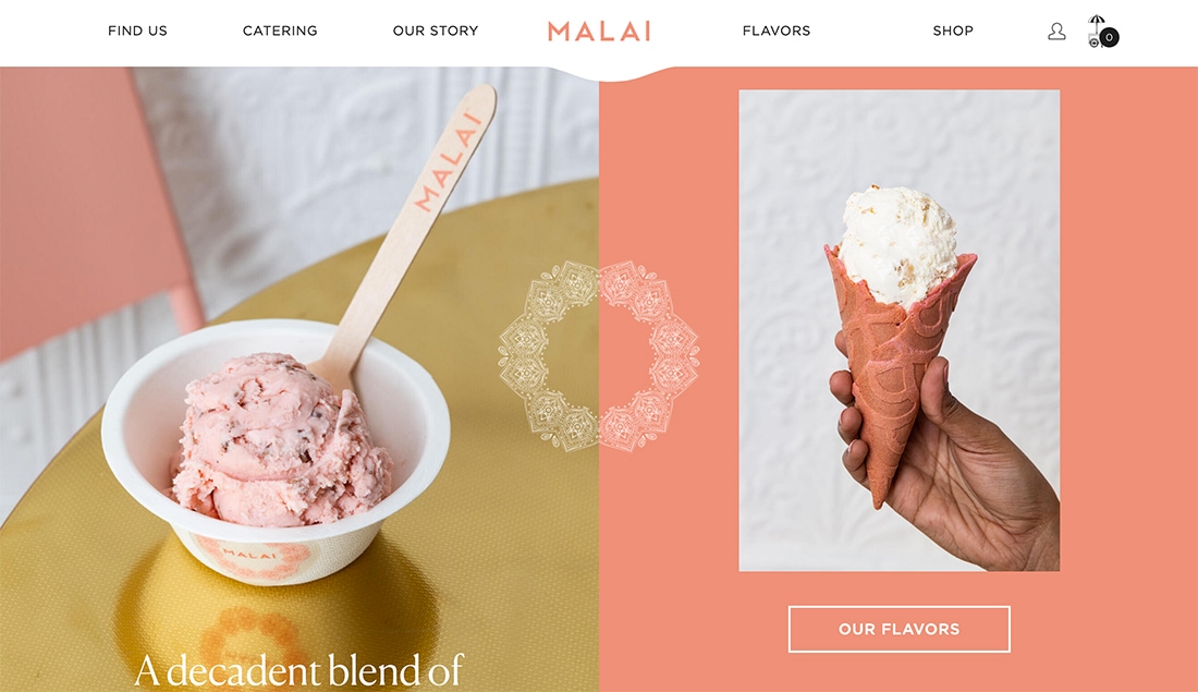
One of the easiest ways to dabble in mixing realism and illustrations is to create an illustrated overlay. It works almost exactly like using a logo over a photo.
Malai uses this technique with a split-screen design (also a pretty trendy element). The illustrated overlay helps connect both sides of the design creating visual flow and harmony.
The illustration is rather intricate, but as an element that’s just white, it feels elegant and does not get in the way of the design.
3D Effects
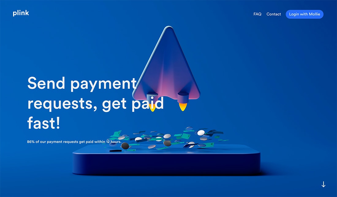
More designers are experimenting in a territory that’s somewhere between reality and illustration. The three-dimensional elements throughout the design for Plink, look realistic.
The illustrations move in a real way and you almost have to look twice at artwork to see that it’s not an image.
This style is an increasingly popular way to show something hard to photograph or otherwise portray visually and animated elements help it along to increase the opportunity for user interaction.
Photos and Illustrations Side-by-Side
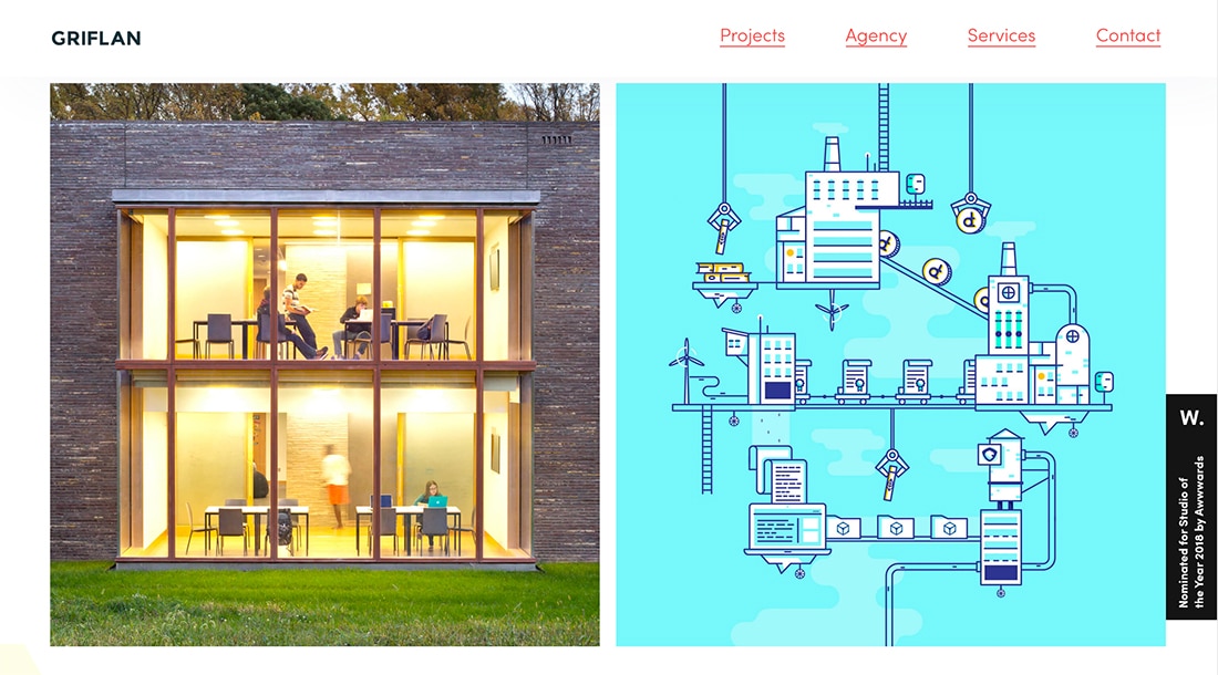
Photos and illustrations can be used in frames throughout the design together. In this example of the design trend, each type of visual is in a “photo” frame or box and treated the same way, whether it’s a picture or illustration.
It’s a lot like the card example above, but with a different twist.
Griflan uses this concept well and even uses more illustrations that photos. It creates a flexible website design framework where images and illustrations can be changed out quickly without a complete redesign.
Layers and Motion
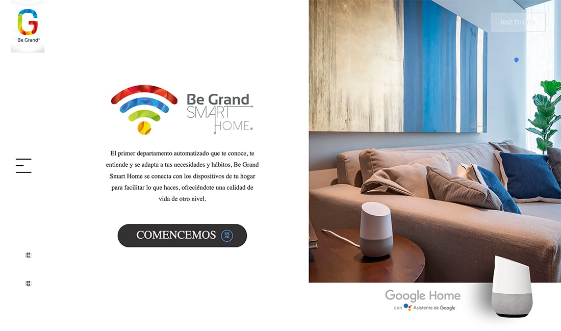
Illustrations might not always be super obvious. As part of a logo or in the case of Be Grand, the illustrated element is a cool pointer/hover circle that seemingly dances across the screen – and image.
Small animations bring it all together in the simple homepage design.
“Almost” Illustrations
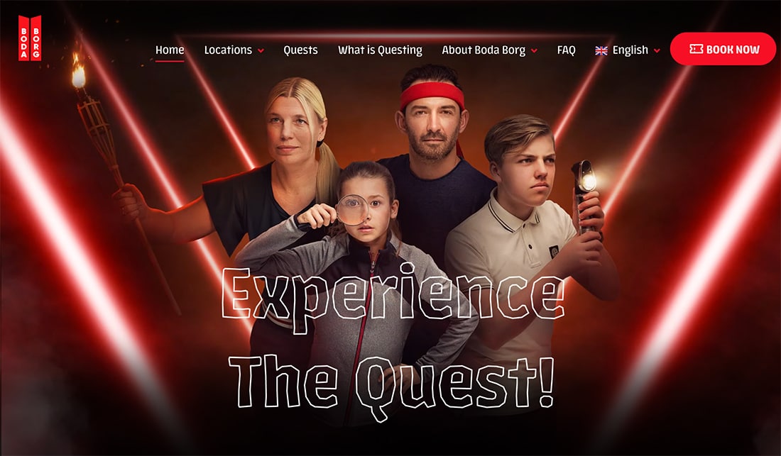
A trending website design trick has been to use a glitchy effect with elements to draw attention. Combine this with an illustrated background for an out-of-this-world effect.
Boda Borg does just that with two photos of a family that “glitch” back and forth over a quest-themed illustration. It’s fun and light and definitely makes you look at the design.
Background and Foreground Layers
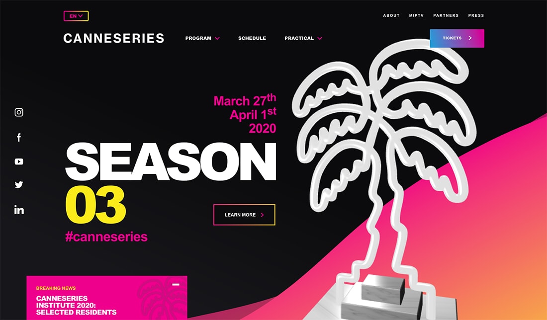
Mixing photos and illustrations can be as simple as layering.
Canneseries uses a photo of a trophy that looks almost like an illustration with background illustrated elements and icons with similar illustrations.
It’s hard to tell the difference between real and illustrated elements and that’s perfectly OK with this type of design scheme.
Simple Illustration with Images
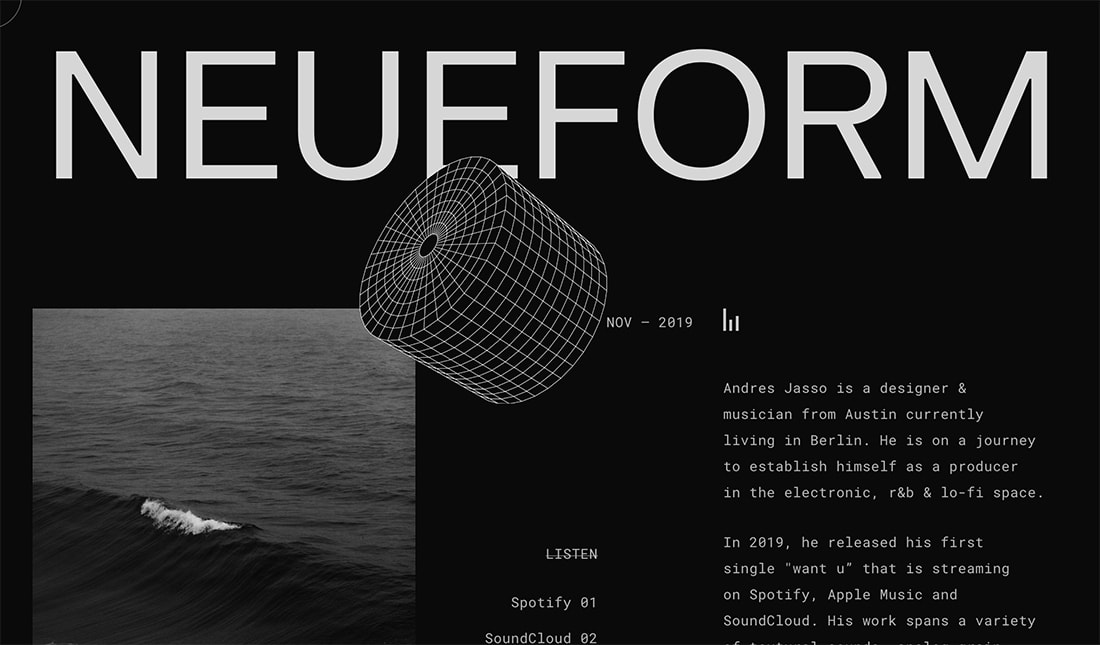
Combining photos and illustrations can be simple. Elements should be designed to help draw users into the design and provide valuable information that enhances their experience.
Neueform uses an illustration that pulls the eye down the design. It represents a microphone and connects to the content for the design.
Hero Partners
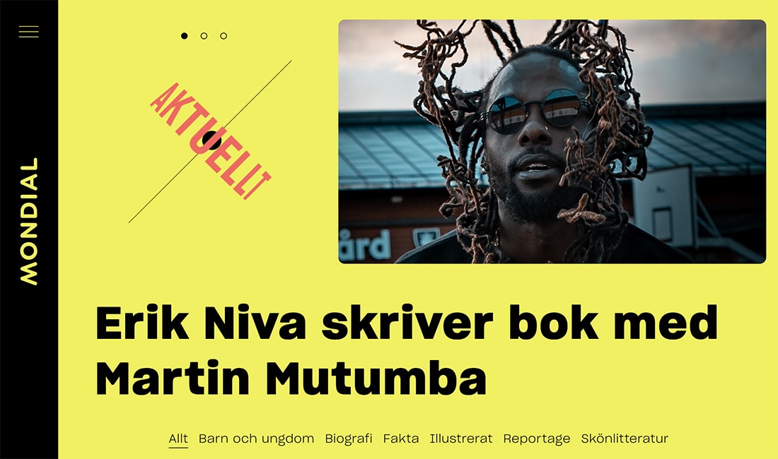
You can use illustrations or animations with images to create a cool hero image area that breaks standard design patterns. It’s a new aesthetic that uses the same kind of space and aspect ratio in a new way.
Something as simple as breaking up space can make the entire design more visually interesting. It disrupts what the user might expect.
Mondial does just this with an animation – maybe not so much of an illustration, but it is close – and scrolling images that connect to the headlines below. It makes you look and read through each different piece of content before moving on thanks to the perfectly timed speed of content blocks.
Combining in a Single Element
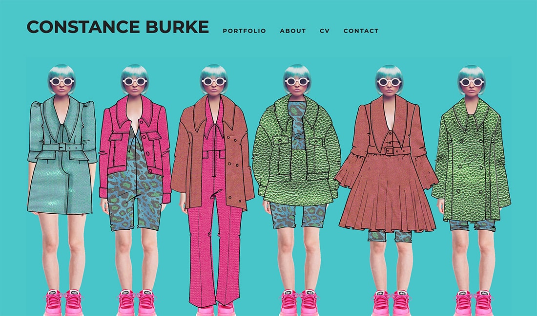
Combining a real image and illustration to create one element can be stunning.
Constance Burke does this fabulously and might be one of the best examples of this style of imagery that you’ll find.
It’s well thought out and executed and matches the content perfectly. The latter is what makes this so effective; the trend is used in a way that makes the content better.
Subtle Illustrations
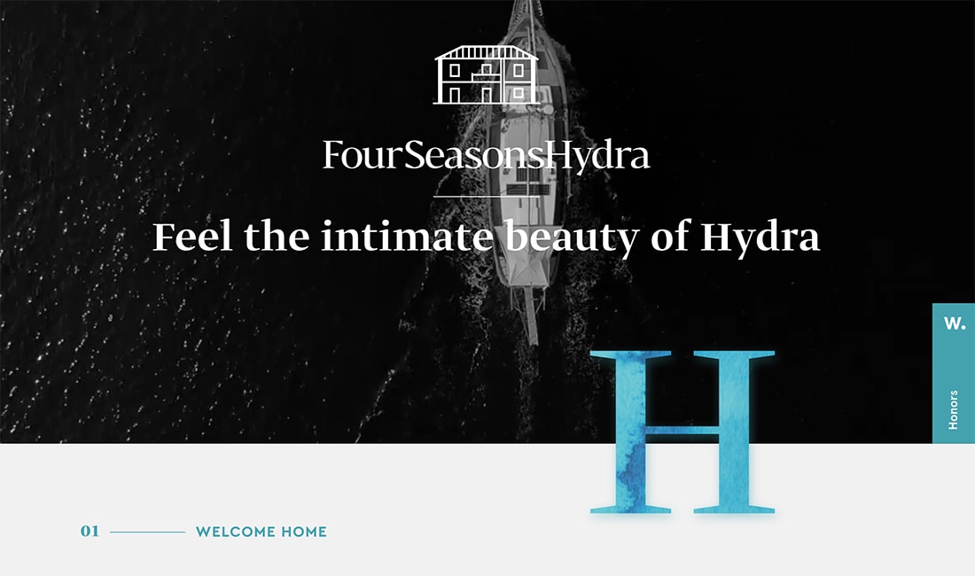
You don’t have to go all out to use this trend. One of the visual elements – image or illustrations – can be rather subtle.
FourSeasonsHyrda uses a subtle moving illustration inside a giant drop cap, layered over a video to create interest. What’s particularly nice about this technique is that it creates extra white space to help draw your eyes through the design so you read the content. Color and contrast contribute here as well.
Conclusion
Do you see this trend as something you could use for projects? The trick is to plan out how the elements will interact with each other. Realism and illustrations must be intertwined so that the effect has an intentional feel to it.