Design Trend: No Images Above the Scroll
Have you taken notice? More designers are launching websites with no images (or video) above the scroll.
There are a lot of interesting uses of text elements, animated effects, and other divots that keep the result from being boring.
Here’s a look at this website design trend, examples, and how to make it work for you. You’ll be amazed at just how creative you can get, without a single image in sight!
About This Website Design Trend
This website design trend has slowing taken hold in the months during and through the worldwide COVID pandemic. Maybe the growth could be attributed to some other design trends that the real-world has influenced, such as keeping more people out of photos and trying things that aren’t so crowded in design.
These projects are popping up across a number of industries and verticals and not just for portfolio sites, which are often at the forefront of website design trends.
There’s a lot of variance in what you may find as well, from super-minimal designs to more packed canvases with animated elements or other unique design features.
Key Characteristics
While the visual spectrum of this trend can be wide, there are some common elements.
The thing you might notice first is that most of these designs start with stellar typography. When there aren’t a lot of other visual elements, type can carry the design. This includes everything from interesting typefaces to size and scale to placement and the actual words on the canvas.
There’s no limit to how these designs can be pulled together with text. This trend is great for helping unify and bring focus to a specific text-based message.
Other characteristics of the design trend include:
- Use of strong or distinct color palettes
- Created design elements such as blogs, swirls, or animated elements
- Bold or big backgrounds – particularly with gradients or blurs – to support typography
- Stark design patterns featuring black and white with just a single accent color for emphasis
- Grids and design tools that create order and organization that contribute to overall visual flow
How to Make It Work for You

It takes great editing, strong language, and a strong design concept to pull this website trend together. While the end result might look very simple, designing it is not.
The key is to not force it. If you have great visuals, this probably isn’t the idea to start with.
If you are lacking visuals, this can be a great direction. Focus on the words and interactions to push the design forward.
This only works if users still choose to interact with the design and complete on-site goals.
A design without a lot of images above the scroll can be a good option for startup without a lot of imagery to work with. Conversely, it can set the stage for smaller images (maybe none of them having the qualities of a “money shot”) below the scroll or on subsequent pages.
With a design outline like this, contrast is your friend. It’s important to ensure that colors, fonts, and the scale of every element is spot on to ensure that there’s enough difference between elements to maintain visual flow.
Things to Be Aware Of
The biggest challenges with this design trend can be ensuring the visual pattern isn’t too stark and creating a visual flow that encourages function and interaction.
It also takes a strong sense of how to use typography effectively and picking just the right colors.
While the list of things to be aware of isn’t long, there can be more long-tailed implications. Without a focus on typography and usability, visitors may not spend any time with the design. (This can signal search engines that your website isn’t very valuable.)
You can also lose some of the innate understanding that comes from images and videos. These visuals add an extra layer of meaning and potential understanding for users. Without them, you have to take a lot of care to ensure that content is easy to read and understand on its own.
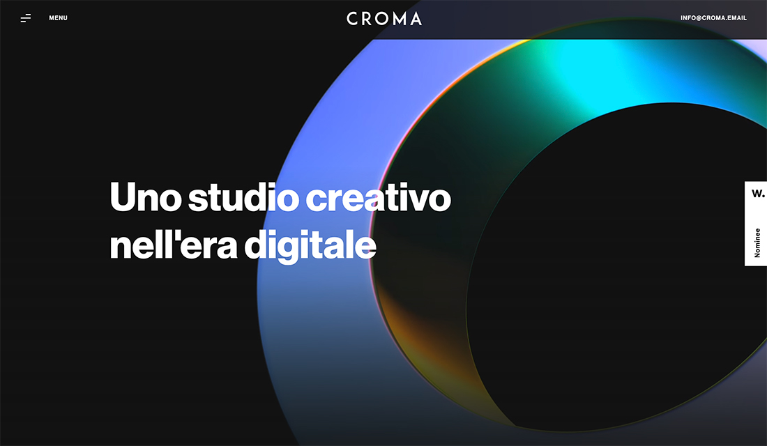
5 Examples We Love
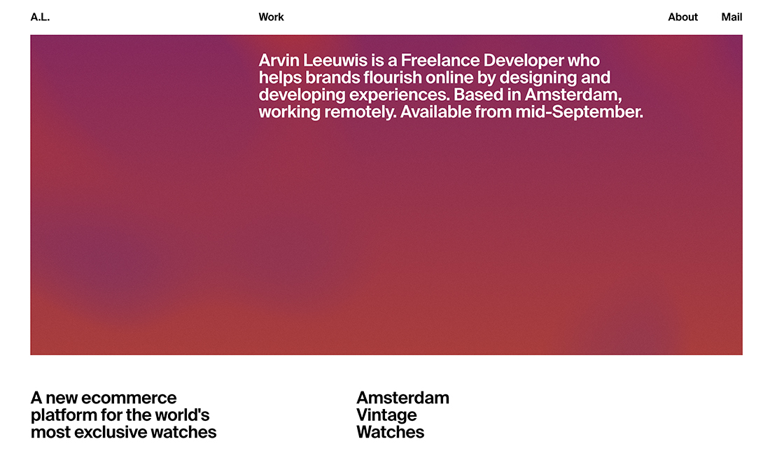
Sarah Guo
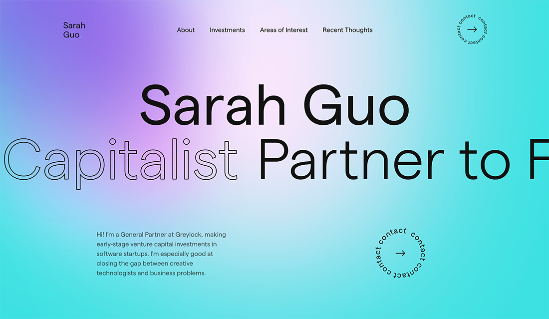
Sarah Guo uses a simple but impactful color background and simple animation with a scrolling sub-headline to bring just the right attention to the design. Every text element uses just the right balance of weight and placement to be interesting and establish a strong flow.
Michael Sumner
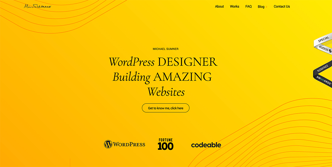
Michael Sumner uses color and typography brilliantly to create a simple aesthetic that makes you want to click the button. The funky lines and simple gradient soften what could be a harsh color choice.
Foundry5
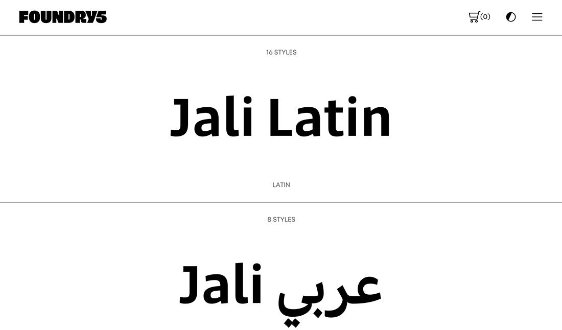
You’d expect it from a type house and Foundry5 delivers with a simple design that gives plenty of room to the typefaces at hand. What’s interesting here is that this is a full e-commerce site where you can purchase typefaces. It’s much cleaner than you might expect.
Christian Kaisermann

Christian Kaisermann bucks the beautiful typography option that many of the design with this trend deploy for a monospaced option with high readability. The retro feel is nice and works maybe in part to the animated background that makes you think of days gone by.
FeNoMeNo
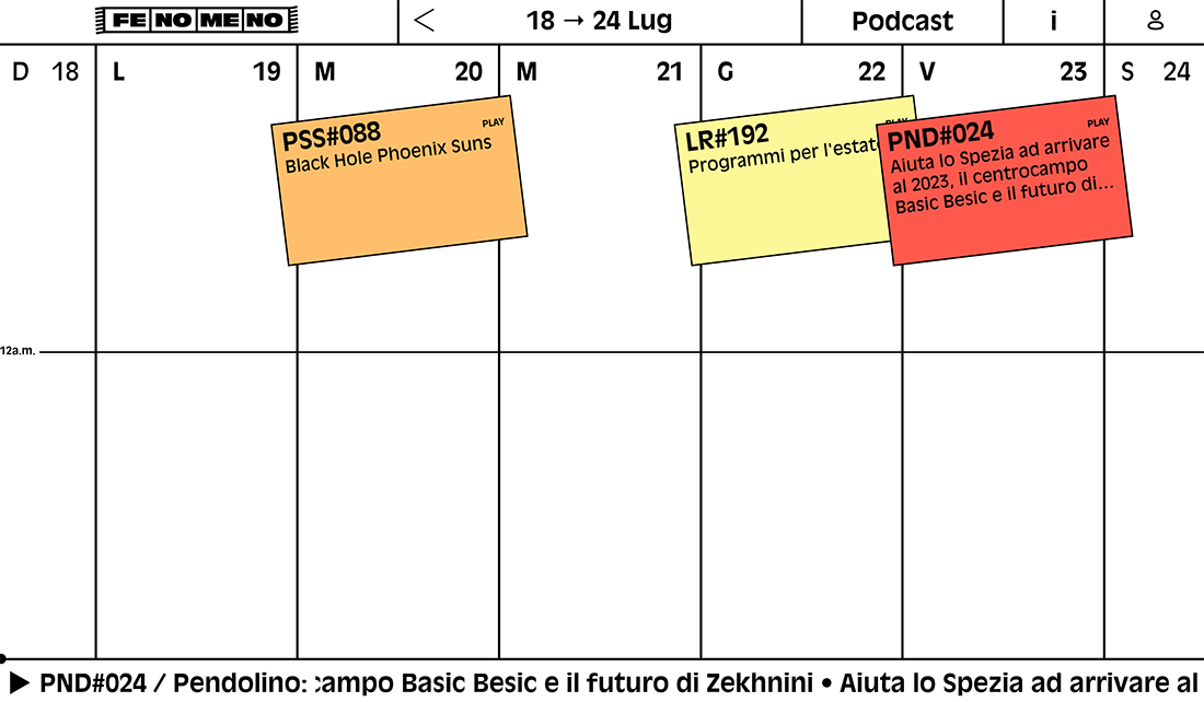
With an almost brutalist style, FeNoMeNo creates “art” elements with the sticky note style on a calendar grid. While there’s a lot of empty space, the placement of elements seems logical and has a strong flow. The connection to a real calendar might be what makes this so intuitive.
Conclusion
Designing without images or video can be a challenge, but with a little planning you can create a stellar website without traditional imagery. Think of ways you can use backgrounds, typography, color, and animation to your advantage.
Focus on contrast and messaging to pull it all together.