8 Packaging and Label Design Trends
Have you taken notice of that beer car or shampoo bottle lately? How about the wrapper on a snack bar or package that comes in the mail? Packaging and label design trends can be some of the most practical influencers in graphic design.
While we put a lot of focus on website design and digital trends, packaging and labels can impact everything. From whether you make a purchase off the shelf, to how you feel about a product when you open or use it.
Design is a major influencer in purchasing decisions.
Here, we are looking at eight key packaging and label design trends of 2019, and how they aren’t just for physical elements. Many of these same design trends are making an impact in the digital space as well. And while we know packaging trends tend to have more shelf life, literally, how do digital and physical design trends impact one another?
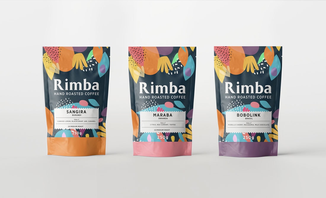
1. Colorful Minimalism
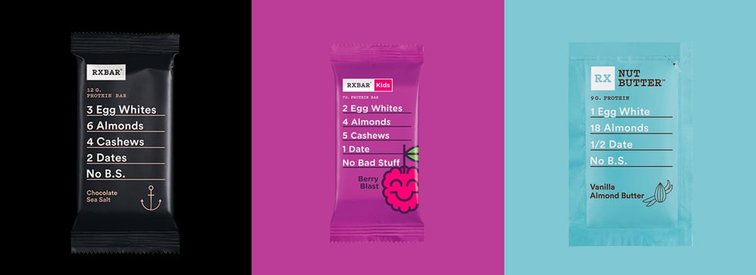
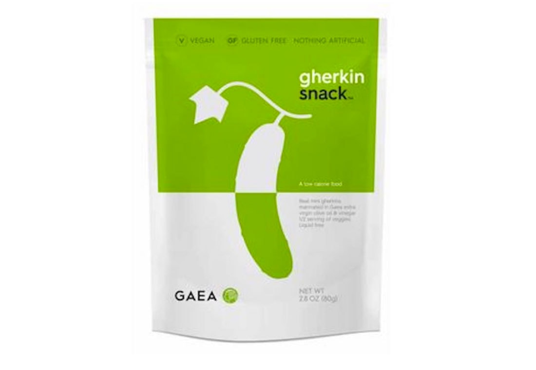
Simple typography. Single image. Bright color.
This trio of design concepts is everywhere in packaging design. It uses the sleekness of minimal design with immense color, which can draw the eye to placement on the shelf.
There’s a certain modern feel about products in a minimal-style package or container as well. With a less is more focus, these designs give you only what you need and nothing you don’t. They aren’t just design in many cases, this philosophy also applies to the product therein, such as RXbar, above, which contains only a few ingredients.
It’s a great lesson in the design matching the content, providing a seamless experience.
2. Sustainable Packaging
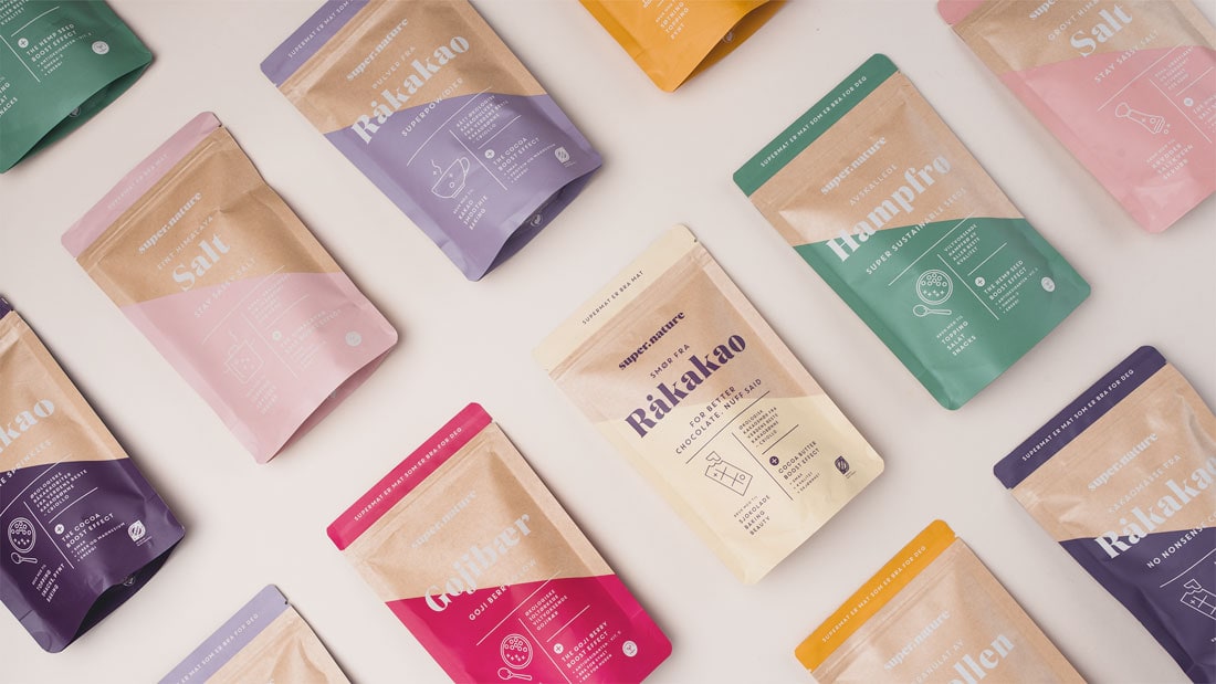
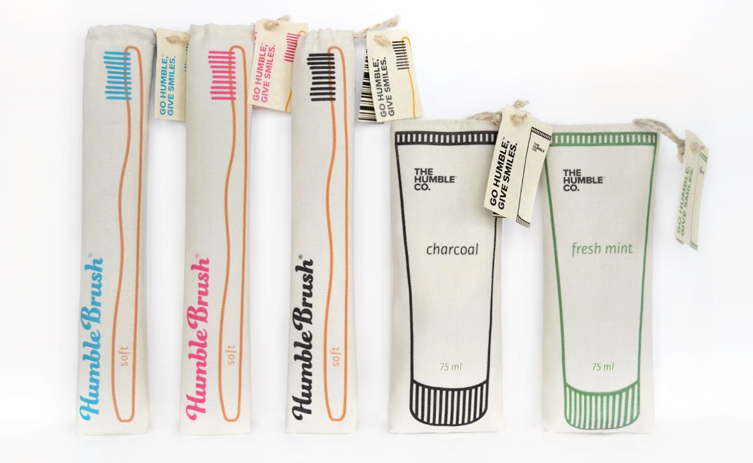
With a worldwide movement to cut the use of plastics, there are more “green” and natural-looking labels and packaging.
But what does sustainable packaging look like?
It’s a combination of a few design elements:
- Paper, rather than plastic packages
- Undyed packaging, so we’re seeing more “brown paper”
- Labels that include words such as “sustainable,” “natural,” or “plastic-free”
- Green coloring for the ink, logo, or other design elements to emphasize the idea of green or sustainability
3. Gradients
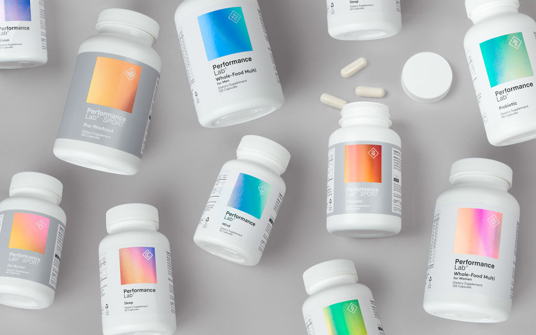
Gradients are one of the most fun and functional uses of color that you can try in any design project.
Use a subtle monotone gradient to create soft, understated texture.
Use a bold color pair in a gradient to put emphasis on the funky nature of what’s inside.
Gradients can also work for entire packaging designs or labels. Conversely, they are equally striking as small design elements. That makes this color trend highly versatile for almost anything you might be designing.
4. Streamlined Color Palettes
Simple color palettes, regardless of hue are another big trend in packaging and label design. Color palettes that contain only two colors with white or black can really stand out on a shelf where everything else is so packed with colorful imagery.
When it comes to thinking about packaging and labels that can be an important consideration. What will the design look like when it’s stacked against other like-size and shape items at a store or in a collection of online inventory.
A design concept that’s different will draw the eye first, and could the be thing that gets you a first sale with a new customer.
5. Nostalgic Design
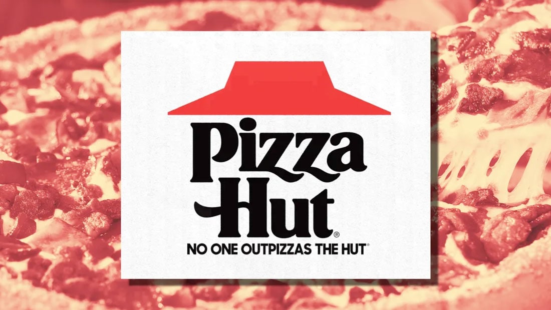
In the past few weeks, Pizza Hut announced it is going back to using its iconic logo design from the 1980s. It’ll be on everything from pizza boxes to delivery cars to restaurants. Why? Because of the emotional connection people have with the feeling of eating pizza there, particularly those who have fond childhood memories.
Products that have some history are finding nostalgia-inspired labels to be an effective way to reconnect with certain audiences and customers.
Who has an old-school swoosh Nike sweatshirt? Who’s got a vintage logo tee from their college or university?
It’s all about creating just the right connection. And for some brands, a label with a nostalgic feel is the perfect fit.
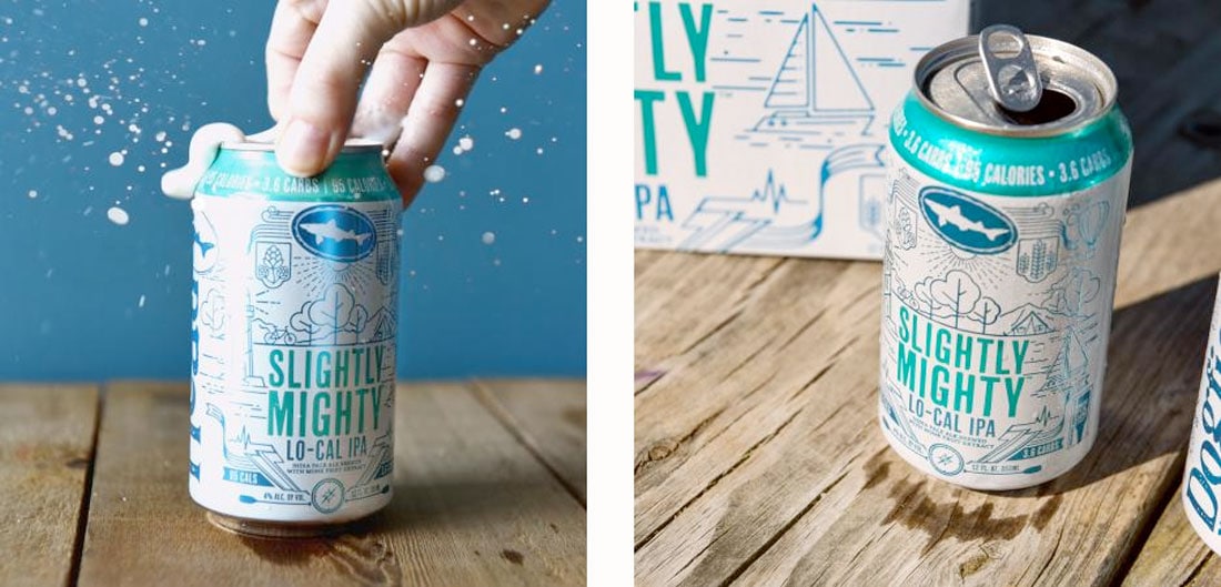
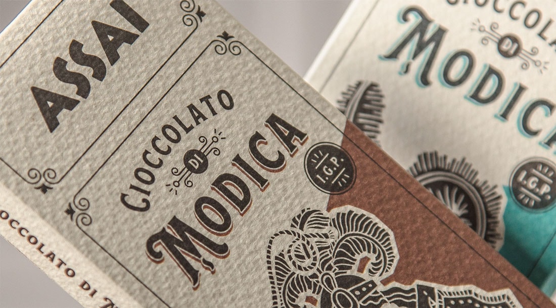
6. Tactile Labels and Containers
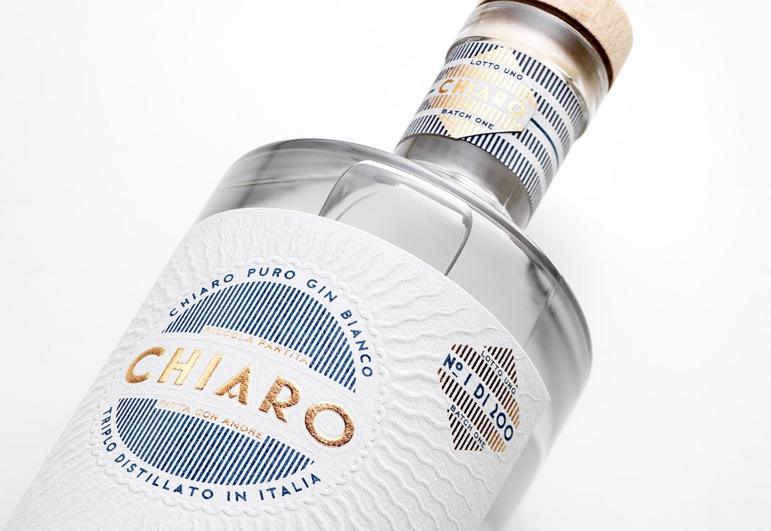
Product and packaging design is more than just aesthetics. It’s also about the actual texture and feel of an item. (That’s a fun part of the design that you don’t get with digital products.)
While there are a variety of techniques to try some of the most popular include foil labeling or UV printing with just a hint of texture and sheen. Cutouts or embossing of the actual packaging or label are also striking options that won’t break the band.
7. Maximal Designs
On the far other end of the spectrum from so many more minimal designs is the use of a maxed-out design, that’s packed with information, color, and typography.
The reason for this is similar to the logic behind using a minimal design, it can stand out among competitors.
The trick to making it work is ensuring that branding and key product information is clearly visible. It’s a delicate balance for sure.
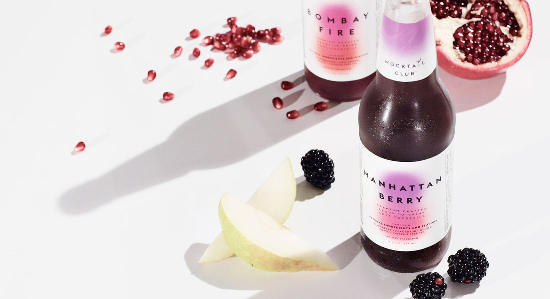
8. Flat Illustration
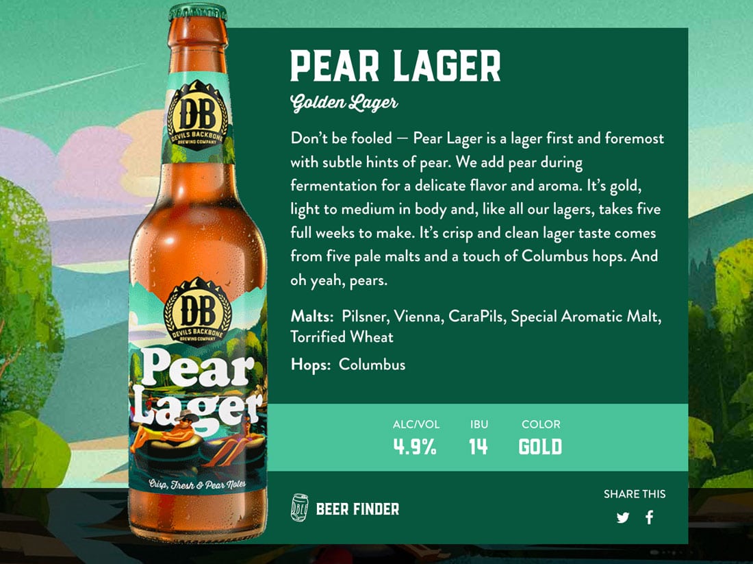
It definitely seems to be a thing with beer and food companies — flat illustration label design.
While flat (and almost flat) was a big deal in website design a few years ago, it is just now making an impact in package and label design. The biggest place where you can find this trend seems to be in food and beverage.
With illustrations that range from super simple to more elaborate, flat is a nice way to add a fun, colorful label and incorporate typography and branding without a design that feels overwhelming. Even with a full scene, such as the Devils Backbone labels, the package seems sleek and fun.
Shapes might be completely flat or have some depth of field with subtle gradients. Almost always, these labels are colorful and bright with a fun feel to them.
Conclusion
What’s cool to think about is the intersection between all the different fields of design. You might specialize in one thing or dabble in print and digital design. You might work or interfaces or promotion or products and packaging or all of them.
The big takeaway is to be observant no matter what type of design work you do because you never know what other types of design elements could serve as inspiration for your next great project.