Design Trend: Sliced Text & Typography
Purists say that you should never alter typography. Lettering should appear as intended by the type designer, or you should select a different font altogether. While this is mostly true, the exception is in the sliced text trend.
The nifty effect makes type elements look like they’ve been cut with a precision tool and can add visual interest to logotypes, headlines and simple text blocks. Sliced text effects can vary from super subtle (such as a small bit of a letter that’s missing) to major parts of words missing altogether.
The thing to keep in mind when using sliced text is that words must always be readable – what point is there otherwise? – and you should pay close attention so that unintended letter combinations or words don’t appear due to slicing. Here’s a look at how to make it work for you with some examples of designs that do it well.
“Traditional” Slice
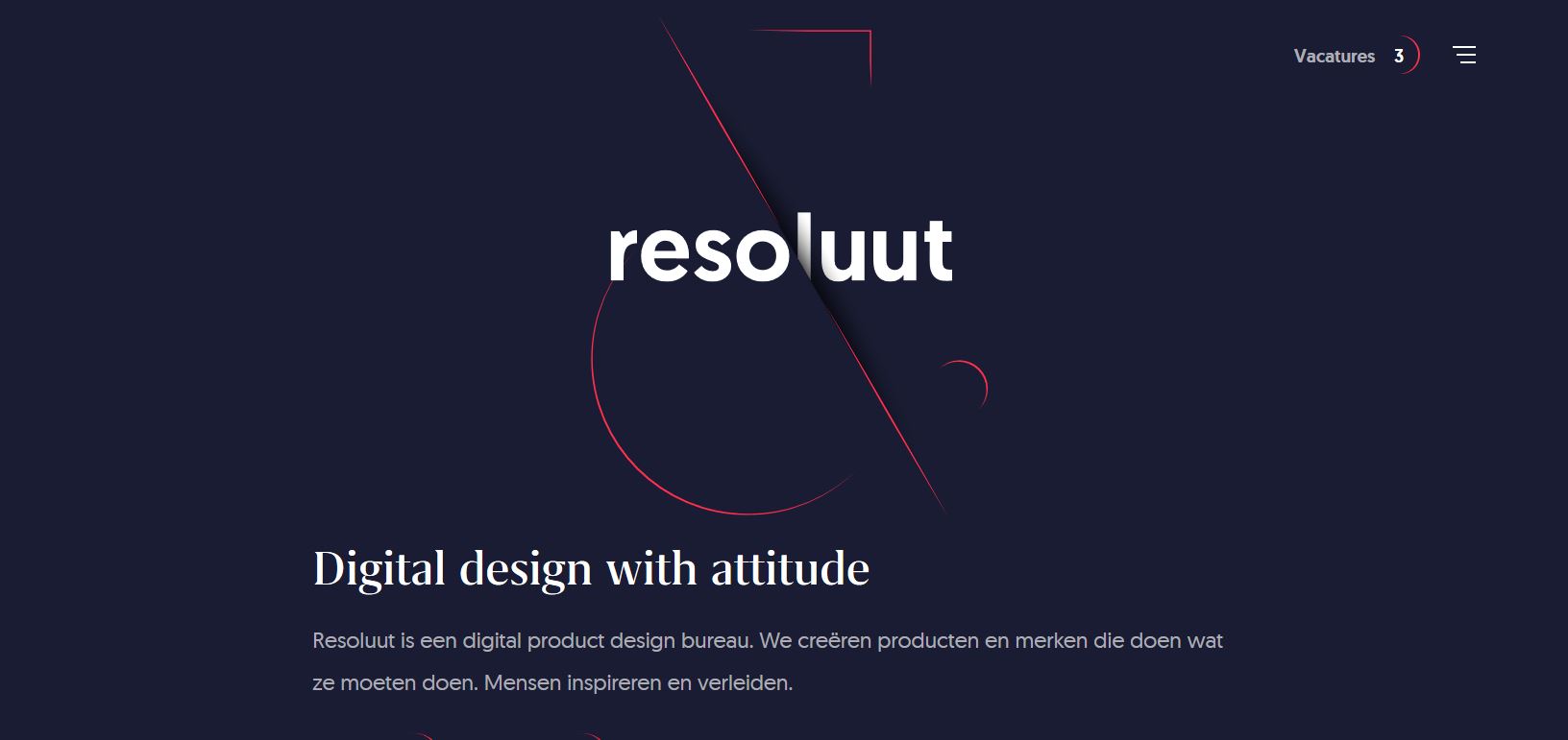
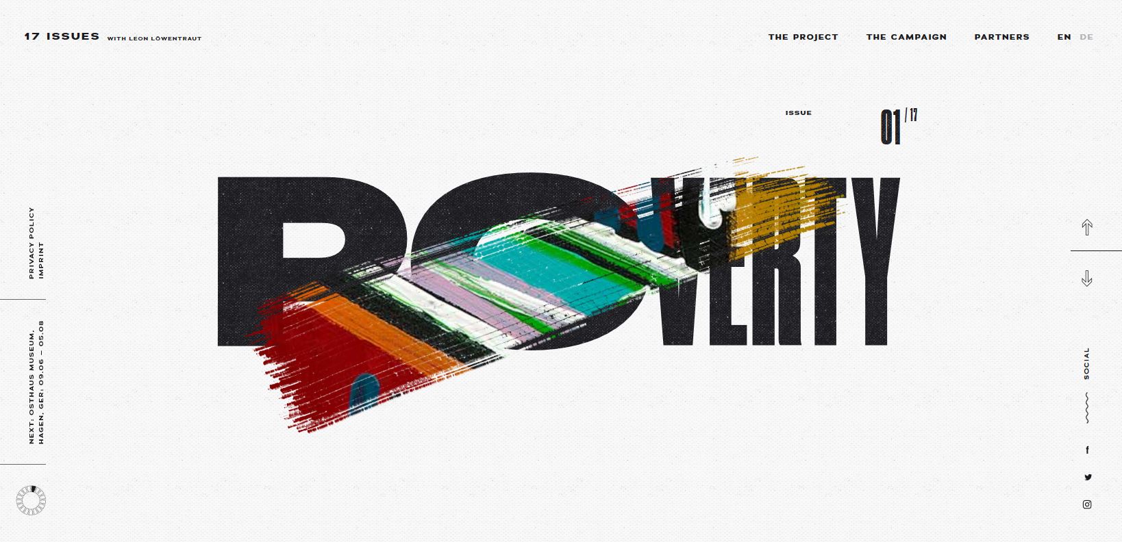
Sliced text includes an almost layered look with one text element, such as a word or small group of words, that is cut and overlapped on two planes. This effect creates depth and can make a simple set of characters visually interesting.
Resoluut uses this effect in combination with an ampersand to draw users into the center of the design. The sliced text mirrors the messaging below that the company focuses on “digital design with attitude,” because sliced text does convey a certain edgier vibe that straight-on lettering.
This technique works best when the character sets are simple (think sans serif typefaces first) and words have a natural break point where they can be cut and maintain readability.
Slice Text and Photos
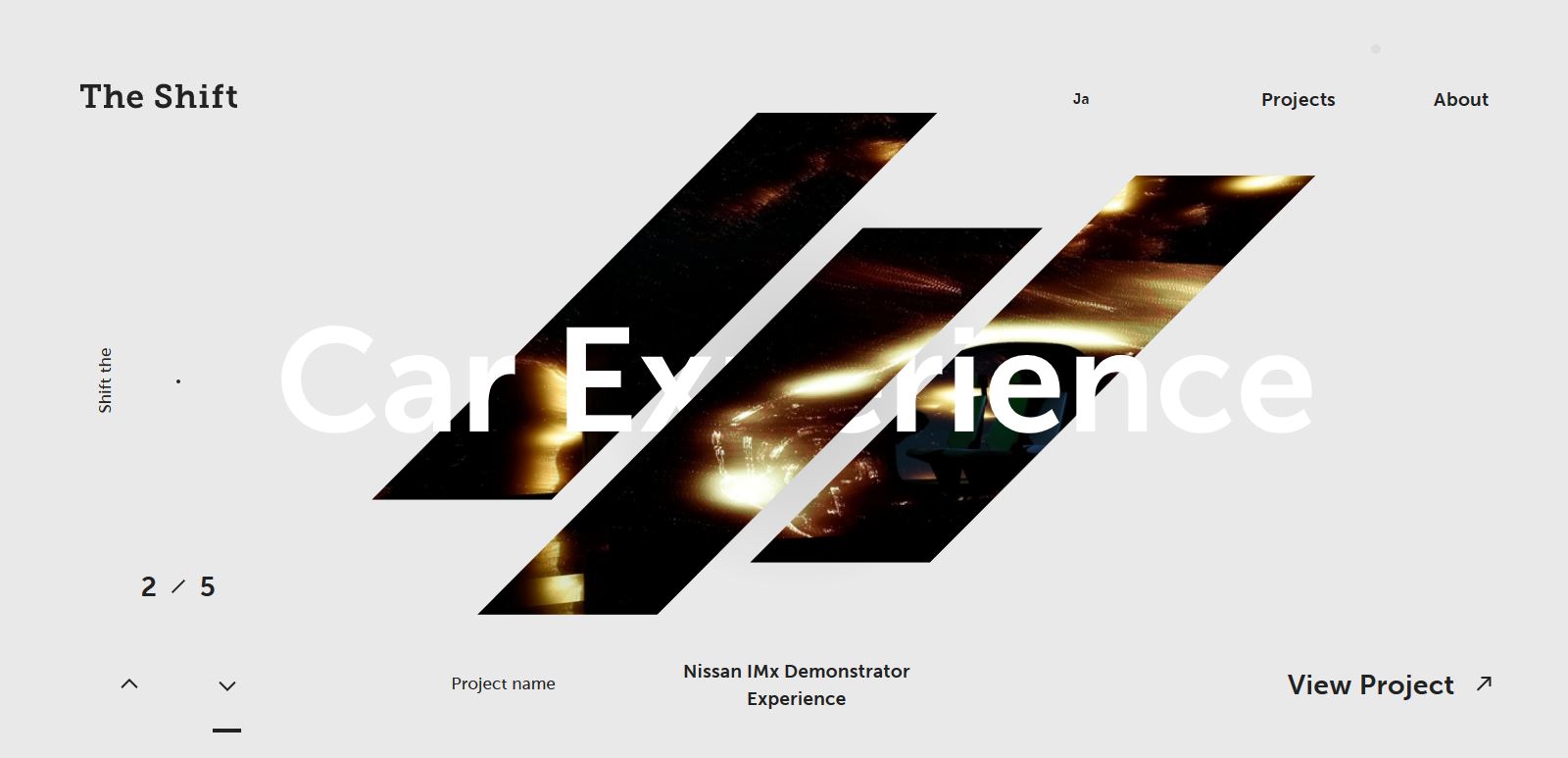
The layering effect isn’t limited to a combination of font and space. Designers can also use images and text to create a cool sliced effect as well, such as the example above from The Shift.
The slanted slice combinations of a single image (also sliced) with lettering draws the user into the design.
While some of the words a little tougher to discern at first, there’s enough time between animations to figure out the message with ease.
This trend works well for digital agencies and portfolio sites as a way to showcase a modern look and feel as well as highlight creative chops.
Slice with Animation
The sliced text effect can be combined with other trendy design elements as well. Mixing slicing with animation can result in a nice visual element.
In the example above, each of the sliced text elements is actually navigation. Users can click either element, but what’s more impressive is the hover action, which puts the sliced text back together.
For Logotypes
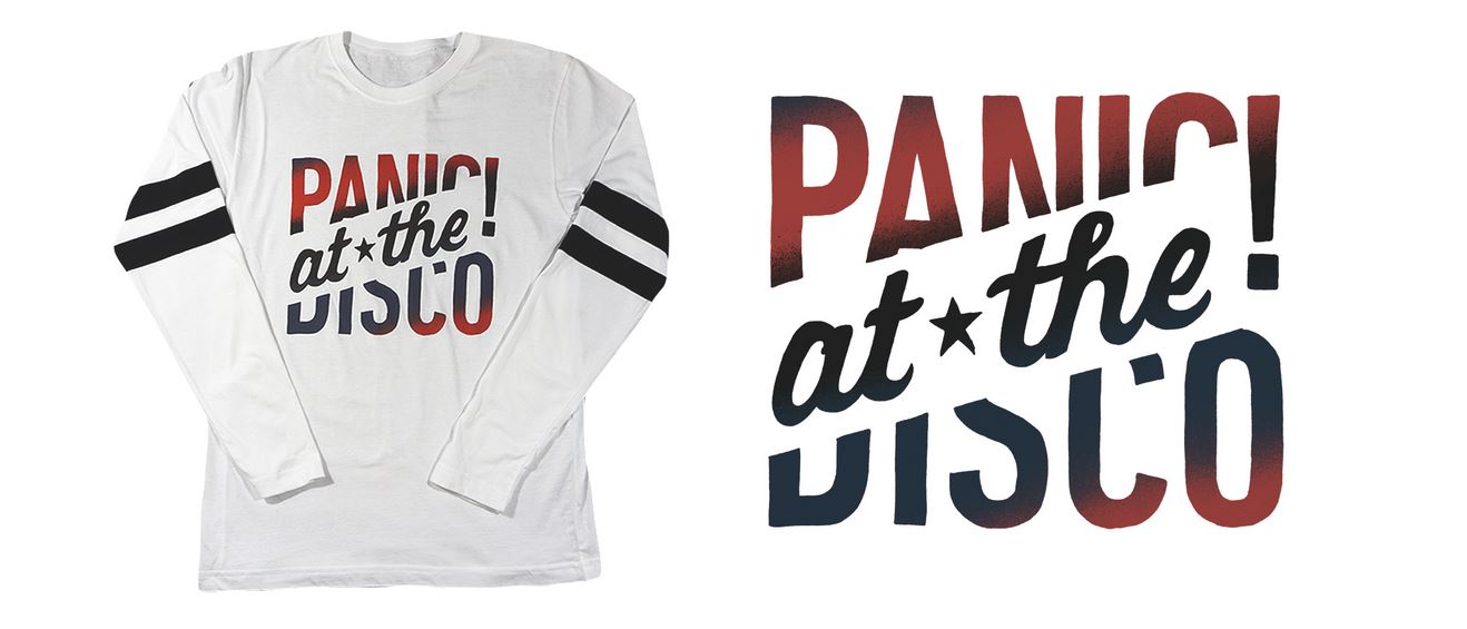
Sliced text can be a fun way to create a logo when the only elements you have to work with are text. A fun logotype can be more than a mark for brand recognition; it can also be a highly graphic element for multiple uses, such as the shirt design, above.
When working with sliced text, look for a natural shape and slope for slicing so that it’s interesting to look at while maintaining ease of reading.
Pay attention to the way slicing creates white space. The design above uses a wide slice of additional information inside it. The more common usage of slicing is often a thin line, but approaches (as you can see from the examples in this post) can vary pretty dramatically.
Create Interactivity
Allow users to slice their own text with an interactive text and brush combination, such as the example above. While the text isn’t exactly sliced per se, the effect is created in the art-making process.
Any tools that allow users to alter the design can result in longer times on site because of the interactive component.
Sliced Vertical Strokes
While most designers seem to be using the trend in the same way with a more horizontally-oriented slice, cuts can be vertical as well.
Vertical slices tend to be shorter because each cut is part of a single letter. The trick to making vertical slices work is consistency. The way cuts are made should mimic each other so that letters look like they do go together. This method of slicing should look like it is almost an intended part of the typeface. (Not in the example above that slices are the same width from letter to letter and the same letters have the same slices.)
Establish Visual Flow
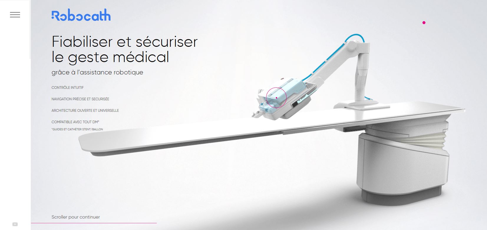
One consequence of sliced text – intended or not – is that it creates visual flow. A users eye will follow the direction of the slice and white space surrounding it.
Look at the logotype in the example above. With slices in the R and o’s in Robocath (plus the normal missing part of the c) there’s an obvious directional pull across the screen from left to right.
The pull is stronger than what you associate with normal reading (also left to right) because the slices push you through the characters quickly. The cuts almost create a sense of reading urgency so that you zip across the letters and over to the main visual on the screen.
Add Emphasis to Lettering
The final – and possibly most compelling – reason to use the sliced text design trend is to add emphasis to lettering or the message. Slicing can be pretty much any alteration of letters where part of a character is missing in the design.
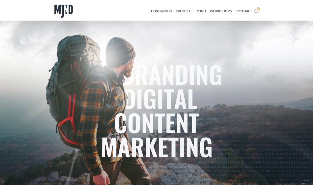
MJND, above, uses more of a layering effect to hide, or slice letterforms to help add emphasis to the message. The image could easily do all the communicating here, but this effect helps bring the user back to the main messaging. The combination is simple, effective and visually interesting.
Learning Resources
There are a few ways to create sliced text effects for projects, depending on exactly what you are trying to create. The most popular options include creating the text effect by hand using editing software or using CSS to create the effect for web projects.
Here are tutorials for each of those options so you can try to create a trendy sliced text effect:
Conclusion
Using the sliced text trend can be a little tricky because it does involve altering type elements. It’s important that readability is not lost or you could lose users with this effect.
Sliced text effects, though, can be a fun solution and help generate a focal point. Adding a touch of animation can help take it to the next level as well. (Many of the examples included in this post do just that; make sure to visit those websites and click around.)