Design Trend: Strong Hero Images With Subtle Text
This website design trend is all about contrast… or the lack thereof. More designs are popping up that have large and stunning hero image areas, but text elements are much more subtle. This is a shift from oversized hero area text that has been big (literally) for some time.
These designs make you look because of this difference. It establishes a sense of contrast with other websites, while maybe not creating so much contrast in the design itself.
Let’s take a look at websites with strong hero images and subtle text to help you generate inspiration for your next project.
Busy Background, Simple Typography
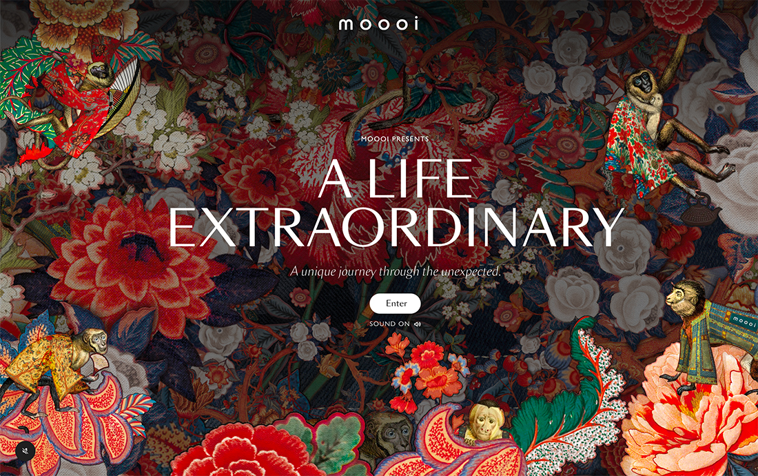
One of the easiest ways to use this trend is to pair simple typography with an overly busy background.
That’s just what Moooi does here, with a background that you could stare at all day and simple text in smaller sizer and weights that are quite secondary to the imagery.
What’s nice is that there is still a nice hierarchy and enough words to help get you into the design. There’s a delicate balance that makes it work without feeling overwhelming, which can be a big risk with a background this busy.
Limited Text
Another way to make the most of this design trend is to minimize the amount of text on the screen. It will automatically feel more subtle if the rest of the hero area includes plenty of action.
In the example above, there’s a video background with color-blocked edges, and standard navigation menu, and a smaller-than-average headline in the bottom corner.
The text element is almost the last thing you see. It’s not overly large, uses a simple font, and lacks contrast against some of the video behind it. Still, the subtle nature of the headline is nice and helps draw the eye to the scrolling icon at the center screen.
Drop Text Size and Screen Location
You’ll find a lot of smaller headlines and subheads with this design trend. That might be because of the actual size on the screen or the weight of type options. Another way to make a text element more subtle is to change the positioning on the screen.
A text element in the center almost shouts to website visitors. This prime position carries a lot of visual weight and implied meaning.
Changing the location of text elements on the screen, especially moving them lower or to one side of the other, softens the approach of this element, making it more subtle.
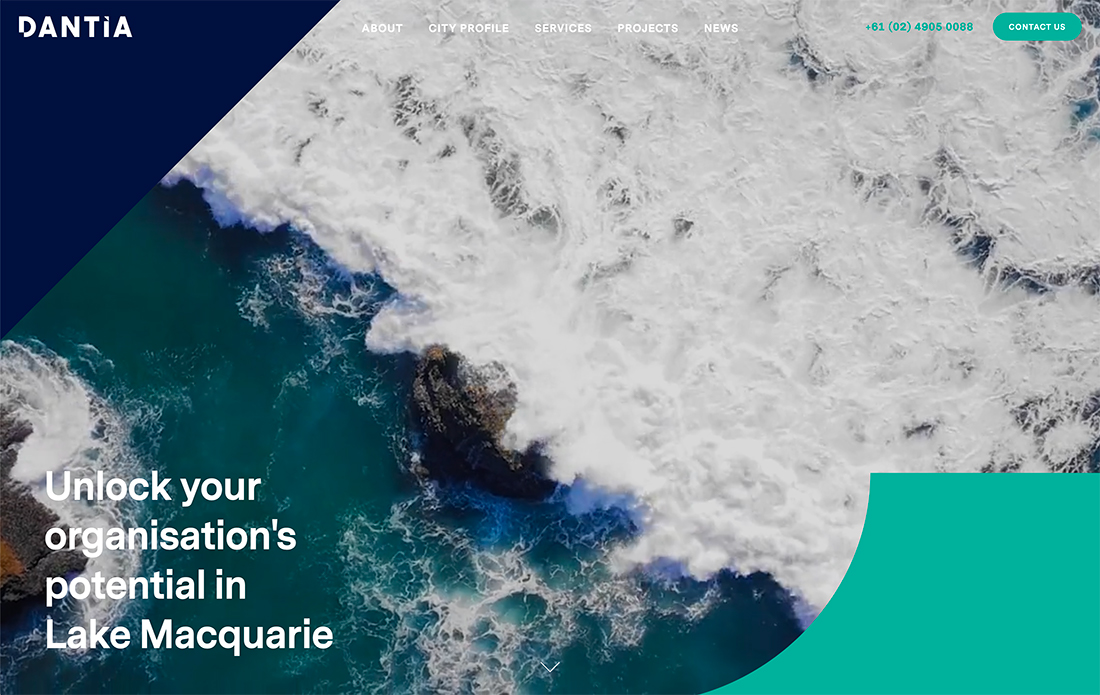
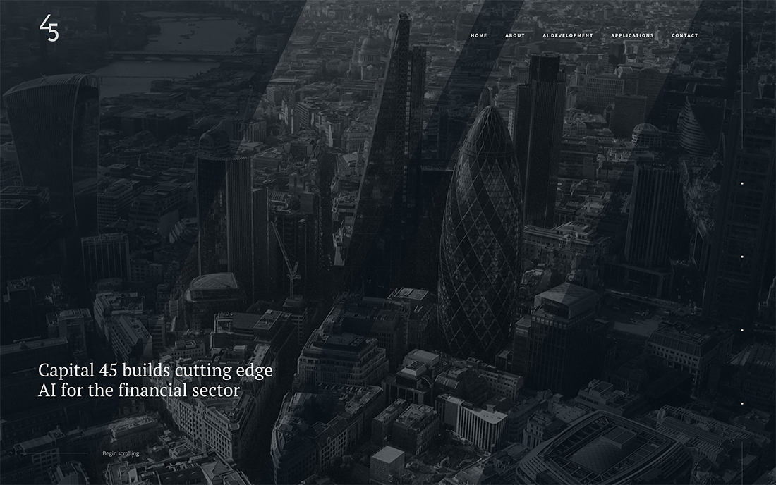
Space and Color
Create text subtlety with space and color of the main image, video, or background element in the design. By drawing the eye to other parts of the design, the text is less dominant by nature.
In the example above, this works because the text is dropped out of the center screen, uses a lighter modern serif typeface, and color variations pull you visually to the top portion of the screen.
There’s a lot of text here, but it isn’t near as overwhelming as you would expect and smaller sizes and lighter typeface options contribute greatly to this.
Tiny Text
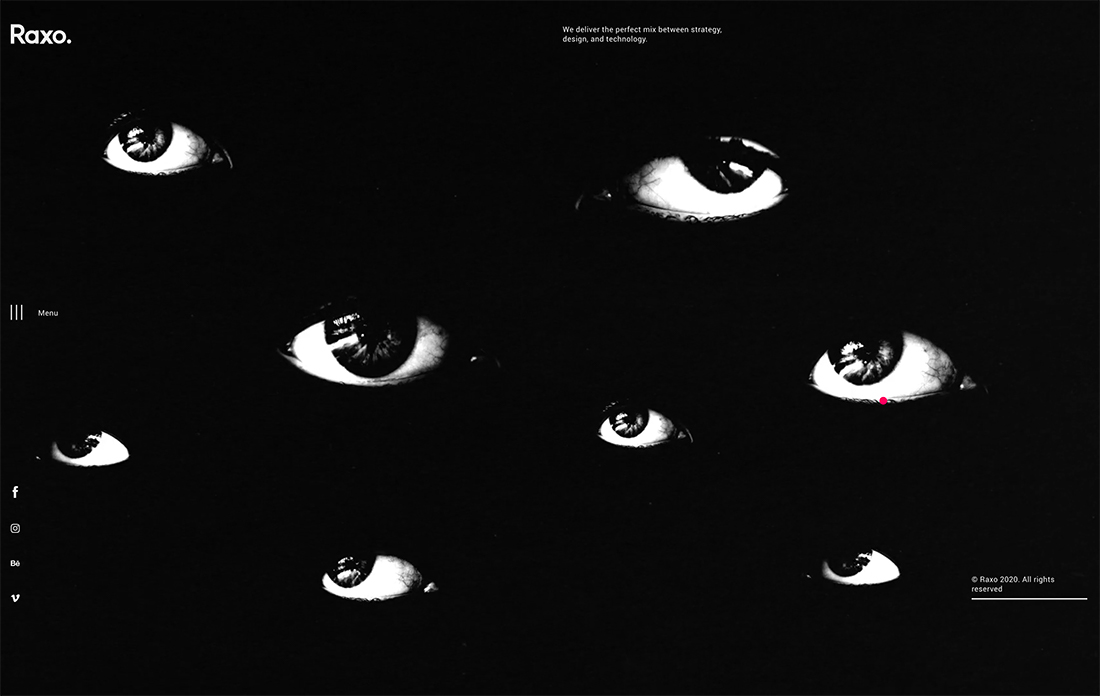
If you are looking for a sure-fire way to make the text a subtle element, make it tiny.
It almost takes you a minute to find text elements in the example above. The background image is fast-paced with animations that don’t stop. Color choices introduce a high volume of contrast, but the text is so small next to the main image that it seems to fall off the screen.
If you are counting, there the main headline tucked in the top portion of the screen, a navigation menu along the left margin, and a copyright notice on the lower right side.
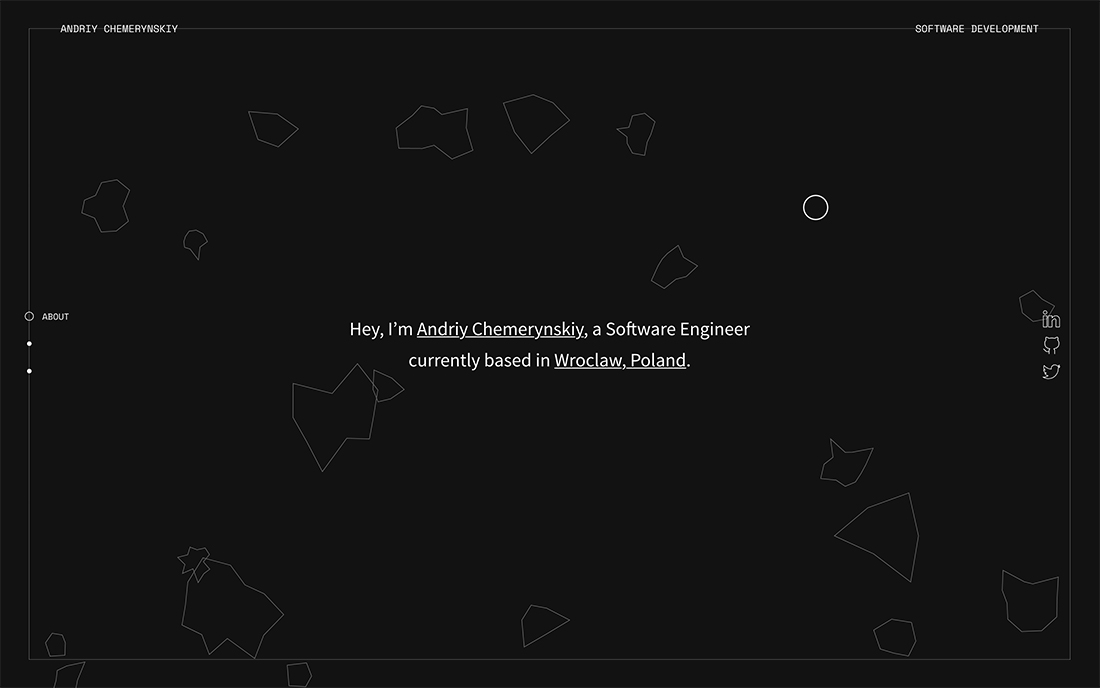
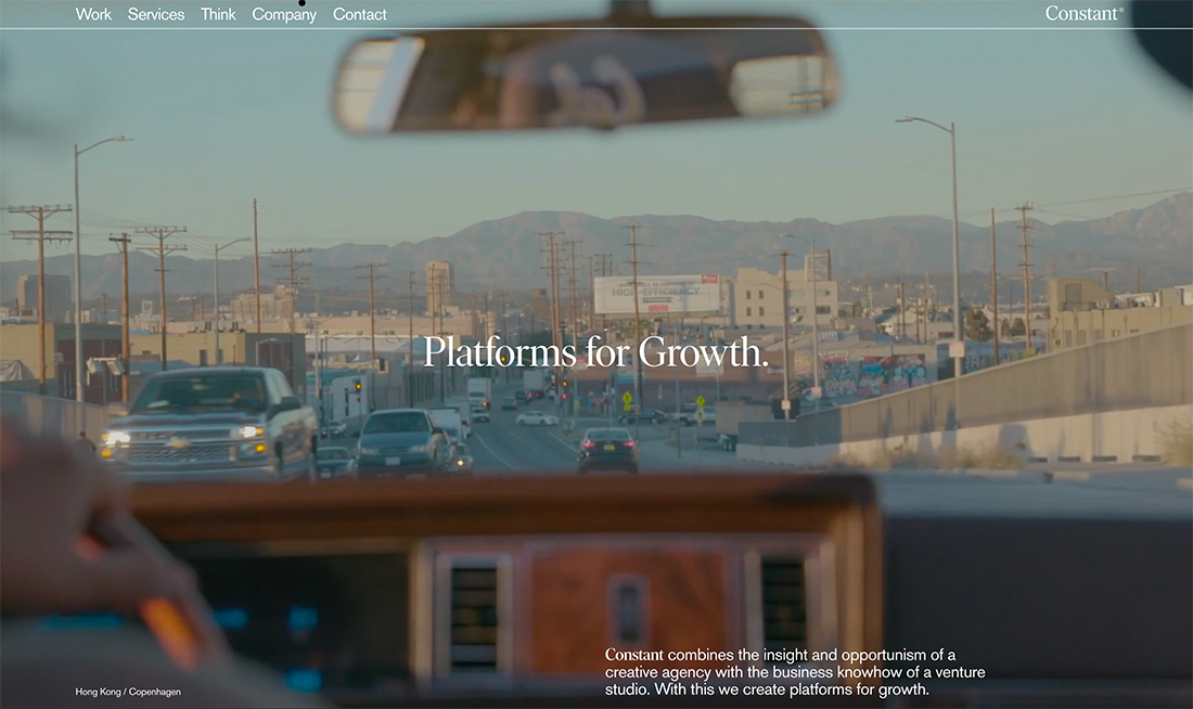
Contrasting Motion
While many of the examples here use limited contrast to create subtle text, the opposite can also be true. The difference between the three-dimensional spinning background above and the static text element do it in the example above.
The text element is almost lost because the rest of the screen is in so much motion. Almost like a whirling dervish, you can’t help but find yourself entranced in the moving background. There’s a lot to look at and the speed forces you to stick with the scene.
You’ll focus on the text, only after a few rotations of the homepage image.
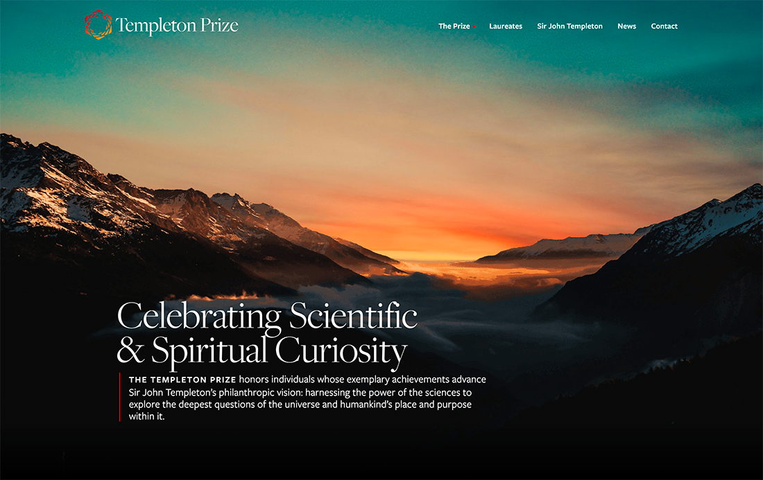
Size
Sometimes subtle text is all a matter of opinion. If there’s plenty of color contrast between the background and foreground text element, you might not consider the words to be subtle.
But in comparison to other projects and designs, the size of the text in the example above is rather subtle. It’s all a matter of perspective.
Moreover, what’s subtle in this design are the navigational text elements. They are small, in more unusual placements, and feature a typeface in a light weight.
Subtle Serifs
A serif typeface – aside from slabs – can have a lighter appearance than regular or normal sans serif options. This can be especially true with modern serifs, which feature thick and thin stroke widths.
If you are looking for an even more subtle feel, opt for a typeface with larger bowls and a wider stance. The increased space inside and around individual letters can make it look more open and less weighted.
Extra Letterspacing
Following the same philosophy from the previous example, more space can make text appear lighter and softer. While you can do it with a typeface selection, you can also do it with letterspacing (the space between letters) or line spacing (the space between lines or paragraphs of text).
More space can make everything seem more open and airier.
But there is a sweet spot with this option. If letters are too spaced out, words can be a challenge to read and cause readability of usability issues with the design. Proceed with caution.
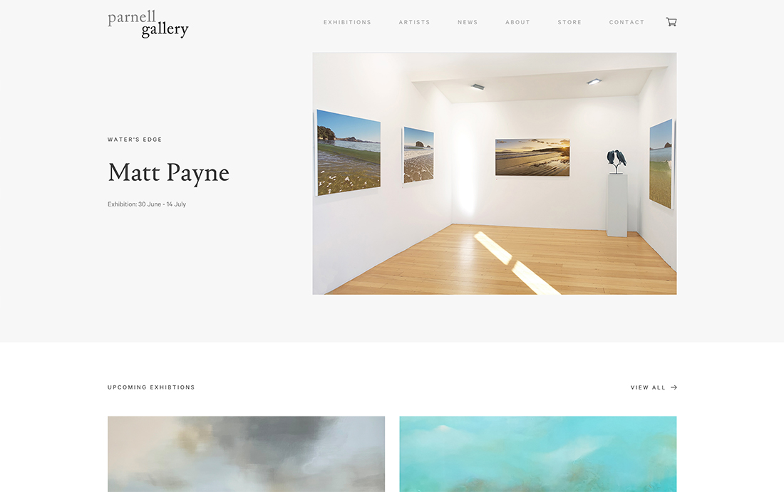
Separate Text Elements
The more text that appears together in a grouping, the bigger it is perceived to be on the screen.
So, if you want text to have a more subtle feel, create separation between blocks of text.
In the example above the headline and subhead are spaced apart vertically as well as on differing “gridlines,” with one centered and one shifted to the right of center. The effect is easy to read and understand, but the words don’t carry a lot of visual weight.
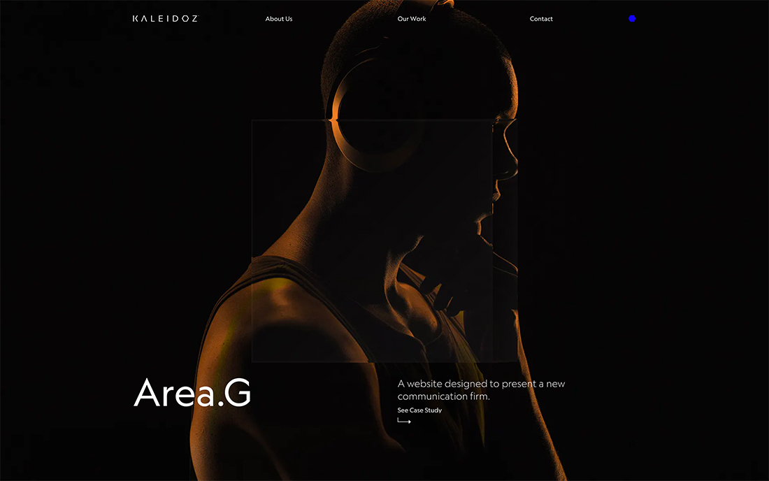
Opposite a “Fancy Effect”
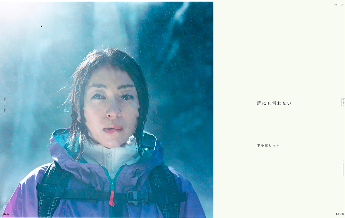
Did you even see the text elements in the example above at first glance? If you click through to the actual website, chances are the strangely captivating image on the left will demand all of your attention.
When small text has to compete with a fancy effect, animation, or image, it is a lot harder to see until you are ready for it. This concept works in much the same way as using an overly busy background because your eyes just aren’t ready to move from the effect to text.
You almost have to understand and clear the cognitive load of the imagery before having enough of a mental reset to focus on reading.
Asymmetrical Balance
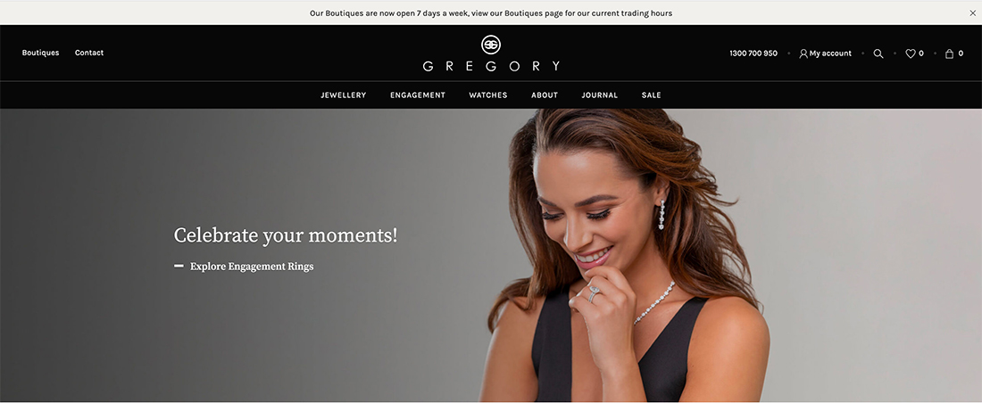
Subtle text can add to the beauty of the design. In the example above, a text element and photo create a sense of asymmetrical balance that helps the eye move back and forth between elements. They support each other.
You may see the image first, but then read the words, and go back to look at the ring on the model’s finger. While the text may be somewhat subtle, it is a key component of understanding and properly engaging with the design
Conclusion
The thing that’s great about this design trend is that it is purely visual. You don’t have to change anything about your brand or overall design philosophy to try it. For that reason, this can be a good option if you want to make a switch to your homepage.
It also works with practically any type of content and as you can see from the examples above, has a wide range of applications. It’s a trend that looks nice and is highly usable.