10 Trends in Tech Startup “Unicorn” Websites
There’s so much you can learn from startup “unicorns”. The companies that generate billions in revenue. The one who revolutionized industries. And changed how you work and manage your day-to-day life.
The way they solve common problems. The strategies they use to stay relevant. The business models they use to generate billions in revenue are all fascinating. But we’re not going to talk about those business aspects.
Today, we take a look at the websites of some of the most popular startup unicorns in the tech industry. We noticed a few trends among these websites. Surely it must have something to do with the massive success behind these companies.
Let’s try and figure out how and why these top startup companies use specific web design trends.
1. Minimal Content Design
Minimalism in website design is nothing new. It’s a well-known fact that minimalist designs with the use of plenty of white space is the best way to reduce clutter. We’re now seeing more and more startups incorporating this strategy into their content designs as well.
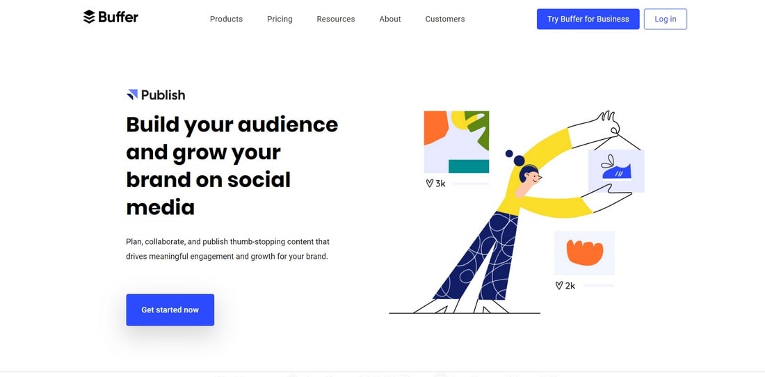
Buffer website is a great example of minimal content design. The website briefly explains what the tool can do on the top half of the website. And then goes on to explain the main features of the app.
Instead of using lots of headings, bright images, and multi-paragraph descriptions, Buffer uses beautiful illustrations and short descriptions that consist of only one or two sentences. The site also uses a plain white background that effectively highlights all of its content.
Minimal content designs not only make it easier for the users to digest the contents of a website but create a peaceful and relaxing user experience.
2. Creative Illustrations
One thing you can expect to see on every startup website is hand-drawn illustrations. It’s no surprise that these beautiful illustrations were able to replace images, especially those terrible stock photos. Because these illustrations help create a more memorable and friendly user experience.
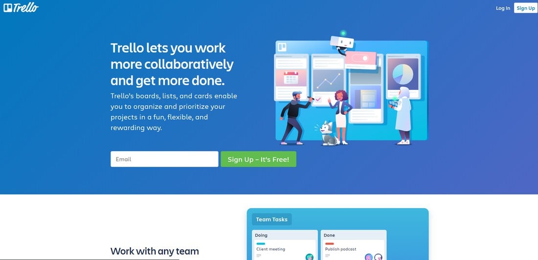
Trello website uses illustrations in a very creative way. It uses illustrations to showcase the product alongside its adorable mascot.
Many other tech startups like MailChimp and Buffer also uses illustrations throughout the website design. Surprisingly, these sites use more illustrations than screenshots showing the actual product. In a way, this helps the brands to create a sense of mystery and arouse interest in the product itself.
3. Two-Color Color Schemes
Almost every startup website we visited shared one common trait—they shared a color scheme that consists of just two colors.
Not so long ago, marketers and web designers were convinced that certain colors help boost engagements. For example, it was a common belief that the color Red is the best choice for CTA buttons.
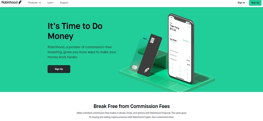
Today, things are different. Take the Robinhood website, for example. It only uses two colors, black and green, throughout its design. And it’s only one of the many tech startup websites that use the same design strategy.
When sticking to just two colors, you have more freedom to focus on more important things. Like the content arrangement and button placements. Also, it fits in nicely with the overall minimalist design as well.
4. Unique Animations
Just when you think the days of animated websites are over, Slack, Dropbox, Robinhood, and more make animations relevant again.
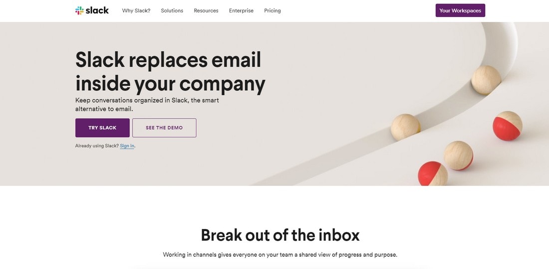
Animations are a great way to attract the attention of the users. For example, Slack uses a very weird but effective animation on its website. It’s actually quite mesmerizing to watch.
When scrolling down, you see another animated video that shows the stacking and organizing of messages. A clever way of showing what Slack is capable of doing.
When used right, animations can be quite useful. Even a simple animation like a moving arrow is enough to guide users to encourage them to explore more of the website and to boost engagement.
5. Feature Walkthrough
The walkthrough section of the website that showcases what an app or service does is a common part of a startup or SaaS website. Popular startup websites excel in this aspect by offering a streamlined explanation of the product.
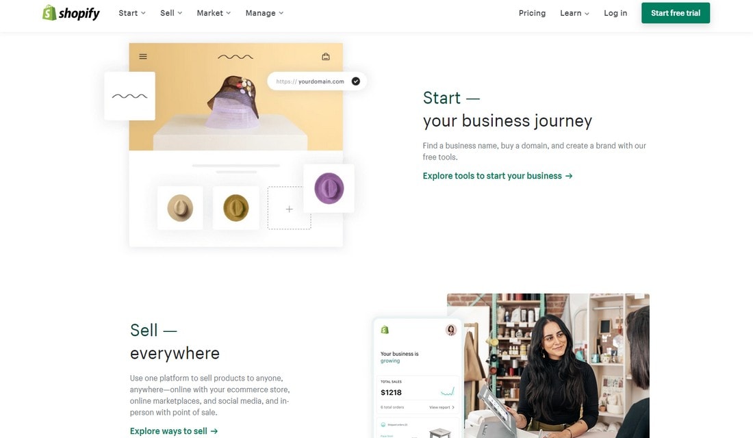
Shopify website has a similar feature walkthrough section showing off what the app is capable of doing and how it can be beneficial to users. This process is streamlined in step by step sections along with subtle animations.
Most other sites we explored shared similar feature walkthrough sections with just a few small changes.
6. Multiple Call-to-Actions (CTA)
The call to action of a website should be included in the top half of the website and at the bottom of the website. This is the practice proven to be effective and accepted by design experts. Well, at least that’s what it used to be.
We saw many startup websites now using a different approach by including multiple CTAs throughout the site design. The MailChimp website is just one of them. Slack, Trello, Squarespace and many others use the same strategy.
More CTAs would obviously mean more engagements from users. However, there is always a question about how it affects conversion rates. When you direct visitors to different sections of your website, they may not end up where you want them to be. Which is usually the user registration page or the pricing page.
The big startup websites, however, uses a funnel-like website design. That takes users from one page to the next. All leading to the final conversion page.
7. Pastel Colors
After going through trends involving flat colors and material colors, the latest trend in color schemes is pastel colors.
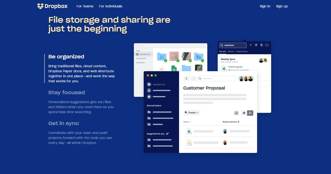
Dropbox used to have a very simple website design. But the company is now adopting a more modern approach for its website. The latest revamp uses pastel colors for its backgrounds as well as for different website elements.
Even though this new pastel color trend helps to create more calm and elegant designs, you shouldn’t expect it to last long. It will only be a matter of time before a new color trend takes over.
8. Explainer Videos
Adding an explainer video to a SaaS website is one of the best ways to attract more visitors and convert them into users. Dropbox proved this with its explainer video that generated over 100 million users.
That was a long time ago. Back then, simply embedding the video on the website was enough to get more people to watch it. But, users expect things differently now.
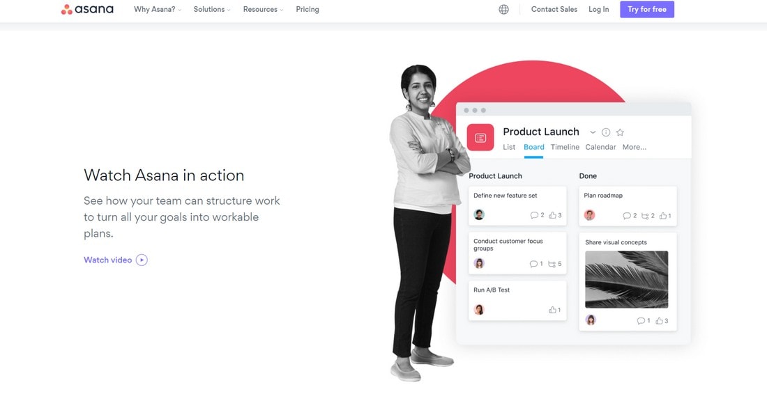
This is probably why Asana, among many others, uses a clever tactic to highlight the explainer video. Instead of embedding the video directly, the site has a specific section on the website dedicated to the “how-to” video to get more clicks and views.
It’s a strategy that accomplishes two things. It grabs the visitor’s attention and tells them what the video is about. And it helps reduce the page size for faster loading times.
9. Simplified Copy and Forms
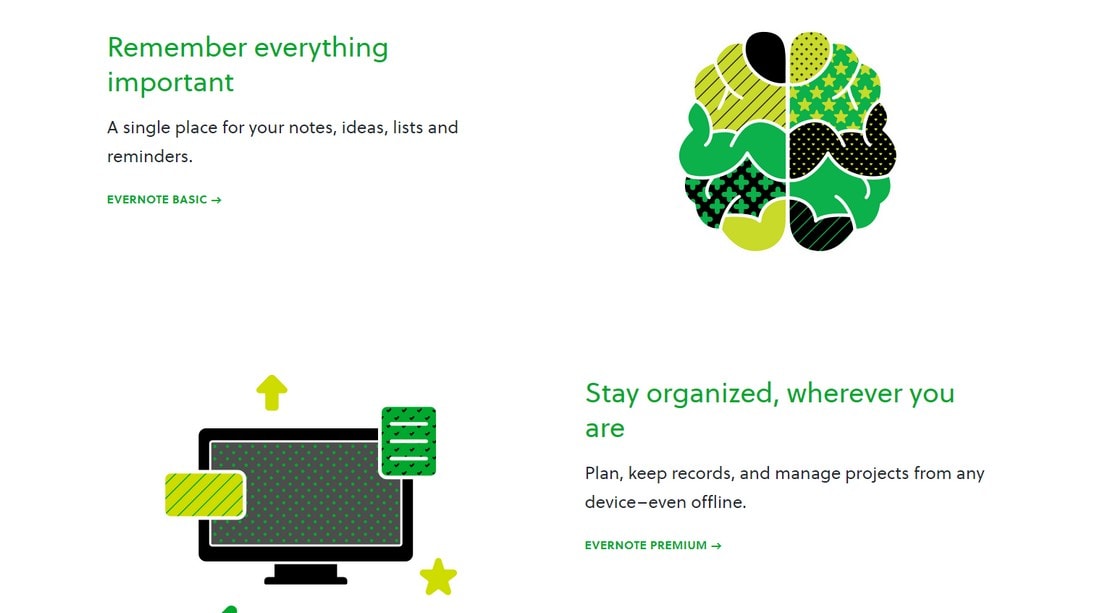
Another common trend we noticed in most tech startup websites is the simplified copy. The sites use very simple words and short sentences to describe the uses and the features of the product.
Even the biggest and most sophisticated online services websites now use short headings and one-liner descriptions. Evernote does this best with its one-liner explanations about the product and the use of large icons.
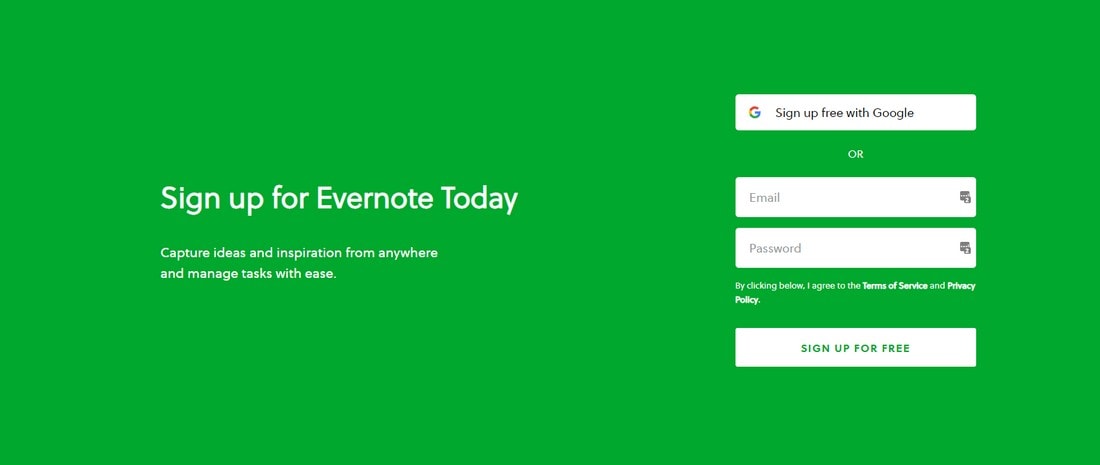
And it’s not just about the copy. Even the signup forms are now more simplified than ever. Registration forms used to be multiple pages long, but today it’s been reduced to just two or three form fields.
Simplicity plays a key role in attracting a broader audience. It’s especially important when you target an international audience.
10. Fullscreen Image Backgrounds
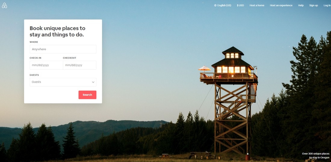
Imagine if all websites on the Internet used the same ultra-minimal designs with white backgrounds and pastel colors. Then the Internet would be a boring place. There no originality in blindly following a design trend. Sometimes, it’s best to stick with an old design trend if it helps you explain your business better.
That’s exactly what Airbnb does with its website. The site uses a large fullscreen image as the background for the header section. This is a clever tactic as it helps create an image of what the platform offers.
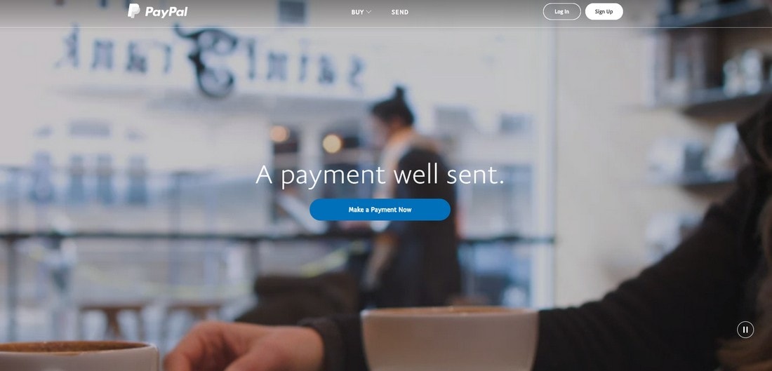
We can’t ignore the video backgrounds either. Some of the biggest startups like PayPal and Lyft still use video backgrounds on their websites. An interesting thing we noticed is that the background video used by top brand websites usually contain visuals unrelated to the business.
We’re unsure whether it’s a clever tactic to build curiosity or just lazy choice of design. We’ll let you decide.
In Conclusion
These are just a few of the trends that you’ll notice at first glance. If you look closer, you’ll notice more striking similarities between these websites. It really makes you wonder about the importance of following design trends.
Although, these startups are clever enough to create their own identities through the websites to make them stand out from the rest. That’s the key to making a successful website. Creating an identity and delivering a simple yet memorable experience to users.
Hopefully, you’ll be able to steal a few good ideas and trends from these startups to apply them to your own projects in the future.