Design Trend: Transparent Text With a Bold Background
Who said typography has to be boring? Designers are having a lot of fun with interesting type options, including the super trendy method of layering transparent text elements with interesting backgrounds, animations, and images.
There are plenty of ways to incorporate this website design trend into a project (or put your personal spin on it for printed projects as well).
Here are some ideas and inspiration to help you get started with using transparent text on a bold background.
Icon Cut Outs
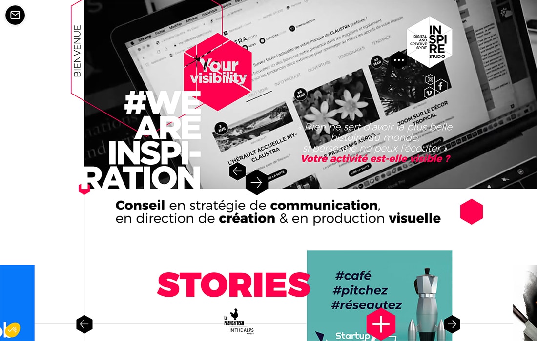
A subtle display of transparent text can add visual interest to an icon or shape.
When we talk about transparency and text elements, think of it as anything other than traditional single-color text (light on a dark background or dark on a light background).
In the example above, a transparent text element inside a colored icon allows the video reel in the background to show through. It’s interesting, provides a hint to color to help draw eye movement and animated elements draw attention to changing content.
Image Slider
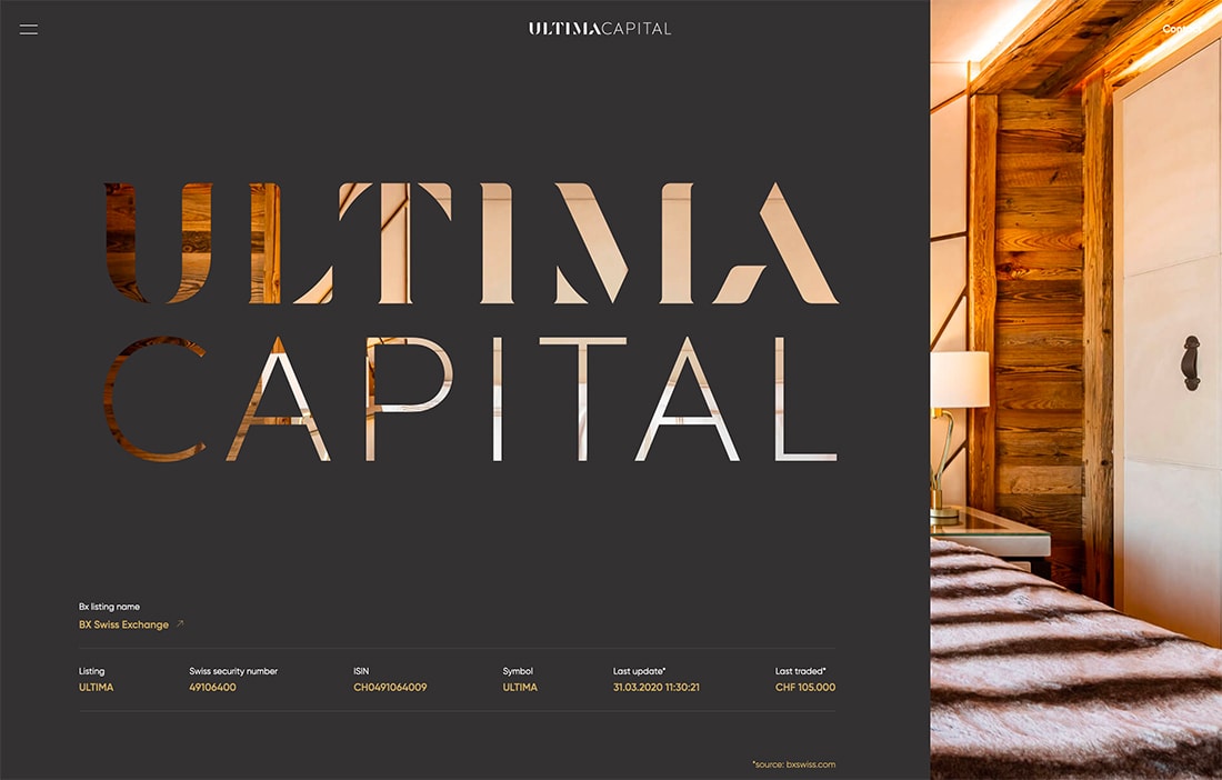
Transparent text can provide a fun preview to a background layer with images or video. This technique works best with a few large (even oversized) letters, so that you can see enough of the background for it to be interesting.
Ultima Capital (above) uses a full-screen image background layer behind a transparent text element on a dark background, almost like a window cutout. You can see the full image as it slides into place and the remaining visual preview is textured and interesting while maintaining the readability of the two big words on the screen.
Shadow Element
For lack of a better description, we’ll call the technique above the use of a shadow element behind transparent typography.
What looks like what text on a dark background is actually transparent with a blue to green gradient bubble floating behind it in the background. The subtle movement draws attention and connects to the subtle bubbles in the foreground as well.
The effect is nice because it helps create a visual focus for a long text block and page design without a lot of other visual bells and whistles.
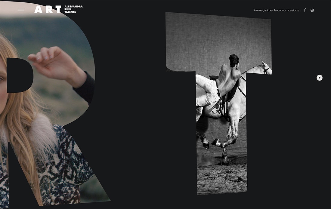
Peek-a-Boo Image
The peek-a-boo image treatment is probably the oldest variation of the transparent text trend. Letters look they have been cut out of the foreground to reveal an image in the background.
Pretty simple, right?
You can add a simple trick to this concept to give it more punch. Here, the background seems to bounce around a bit as the mouse hovers over the lettering.
Outline Text
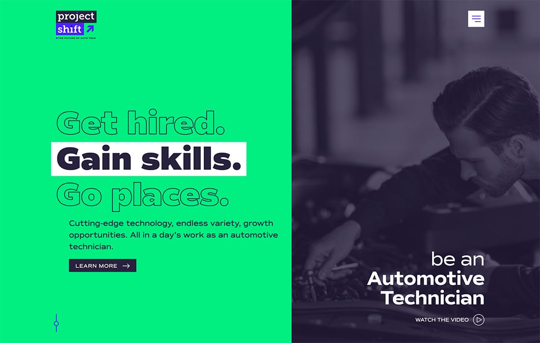
The simplest and easiest way to use transparent text is with an outline font. Look for a text option with a fairly thick outline stroke and make sure there is plenty of contrast with the background.
Outline font usage is quite popular as well and is a trend in itself.
The best part about using an outline option is that it doesn’t require any tricky techniques to pull off. Just pick an outline font that you love and you are ready to go!
Animated Background
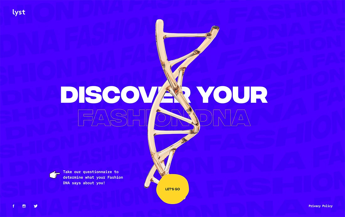
If you like the idea of an outline font, but feel like a simple background isn’t enough to help your aesthetic, pair an outline font with an animated background for more impact.
What neat about the example above from Lyst, is that the moving background is also text-based and you can see the motion and color variances through the outlined text. The design does a nice job of layering lots of similar, but different, design elements to create a lot of visual interest without a ton of visual elements.
This type of design can be great if you are launching a new site or design and don’t have a lot to work with.
Video and Layers
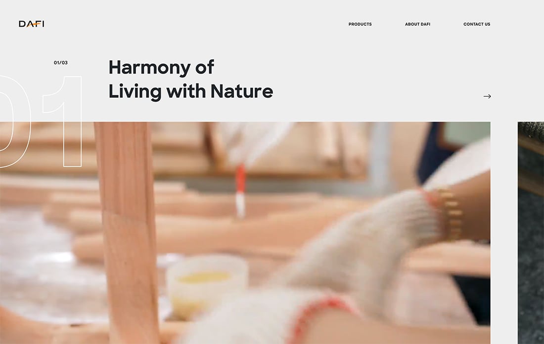
Commonly transparent text is paired with still photos, but it can also work with a video layer.
DAFI uses transparent numbering over two planes – a solid background and video – to provide navigation information for users. What’s especially nice about this treatment is the subtle nature of the numbers, which use an outline and transparency so that they don’t get in the way of the remaining content.
Text Animations
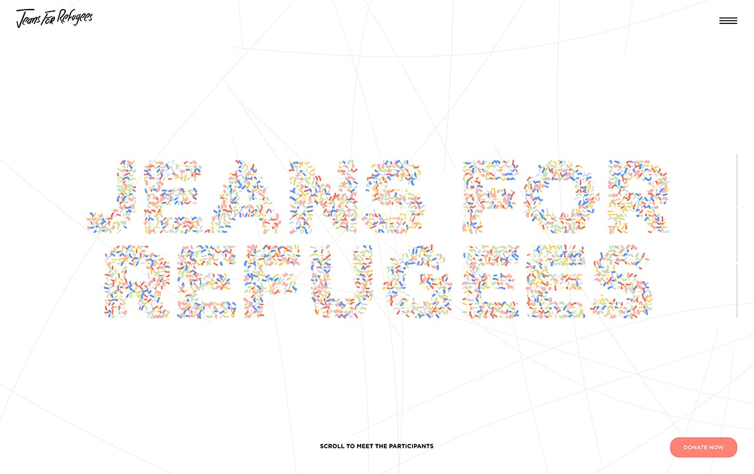
Yes, a lot is going on with the type treatment for Jeans for Refugees. The text element is transparent – you can see the moving background through it – and each letter is filled with animated confetti.
If you want to use a technique like this, proceed with caution. Here, it works because everything is simple. The text really is the only thing “happening” on the screen.
It draws the eye and gives you time to think about and comprehend the letters, since readability is more of a challenge here.
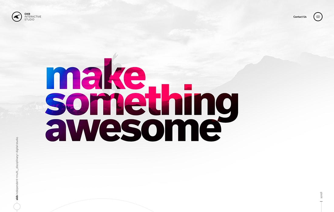
Animated Color Fill
You could think about the typography in two ways for the example above: Letters filled with colorful animation or letters that are transparent over an animated background. (You can argue the principles of how to do it best on your own.)
Whichever technique you like, the result is the same and quite stunning for short words or phrases.
The word “design” here has such a striking design that you’d trust the team behind it with just about any creative need.
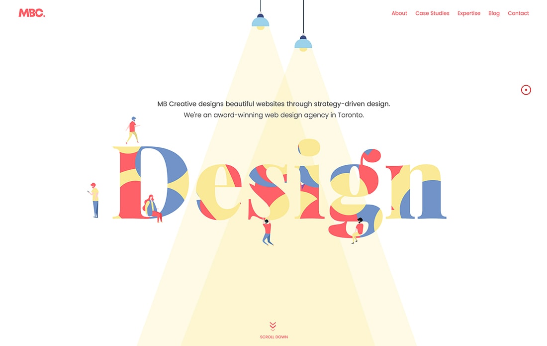
Oversized Peek-a-Boo
Take another typography trend and make it really big, then add transparency and cool background images.
That’s what you get here with oversized lettering that is cutout (or transparent) to allow background images to show through.
The beauty of this technique works in that each image is interesting and fits into the oversized letters. (Think of how different this would look with a skinny font.)
When planning a design like this, typeface selection is vital. So is pairing each image with just the right letter so the appropriate content shows through.
Transparent Layers
The transparent layer almost works in reverse here. The background layer is an image with a gradient color overlay. The foreground layer whites out most of the image but transparent type brings through color and imagery.
The best part of this design might be that while it makes you look and think about the image, the message and words are incredibly easy to read.
Conclusion
One thing that all of these examples have in common is that they use simple typefaces with this effect. The reason is that a simple typeface ensures use of text as an artistic and readable element.
The commonalities don’t stop there, either. Most of these typefaces are also sans serif with wider, thicker strokes. This gives plenty of room for whatever design element is behind the text to show through clearly. (Also aiding readability.)
This is a fun trend that can work in a lot of different ways. Good luck playing around with it!