The Art of Website UI Button Design: 10 Trends & Tips
Great button design is something that most website users never think about… because when it works well, it’s almost invisible. The best buttons are easy to click or tap, have an obvious function, and help users interact with the design without thinking.
It’s a fairly simple formula, but it can be hard to design if you leave it as an afterthought.
Today, we’re looking at trends in button design, plus a few tips to help you design a UI button that people click over and over again. Give your button design a boost with these tips, trends, and ideas to spark inspiration.
1. Keep It Simple
It all comes back to this classic phrase in design theory: Keep It Simple, Stupid (or Silly, if you prefer).
Website button design is no different. A button design doesn’t have to be overly complex. It should be obvious and functional. Sometimes other design trends can get in the way of this, and that can impact conversions on your website.
So, when it comes to button design, think like this – and don’t overthink it. A button should look like a button. It’s that simple.
2. Provide Plenty of Contrast
Almost as important as having an identifiable button is making sure that it is easy to see.
The reason ghost button styles on top of images trended and faded quickly are because the buttons did not have enough contrast to be easily discernable. Users could not find them right away.
Don’t hide buttons with poor contrast. Make them stand out and shout with plenty of color and space contrast so that they stand apart from other elements on the screen. Leave plenty of padding around buttons so that they can breathe.
This makes buttons easier for users to find and identify as clickable elements as well as makes them physically easier to click without getting the wrong element by mistake.
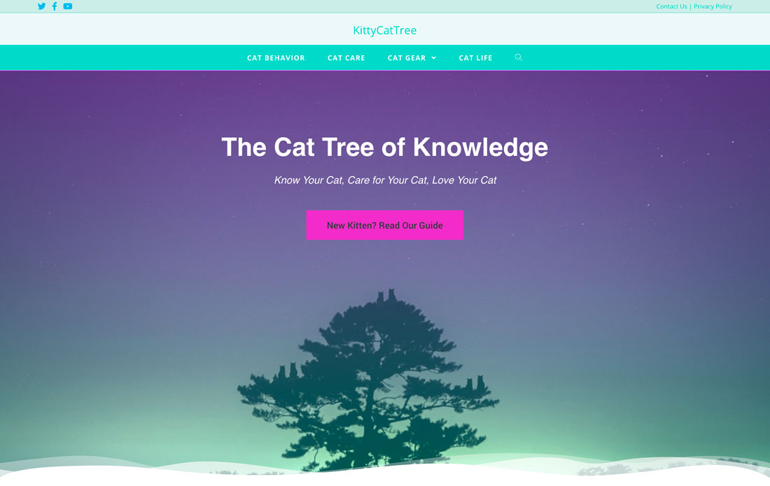
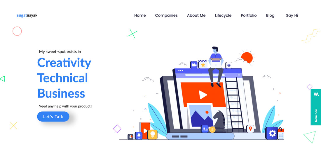
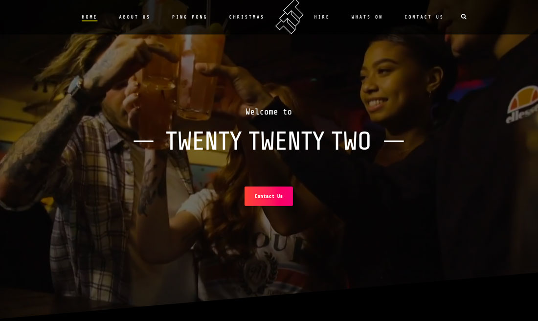
3. Use Color
Have you ever noticed how many buttons are red or orange? It’s because bright colors draw the eye to these elements and encourage action.
Using color is also a pretty trendy design technique. From bright colors to buttons with simple gradients, the color might be one of the easier ways to help people interact with the design.
4. Write Microcopy That Creates Expectation
Don’t make this mistake: A button with the words “Click Here” on it. (How spammy is that?)
The microcopy within a button design should create a clear expectation of what will happen with a click. Tell users what they will get next. This might be as simple as “Submit” to enter data, or clicking a link to “Learn more,” or watching a video. Regardless of what the action is, tell users in the microcopy.
This information can help create trust with users and increase conversions with actions/interactions that users find desirable.
5. Engage with Subtle Animation
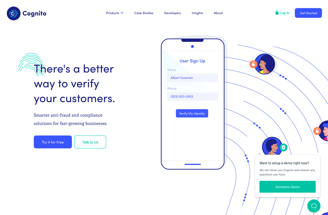
There is a trend in button design where websites use two buttons side-by-side. One is filled, one is a ghost style. Both include a hover animation that further emphasizes two clickable choices.
Animation can help bring attention to buttons and even encourages clicks. It’s become a commonly accepted user pattern to include a hover animation on buttons and provides a simple cue to users that they should engage.
Just don’t go overboard. Swirling, spinning, flashing buttons are more annoying than helpful.
6. Make It Big Enough to Tap
Buttons should include a clickable (tappable) area that is a least 10 millimeters in diameter, and larger is always OK. This advice comes from a study by the MIT Touch Lab that looked a finger pad sizes in relationship to touch devices.
Let’s put that in perspective. The typical key on a physical computer keyboard is 15 millimeters by 15 millimeters. That’s a good goal. (Just don’t forget to account for different screen sizes so that your button doesn’t get lost on small screens.)
If you do need to use smaller buttons, consider adding a wide click radius to it. That way if the user misses the buttons itself, there’s enough room around it so that the desired action still happens. (Your website visitors will thank you.)
7. Use a Familiar Style
There are a few general button styles that everyone is familiar with. Use one of them.
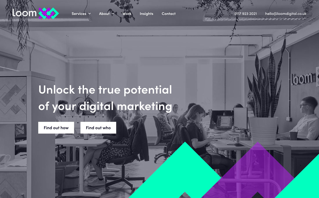
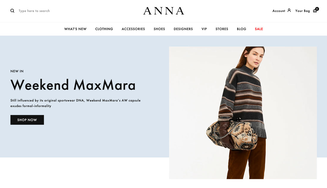
- A rectangular filled button with square edges and text inside
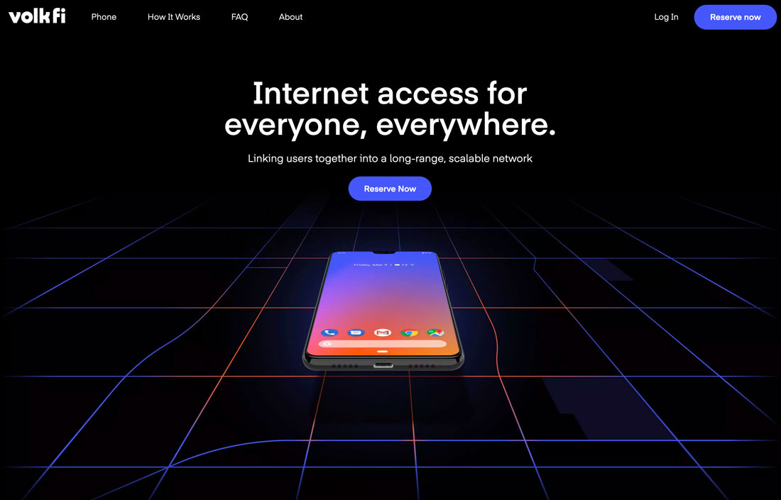
- A rectangular filled button with rounded edges and text inside
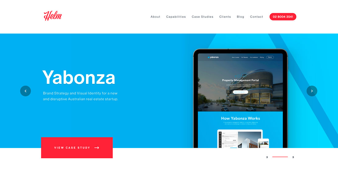
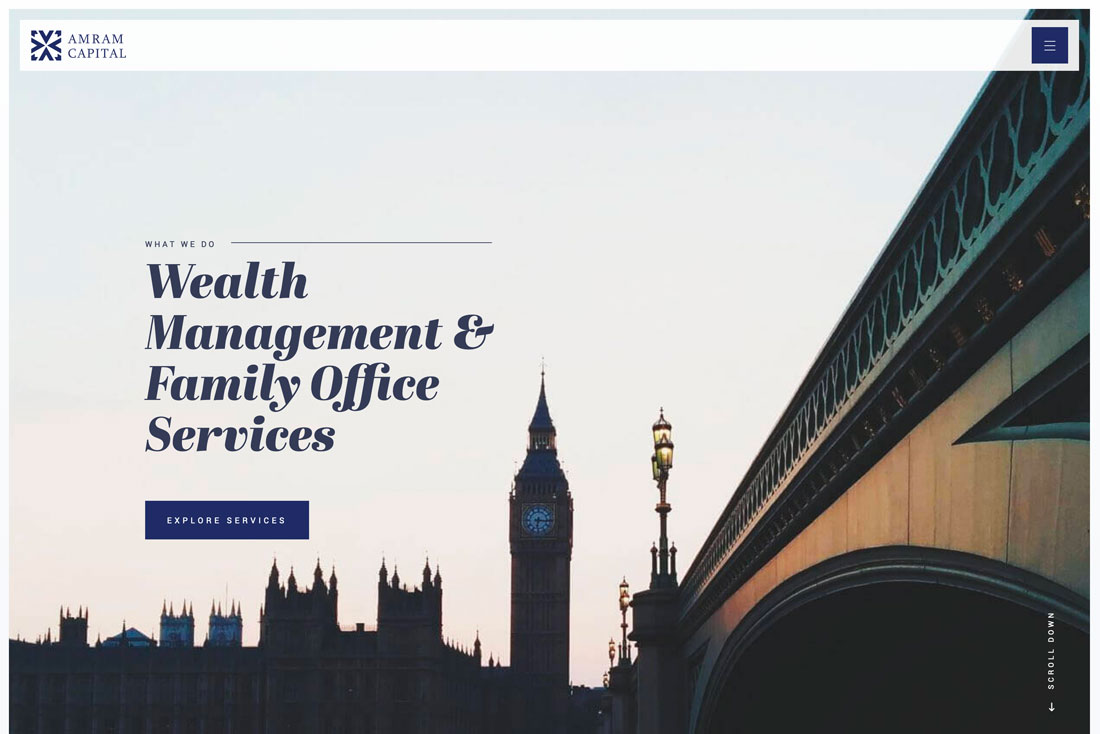
- A rectangular filled button with a visible drop shadow (above)
- A rectangular ghost button
- Simple circle buttons, most commonly used in the bottom right corner to denote support, help, or chat
8. Put in an Expected Location
Not only do buttons need to appear and function expectedly, they also need to be located in a place that users will look for them.
- For homepages, this includes button placement below a main headline or block of text. Buttons are generally left aligned with the text or in the center of the screen.
- For forms, buttons appear after inputs. Some single input forms align the button on the same row to the right of the input.
- General CTA buttons appear directly below the content they reference.
- Buttons to play or start a video or game are often in the center of the preview screen.
- Shopping cart or ecommerce buttons are generally in the top right corner.
9. Don’t Forget Feedback
Does the button respond to interaction? Make sure that there’s an obvious feedback loop included in the button interface design.
Provide a visual or instructional cue that the button has done its job. Some buttons will require more work than others. Buttons that link to another page or website, for example, provide feedback that the button has worked if the new page loads. A form submission button might provide a “thank you” message on the screen if the information is submitted properly.
10. Use Buttons Intentionally
Too many buttons create chaos.
Use buttons where they make sense. Don’t overload the design with buttons all over the place. Users won’t have a clear idea of where and what is most important to click.
Save buttons for use with website goals. They should drive visitors to the elements that are most important in your overall design.
Conclusion
A website button is an element that converts your call-to-action into a result. Take the time to think about this design, from color to function to microcopy. Test button designs to ensure that you have the most functional version in your interface.
If you have a button that’s working, don’t fall in the trap of trends and change the design. When it comes to buttons, the function should be the top priority.