10 Website Design Trends That Are Fading (Thankfully)
Website design trends can be a lot of fun to experiment with and incorporate into projects, but if you aren’t careful these elements can add a dated look to projects. Sometimes trends fade out as quickly as they rush in!
Here, we’re going to look at some website design trends that are fading. (And that’s a good thing.)
If you have these elements on your site, it might be time to consider a refresh.
1. Not-So-Subtle Shadows
Drop shadows don’t need to be so obvious.
As with many other design trends, there seems to be an ebb and flow between extremes. Designers went from skeuomorphic elements to flat designs to long shadows to bulky shadows. Now, more subtle shadows are starting to come into play (thankfully).
The goals of a shadow on an element should be to help add a layer of depth or lift it off the background to enhance legibility. A good shadow is part of the design, but isn’t often obvious.
A shift away from not-so-subtle shadows is a good one.
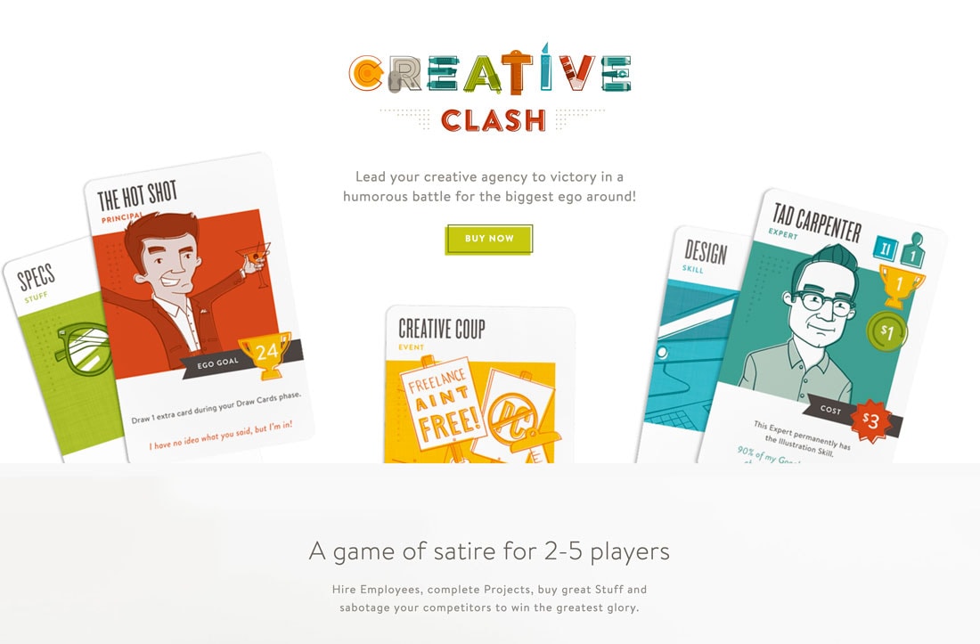
2. Too Much Crazy Color
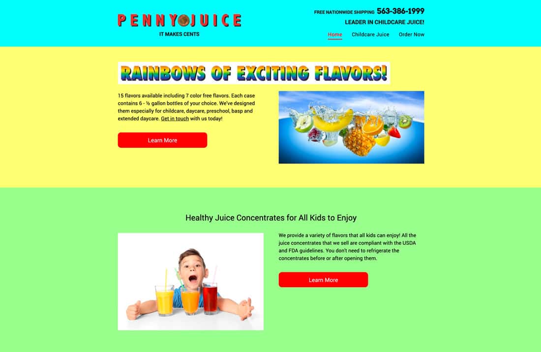
One of the biggest trends of 2018 and 2019 has been the use of bold, bright color.
But designers are scaling back a bit with more pops of color and less in-your-face palettes.
This shift might be because of difficulties branding websites with massive color palettes that might not match organizational standards, or it might be because everything was starting to look the same with similar palettes featuring pinks, yellows, and bright blues.
3. Flashing Video
Homepage video is a trend that doesn’t seem to be slowing, but all of the fast-paced flashing videos that seemed to be on every other website for a while are fading.
The problem with flashing video is that it could be a little too much for many users. What are you supposed to look at when everything is moving at 100 miles per hour?
While this can work for some websites – if the content focuses on a high-speed or high-paced environment – it shouldn’t be the default. Slow it down a bit and give website visitors a chance to enjoy the motion on the screen.
Use video to tell a story and contribute to the overall message of the design. Not just fill the homepage hero header space.
4. Loading Animations
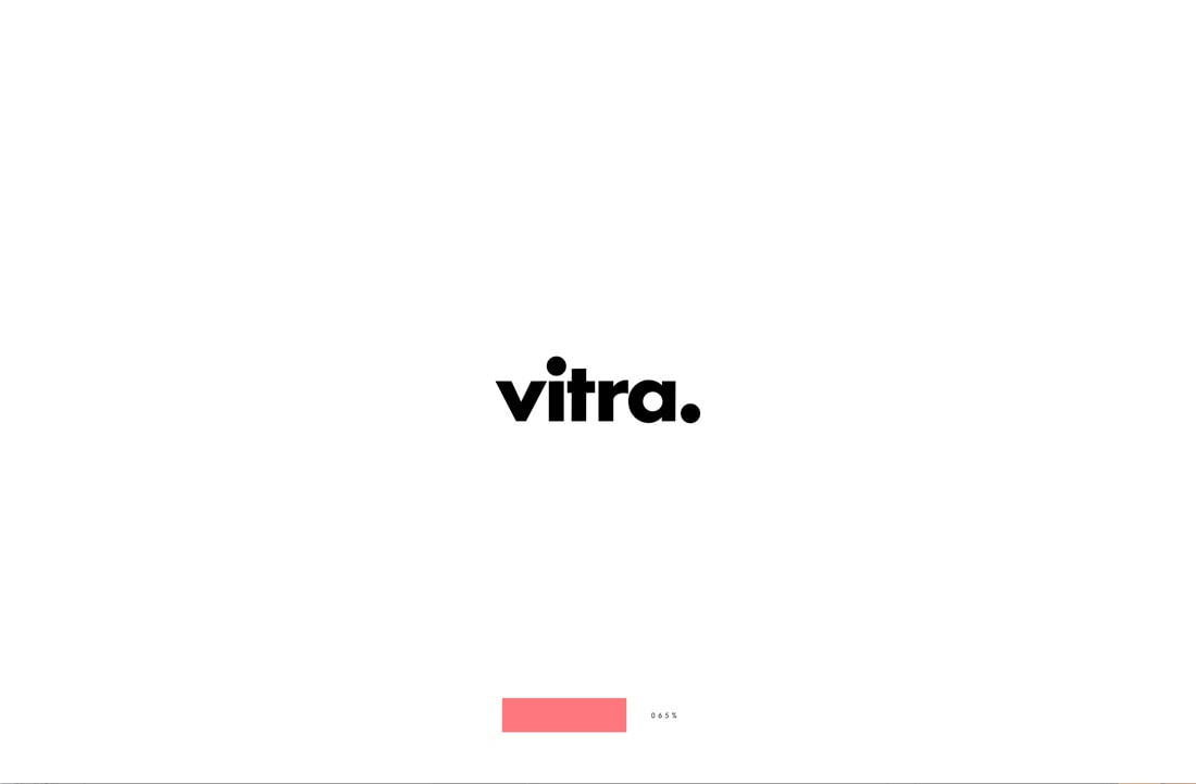
Goodbye, loading animations!
This is a trend that’s disappearing and is unlikely to come back for two primary reasons.
- High-speed internet access is more accessible to more people, so fewer people even see the animation.
- A loading animation is just a signal that your website is slow and needs work.
5. Infinite Scrolling
There’s something to be said for a nice long-scrolling website. The feel on a mobile device is nice and provides an uninterrupted way to engage with content.
But the scroll does not need to last forever. Infinite scrolling websites can get annoying fast.
Many of these designs come with user experience concerns – getting lost in the scroll, navigation, loading times and issues, and just too much information with no clear click/tap path. It’s easy for a user to get lost (and your website will lose conversions) with an infinite scroll.
Plus, infinite scrolling is bad for search optimization in the long run.
6. Animation on Mobile
Yes, animation can be cool.
No, every element in the design doesn’t need an animated effect.
And many of them still behave oddly on mobile.
Thankfully, more designers are accepting this and scaling back animated effects on mobile devices. While many of these techniques look great on desktops, they just aren’t appealing on a smaller screen.
7. Sliders
If your clients are anything like mine, they love hero homepage sliders. (And I keep trying to talk them out of it.)
The problem with all these sliders is that they don’t contribute to the overall design or content. There’s little to no engagement happening there. It’s more of an excuse not to pick the one thing that should be at the top of the page.
Sliders can also be problematic on mobile devices, which is probably why we are finally starting to see less of them. Sometimes the animation doesn’t work. Often the alignment and layers of elements lead to readability issues. Text can get super small, especially if slider images aren’t built with code and are flat images.
Overall, it’s been a longstanding design issue. Kudos to everyone ditching this trend.
8. Sidebars
Dump your sidebars already!
It’s all about usability. A sidebar drops to the bottom of the screen on mobile devices, where it is likely that most users are accessioning your website. That content – while thought to be at the top of the page on desktops – gets lost on mobile.
It’s also the home to ads and other content that users are “trained” to ignore.
So, designers are dropping them and making better use of whitespace, margins, and full-width design options.
9. Dark Pattern Buttons
With so much chatter about dark patterns on the web, reputable designers are shying away from elements that are specifically made to trick users.
Examples of a dark pattern might include a large button for action that users aren’t including to take and a tiny link for what they want to do, or an “x” so small that users can help but tap or click the element they were trying to get rid of.
Thankfully, there seem to be a lot less of these elements right now.
10. Icon Overload
Icons are a great tool, but probably shouldn’t be the only graphical element in a design.
There was a phase when it seemed like every other website used entire UI icon kits in the design. It was unnecessary overkill.
Now, designers are rethinking icon use with more of an accent-based approach to this design element. And that’s a good thing.
Conclusion
What other website design trends are you getting tired of?
There’s no better time than now to do a quick inventory of your website projects and suggest changes and tweaks that are tell-tale signs of an older website. Even small changes can make a lot of impact and keep a design looking fresh.