10 Tips for Using Text Effects That Don’t Suck
Adding effects to typography can be a source of heartache for designers. Clients demand a drop shadow or embossing, and you’re stuck with text effects that threaten to ruin a project. What you need is an arsenal of text effects that don’t suck so you can help the client pivot to something a little more classy.
The trick to all of these effects is using them with purpose. Good typography doesn’t need “help.” If a font isn’t working alone, it’s not going to work with a bunch of techniques added either. (You’ll only make something bad even worse.)
The best text effects are nearly invisible to non-designers. Or text effects are used to add meaning to typography or lettering. Here are a few tips for using text effects that don’t suck with some pretty cool examples.
1. Use Purposeful Drop Shadows
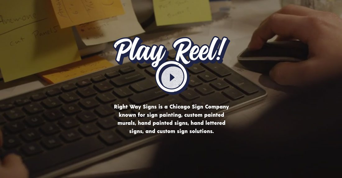
The best drop shadow is one that you don’t even see. A drop shadow technique is best deployed as an element to help create depth between text and background layers.
This “invisible” drop shadow style is something you probably see as the designer when you add the technique to text, but it shouldn’t be recognizable to the common user. Drop shadows are most often used in this way as a soft element to create separation or to add just a hint more contrast between text and background elements.
Whatever you do, don’t click the drop shadow button in design software and just apply the defaults. Seldom are these settings appropriate and often look amateurish.
Other common – and highly usable – drop shadow techniques include options that are made to be seen, such as a hard edge shadow or a layered shadow.
- The hard edge shadow (pictured above) has a distinct retro feel that adds a second layer behind the text. This works best with thick stroke or slab typefaces.
- A layered shadow creates an almost three-layer/three-dimensional effect. It also has a retro feel and works best with thicker typefaces.
2. Go Trendy with a Double Exposure
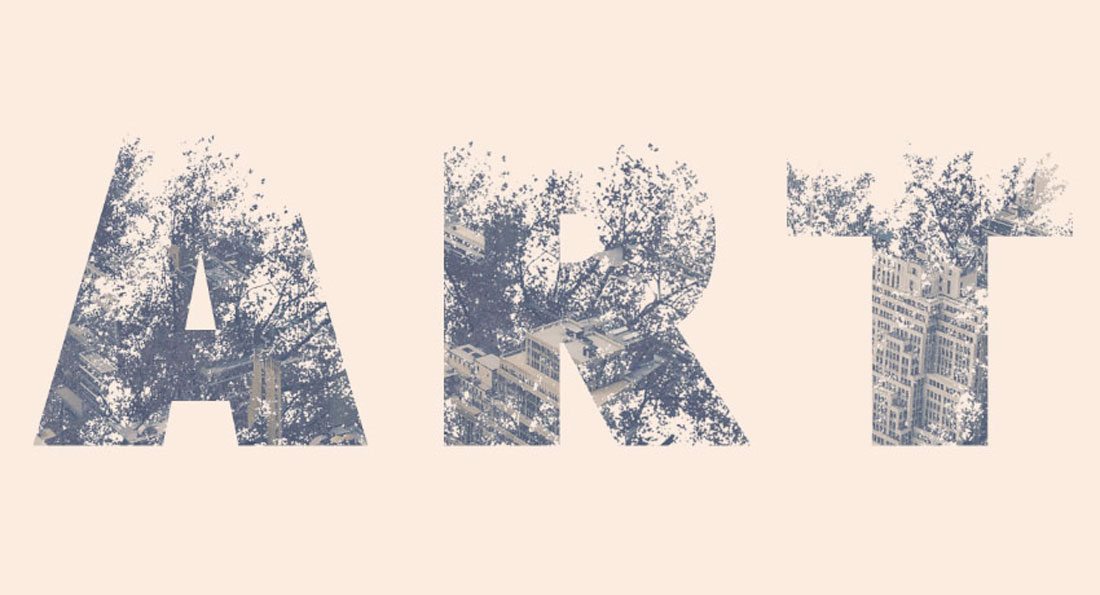
Double exposure images are a trendy and popular option in web and print design applications. The effect which places two image exposures inside lettering looks complex and interesting. When used sparingly or with just the right imagery, it can be absolutely stunning.
Want to create a cool double exposure? We have a list of 20 Photoshop actions to make it a breeze. Or Envato Tuts+ has a great tutorial if you want to do it yourself.
3. Have Fun with Strokes
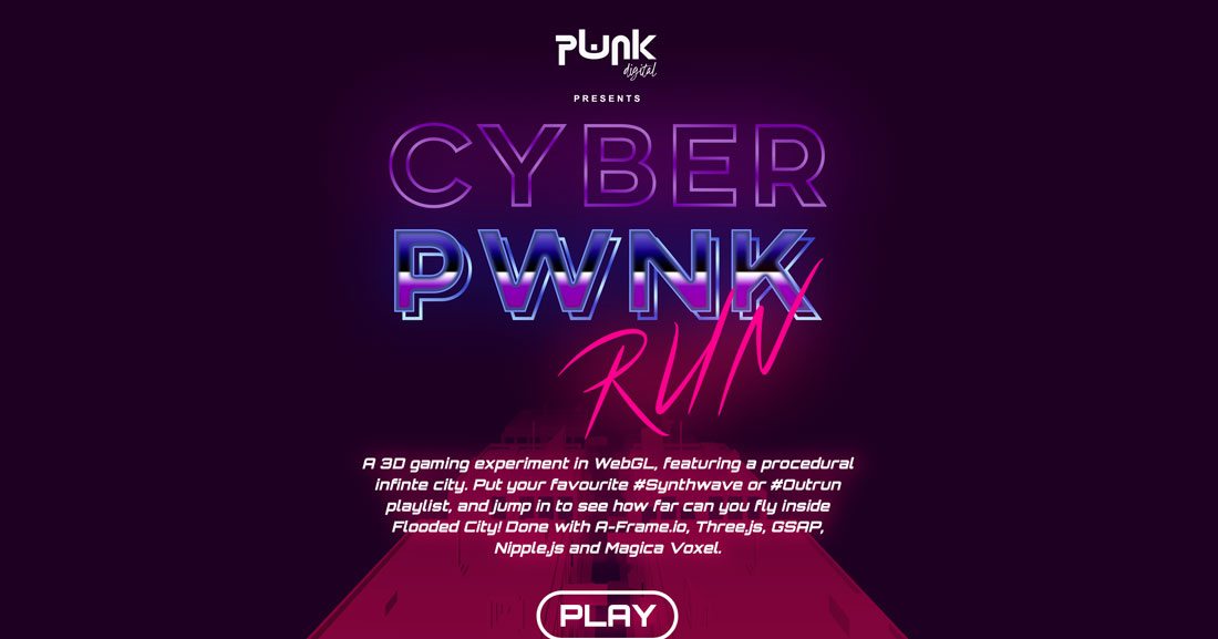
Spice up block lettering with interesting stroke or stroke effects for added depth. A deep, wide stroke can have a retro feel or even emulate lettering from old signs. The neon stroke effect above is a great example of how to use a stroke to create a specific feel for the design.
4. Use Colors (or a Color Font)
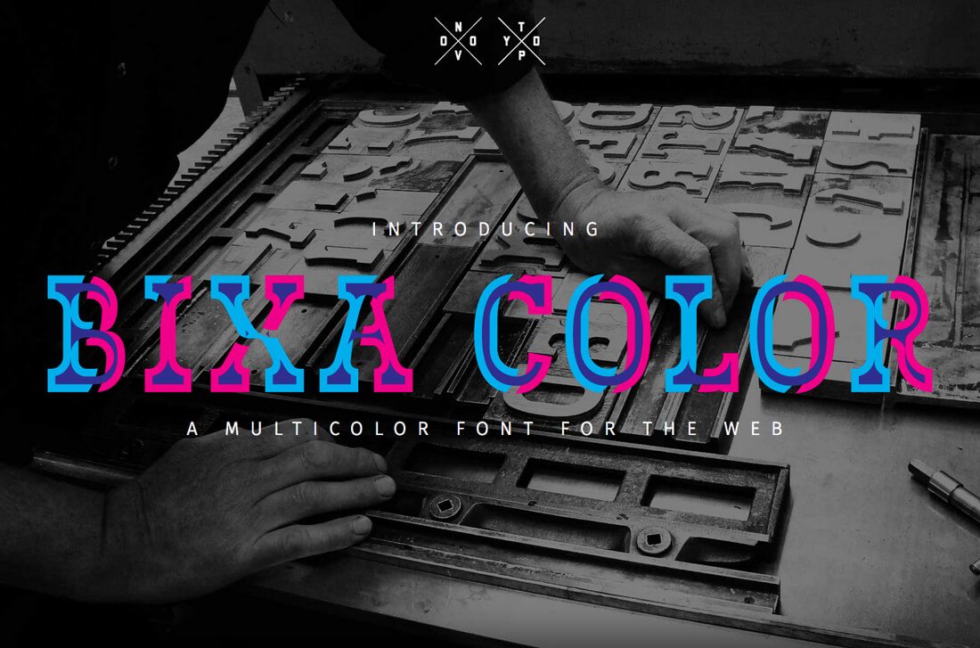
Color fonts are typefaces that include multiple colors, shades or gradients, textures or transparency. You can use a color font to get this funky effect (we have a few to choose from here), or create your own.
When using a lot of color as a text effect, it almost needs to be over the top. Bright, bold color choices are rather trendy and won’t offend users since people are used to seeing them.
Just make sure to use color in a way that appears intentional. Just popping some color on Helvetica isn’t the same as designing a text effect that is the primary visual element in the design.
5. Add a Touch of Animation
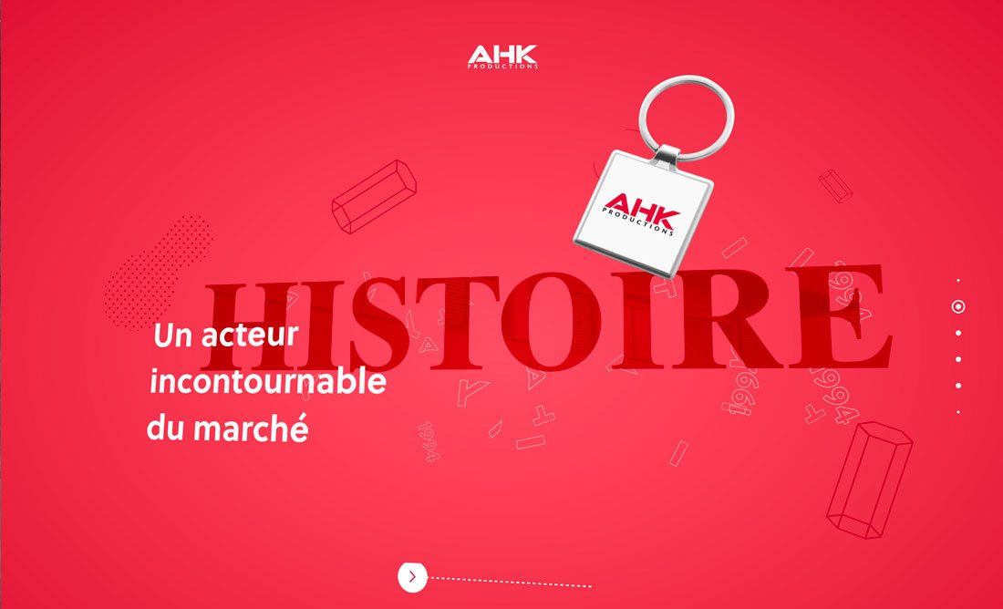
There’s no rule that says text elements have to be static. An animation in website design is a fun way to add visual interest.
Add that visual interest to text elements as well. When using text animation, it is important to keep a few things in mind to ensure that lettering remains readable:
- Movement should be intentional
- Letters should not move to fast
- Scrolling or auto-play text should include a way to stop motion
- Words should always be readable, regardless of screen size
6. Mimic Something Iconic
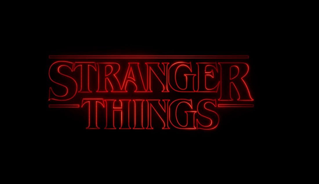
Whenever something gets popular, such as the Netflix series “Stranger Things,” design trends tend to mimic the original.
The neon, 80’s-inspired logo for the series is no exception. It’s been the basis for memes, knockoff projects and a fun way for designers to play with a new effect.
Just be aware that the line between cool, and a text effect that does suck, can shift quickly with mimicking techniques. A style can date a design quickly. Poor replications can also look cheesy and might not fit the project as intended.
7. Incorporate Shapes
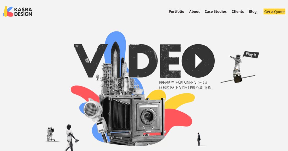
Creating layers and mixing “mediums” can be a fun way to add something a little extra to text. By allowing shapes or other elements to fit in place of a letter or letters, the design pulls the eye as elements are merged.
The trick with this technique is to ensure that the element acting as a letter fits the text. It must be obvious that the object is replacing a specific letter so that the design does not become difficult to read.
Kasra Design, above, does a good job of this with the main video headline as well as the company icon, which makes an interesting “k” using shapes.
8. Add Texture

Some typefaces come with a vintage, roughed up style. Others can use a little custom enhancement to work with your overall design.
Adding texture as an image inside a typeface or as elements cut out of lettering, such as that above, can make the design feel a little more tactile. Texture can make text stand out a little more as well.
The example above includes two types of textured text:
- Letters with bits cut out to make them look a little more rough or vintage
- Letters that are transparent with the background showing through
9. Create a Custom Character
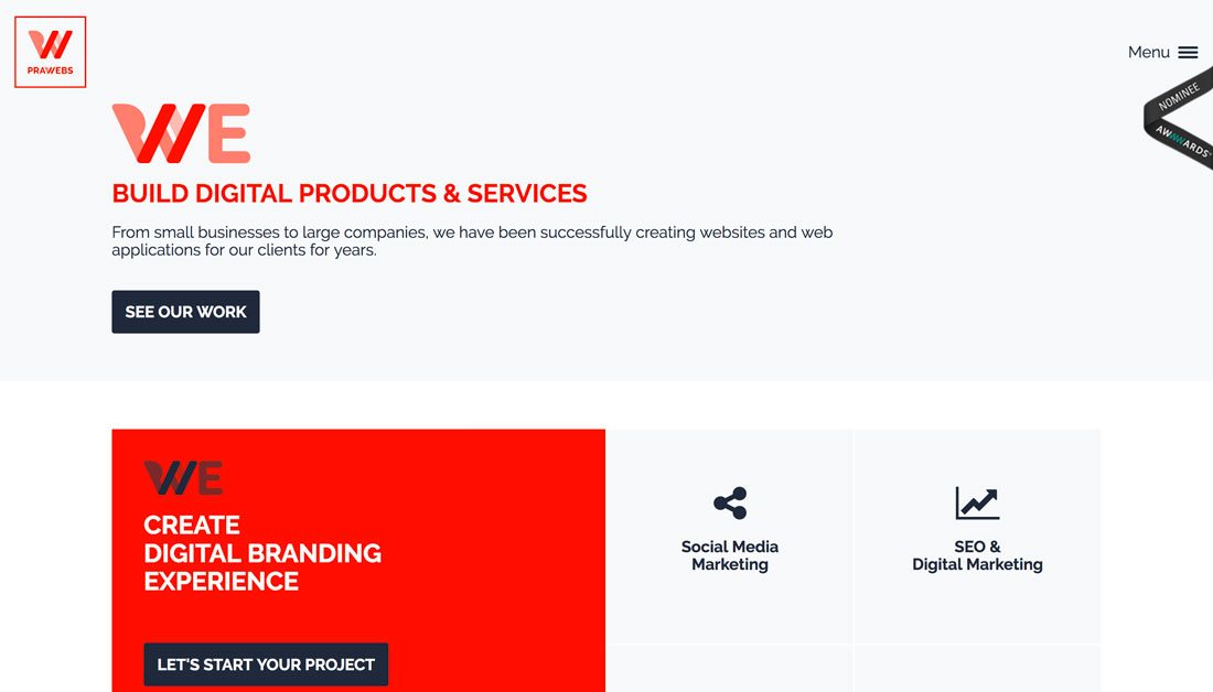
When it comes to creating a neat text effect, the natural fit is branding. Brands can actually alter or adjust a typeface to include a custom character for lettering that’s memorable.
This is not a technique that should be taken on lightly. Creating a letterform or altering a character must be done with care. In most cases, you’ll want to work with a typographer (preferably the creator of the typeface) to get the best results.
This text effect should be used in the most sparing instances.
10. Leave Lettering Alone Altogether

Sometimes the best text effects are using no effects at all. With enough contrast in shape, size and color, text elements and the background have a natural separation.
The lack of using a text effect can be more difficult than adding techniques to aid readability or amp up the contrast. You have to plan all the elements precisely to ensure that elements work together and bold typefaces, or dark on light, or light on dark combinations are the most readable.
The University of Essex goes bold with a thick typeface on a darker video background that almost jumps out of the design. And the best part? No a single “enhancement” to the text.
Conclusion
The problem with text effects is that these “trends” come and go quickly. (Remember all the long shadow text not too long ago?) Heavy text effects can make a design look dated, so be careful unless that is the look you are going for.
And remember that subtlety works in your favor. If you can see that drop shadow, it’s probably too much (and does indeed suck). Scale it back or look for another way to get the look you are trying to create.