3 Typography Trends for 2016 (With Examples)
Design trends. You can hardly do anything without seeing them, they pop up everywhere, and they can give your design feel “current” when used well.
Today, we’re going to take a look specifically at three typography trends and why we hate to love them. While these three styles – retro, watercolor and all caps – are everywhere, designers just can’t help but love them (even if they don’t want to). Here’s why, paired with some excellent examples of the trends in use.
1. Retro Grunge Typography


Retro and vintage are having a moment. Everywhere you look, designers are using old style, grungy yet elaborate, type options. Typefaces have a custom look and feel but not too custom. In short, these typefaces are just a little bit (ok, maybe a lot) hipster.
You’re going to want to hate them. Most of these typefaces are not part of an easy to use freebie plan for web design such as Google Fonts or Typekit, or might not be “quality” enough for large scale print projects. Many of the most interesting styles are custom, single use designs that don’t have a lot of extra characters or styles.
But they are so darn cool.
Despite the flaws with many of these typefaces in terms of flexibility is a great bonus. You can use them for a stellar display option. The trick to using a retro or vintage typeface is definitely moderation. Pick a word or two (or maybe a logotype) and don’t use the typeface anywhere else. It works best as a single0use option.
Here are three typefaces to try, to re-create these yourself:
Brandon Printed

Wanderlust

Monthoers

2. Watercolor Typography


Watercolor is everywhere. From backgrounds to illustrations to typography, this softer trend is combining styles of artistry with a custom-made design aesthetic. Watercolor styles are appealing because they feel handcrafted, making the design appear special.
If you want to learn more about watercolor trends, take a look at this previous Design Shack article.
Watercolor typefaces can certainly be a challenge to use. Particularly because they include color and variations of color. The other problem with watercolor is that many users see the style through a feminine lens. These two challenges can make it difficult to create an overall design using the concept.
But those who take on the challenge will find it worthwhile. Using a watercolor style forces you to stretch your design skills and really plan the project and how lettering will be used. As with retro styles, watercolor should have a singular and specific purpose in the design. (This style is quite popular for invitations and cards and for DIYers.)
While many of the most-loved watercolor styles are created with a brush script, it’s not a necessity. All you really need to make it work is a typeface with thick strokes so the color stands out. (Or try it in reverse with a watercolor style background and white lettering.)
Here are three typefaces to try for this effect:
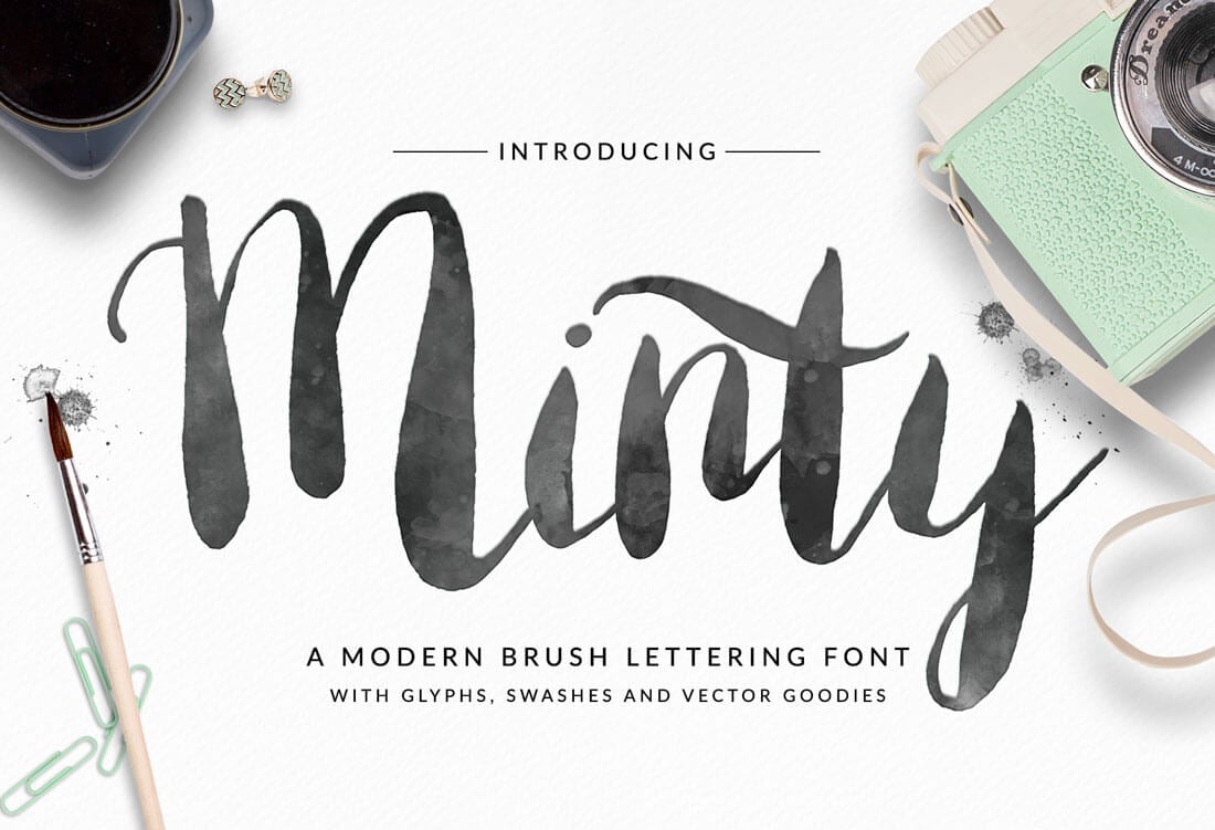
Minty
Zubuqlione

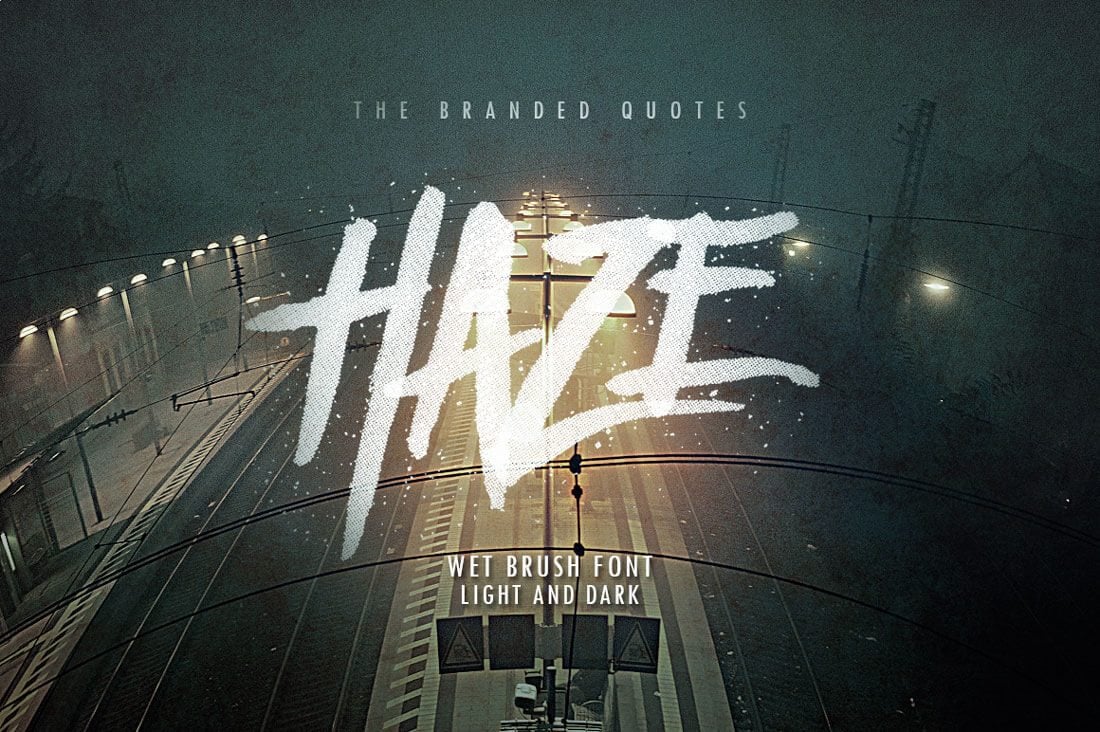
Haze
3. All Caps Everything Typography


All caps lettering has almost forever been associated with shouting at the reader. Sometimes you want the design to scream a specific message. (Just make sure to keep it somewhat concise.)
Some people hate, hate, HATE all caps lettering and absolutely refuse to use it. It can get hard to read when not used well and some typefaces just don’t lend themselves to the all-uppercase format. It has to be used carefully so that all caps add to the message and not detract from it. (This can be quite the fine line.)
But all caps can have a lot of impact with a minimal effort. Thin typefaces, condensed typefaces and even wider typefaces can all work effectively in all caps. So do serifs and sans serifs, although many script and novelty styles do not.
Two uses for beautiful all capital type are in navigation elements. These small divots can benefit from short phrases without the flow of upper- and lower-case reading. Users won’t stumble on caps with limited reading. Display typography is the other place where all caps can work well. (And where many designers are using this concept.)
When using all caps for display purposes, opt for simple and easy to read words and phrases and make sure to include plenty of space around lettering. You might use more space than you would normally to ensure readability. All caps can pair particularly well – as is the trend – with hero-sized imagery to create an engaging dominant visual.
Here are three typefaces to give it a try!
Oswald (Google Fonts)

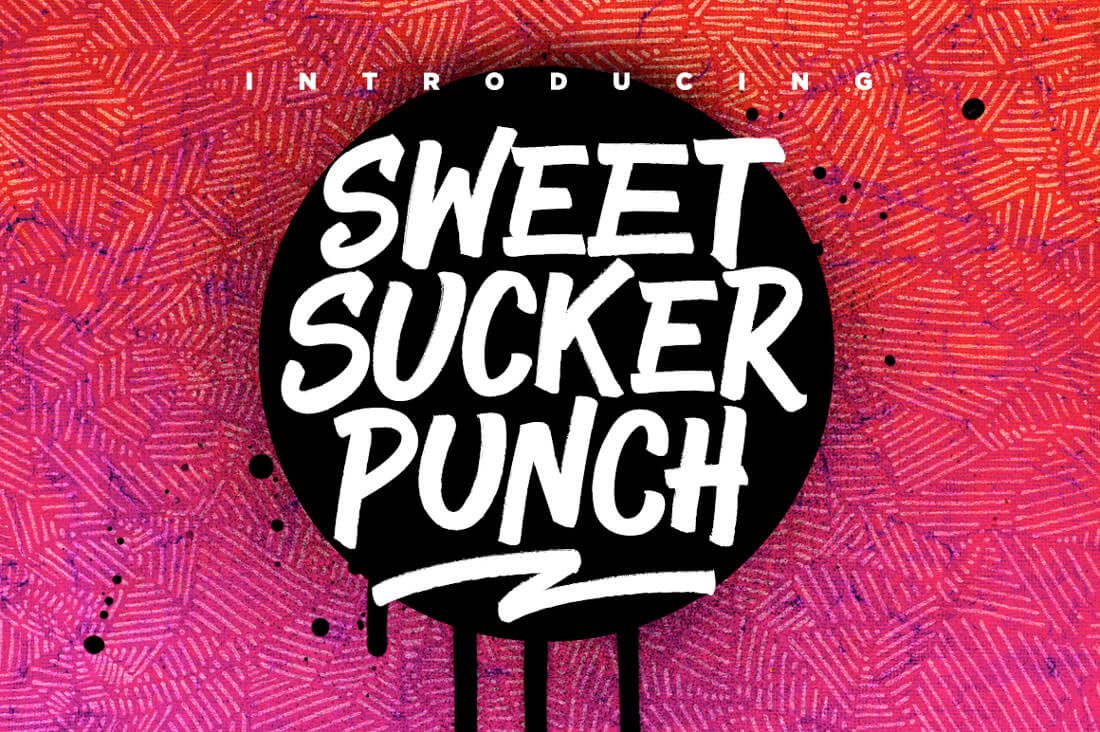
Sweet Sucker Punch
Prestiggio

Conclusion
While these three type styles are the trends of the moment and might hover on the border of overuse, they are styles you can’t help but love (even if you hate that you do).
What other design trends or techniques do you hate to love? Let me know on Twitter – tag @carriecousins and @designshack – it might just be the starting point for another post soon!