7 Tips for Choosing the Best Web Font for Your Design
There’s no way to quantify all of the font options available for website designers. Almost every day a new typeface shows up in my inbox or Twitter feed. But not every one one of these typefaces – no matter how beautiful – is right for designing a website.
When it comes to selecting the perfect font, you have think about a variety of things including compatibility, load time and design purpose. Today, we have seven tips to help you select and use the best web font for your design project.
1. Start with the Fundamentals
Working with web fonts is just like any other typography project. It starts with the fundamentals.
- Serif vs. sans serif: There are other type categories but in terms of web design, almost every project is based in one of these options. (And sans serif typefaces are the dominant choice.)
- Kerning, tracking and leading: The amount of space surrounding text can be just as important as the typeface. Kerning is the space between letter pairs; while tracking is the space between group dos characters. Leading is the amount of space between lines of text (aka line height).
- Readability: When working with text for the web the number of characters per line can be important. Think about the size of the screen where text will appear and design it to be easy to read.
- Hyphenation: Just don’t do it. Hyphens make a mess of text on screen.
- Alignment and justification: Most applicable to large blocks of text but think about how text will align on the screen – left, right or center – and whether blocks of text will have ragged edges or be fully justified.
- Number of typefaces: As with any project, no more than three typefaces … unless you have a really good reason.
- Remember contrast: It does not matter what typeface you select if there is not enough contrast between text and the background for it to be readable. Elements that contribute to contrast include size, stroke weight, color and space.
2. Consider Compatibility
One of the things that makes web typography difficult is that browsers are always changing and getting updates. You’ll want to select a typeface that is compatible with modern web interfaces used on both desktop and mobile devices.
Sounds easy, right? It may take testing across multiple devices to find something that works seamlessly.
You will have even more luck if you stick to a type family that is design for the web or by using an options from Google Fonts or the @font-face rule. (You can learn more about the latter and how it works from Six Revisions.)
3. Use a Service
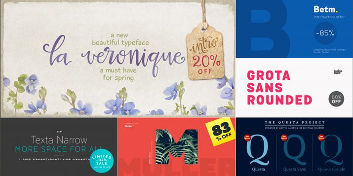
Speaking of Google Fonts, many designers opt for using a web font service. It is a good idea and can make a lot of the possible technical issues easy to overcome.
Aside from Google (probably the most popular option), there are a variety of other choices. While Google Fonts is a free service, pricing tiers for the others vary from free option levels to more expensive kits.
Each of these services has thousands of type options and are fairly easy to use. What’s nice about any of these options is that they can provide an expansive type library without having to spend money on a lot of individual fonts. The downside is that most of the typefaces are only available for you to use online and not in printed projects.
4. Be Considerate of Tone and Message
Start with the type. Sometimes font selection comes almost as an afterthought; things will come together easier if you determine type options first. Then think about how the text will play in with other design elements such as color and images.
Choosing a typeface can put your brain into visual overload with all of the available choices. It’s easier to navigate through all the font clutter if you have an idea of what you are looking for from the start.
It is vital to ensure that the typeface you select matches the tone and messaging of the project you are working on. Here are some questions to help you map it out:
- Is the project formal or casual?
- Should text be bold or lighter?
- Is the typeface for large text or small?
- How will it pair with color or images?
- Does the mood of lettering match the words being read?
5. It’s OK to Look at Suggestions
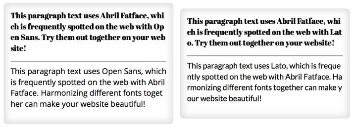
One of the things Google Fonts does exceptionally well is allows the user look at font combinations and make font combination suggestions. There is no shame in using one of these options. (The Adobe Typekit library also does a great job of helping users select typefaces based on how they will be used. Take a look at the tools on the right side of the screen for guidance.)
Font pairing can be difficult. It is not a strong suit for every designer. Getting help is OK. Just be wary of overused font combinations; the first option you see might be the one that is most-used.
Remember your basic principles of font pairing and look for letterforms that are similar in mood, stroke and x-height. Think about the shape and slant of letters and opt for typefaces with similar outlines. It’s a good idea to mix-and-match type styles and select a serif and sans serif pair or a sans serif and novelty typeface.
6. Think About Load Times

If a font does not load quickly, look for another option. Users have no patience for slow websites. No matter how awesome the typeface, it needs to load at near-lightning speed to be effective.
When selecting a typeface test it for speed. (Most type services will help you with this, including Google.) Then think about other ways to keep load times to a minimum.
- Use a limited number of typefaces.
- For each typeface, select only the styles you plan to use.
- Choose only the languages you will use for a specific font.
7. Be Choosy
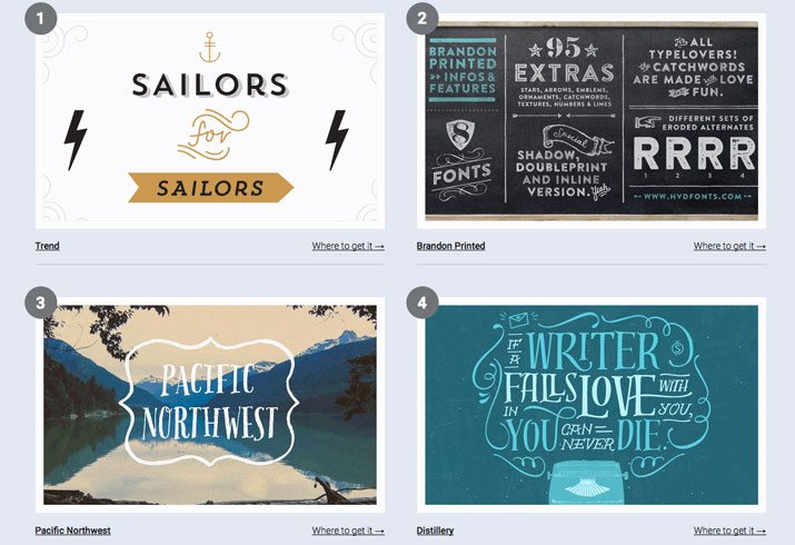
You do not have to use Helvetica, Arial or Droid Sans to create web typography. Take your time and be choosy when selecting a font palette.
Typewolf is a great resource when it comes to avoiding popular fonts. The site ranks the top 10 most popular options in a variety of categories – serif, sans serif, slab serif, monospaced and so on. It also has some fun lists for alternatives to popular typefaces such as those mentioned above.
Bonus: 10 Great Web Fonts
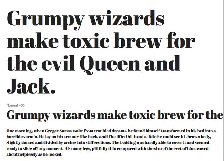
Abril Fatface
Josefin Slab

Lato

League Gothic

Open Sans
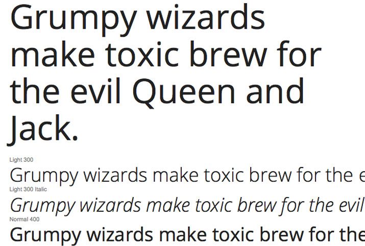
PT Sans

Roboto Slab
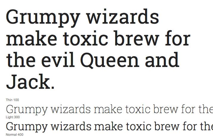
Stalemate
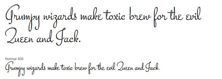
Ubuntu

Vollkorn
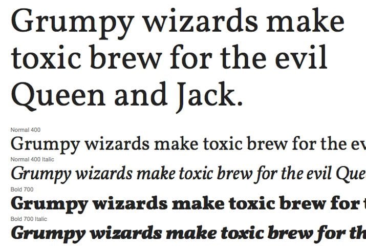
Conclusion
Selecting a perfect web font can be one of those processes that feels incredibly rewarding – when you find the perfect combination – or make you want to pull your hair out – when nothing seems to work. But you can work through all of the available options to find a typeface and system that works for your website design projects.
How do you choose a web font? Is there a process different than the steps we have outlined above? We’d love for you to share your tips as well in the comments.