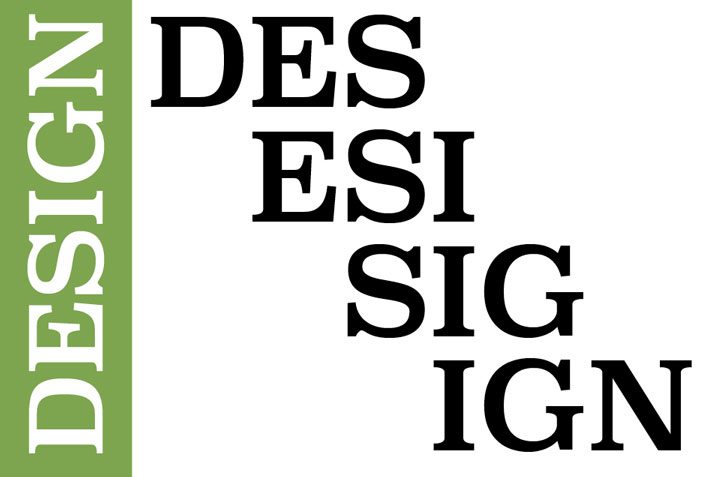
8 Ways to Kern Any Typeface Like a Professional Typographer
Kerning is a subjective art. Every designer may feel differently about how combinations of letters look together. Most though can agree that almost every bit of type needs a little kerning.
Kerning – the adjustment of space between two letters – is something the untrained eye can rarely see. Good, or poor, kerning is more of a feeling as to whether type works or not. Here we have eight tips to keep you from falling into the auto-kerning trap so that you can kern type like a pro. (This post is filled with letter combinations; use them as a springboard to thinking about kerning. Do you like the way the letters or numbers work together? How would you kern them differently?)
1. Think About Visual Space

Because kerning is a visual element, think of it that way. While many other design elements can be quantified and defined as mathematical elements, kerning is not one of them. Good kerning centers on the visual space between letters. How close (or far apart) do they look?
There are two ways to tackle visual space.
- Color the spaces between letters in and look at the shading. Do the spaces feel similar?
- Draw boxes around each letterform, remove the letters so you are only looking at the boxes and remaining spaces. Does this result in forms that work together in harmony?
When you think about kerning, remember that space can be added or subtracted. Many designers are great at thinking about tightening the space between an AV pair, but often forget to add space with other often-tight combinations like 00.
2. Kern in Threes
Yes, kerning is defined as the space between letter pairs, but looking at the space in three-letter groups can make it easier to see what tweaks you should make.
Here’s how it works:
- Start by isolating the left-most trio of letters.
- Kern the two pairs.
- Isolate the first letter to create a new three-letter combination.
- Kern the pairs.
- Repeat until you have kerned the whole word.
What’s different about this approach is that you actually take a look at each letter pair twice – once behind the preceding letter combination and then ahead of the next letter combination. By isolating other letters during the process, you really focus on the letterforms at hand individually.
3. Remember Word Spacing
While most designer associated kerning specifically with letter spacing, the space between the last letter of one word and first letter of the next word is also a kerning pair. Word spacing can be just as important (or more important when it comes to readability), because you want clear distinction from word to word in the text to ensure readability.
Depending on the style of typeface you choose and where it came from spacing – particularly between words – can be tricky. It is not the case with all free typefaces, but spacing is often a concern with some of those freebies. It can be less of a concern with higher quality fonts.
4. Use Quality Typefaces
Speaking of quality typefaces, using a quality type family can be beneficial. While you will often have to pay for a license (or kit for online usage), high quality typefaces are often kerned more professionally right “out of the box.” A professional typographer or typography house has often crafted the typeface down to the last detail, including letter-pairing combinations.
Selecting a typeface comes down to a lot more than who made it. The point here is this: If you struggle with kerning, opt for a high-end typeface. If you are confident in your kerning skills, you will feel good working with typefaces from rather unknown typographers with great style and letterforms but maybe less-than-acceptable spacing.
5. Turn it Upside Down
One of the oldest tricks in the typography book is to turn letters upside down when kerning them. This works because it changes your perspective and forces the eye to actually look at shapes and spaces and not try to actually read the text.
(Plus it’s a fun little game to play with other members on the design team.)
- Flip the word upside down.
- Kern from left to right. (Don’t try to force yourself to read it upside down.)
- Pair with other kerning tricks for maximum kerning ability.
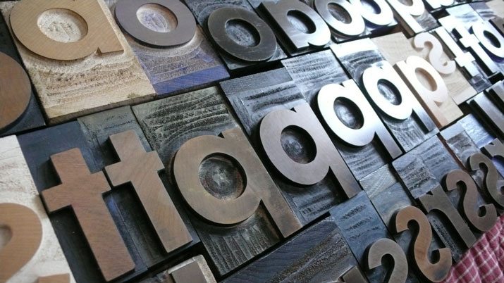
This trick works in other ways too. You can flip the letterforms horizontally as well. (They will look much like the wooden letterpress characters in the image above.) The idea behind any type of flipping, vertically or horizontally, is that you look at the space rather than read the words. Try it both ways and see what works best for you.
6. Print It Out
Designers love to zoom in on the screen and look at elements of the design detail-by-detail. This actually is a detriment when it comes to kerning. Zoom in too close and the space appears much bigger than it is and can trick you into kerning too tightly. Conversely, spacing looks may too tight when zooming out to an extreme degree, also resulting in kerning trouble.
To accurately kern type, it needs to be viewed at an accurate size. Print it out. Look at it on paper and make adjustments based on a “live size.” When kerning for a web-based project, make sure you are looking at lettering at 100 percent and are not zoomed too far in or out.
This is not to say you can’t zoom at all during the kerning process. Just remember to keep an actual size perspective so that you aren’t disappointed with the final version.
7. Color and Reverse Type

Kerning in color comes with a few special considerations. Color contrast can make letters appear closer than they really are in a few scenarios.
- In high-contrast elements, such as a vibrant red on a bright white screen.
- In reverse type – especially for printed jobs – when ink lay and bleed can impact letterforms.
- In low contrast monotone design, where letterforms can be harder to distinguish.
When using any color with type, it is vital to think about how that color can impact the way users see and read the letters. Odd contrast pairs, screen brightness and even the type of paper used for print jobs can have an impact. In many of these situations, the solution is to kern a little looser than normal, but the key is testing so you know how letters will look when it comes to the finished product.
8. Kern Last
Kerning should be one of the final steps when you are working with lettering in a design project. How letters are kerned depends on all the other design processes before it from color and size to tracking and leading.
Changes to any of these elements can impact kerning pairs. Any time you make a significant design change that involves the type, you will want to reconsider kerning. This is especially important when it comes to font, case and leading. Even small changes can make a large difference. (Yv can look quite different than YV or yv.)
Conclusion
Learning to kern can be one of the most rewarding aspects of working with typography as a designer. Seemingly small changes can impact the overall design in such a large way and take you from thinking “that does not quite work” to “wow.”
The trick to becoming an expert is practice. Look at letterforms in your projects and all around you. Imagine how the letters could work together better, or why they do work together so well, or what is making them read poorly. And then use the tips above to kern! It’s takes practice to feel good about it, so get started.
Image Sources: See-ming Lee, Andrew Steele, VFS Digital Design, Kyle Van Horn, Double-M, Opensource.com and Lauren Manning.