Design Trend: Square-Stacked Typography
Everywhere you look these days, it seems like someone else is using stacked typography. Particularly square stacked typography. It’s a common design trend that we’re seeing more and more.
The trend is hard to ignore, and is worth replicating because this aesthetic is charming and impactful. There are plenty of ways to combine words and lines of lettering to create a design that is attention-grabbing. Today, we’ll look at exactly how to make the most out of the square stacked typography trend with examples from the Design Shack gallery. Read on for some great examples, and helpful tips!
On Photos or Video

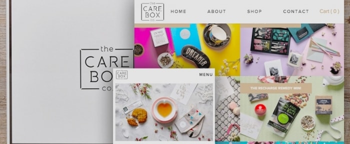
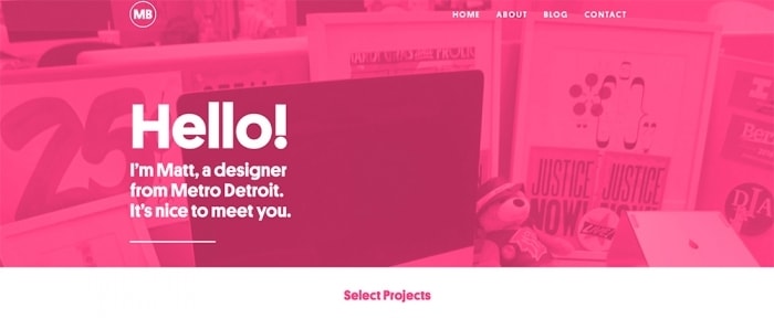
One of the most common uses of stacked typography is to compliment a photo or video. It’s a technique that’s popular on websites and apps but can also work with photos in printed design projects as well.
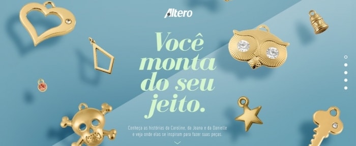
To make the most of square stacked type and an image or video, you’ll want to pay particular attention to placement of the text. Words should not cover important parts of the image and should work with the visual to provide clear meaning.
Color is important here as well. Text and the background should have enough contrast so that they are clearly distinguishable (a key factor when it comes to readability). This is why many designers opt for white or black text on top of imagery. It can be easier to establish contrast and avoid clashing colors between the image and text.
As Dominant Art
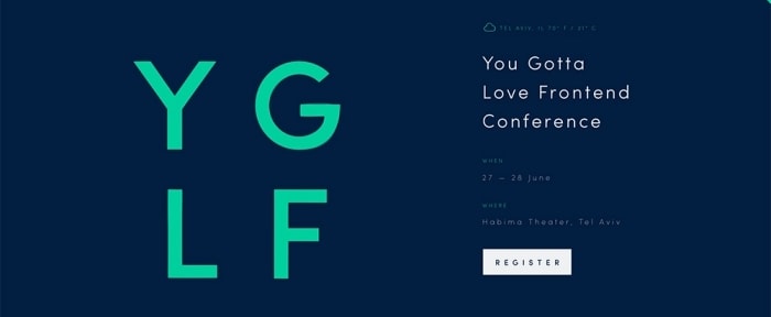
Squire-stacked typography is not always part of a bigger visual presence in a design. Sometimes it is the visual presence.
The key to using stacked typography as a dominant art element includes two key elements – plenty of whitespace and another visual element inside the type. Type might be a color or colors, have an image inside the lettering or include a touch of animation. Regardless of which “trick” you choose to try, this special element is what will help the text stand out and have more visual pizzazz.
Just don’t try to do too many things. Think of square-stacked type as working in one of two ways – black or white on color or color on black or white. Start with guideline and you’re likely to find more success as you shape and design lettering.
Put Emphasis on Specific Words
Here’s where many of these projects go wrong – they look great but become difficult to read. The “right words” need to be the biggest and heaviest words in the square space.
This is easier said than done. It takes a lot of planning when it comes to the messaging. You’ll have to balance long words against short words and phrases. And when it is all done, make sure to look at how everything falls into place. Are the most important parts of your message represented in the best way? What do the weight of the words say? Is the package readable?
If not, rethink it. Not all messaging will work with this type of design format. Some things will work a lot better than others. Don’t fell dismayed if it isn’t working for you. Save the technique for another project.
For Social Media
One of the reasons we are seeing this technique used so much is because of the square as the commonly associated shape for everything from social media icons, to Instagram photos to images in card-style interfaces. Squares are definitely in. (And a lot of that really connects to social media.)
Then there’s the idea that text on an image is highly shareable. Head over to your social media feed right now. It’ll be hard for you to scroll very far without running across type displayed in this manner.
And for good reason. It provides an opportunity to showcase a text message in a visual way. That gives the user more room for characters in their tweet or post and helps draw attention visually to the main messaging. (Pretty clever, huh?)
Jazz it Up
While many of the designs out there right now have a pretty similar look and feel, you can include other simple, yet fun, elements into your square-stacked type design.
- Add thin rules between lines to help users fully visualize the shape (or box lettering altogether).
- Add a simple shape or icon to “fill” holes to make lettering read more consistently.
- Rotate the shape a little. No one ever said everything must be perfectly square (a diamond-shape is ok too).
- Play with color variations an tints to add extra emphasis to specific words.
- Pair a totally unexpected typeface with a nice sans serif. A fun font can go a long way!
5 Reasons It Works
This technique works because it is visual and simple. To use it well, design with that concept as a priority. Here’s a breakdown of all the other reasons square-stacked typography is so popular.
- There is visual interest. Stacked type often lives in a tight-packed space so it carries visual weight, demanding attention.
- Plenty of white space around the text increases readability.
- Add an interesting twist to a normal word. Many of these designs feature a single word broken apart by syllable.
- Stacked typography starts to take on a logo-like look that establishes identity and messaging.
- It’s easy and fun to read (or it should be).
- Use a grid. It will help you establish how lines should fall and what the overall spacing looks like.
- Make sure the words are scaled properly. Stacked typography often relies on multiple sizes. The right words in your messaging need to carry the weight.
- Be aware of line breaks and hyphenation. People need to understand the message (so keep it short).
- Mix and match two typefaces or stick to weights within a single family.
- Don’t get stuck going edge to edge in the shape. It’s ok to use different line lengths or rules establish the container shape.
5 Tips for Success

Now that you are looking into the trend more or even if you had already considered it, how do you make the most of stacking type in a readable and visually-appealing way? Here are five tips to get started.
Conclusion
Sometimes the best trends are the ones that are easy to replicate. The most difficult part of creating an effective square-stacked typography design is messaging. It only works with the right combination of words. (So don’t force it.)
If you don’t have the right project to use this technique, social media is a good playground to help you perfect it. Turn a short quote into a square-stacked element and pair it with a cool background. Share and see what kind of response you get. Have fun!