Every Design Needs Three Levels of Typographic Hierarchy
One of the most important elements for people looking at anything you design is the type. It needs to be clear and readable and it should direct users through a design, from most important elements to least.
And that, in a nutshell, explains typography hierarchy. But to really master the art of type, you need to understand how to layer type throughout a design to achieve maximum impact. Read on to learn how to master typography hierarchy and create effective type in every project.
What is Typographic Hierarchy?
Typographic hierarchy is another form of visual hierarchy, a sub-hierarchy per se in an overall design project. Typographic hierarchy presents lettering so that the most important words are displayed with the most impact so users can scan text for key information.
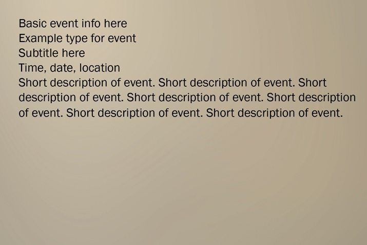
Without typographic hierarchy, every letter, every word and every sentence in a design would look the same. Can you imagine reading something where everything is the same font and size and color? Where do you start? How do you know what matters most?
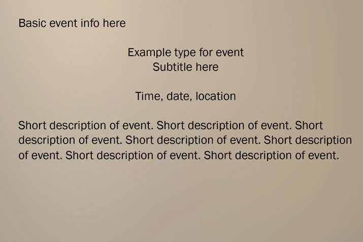
Typographic hierarchy creates contrast between elements. Designers achieve this through the use of typefaces, size, weight, capital and lowercase letters, bold or italics, orientation and color. Combinations of those design tools are used to create type that falls into distinct layers.
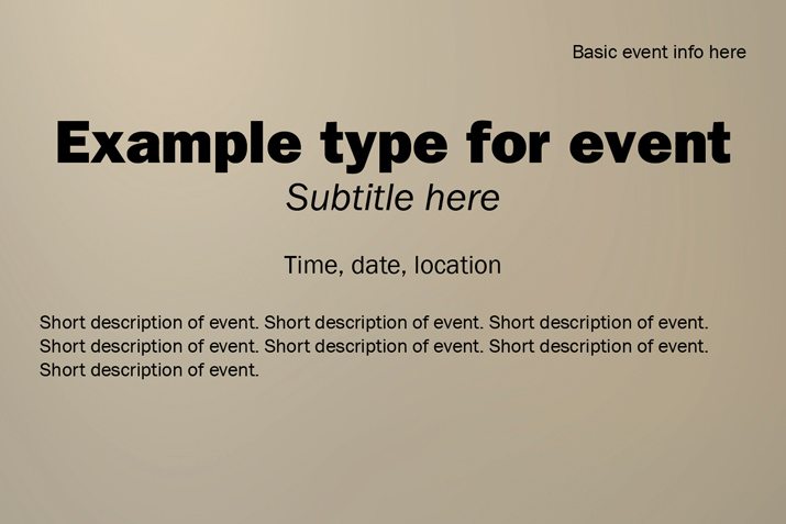
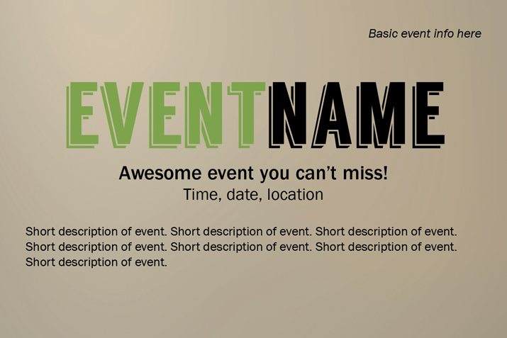
Primary Level
The primary level of typography is all of the big type. It’s headlines and decks – also known as “furniture” – that draw readers into the design. This is the biggest type in the design (unless you are using typographic art).
Secondary Level
The secondary level of typography are the nuggets of scannable information that help readers stay with the design. This includes elements such as subheads, captions, pull quotes, infographics and other small blocks of text that add information to the primary level of text. The design of these text blocks is on the large side, but typically much smaller than lettering in the primary level of typography.
Tertiary Level
The tertiary level of typography is the main text of your design. It is often some of the smallest type in the design, but it needs to be large enough to be completely readable by all potential users. The typeface should be simple and consistent in design, spacing and overall usage.
Other Levels
The other levels of typography include effects applied to type in the tertiary level for small areas of impact. Effects such as bolding, italics, underlining and color can bring attention to specific areas of the main text. These effects work best when applied to text of the same size and typeface used in the tertiary level. Effects are used sparingly and for only a few words in sequence. Examples of other levels include links that are underlined, bold words for impact or italics or color for emphasis.
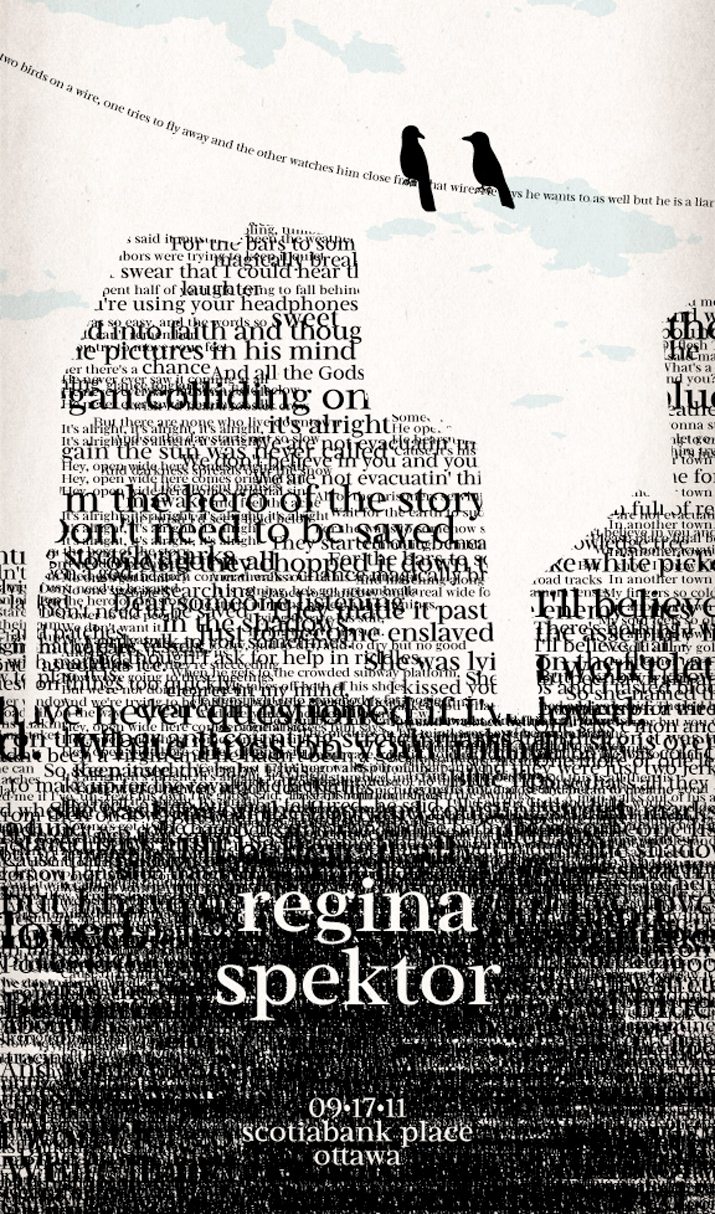
Hierarchy in Print Projects
Visual hierarchy in print projects is strictly visual. Using size, color and other effects to make certain bits of type appear large and more important and scaling accordingly is all you really have to do to get a good start.
Looking at the step-by-step example above, you can clearly see different levels of typographic hierarchy and how it makes the design both easier to read and more appealing visually. You can apply this same technique to any design project by adding emphasis in key areas.
Create It
There are a variety of ways you can create a sense of hierarchy. Here are some of the most common techniques:
- Typeface selection: More interesting typefaces can appear larger and draw the eye faster than ones with less visual intrigue. When using novelty, script or elaborate typefaces be aware of readability concerns and make sure the type is plenty big.
- Size: It almost goes without saying, but the bigger the type, the quicker the eye will be drawn to it. Type sizing should correlate to the order of importance in reading the text.
- Weight: The thickness of letters can make text look larger (bold, thick strokes) or smaller (thin or compressed typefaces).
- Capital and lowercase letters: You’ve heard that sending an email in all capital letters is like yelling at someone. The same is true of all caps in design. Be wary of use. Capital letters will appear larger and come to the forefront while lowercase letters appear smaller and often fall into the background.
- Bold: Bold lettering is a good point of emphasis for a single word or phrase. It works especially well in the tertiary level of type.
- Italics: Italic lettering can highlight a single word or phrase in a less dramatic and more subtle way than bolding. It works especially well in the tertiary level of type.
- Orientation: Turning letters on their side, upside down or with any other orientation that horizontal can have immediate eye-appeal, because they are placed in a way different than what is expected. This can work well for short words or phrases in the primary level of text.
- Color: Adding color to letters that typically do not have color creates specific and immediate interest. This effect can work in any level of text, but should be deliberate as to not create readability concerns or confusion.
- Placement: Where text is located on the canvas can establish hierarchy as well. Typically you read from top to bottom (a natural hierarchy of sorts) but this can be changed by employing some of the techniques above.
Hierarchy in Digital Projects
All of the tools that you use in print projects also apply to digital projects, with some additions. Digital typographic hierarchy must also include consideration for HTML in the creation of web type. This additional level of thinking ensures that your visual levels will translate to other users on screen.
Create It
Make sure to use common conventions, including header, body and bold styles when working on projects that will be published online. Each of these commonly-used style definitions falls within carrots (< >) in the HTML.
- Title (title): Defines the document title for web crawlers and users.
- Body (body): Defines the body text in a document.
- Headers (h1 to h6): Defines different layers of header styles. H1 is typically the biggest and most important, moving down through H6. You only need to use as many as you like.
- Bold (strong): Defines heavier, more important text.
- Italic (em): Defines text with a tilt for emphasis.
Hierarchy and Usability
When it comes to mobile applications, you need to think about visual typographic hierarchy, HTML typographic hierarchy and usability in typography hierarchy. Not only does text have to look good and work properly, but it also has to be designed in such a way that users know what to do with it and it interacts as expected.
This action-based typography includes some key things for designers. Type has to be big enough to tap, spaced so that each tap-able item is clearly defined, and usable elements have some sort of visual definition (such as a button).
Create It
The thing to keep in mind when creating usable typographic hierarchy is to separate type elements that users will interact with from ones they will not and from each other. Important considerations include:
- Space: Give each element that is supposed to be touched or tapped, plenty of room. Consider the size of the space and the amount of room it takes for a finger to touch it. Users can be quickly frustrated if type is so close that the wrong element is clicked.
- Color: Create a color palette for usability. Consider making every word that is intended for touch a different color than the main text.
- Shadows: Drop shadows are a common indicator of a button that can be pressed in some way.
- Borders: Consider adding borders to independent elements that you want users to interact with. Make sure they are set apart from the background. (Trendy “ghost buttons” are a good example of this, as in the Spacecraft website example above.)
- Animation: Moving text, while difficult to use, can be a quick way to help draw the eye to certain words.
- Direction: Remember to tell users what to do on the screen, from tapping to scrolling to calls-to-action.
Conclusion
Chances are you design with some sort of typographic hierarchy even without thinking about it. But considering how type will align in a big picture way can improve your overall design.
Use typographic hierarchy to add emphasis, impact and create calls to action that users can see and react to quickly. Remember to think about readability, scanability and overall comprehension when making decisions about a typeface, size and effects applied to it. Your readers (or users) will thank you.