Serif, Sans, Script & Slab: 4 Font Types Explained
Always wanted to know the difference between serif, sans, script, and slab fonts? Look no further. Take your typography game to the next level, and quit guessing if certain typefaces or font pairs work together. Back your logic with a little design theory!
Having a better knowledge of fonts and typography can make explaining your choices to clients easier (always a bonus), and will give you more confidence when selecting font pairs. Here’s a primer (or refresher) on four common font types and how to use them in your design projects.
1. Serif
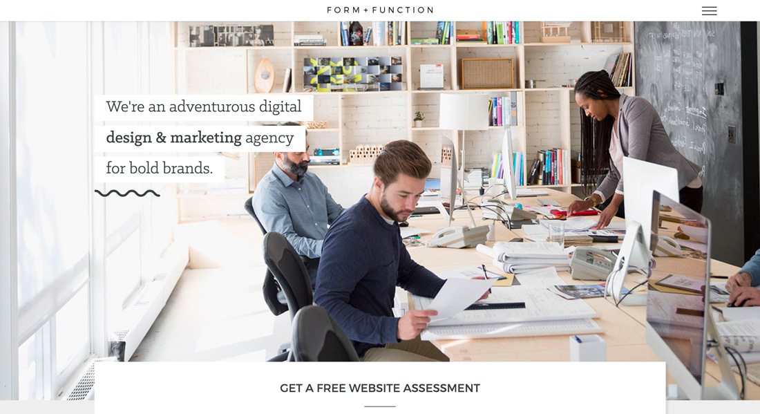
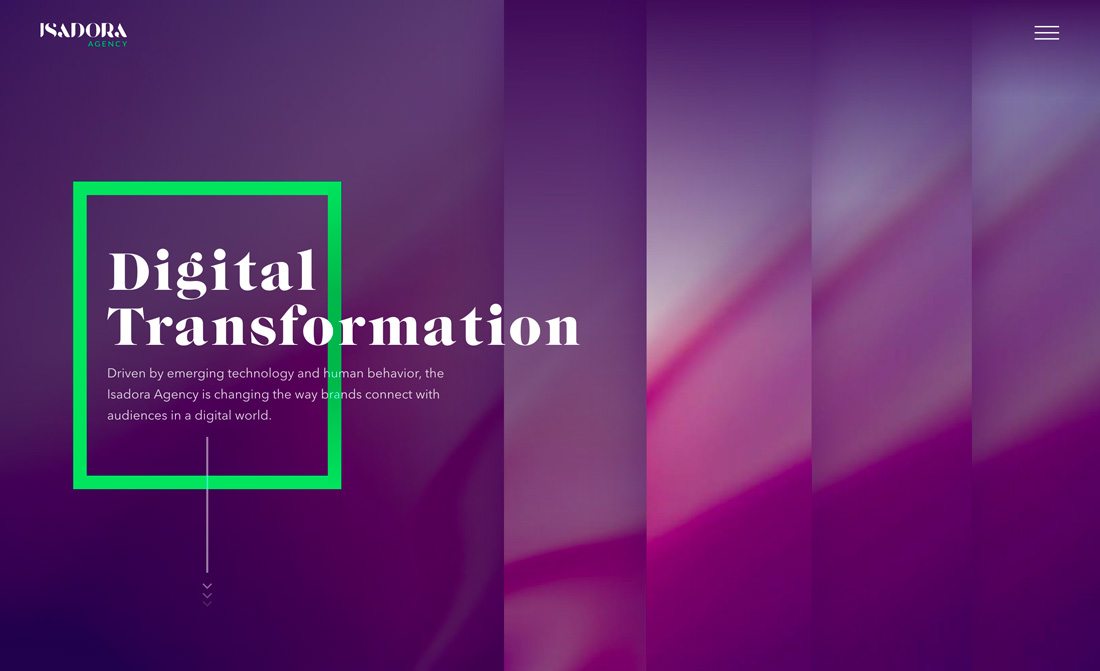
Serif typefaces are arguably the most traditional category of type. The style is common with typesetting in books and newspapers and is often used in long blocks of text.
For a while, many web designers stayed away from using serif typefaces because they worried that the look wasn’t readable online. This is no longer the case, thanks to high definition screens that show every detail.
Regardless, use of serif typefaces isn’t near as common as the sans option. In most instances where serif typefaces are used, they complement a sans serif option that is used for most of the text on the screen.
Serif typefaces can be identified by small divots on the ends of letterforms. These small strokes can be short or long, straight or angled or have varying weights.
Serif typefaces are often grouped into a handful of subcategories based on the time period in which the style was originally created – old style, modern and transitional.
Old style serifs have a rounded shape with uniform stroke widths. Each letter of a modern serif has thick and thin stroke widths. Transitional serifs are a combination of the two aforementioned styles and are an almost default serif style for many designers.
- Best for: Display or body text
- Avoid: Stacking too many serifs unless you are looking for an old-style feel
- Pair with: A simple sans serif
- Popular choices (from Google Fonts): Merriweather, Playfair Display, Arvo
2. Sans Serif
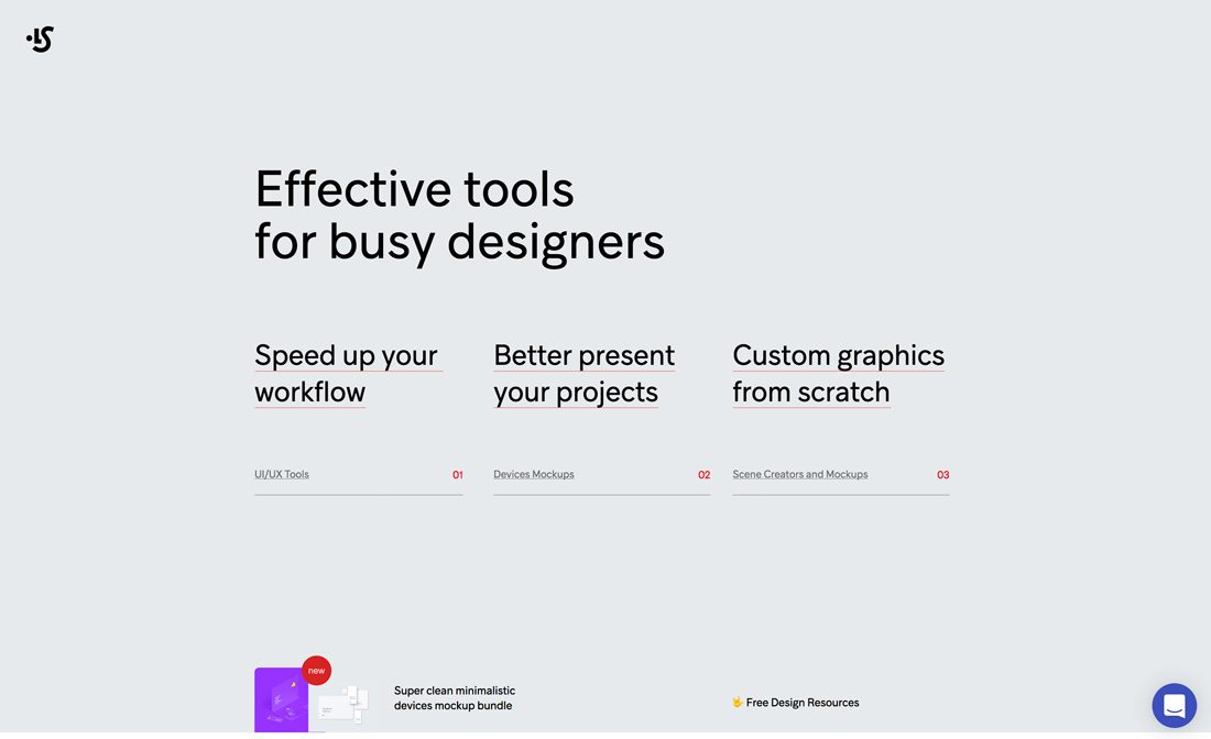
Sans serif typefaces lack any embellishment on the ends of letterforms, taking on a more simple shape. But don’t think that because there is a lack of adornment on letters, sans serifs are boring. They are anything but.
Sans serif styles can have letters that are thick or thin, short or tall, fat or condensed.
This style of type has been used pretty dominantly in website design due to its versatility. Sans serif typefaces are universally accepted by most designers and can almost take on the personality of the design where they are used. (Just think of how many times you’ve seen Helvetica, and how vastly different those projects have been.)
- Best for: Display or body text
- Avoid: Super thin options because they can be hard to read
- Pair with: Any other font style
- Popular choices: Roboto, Open Sans, Raleway
3. Script
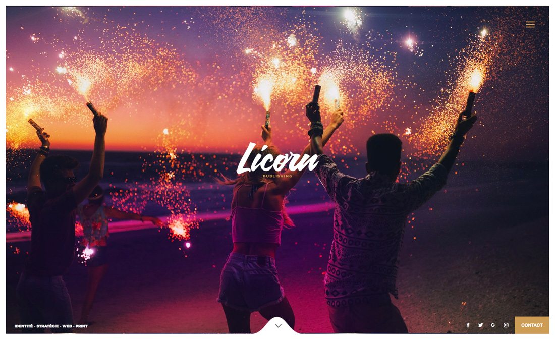
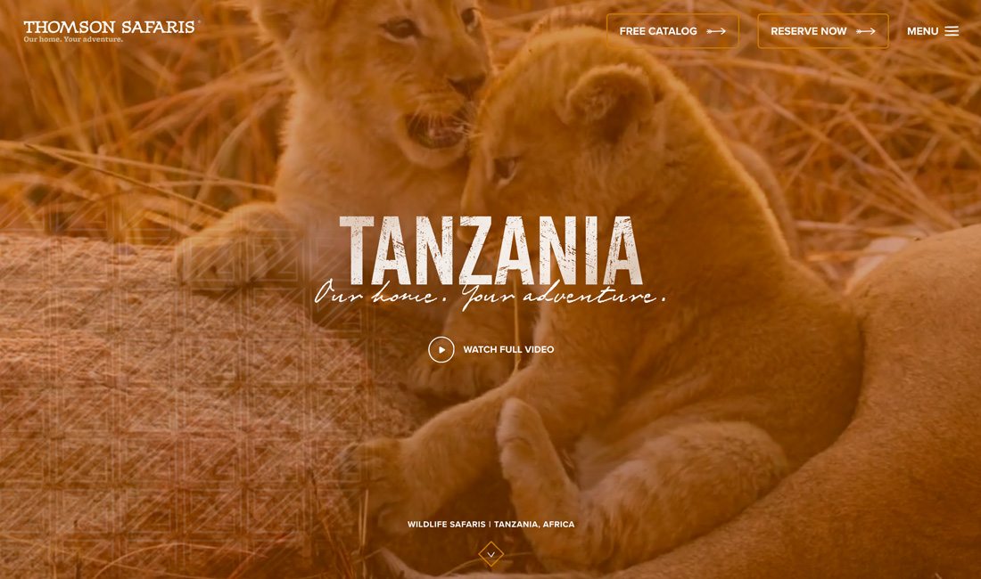
Script typefaces are one of the least commonly seen styles in website design, and for good reason: Scripts tend to evoke distinct emotions with users and can often be difficult to read.
Most script typefaces can be identified by the curve of letterforms and connecting strokes, which imitate cursive handwriting. Many designers refer to scripts as a class of “handwriting” fonts.
While many people assume scripts have a feminine touch, that’s not always the case. Scripts with thicker or harsher strokes can actually feel more masculine. Much of the association actually depends on surrounding design elements.
The biggest concern with script typefaces is readability. Scripts are not easy to scan and are exceptionally difficult to read at smaller sizes or in compacted space (such as large blocks of text).
- Best for: Display with only a few words
- Avoid: Using in large blocks of text
- Pair with: A sans serif
- Popular choices: Pacifico, Lobster, Sacramento
4. Slab
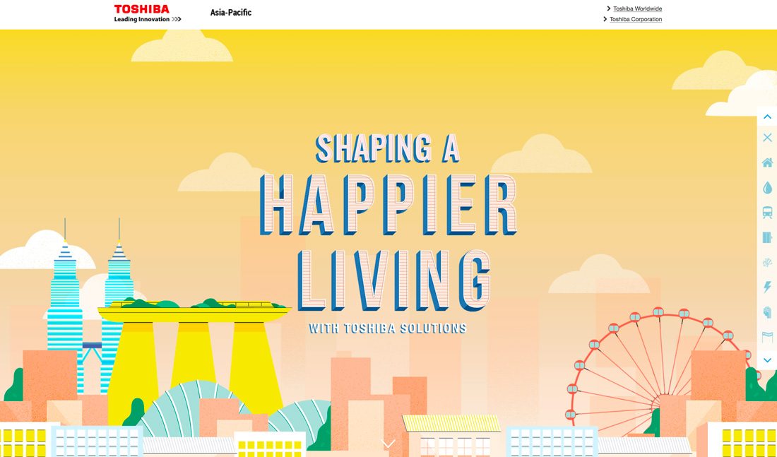

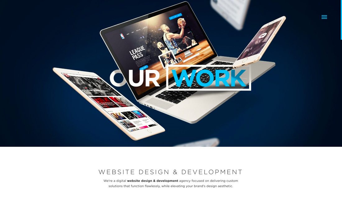
Slab typefaces are interesting. There was a time when slabs were a subset of serif typefaces, but that has changed, and slab fonts refer to almost any style of typeface with super thick stroke weights for all of the letters.
These heavy typefaces are almost always used for display type and large headlines. They are bold and almost scream at the user.
This type style is common in advertising and for websites when the message is short and distinct. Slabs can be overwhelming and difficult to read if too many letters are used because of the weight and size. This type style can also be used for design elements such as drop caps and small single-letter applications as well.
The fun thing about slab typefaces is that because of thick stroke weights, there are a lot of things you can do with them. Slab typefaces are perfect for inline styles, color fonts, filling letters with images or creating a transparent word over an image. Thick letterforms make these applications more usable, and readable, in a way that doesn’t work so well with other font styles.
- Best for: Display text
- Avoid: Using at smaller sizes because of legibility concerns
- Pair with: A sans serif or serif
- Popular choices: Slabo, Rammetto One, Graduate
Conclusion
The biggest mistakes designers make when working with fonts is using too many typefaces or using typefaces that are too similar. Most great type pairings include two type families from different categories – pick from two of the options above. Pick typefaces with plenty of options and assign a distinct role for each typeface in the design.
Look for typefaces with similar shapes and slants for pairings that work together like a charm. And don’t be afraid to experiment with plenty of options to get just the mood you need for each project.