How to Design Readable Content for the Web
Designing content is more than just making something look great. You have to create a design that people will actually read, and help them engage with the content. Sometimes, that’s easier said than done.
People generally have short attention spans, and you shouldn’t expect them to digest every word on the screen. But you can use certain design techniques and elements to help users read as much as possible.
Establish Hierarchy with Size and Scale
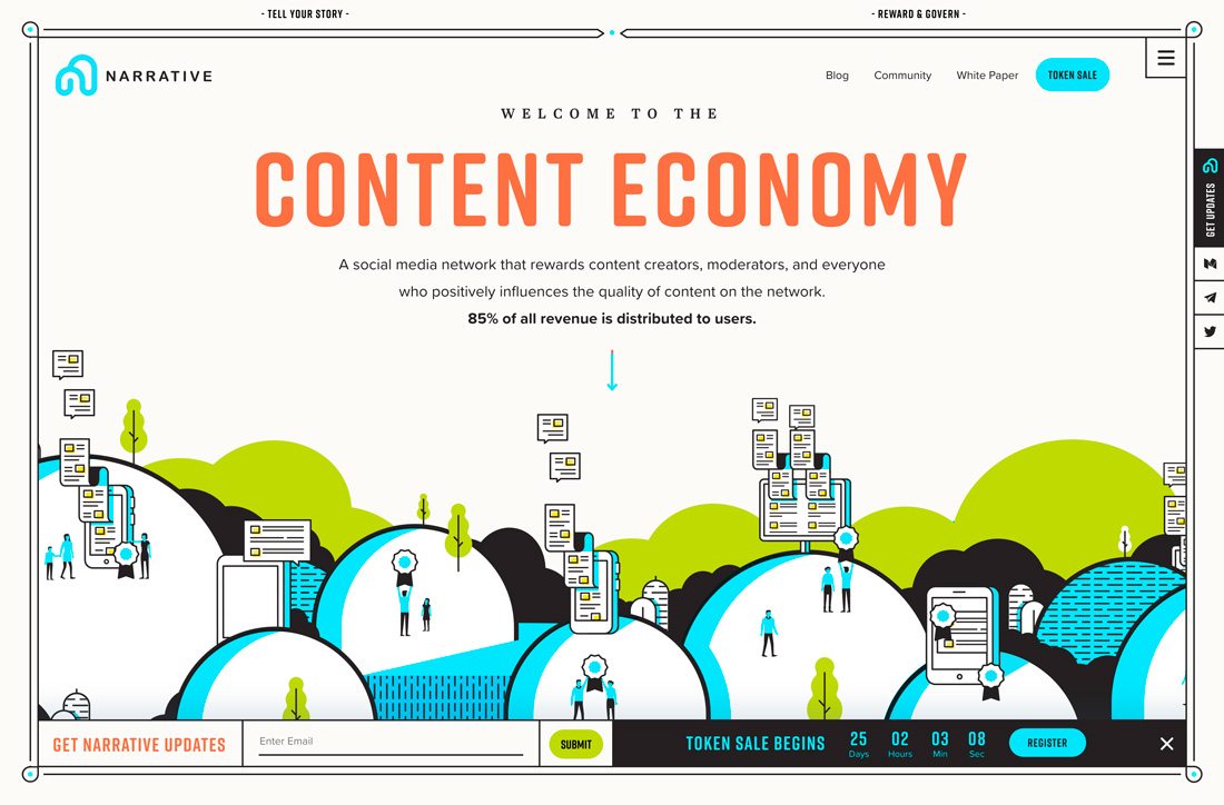
Readable design starts with multiple levels of text. Establishing a hierarchy of thoughts will help users move through the text.
Larger sizes are a visual cue that tells users to read a certain thing first because it is most important. Most users’ eyes will naturally move from larger elements to smaller ones creating a nice visual flow.
Make the most of H2, H3 and H4 tags in the design and create a consistent scale for subheads that can be used to break up large blocks of text.
Creating a scale with consistent text placements and sizes makes it even easier for users to navigate the text. This is true for both long-form content and even short content on homepages, such as Narrative, above.
Note how the homepage has four distinct levels of text in the hero area. There’s a big headline in color, with a short snippet above. Then the body content has a style with an additional bold line for emphasis. Most users will see the words in this order: Headline, bold text, body text, headline snippet due to the weights, size and scale of lettering.
Pick Readable Typefaces
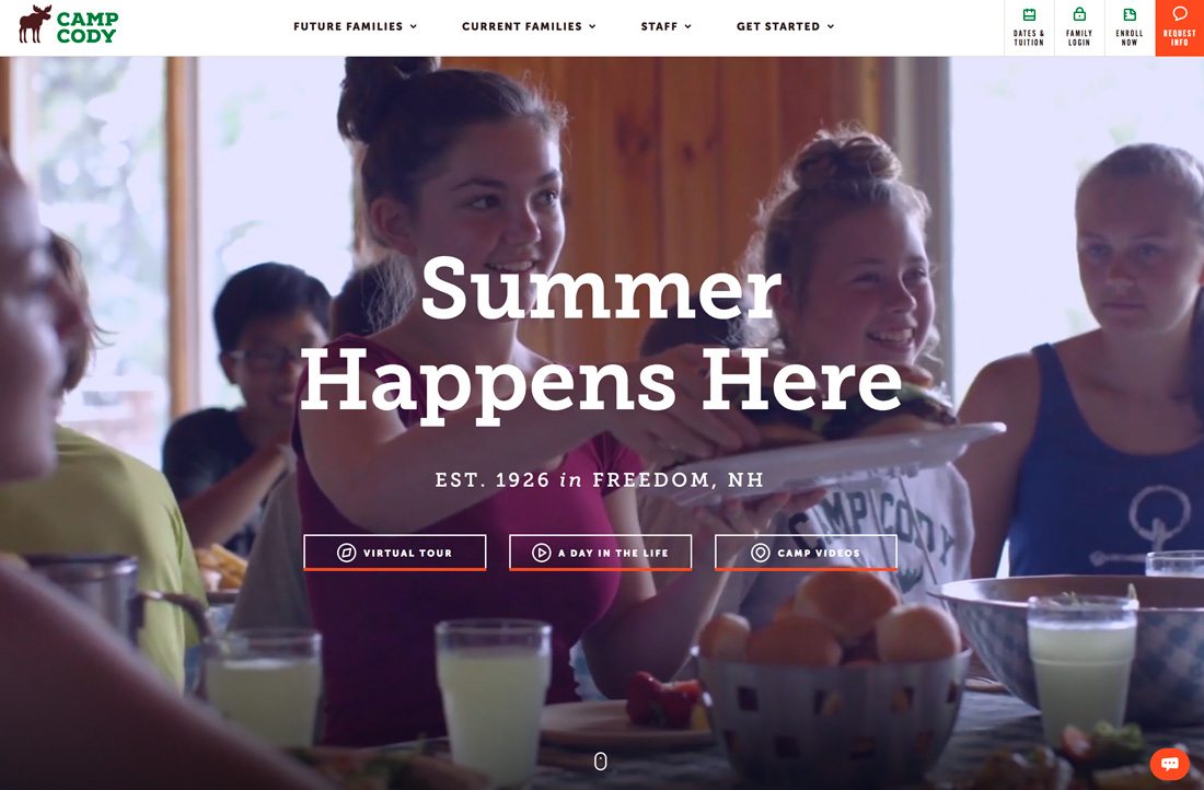
While a fun novelty typeface or elaborate script might be a lot of fun to design with, it isn’t always the best choice for the end user.
Readable typefaces are the most likely to actually get read.
Here’s why:
- Highly readable typefaces are easier to scan.
- Letterforms are easy to see at different sizes.
- Letters don’t run together or create awkward spaces or shapes.
- These typefaces are commonly used and easy for users. (Even typefaces that are similar, but not from the same family look familiar to most users.)
Characteristics of a readable typeface include:
- Standard weight – not too thick or thin
- Common x-height – not too short or tall
- More rounded letterforms – so that the “o” has a circular shape
- Slight or no slant
- Letters that aren’t too close or far apart
Looking at those characteristics you can see that almost any type category probably includes a readable option. You don’t have to stick solely to serifs or sans serifs; a mix of other typefaces is actually good. Just make sure to test our words you plan to use in that typeface to ensure they are easy to read.
Stack Content for People Who Scan

Stacking content goes back to hierarchy. But with an extra element – think about text and non-text elements when stacking content.
If the user sees a text block and an image on the screen, the image is almost always the thing that gets his or her attention first, making it important to stack elements in a way that will help users move through them from the image to the text.
Alzheimers New Zealand, above, uses stacking to get users to the main headline. Note how the text is positioned in the center of the image with three people. Your eye goes to the faces first but then drops to the subtly animated circle with text inside. Then they eye moves to the smaller, more secondary block of text.
And here’s the thing: All of this happened so quickly when you first saw the image that you might not have even thought about it. Most users scan the entire screen in the same manner when deciding whether to interact with the content or not.
Play Up Visuals
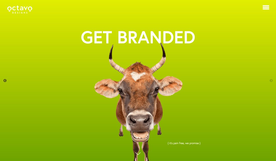
Really want to make sure users see your content? Integrate text and visuals in a meaningful way. Create a hero image that uses an interesting visual, unusual color pairing or combination of animation and lettering to make users pause.
The mistake that designers sometimes make is separating every element into its own box or space. Play up visuals by integrating them with other elements for a more immersive design.
Octavo Designs, above, has a homepage that you can’t avoid being drawn into. For starters, there’s a very funny-looking cow on a bright colored background. The text is very much a part of the image. (It actually touches the cow’s horns at the top.) This combination of visuals and text draws users into the content, making them want more.
Keep Lines (And Thoughts) Short
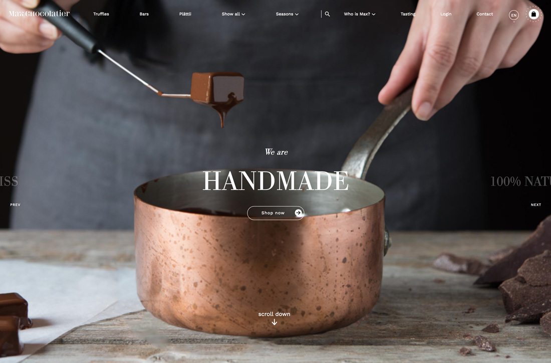
When planning the design, think in short bursts. Each page or screen should focus on a single thought and simple, easy to read blocks of text.
Structure and organize thoughts for users in a way that encourages reading:
- Use one- to three-sentence paragraphs
- Incorporate bulleted lists
- Use subheads to break up large blocks of text
- Include links for interactivity
- Highlight or bold key points
- Edit all copy for clarity and brevity
Create a Focal Point
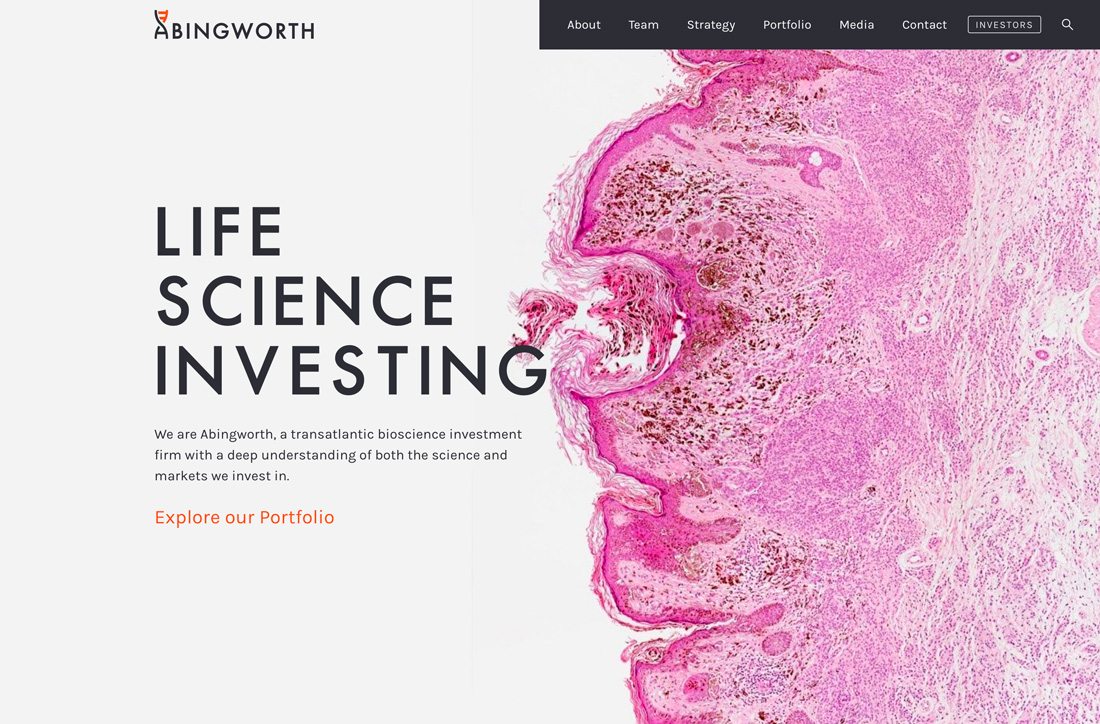
Every design should have a focal point. The focal point is the part of the design that almost every user will see first. It’s often highly visual or stands in stark contrast to other elements on the screen.
In the example above, Abingworth uses a bright pink blob as the focal point. It draws attention because of color and curiosity (what is it?) and because it contrasts with the white, open space on the other side of the screen.
The focal point of the design should be your best image, illustration or animation and relate to key messaging. The focal point should establish what the design is about and why users should care. Because this is the first place users will look, it sets the tone for how (and if) they will interact with the design.
Conclusion
Creating content that users will actually read is more than just text on the screen. It’s a combination of writing and visual elements that draw users in, help them get a glimpse of what the design is about and then decide to keep interacting with it.
While it sounds like a lot, this all happens in a matter of milliseconds. There’s research that says most users have the attention span of a goldfish – 8 seconds – make the most of that time with content that’s easy to read.