Is My Type Stressed? a Primer on Stressed Typography
As a designer, either working with a design firm or on a freelance basis, you probably know a lot about stress. From deadlines to redesigns, client relations to cash flow — it is part of everyday life for someone working as a designer in any capacity.
But did you know your typography could also be stressed? Just like in your life, type has certain pressure points, and there are good and bad types of type stress. In today’s article, we’re going to delve into this concept in a little more details. We’ll walk you through exactly what types of typographical stress there are, how you can ensure it doesn’t affect the readability of your designs.
What is Type Stress?
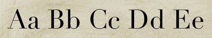
Type stress refers to the change in direction of a stroke, vertically or horizontally. It can also refer to the feel that is created by type in relation to how it is perceived. Stress can be by design or created with effects as it used for certain projects.
Typefaces are designed with or without stress points. Stress can refer to arches, tilts and uneven strokes. In many letterforms, type stressors are not obvious and add to the character of the typeface. But in some more extreme fonts, stressors are very evident and can help create a certain mood. Just as many typefaces include stress as those that do not; stress points are also more common among certain styles and typographers than others.
Type can also be stressed by its surroundings and by effects that are added by the designer in the creative process. This created stress is often a result of dramatic kerning, leading or rotation of letters.
Stress by Design
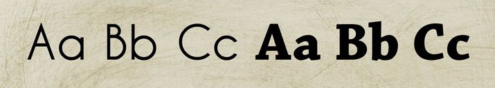
Certain type categories tend to contain stress more than others. Modern, transitional, slab serifs, scripts and novelty typefaces are often stressed. Old style and sans serifs typefaces are the least often stressed, aside from condensed variants.
Uneven Strokes
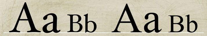
Variations between thick and thin strokes cause varying degrees of type stress depending on the difference in stroke weight. Some type styles, such as those in the transitional category, have little variance in thick and thin strokes, creating a light stress. Others, common among slab serifs, have great contrast between tick and thin strokes, creating uneven weight in letterforms and a more stressful overall feel.
Tilts
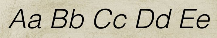
Italics are an immediate stressor for any typeface. The degree of tilt corresponds to the degree of stress; more tilt, more stress.
Changes in stroke weight can also cause letters to seemingly tilt. This optical tilting is considered a stressor, even though it is quite common. All letterforms created in the Bodoni style, for example, have this type of letter stress.
Arches
Even some serifs that contain no uneven strokes or tilt can contain stress. The actual stress is designed as part of the serif itself in the form of curves or arches. Instead of perfectly flat serifs, these small strokes extending from each letterform are more fluid.
Even the primary strokes of a letter can contain stress. In some typefaces, the vertical and horizontal strokes are not perfect. Any curvature in these strokes can indicate some letter stress. This is most commonly seen among serif typefaces but can occur with sans serifs as well.
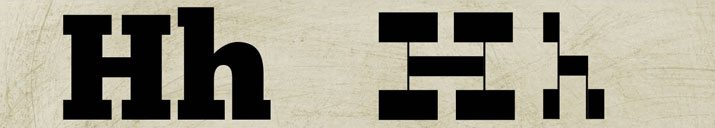
Bowls and Counters
Elongated bowls and counters are representative of stressed type is well. Typical unstressed letterforms have almost perfectly round open spaces. Stressed lettering can have more vertically-stretched or horizontally-stretched spaces. This is a common type design practice often seen in condensed typefaces.
Reversed Stress
Reversed stress is created when letterforms have heavier serifs, tails or swashes than essential strokes. These super-sized fonts are often heavy in feel and work best as display type for a limited number of words. Reversed stress can also occur when horizontal strokes are much thicker than their vertical counterparts.
Created Stress
Designers can create type stress in the design process. Created stress is anything that stretches the comfortable limits of readability – changes in kerning, leading and rotations. Created stress can be a great design tool but can also be a challenge to create and use effectively.
Kerning
Kerning – the adjustment space between pairs of letters – can create type stress of its own. Too much space can feel awkward and disjointed while too little space can be cramped and uncomfortable. Just as stressful for the reader is awkward kerning, where letter pairs are spaced with great variances in space within the same block of text.
As a general rule, larger type needs to be kerned tighter whereas smaller text needs less adjustment. But extreme adjustment in either direction can case stress on the type. Letters that touch, for example, can affect readability.
Leading
Leading – the adjustment of space between lines of text – allows text to breathe or lines to sit uncomfortably close. Optimum leading is a balancing act. Measured from baseline to baseline, typical unstressed leading is somewhere between 100 percent and 140 percent of the typeface’s size. Anything more or less than that is considered stressed and can affect readability.
Rotation and Distortion
Any typographer will tell you it is a typographic sin to distort type in any way. If you want a typeface to look another way, choose another typeface.
But that is not how things often work. Many designers – whether you consider it to be right or wrong – alter or distort type at some point. From faux italics, to shrinking or stretching to flattening or changing the orientation, any distortion to a typeface is considered stress. The same applies to rotating or flipping text.
Conclusion
Although the terms type and stress may have negative connotations, that is not the case. Type stress can be caused by a number of factors – by the typographer or in use by the designer.
The key is to understand type stress and use this to your advantage in projects. From super-dramatic to curved serifs or super-loose or tight leading or kerning, stressed type might just be the perfect match for your next design project.