Is Your Website Font Size Too Small? Large Text Is In
The standards for typography on the web have shifted. Designers are going with bigger, easier to read typography that is more seamless and consistent across devices. The trend toward bigger web typography started with oversized treatments above the scroll, from headlines to more artistic hero header text elements.
Body text sizes concurrently started to increase on mobile devices to enhance readability. And from there, the trend started to trickle down to almost all aspects of web type. If you haven’t thought about the size of copy on your website recently, it’s time to revisit that 12 or 14-point/pixel body copy. Large text is in!
Oversized Headlines
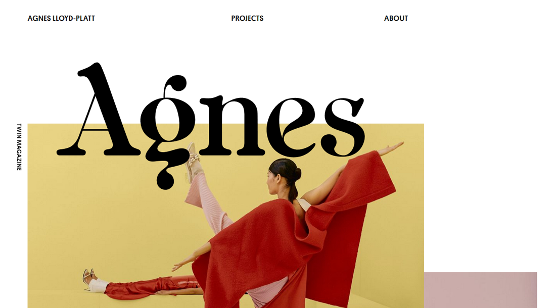
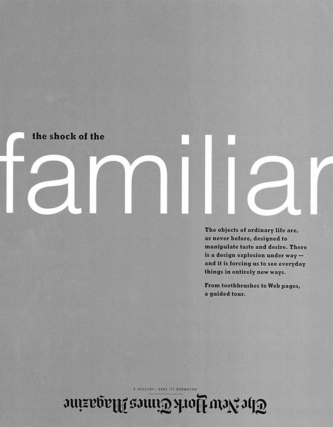
The most obvious – and easiest – implementation of bigger text is to use oversized headlines to demand the attention of the user.
An oversized headline works best when there aren’t a lot of long or complicated words to consider. This is an in-your-face treatment so that actual lettering needs to be easy to understand.
Tips for success:
- Stick to a serif or sans serif typeface that you can use in other parts of the design. Novelty or script options can get tricky quickly.
- Make it big – uncomfortably big – and then back off a little bit to find the right harmony in the design.
- Start with text that’s at least 80 points and expand to fill the screen. Make sure to use a relative size in the final design so that it will scale appropriately on all devices. (The appropriate CSS rule is “font-size,” which uses a percent scale based on a standard size that is 100 percent.)
Making the Case for Bigger Body Copy
If the body copy on your website isn’t at least 16 points, it’s time to rethink your typography situation.
This “rule” has roots in mobile since text that’s smaller than that for inputs will actually zoom in on some devices. (This can be annoying in terms of user experience.) The design fix is to create levels of typography that are big enough to read and understand with ease.
Further, the goal is that text on a mobile device is comfortably readable when held at a natural distance (typically about half an arm’s length, similar to reading a book).
Larger text can be easier to read at this distance and is more appropriate for the screen size. Users should not have to squint or bring the device closer to their face to reasonably understand the text.
Tips for success:
- Start with a body copy size of about 16 points. This is usually acceptable for desktop and mobile devices.
- Use a highly legible font with a regular stroke width and clean lines to maximize readability.
- Adjust the size up or down slightly for typefaces that are thin (make it larger) or wide (make it smaller).
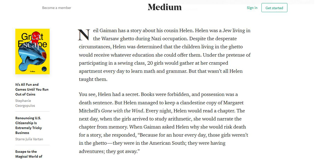
- For text-heavy pages, consider going even larger with body text to reduce eyestrain, such as 18 points or even 20 points. (As a guide, Medium uses 21-point body text, and Jeffrey Zeldman’s site is at 24 points.)
Increase Overall Hierarchy
So you have to do more than just adjust the text size on one part of your website design. You need to rethink the entire typography hierarchy.
As the size of body text increases, you’ll want to scale the rest of the type accordingly. Otherwise, you might end up with a jarring typographic scale in which some text sizes are difficult to differentiate from one another.
When it comes to increasing the size of big typography, such as headlines or subheaders, it’s a little less vital to adjust the overall typographic scale. Even as these elements get bigger the natural distinction from body text elements will remain (obviously). You should consider increasing the overall body text size as well if it starts to look out of place or if the size of the big type makes body text appear smaller than it really is. (Optical illusions can ruin a design hierarchy.)
Tips for success:
- Adjust text sizes in proportion to one another throughout the design.
- Pay attention to how color and size contrast impact the look of letting sizes.</li.
- Trust your eyes; if the text looks way too big or small, continue to make adjustments until it feels right.
Don’t Forget to Adjust Line Spacing
While making adjustments to text elements, don’t neglect the space between lines of type. Larger sized text often requires increased line spacing.
Consider creating line spacing rules based on a percentage of the text size rather than a fixed height. (This way those changes will adjust automatically.)
Tips for success:
- Start with 1.5 times (150 percent) the body text size for the line spacing of the same block to text. If it feels tight, increase the line spacing.
- Background and text elements with extreme contrast often need a little extra line spacing for a more harmonious feel. Add line spacing for white text on a black background, decrease it some for mid-tone gray backgrounds.
- Play close attention to ascenders and descenders of your chosen typeface and adjust line spacing accordingly.
Text Sizes Are Increasing Offline, Too
And while this typography trend is mostly targeted at web design projects, text sizes are increasing in general. From emails to printed materials, designers are using the same guidelines for digital projects with printed designs of similar sizes. (You might equate a mobile device to a postcard.)
Good design is good design.
And so many projects include multiple components where we are focusing on a common user experience. So you want the design of a website to seem similar to the design of a related postcard.
The other commonality is your eyes just start to get used to seeing text at a certain size. Just like working with user patterns, visual patterns make things easier to understand and see quickly. Larger text is no exception.
Conclusion
Have you started to notice a shift in the sizes you use for typography in various design projects? Personally, I was surprised at how quickly it snuck up on me. I actually find myself pushing for bigger and bigger type sizes all the time.
This is how trends and changes to common design patterns start. I’d love to hear your experiences with trying bigger type. Was it well-received or did you get a lot of push-back? Let me know on Twitter and tag @designshack.