Mixing Typefaces: Tips and Techniques
Mixing typefaces can be on of the most rewarding, and trickiest parts of the design process. Creating the perfect pairing of typography can result in a beautiful and perfectly readable outline for almost any project.
But how can you get started? What should you consider when mixing typefaces? While the answers aren’t black and white, there are a few things you can do. Think about contrast, x-heights, shapes and slants and overall mood when combining typefaces for any project. In this article, we’ll be delving into each of these in a little more detail!
Getting Started
Although they may seem to contradict each other, the keys to mixing typefaces are variance and matching. Choose typefaces with enough variance that they are obviously different, but go for pairings that match each other to create just the right feel.
The other thing to think about when mixing typefaces is quantity. Keep it simple — fewer typefaces per project is typically best. Start with just two type families; this is sufficient for many projects and especially for those new to matching typefaces.
To create enough variance between typefaces, create contrast by mixing type of different categories, sizes and weights (and, to properly match typefaces, consider selections that have similar x-heights, shapes or slants and mood).
Creating Contrast Between Typefaces
You can create typographic contrast in a number of ways – with typefaces from different categories, with weight or size, and with color in the overall design scheme.
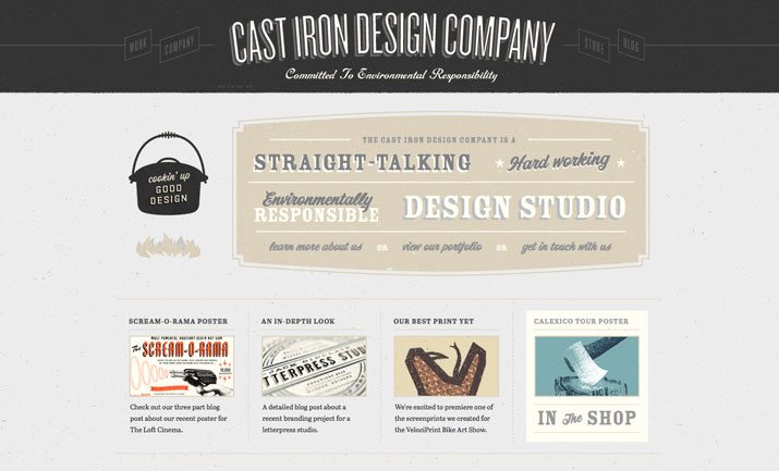
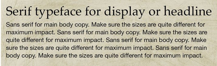
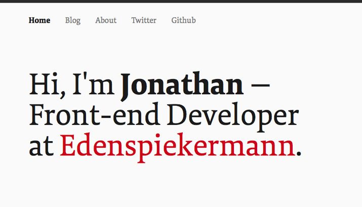
One of the easiest ways to create simple contrast is by mixing a serif and sans serif. In web design, the sans serif typeface is typically used for the body copy while a serif is used for headlines and display. In print design, the opposite combination is quite popular. While this does not only work with serifs and sans serifs, this tends to be the most common pairing and is typically the easiest to read.
Sans serif typefaces also pair quite well with many other type styles as well. Some projects work great with a script or novelty typeface paired with sans serif body copy. The key is readability. If you select a typeface that is more challenging to read, use it larger and for fewer words, such as in art-style treatments.
Contrast can also be created with size. Use widely varying sizes for different parts of type throughout a project. Set the size for the main body copy first, then dramatically increase point sizes for other surrounding type, remembering that the biggest type should be the most important so it creates a hierarchy for your project. Avoid typefaces that look similar. This lack of obvious contrast can be jarring and make typography feel off balance.
Thicker, heavier typefaces with thick strokes will always look bigger. Use them accordingly to create contrast with thinner, more regular-style type.
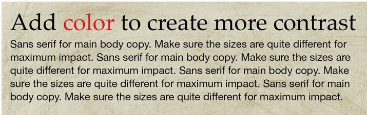
Finally think about how color can create a sense of distinction. While many projects work best with black or white lettering, some color can add emphasis. Consider using an accent typeface that is always a specific color as you mix typefaces to create a certain feel and contrast between type styles.
Considering X-Height
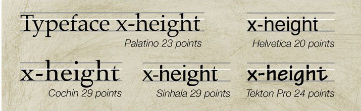
The x-height is the measure from the baseline to the top of a lowercase x (or general height of the lowercase letters) in a type family. Mixing typefaces with similar x-heights creates a sense of harmony and balance.
Further you can almost “trick” typefaces into having similar or aligned x-heights just by changing the point size so that pairings seem more consistent. This is especially important in projects where varying typefaces are used in the same blocks of text or in alignment with each other. (Think of a bold sans serif used to highlight words in a block of text using predominantly serif characters.)
Shapes and Slants
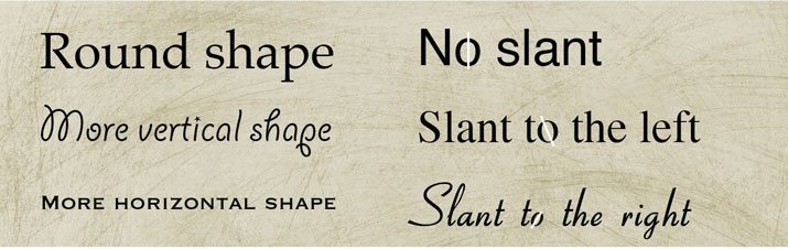
Typefaces with similar characteristics tend to pair most easily. Consider the overall shape, stroke widths, serif styles and angling of letters.
Look at the shape of bowls, counters and overall letterforms. How different or similar are they? Letters that are of average or regular style often go with almost anything, but super-thick, short, tall, thin or condensed styles may look odd with letterforms at the opposite end of the spectrum.
Bowls and counters are a good measure – in typefaces that pair well, these open spaces tend to have similar shapes and sizes regardless of type style or the category they come from. Consider counters as well: Are they they open or closed? Are the shapes similar?
Stroke widths fall under the same general guideline. Mix typefaces with similar stroke widths or typefaces with the same degree of variance between stroke widths. The same can be said for serif styles – are they thick or thin, slanted or flat, simple or elaborate?
Finally, look at the angling of letters. Avoid mixing typefaces that have opposing directional slants. You can typically see the slant by looking at a lowercase “o.”
A Typeface Can Create a Mood
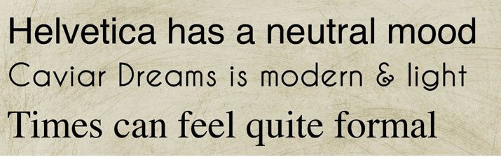
Typefaces tend to be either neutral, or have a distinct mood and feel. When mixing fonts, put together styles to create the right attitude for your project.
A neutral typeface can be paired with a typeface of any feel and will take on that mood. Two typefaces with the same feel tend to work well for creating a unified and harmonic feel; typefaces with contradictory moods can be jarring and confusing.
The best option is to use a neutral and one super-moody typeface if you want to create a distinct mood with type. Too many moody typefaces can be a little overwhelming, and because of the more creative nature of this type of setting, can affect readability.
When it comes to mood, the philosophy of font maker Hoefler & Frere-Jones is the best mantra: “Keep one thing consistent, and let one thing vary.”
More Great Resources
- Douglas Bonneville’s 19 top font combinations: Keep it simple with 19 common font and 19 different ways to put them all together.
- Like Helvetica? Font Shop has a neat guide to typefaces that pair well with the iconic font.
- Yes, no, maybe? This font combination chart has 484 possible font pairings, coded as “combine at will,” “not a conservative choice” or “think again.”
Conclusion
When it really comes down to what works, your gut is your best guide for combining typefaces. If something does not look or feel right, try something else. You should not even really see how typefaces are combined, the end result should just have a consistent look, feel and mood that works with the concept behind the project design.