Pick the Right Typefaces for Your Project
Sometimes the most daunting part of a new project can be the brainstorming phase. Thinking of color schemes and font selections can be inspiring in your head, but really tough when you start mixing and matching elements on paper or for your website.
Understanding some of the history of fonts and typography can help make any project a little easier. Learn how to pair different typefaces to get desired effect every time and learn what things to avoid. Sharp typography and font selections can really make or break just about any project.
Like the article? Be sure to subscribe to our RSS feed and follow us on Twitter to stay up on recent content.
Origins of Type
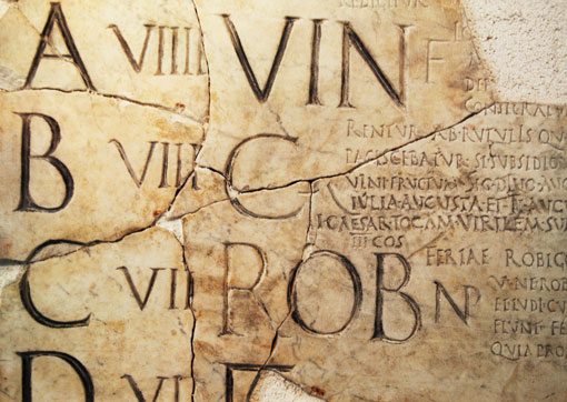
The modern Roman alphabet, which is the basis for type as we know it was developed somewhere around the year 300, according to “A Typographic Workbook: A Primer to History, Techniques and Artistry” by Kate Clair and Cynthia Busic-Snyder. Lettering, even though it was all done by hand or chisel, featured some of the same characteristics we see in modern type styles and fonts, such as detailed capitals (modern serifs) and script writing. Producing letters was considered an art form and specialized skill and many of the pen strokes used to create the first alphabets are the same as those used in popular fonts.
It would be hundreds of years, and with the development of printing presses, before sans serif fonts came to life. William Caslon IV developed the first printed type of this style in 1816, according to “A Typographic Workbook.” A font family bears the Caslon name, a family that included several type pioneers.
Technology is also a factor and helped contribute to the millions of fonts on the market today. With digital typesetting, almost anyone can develop and sell a font. But some of the most popular, as well known fonts bear the names of the fathers of modern type – John Baskerville, Giambattista Bodoni, Adrian Frutiger and Hermann Zapf, among many others.
A Lesson in Type Styles
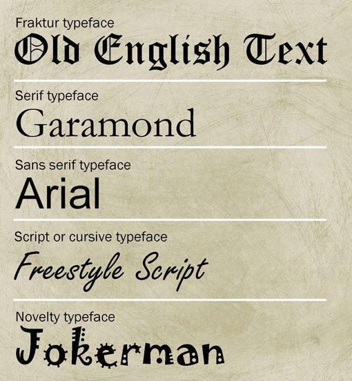
Of the thousands of font choices out there all fall into one of five basic typeface categories – Fraktur, serif (which contains several subcategories), sans serif, script or cursive and novelty, according to “Typography and Design for Newspapers,” by Rolf E. Rehe, who earned a Lifetime Achievement Award for his contributions to typography by the Society for News Design. All of the fonts in each of these categories share a set of characteristics that make them distinguishable. The way fonts are mixed within categories can set the tone for a project.
Fraktur type

Fraktur typefaces are also categorized as those with names containing “Old English” or “Black Letter.” These typefaces contain letters that were originally made using multiple strokes with pen and paper. Today, these typefaces are not widely used but are still often seen in the nameplates of newspapers such as the Detroit Free Press. Fraktur typefaces can be difficult to read in multiple lines of text or at smaller sizes. They are best used for short, large phrases.
Serifs
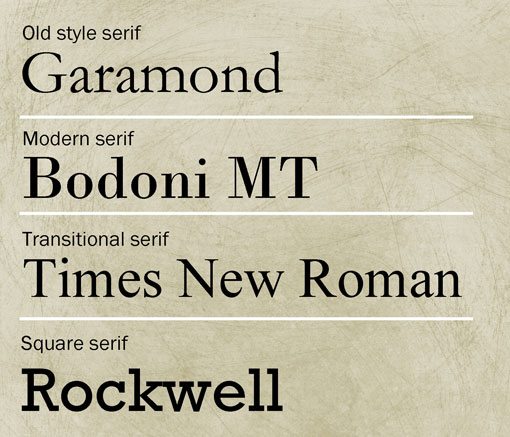
Serif fonts are some of the most commonly used typefaces in print publishing. Most books and newspapers use serif fonts as the primary body copy. There are four distinct types of serif fonts – old style, modern, transitional and square serif. Old style serifs are the least commonly used in text-heavy projects; the letters tend to be quite round and letters do not connect between strokes. Letters also have rather pointed serifs. Garamond is a popular example.
Modern serifs are used commonly in big type. The letters are distinguished by contrasting thick and thin strokes in letter elements. Fonts in the Bodoni family exemplify this style.
The transitional serif subcategory combines attributes of the old style and modern groups. Fonts have some contrast between thick and thin strokes and feature the more rounded shape with pointed serifs that are common with old style typefaces. Times New Roman is a common example of this type style.
Finally, square serifs have a uniform shape and stroke weight; fonts can be rounded or feature a tall, condensed shape. Each serif has a square edge that closes in 90-degree angles. Rockwell is a common square serif font.
Sans serifs
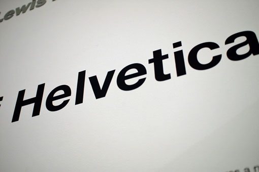
The independent film “Helvetica” brought one of the most popular sans serif fonts into the eye of the non-graphic design public in a major way as a winner at several film festivals in 2007. For the first time people outside the graphic design community were looking at and really talking about a font. This is an example of a sans serif typeface, which features uniform stroke width and weight in each letter, and no serifs. This typeface style is one of the most widely used in web design for body copy and is becoming more common in print publishing.
Scripts, Cursive and Novelty
Script or cursive and novelty font types all fall into the for-seldom-use category. The script or cursive styles are based on handwriting and feature lots of extras with each letter. These fonts also tend to have a very distinct left or right slant. Script type styles also allow for each letter to connect to others; cursive does not. Novelty fonts are all those that fall outside the traditional categories and sometimes feature cartoonish or artistic elements. All of these font styles are best used in projects without mass blocks of text.
Mix Fonts Successfully
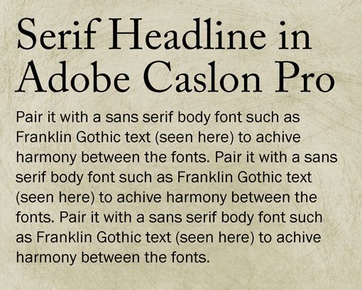
Mixing fonts can be an essential part of any project. Using just one font exclusively can work for some projects but much of your work likely requires emphasis that is best achieved through the use of varying type styles.
Start With the Body
Choose your main body font first and select other complementary typefaces. You don’t want to build an entire project around a headline. Determine the size of your primary font and whether you prefer serif or sans serif. Try to select one or two fonts that add punch but be sure to limit your palette.
Mixing Serifs
It is acceptable to mix serif and sans serif fonts and can actually give your project a sleeker feel. Using fonts that have very different styles and weights can put a great deal of emphasis on the less-used font. If you go with a serif for the body copy, add emphasis with sans serif headers or subheads. For smaller projects, such as a business card, experiment with using a novelty font for your name or company name and use a simple sans serif font for everything else. Douglas Bonneville, author of “The Big Book of Font Combinations” developed a chart featuring 19 font combinations, pairing a serif and sans serif styles. The chart includes common fonts and is a great starting point in developing a font palette for almost any project. Type designer Alessandro Segalini has a similar cheat sheet that goes one step further, and ranks fonts based on compatibility.
Be Cautious
Add pop without going overboard and be careful when using multiple fonts. Take a step back from your project and watch where the eye goes. Watch the curvature and slant of letters to ensure harmony between type styles. It can cause an unintentional chaos when you mix fonts that slant in different directions. Also take width into consideration; combine fonts with similar strokes, such as a palette of thin fonts with a headline style that uses a strong solid serif.
Watch Your X-Heights
When mixing fonts, opt for font families where the letters have similar x-heights, ascender and descender lengths and overall letter width. Ensuring similar letter attributes will help create harmony among the fonts and make it easier to use less complicated leading formulas and keeps allows different typefaces to sill work with your hyphenation and justification rules within certain set widths. The similar letter attributes also allow readers to move through copy without “noticing” a distinct font change.
Think About Scale
Size and scale can make or break your font choices. Serif and sans serif fonts work well at almost any size and can carry large blocks of text. Headers and headlines should be larger than body fonts, but be careful not to overpower the main copy. Color adds emphasis as well; adding just a pop of a bright or unusual color can make a font look larger than it is, while grays and muted tones can make fonts appear smaller.
Be Wary of Certain Combinations
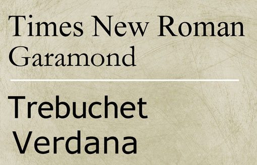
Avoid selecting similar fonts; using two typefaces that mirror each seldom works and can create visual imbalance. Note the combinations of Time New Roman paired with Garamond and Trebuchet and Verdana above. The slight differences between the fonts can be confusing to the eye and distract from your design. For slight variances, opt to use items such as bold, italics and underlines within a font family to achieve subtle differences.
Keep It Readable
Keep text readable. Avoid mixing fonts within the body copy or using too many fonts. When selecting a font palette, determine what each font should do and stick to those rules. Don’t replicate the font from your nameplate in the body copy; keep that font unique. Use the body font for only body copy and not for headlines and subheads. When working with web-based projects ensure that fonts are web-safe and will render properly using different Internet browsers.
Watch Those Specialty Fonts
Use specialty fonts sparingly. Gimmicks only work in small quantities. Fraktur, script and novelty type styles can get lost and become unreadable if used too small or for chunks of text. These font styles also work best when they stand alone or are serving as art objects.
Conclusion
Selecting a font palette for any project can be both challenging and rewarding. Remember to keep the basics in mind when choosing typefaces – serif and sans serif fonts work well for most applications and in a variety of sizes, other type styles should be used for specific and small bits of type only.
The key is for your print or web project to have pop and be easy to read and understand. Experiment with a variety of font options and listen to your instincts when making a final selection. Sometimes the simple choice is the best one. More is not always better when selecting a set of fonts.