This Week in Design: April 4, 2014
From a teen who made headlines about saving millions of dollars with a font to some of the most impressive design names of our generation, this week in design featured people who make an impact. Whether you like or agree with a theory sometimes does not mean as much as the simple idea that it gets people thinking about something new.
Every week, we plan to a look at major product releases and upgrades, tools and tricks and even some of the most popular things you are talking about on social media. And we’d love to hear what’s going on in your world as well. Have we missed anything? Drop me a line at [email protected].
Could Garamond Save Millions of Dollars?

There’s a hot topic trending on social media this week based on a project by a teenager. Could something as simple as a font change save the U.S. government millions of dollars?
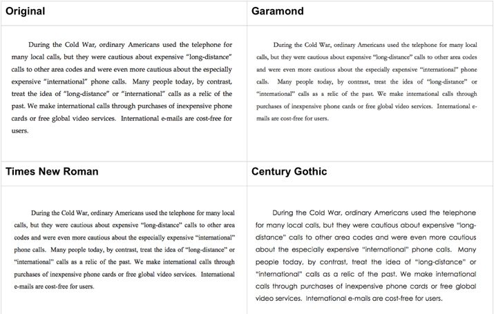
Suvir Mirchandani, 14, crunched numbers and type specs to conclude that the federal could save $167 million and state and local governments could save an additional $67 million by switching to Garamond for all printing. His study was recently published in the “Journal of Emerging Investigators,” a scientific journal for middle and high school students.
“The government could save almost $234 million simply by switching to that one font. That’s because the font is thinner, it’s lighter, it just simply uses less ink,” Mirchandani said in an interview with CNN.
Seems like a pretty cool concept, right? Typographers have come down on both sides of the issue. The teen has been praised for the idea and logic. Yes, by switching to a thinner, lighter typeface the government could save money on paper and ink.
But there are some concerns. Garamond is more efficient because it is smaller, making it somewhat harder to read. (The study did not adjust the typeface for an equal x-height.) The study is also based on the idea that the government prints everything on your standard office printer (which it does not). There is question as to what the actual amount the government actually spends is in relation to printing costs. And for any change such as this one, you could have to think about the cost to get users to make the switch.
There were some other concerns as well, some of them best laid out by type expert Thomas Phinney on his blog. His suggestion is to take the study a step further to ask the question: “what font and size combination could be used to maintain or increase legibility while saving money on printing, by reducing page count and/or ink/toner usage, with a font that is bundled with common apps (or free), and has all the required font styles?”
This really is a great theory and topic of conversation, and could be something that companies and government entities should look at when it comes to ways to saving money. Thanks Mirchandani for making the world a little more aware of what a typeface can do.
A Belated April Fool’s

Hopefully you weren’t the subject of a prank on Tuesday in honor of April Fool’s Day. And even if you were maybe you are ready to share a design giggle or two. Youth Designer put together a fun collection of graphics that are sure to make you laugh.
“15 Hilarious Graphics to Brighten Your April Fools” is a clever mix of subtle type, design theories and image use that maybe only designers will understand. (Someone else in my office looked over my shoulder as the image above was on the screen as asked what it meant as I chuckled.)
Go peruse through the full collection. It is sure to bring a smile to your day.
10 Designers Who Have Changed the World
If you have not read “10 Designers Who Have Changed the Face of Business, Music and Art” on the Creative Market blog this week you are missing out. The post features 10 creative people who have changed the world through design.
From icon designers to product design to message delivery, it’s neat to think about how these simple things have changed how we work and live. Here’s the list of names. (But you will have to visit Creative Market to get a full description of each creative icon.)
- Paul Rand
- Markus Diebel and Joe Tan
- Scott Hanson
- Milton Glaser
- Storm Thorgeson
- Yves Behar
- Tom Crabtree
- Bryan Chesky and Joe Gebbia
- Evan Sharp
- Charles Adler
Create a Cool Website Counter

Looking to learn something new in just a few minutes? Tuts+ has a great (and quick) tutorial that shows you how to “Impress Your Visitors with a Web 2.0 Hit Counter.” The tutorial is easy to follow and helps you create something that is totally usable for your website. (Everyone loves a counter, right?)
April Fool’s, you say? It’s another good one…
Fun with Branding

How much does branding matter? Can you identify a candy bar from an unbranded package? That’s the concept of this fun little game, “The Candy Quiz.”
The design of the game is fun and simple and works by recreating common candy wrappers in a flat style and removing brand identifiers. Each “wrapper” is based on the color and type schemes of the actual candy bar. The fun game shows just how important these design concepts are to creating effective brand visuals.
I scored 12 out of 40. (Maybe I need to eat more candy!) How did you do on the quiz? Share your score with us in the comments.