Tiny Text: 6 Ways to Use It Effectively in Web Design
One of the biggest trends in web design right now is super small. “Tiny” text elements have become a popular idea, but it’s a design trend that has spurred some debate.
There’s no doubt that small text sizes can cause some readability concerns. But when done well, a small block of tiny text can actually help create a point of visual emphasis and draw users into certain parts of the design.
Join us as we take a look at the tiny text trend, with examples to provide some design inspiration.
1. To Create Hierarchy and Organization
While oversized text has been the dominant option for home pages and headers for a while, there’s a shift to provide more information on the first screen of desktop monitors. (One reason for this could be that screen sizes keep increasing, giving designers more canvas to work with.)
That’s where “tiny” text comes in. Using varying sizes and proportionate scale for typography creates a distinct visual flow, commonly from large lettering to small. By using one level of tiny text – typically smaller than common body type sizes of 14 to 16 points – you create an additional point for the user to look. Tiny text, particularly when used with other text sizes, can draw the user in because it is different.
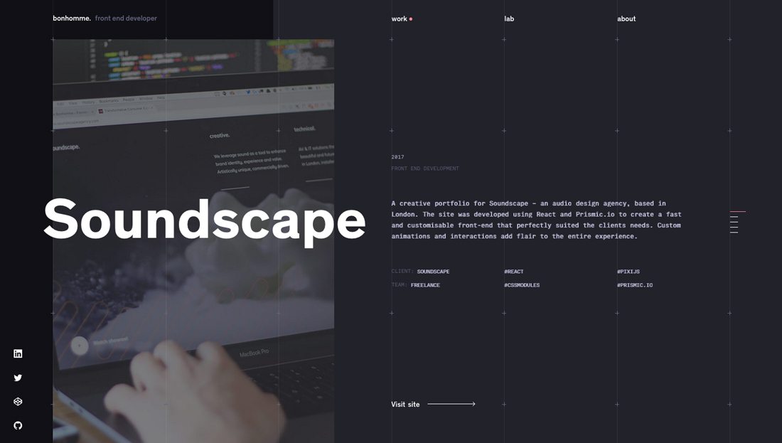
Maxime Bonhomme uses tiny text in a portfolio website design. The smallest text elements provide key details about projects, while larger type gives a description of the work. Note how the tiny text elements work in part because of the amount of space and contract surrounding each copy block.
2. To Make You Look
Sometimes tiny text is by design there to make you look or take a second glance.
Because it is often unexpected or different from what users see on so many other websites, the design element captivates you.
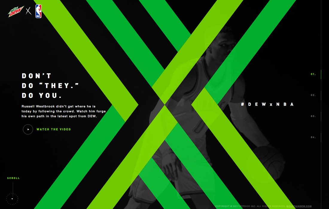
Mountain Dew, a brand that’s not afraid to be edgy, uses a super small headline treatment. It does make you look. And the headline perfectly fits into the apex of the X to create a distinct eye movement pattern from the action moving across the screen featuring NBA player video to the headline to the brand identifier. Even the call to action is tiny, but it does not feel uncomfortable to the user because it feels intentional.
3. To Create Engaging Navigation
While many websites have stripped navigation off homepages altogether in favor of hamburger/hidden style menu items, using tiny text can be a way to get some elements back on the screen without feeling intrusive. It’s one of those ebbs and flows in design patterns, moving from one extreme to the next. (Will oversized navigation be next?)
Using tiny text in navigation can be tricky. It needs to be big enough to read and click with ease. It’s important to use a simple typeface that’s super readable as well, because tiny text can be a little difficult for the eyes.
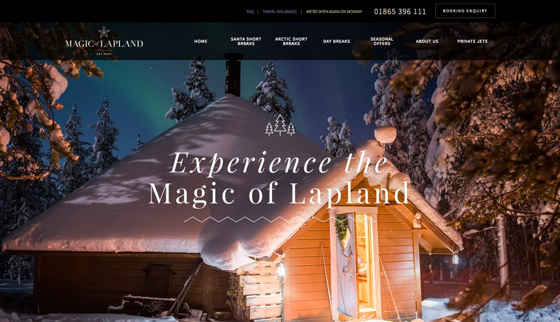
Magic of Lapland found a good middle ground with tiny text elements in the main menu bar. There’s plenty of spacing around each element – some even using double decks – and the simple sans serif in white on a dark background contributes to readability. There’s also a second level of “less important” tiny text above the main navigation for travelers.
4. To Showcase Space
Tiny text works most effectively when the canvas is large. The contrast between a small element and vast space can be stunning. Large blocks of tiny text can be jarring and difficult to read, so keep the text element concise.
Tint text should also be used with a distinct purpose in mind. Before jumping into this design trend ask yourself: Why am I using tiny text here? What does it contribute to the meaning of my website design?
If you don’t have solid answers to those questions – “because I want to” does not count – then you should consider something else.
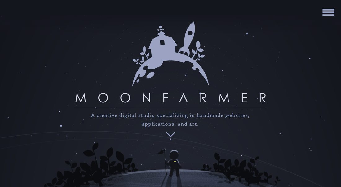
Moonfarmer does a beautiful job showcasing space with tiny text. The design uses two levels of typography and plenty of wide open canvas to establish a mood and introduce users to the content before they being to click or scroll. Tiny text is just one of the many details in the design that draws you in to just stop and look. And with great contrast between elements, there’s zero concern about readability.
The design does one more thing that’s important to keep in mind: You don’t have to use tiny text everywhere. Treat it as a special art element. Moonfarmer uses tiny text on the homepage and then bumps up the same typeface to a more common size throughout the rest of the design.
5. When the Text Isn’t The Most Important Element
Sometimes the most important element on the screen isn’t lettering. Text comes secondary to a visual element.
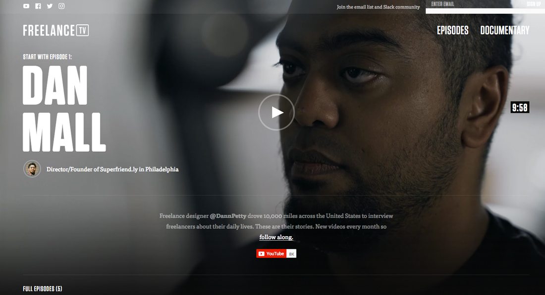
Freelance TV is a perfect example of how to use small text to help users while allowing another element to serve as the dominant part of the design. For this project, the video is the important element. Tiny text serves as an element to provide additional information and encourage signups with a static text block that appears regardless of the episode featured on the homepage.
6. To Create a Visual Element
Text elements primarily exist to read. That makes perfect, logical sense.
But sometimes text elements work to serve as part of a visual element, and whether they get read or not is of much less importance. (This requires planning and plenty of design conversations, so don’t tackle this concept on a whim.)
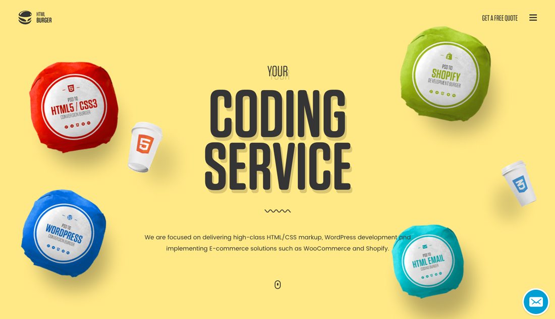
HTML Burger uses several layers of small and tiny text. Small text is used as a descriptor with an oversized headline treatment. Tiny text is used within each of the “burger” wrappers to create cool visual elements with a little more information about what the company does. It’s a design outline that you don’t see very much and in this case, it is impactful. (But this technique is rather difficult to pull off; proceed with caution.)
Conclusion
To go tiny or not? It can be a tough decision. While the use of small text is debatable, there are appropriate uses for tiny typography. To ensure that tiny text works in your design, give it plenty of space, use a typeface that’s highly readable and use other design cues to help get users to the words.
Finally, if you plan to experiment with tiny text, use it sparingly. This isn’t a technique that will help your cram more into a design. It works most effectively with small text blocks in purposeful placements.
