Tips for Using Contrast to Enhance Readability
Good design is readable design. Without a clear message, displayed in an easy-to-digest way, it’s easy to lose the meaning of any piece of design work. That’s why it’s so crucial that any design must be easy to read.
Designing for readability is a lesson in typography, but also in contrast. Contrast is the key to enhancing readability, and helping create a flow through the text in a logical manner so that users understand exactly what you want to say.
Color Contrast
Lettering must stand out from the canvas. It needs to have a presence that draws the eye.
There are plenty of ways to create color contrast, but the most popular is black text on a white or light canvas. And it’s popular because it works. (The opposite combination works equally well.)
When placing text, it is vital to think about how letters will appear over the background. Are they easy to see? This consideration is of particular importance when working with letters on top of images or video, where colors in the background might be positioned differently based on screen size or motion in the content.
One way designers overcome this issue is with a color overlay on images or video that create a bit of readability insurance. Whether it is a dark transparency or bright hue, an overlay can ensure that text appears as intended regardless of what is happening in the background.
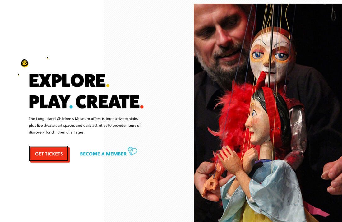
The other option – and one that’s gaining traction – is to remove text from images or videos and pair them side by side. This provides room for both elements without sacrificing the content of either.
Contrasting Typeface Styles
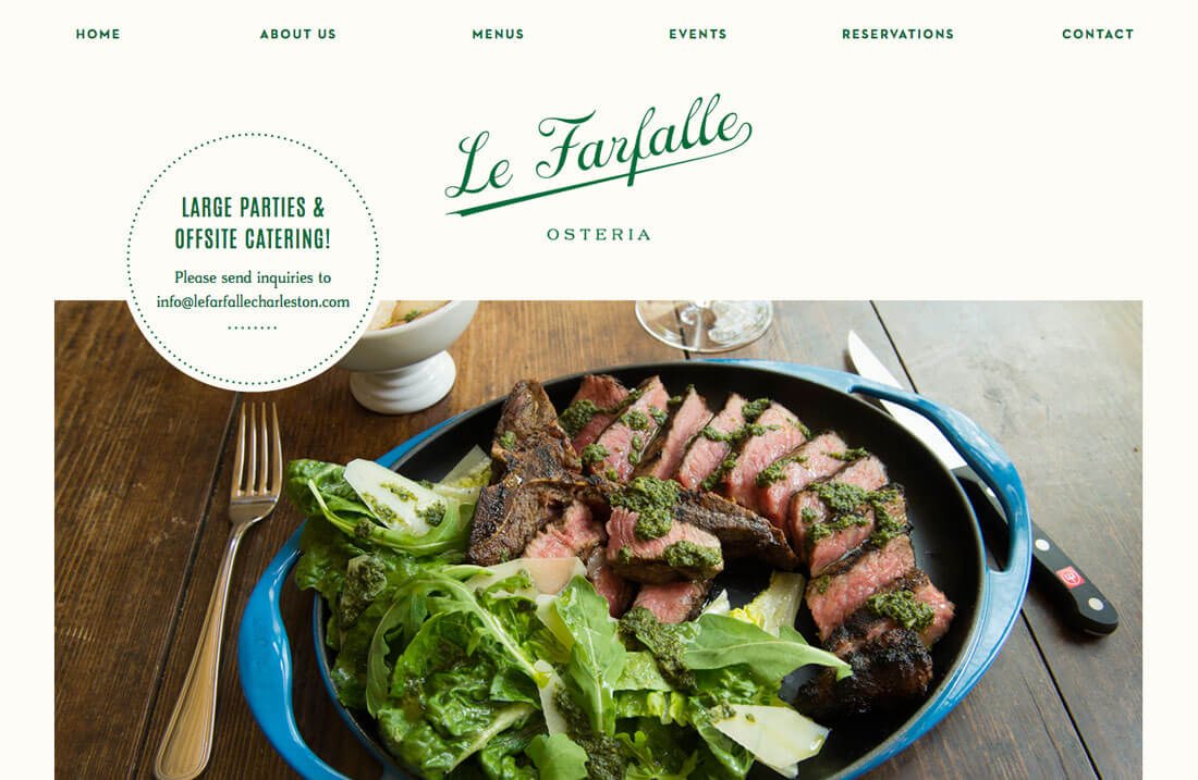
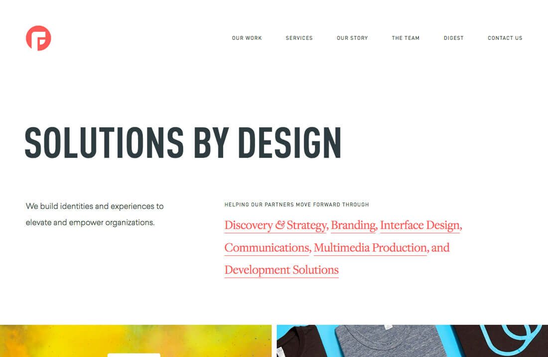
Variances in typefaces or styles can draw the eye to lettering immediately. Visual interest increases with typefaces that are quite different, such as the script and serif paired in the main logo treatment for Le Farfalle.
Each typeface is interesting on its own, but the difference between the two creates quite the composition.
Pairing typefaces in this way can be a bit tricky because some pairs of distinctly different styles can leave users feeling jarred. Opt for typefaces with some similarities that aren’t as obvious to the common user, such as common x-heights, letter shapes (check the lowercase “o” to see if styles are rounded or more oval) or slants. By keeping a similar feel in these areas, styles can be mixed and matched in a way that creates plenty of contrast without interrupting the flow of the design.
Size Variability
One way to wow users with contrast is with oversized or undersized lettering.
Oversized typography can be a lot of fun to design and it is a striking way to entice users to keep moving through a website. While undersized lettering can be equally effective, it is a lot more difficult to use.
Pair oversized options with text blocks in a more traditional size to highlight the variance between text sizes. It will help provide a focal point in the design and make the large words impossible to avoid. Continue the theme beyond display lettering and consider subheaders that are slightly bigger than normal as well so that the same oversized, in-your-face concept follows users throughout the design.
Consider Alignments
Many people forget about alignment when it comes readability.
There are two schools of thought:
- Use contrasting alignments for display and headers versus text.
- Use the same alignment for everything.
Both ideas are right in their own ways. Think about text alignment in relationship to the rest of the design. Does alignment provide enough contrast to pop out of the background. This can include everything from spacing between the edge of the canvas and text to placement in relationship to other elements.
When it comes to alignment, the best way to think about it might be to imagine a button. How is the text aligned within the button? Most designers would opt for center, but that doesn’t mean the rest of the website will include centered text. The alignment is dictated by the element itself. Now scale that up in thinking about the whole design.
Text Flow
Text flow becomes more important with the more text included in a design. If text elements don’t flow seamlessly in a hierarchical manner, users can get lost or miss information by reading in an illogical manner.
Key considerations when it comes to text flow include:
- Size of text blocks
- Bullets and lists
- Line heights and lengths
- Bold or italics
- Color
Each of these text attributes helps to differentiate key words, information and phrases from the rest. They provide visual points of entry for scanning text so that the most important information jumps out for the user.
Using varying styles within long blocks of text – this is particularly important for long-form content or blogs – can decrease reader fatigue. If the user tires from reading the copy because it is cumbersome to look at and digest, they won’t consume the content. Break it up into parts that make it easier to read.
Keep It Consistent
The final key to readability is consistency. Whatever you do on the homepage or for the header or in the body copy to create contrast, stick with it.
Using the same colors, or styles or type treatments throughout will show users that they aren’t lost in the design. No matter where the navigation takes them, it will still look and feel like your website.
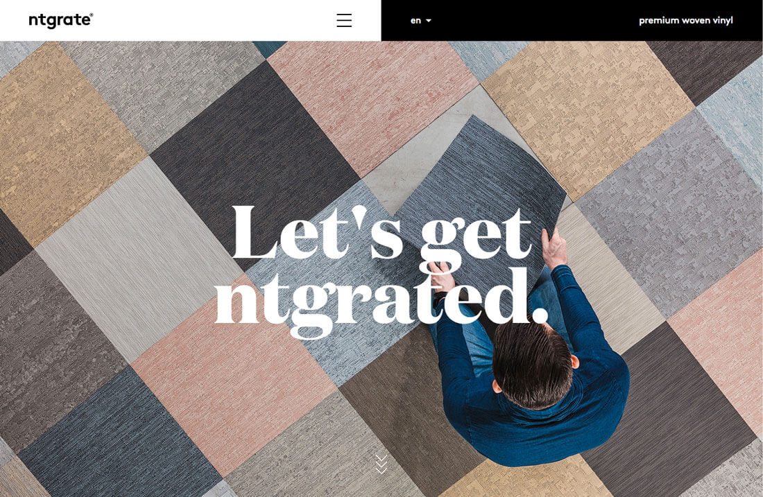
Ntgrate does a god job of this by establishing a black and white background and text block combination from the start. The yin and yang color combination is featured above the hero image in the header and subsequent text boxes through the site feature the same text and color pattern.
Conclusion
Contrast is one of the tools that helps establish visual interest in any design project. It’s also important when it comes to creating readable typography with hierarchy.
High contrast is the most readable option. Muted colors or styles that are too similar can almost always present issues in terms of readability. Make it easy for users to understand what you want to say with a highly readable design that provides plenty of contrast between text and other elements.