20 Must-Know Typography Terms for Beginners
No designer wants to look like a rookie. Crafting projects with beautiful typography is one way to look like a pro every time.
Today, we’re going to delve into the language of typography. It’s a great guide for beginners and a refresher crash course for more seasoned designers. Either way, understanding the language of beautiful typography – from pairing fonts to communicating with the team – is a vital design concept.
And rather than packing this article with descriptions of every term … we’ve included beautiful examples of typography to inspire you.
1. Readability
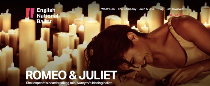
You will see the term “readability” in Design Shack articles rather frequently. Without readability, typography almost has no purpose. Lettering is designed to be read (99 percent of the time anyway).
Readable type has a few defined characteristics:
- It is different enough from the background to see with ease. (There is plenty of contrast.)
- The spacing between letters and words is appropriate, making type easy to understand at a glance.
- The words are big enough to see, but not so big that lettering becomes cumbersome and causes eyestrain.
- There’s plenty of white space to set off lettering.
- The language is clear, edited and free of spelling or grammatical errors.
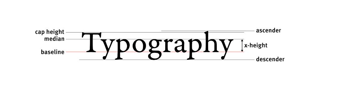
2. X-Height
The x-height is a measure of a typeface based on the size of a lowercase x of any specific typeface. It helps set the tone and style for the rest of the type design, including the size of ascenders and descenders. The cap height is a similar measure that accounts for the height of capitals; most of the time all capitals letters will have the same height in a single typeface. The cap height determines the point size of a typeface.
3. Point Size
The point size is that number you assign to a type value in design software. Commonly, you might hear that website designers like to set body text at 16 points. Technically speaking, one point is equal to 1/72 of an inch or 0.75 millimeters vertically. (For print designers, one pica is equivalent to 12 points.)
4. Baseline
The baseline is an imaginary line where letters of a typeface rest, excluding descenders. It’s essential the bottom row. The baseline can be used to measure vertical distances and helps designers make spacing decisions.
5. Set Width
The set width is how wide letters in a typeface are. Whereas the x-height is a vertical measure, set width is a horizontal measure. Aside from monospaced typefaces, the set width of each letter can vary within a typeface, but they should have a harmonious scale that’s proportionate. The width of typefaces can be tight or wide. The most readable options are often somewhere in the middle.
6. Ascender and Descender
The ascender is any part of a letterform that extends above the x-height. A descender is anything that falls below the x-height.
7. Kerning and Tracking
Kerning and racking are often confused because both refer to the amount of spacing around letters. Kerning is the space between a pair of letters. Tracking is the space between all the letters in a group, such as a paragraph. Kerning is most commonly used when working with display type so that odd letter pairs – think AV – don’t have unusual or jarring gaps that hinder readability.
8. Leading or Line Spacing
Leading is the term most used by print designers, while digital designers prefer line spacing. Both terms refer to the space from baseline to baseline. A common measure for line spacing is 1.5 times the point size.
9. Character
A single letter, number or symbol in a font is called a character. Character sets can be somewhat limited in the case of a typeface that only incudes capital letters, for example. On the other hand, character sets can be expansive with plenty of alternate characters, glyphs and symbols.
10. Serif and Sans Serif
These are terms that most everyone probably understands – but can’t be left out of a list such as this one. Serifs are letters with little lines, strokes or caps on letterforms. Sans serifs lack the additional adornment.
11. Stroke
Any element that forms part of a character is referred to as a stroke. It can be a straight or curved line and strokes within a typeface can have a uniform or varying weights. Strokes can be thin or thick and are often noted in the name, such as Helvetica Light, Helvetica Regular or Helvetica Bold.
12. Bowl or Counter
A bowl is the space inside a letter that’s trapped, such as the hole inside an “o.” A bowl can be round or oval in shape. The counter is a partially closed bowl, such as in the letter “e.”
13. Swash or Tail
A swash is any decorative element that extends from a letterform. A tail is a swash that specifically extends below the normal range of the character set. Swashes and tails are often found with alternate characters.
14. Ligature
A ligature occurs when two letters join in some way to create a new glyph, such as “fi” in certain combinations. Some typefaces include special ligatures; designers can also force ligatures with kerning.
15. Terminal

Any stroke that does not end with a serif is referred to as a terminal.
16. Fill (Color)
While most letters are thought of as having a solid fill – often black or white by default – the fill refers to anything within the stroke of letterforms. This includes color, texture or shading.
17. Line Length
The line length refers to the number of characters in a single line of text in a single column. For most websites, the ideal line length is somewhere between 45 and 75 characters and about half that for mobile design. Line length is a great contributor to overall readability.
18. Widows and Orphans
Widows and orphans are words left behind on lines alone in blocks of text. Both are the bane of print designers, but are more commonly accepted in digital design. (You can thank less precise responsive frameworks for this.) An orphan is a single word or short line at the beginning of a column or page; a widow is a single word or short line at the end of a column or page.
19. Alignment

Left, right, center, ragged, justified … these are all terms that relate to the alignment of text horizontally from the left margin (in languages where you read from left to right). For large blocks of copy the preferred alignment is left, smaller text blocks are accepted right and centered. Justification – meaning all type goes from edge to edge of the column – is often a matter of preference, but can lead to some readability concerns. Ragged text means that the edges opposite of the left (or right) margin are not stretched to the edge.
20. Family
A type family is a set of characters that are variations of one style of type by a designer. This includes everything from italics and bold to different weights and alternates. (Type families can also include both serifs and sans serifs.) Premium type families often have multiple versions in the set, whereas freebie typefaces often contain just a single type style. The benefit to a type family is that you know all the typefaces will work harmoniously.
Conclusion
Do you love typography? Ellen Lupton’s “Thinking with Type” is the authority of everything typography. The book is a classic and can greatly expand your thinking on the subject.
Beautiful typography is a lot more than just picking a nifty typeface. You have to match lettering to the rest of the design, messaging and tone for absolute success. It can take time and practice to really master the at of typography. So, keep playing with typefaces and experimenting!