What Does That Say? How Typefaces Add Meaning to the Design
Can something as simple as a typeface change the meaning of words and an entire design. Of course! A typeface can add a new level of emphasis or meaning to your message.
It can help you connect with users, establish brand, and set the tone for your entire project. The wrong typeface can leave a design feeling flat, disjointed or even give users the wrong impression about your brand. Now let’s take that knowledge and add a little practical application.
Match Mood and Message
This might sound a little crazy, but here it is: Every typeface has a mood. And just like with your mood, it can be subtlety different based on the surroundings.
This mood helps establish context for a project. It determines how people will feel and think about the content. It creates a connection between what you do, who you are and how people respond to you. (It’s a lot of pressure for lettering, right?)
Creating right connection starts with understanding what you want a project to convey and understanding a little about the roots of different type styles.
Compare Messages
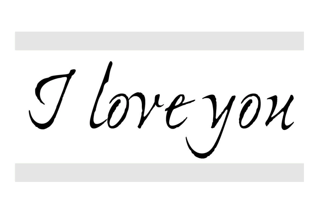
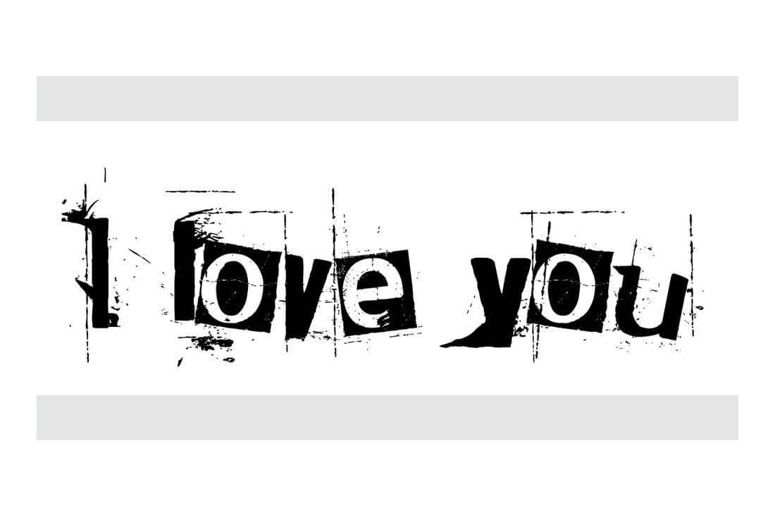
Did you mean to say:
Or were you trying to say:
The only difference here is the typeface. See how different the message is?
Typography Mood Primer
There’s no exact science to matching typefaces to moods. In fact, a lot of it is intuitive and you’ll have to look at the words and the lettering together to see what they seem to say to you. (If you don’t believe this, just go back to the previous example.)
There are some mood pairing guidelines to start with for different typography styles.
- Serif: Timelessness, formality
- Modern serif: Glamour, high fashion
- Slab serif: Importance, attention
- Sans serif: Neutral, easy
- Ultra thin or condensed: Authoritative, busy
- Italic (serif or sans serif): Motion, distinction
- Black or bold (serif or sans serif): Importance, stop
- Script: Elegance, personal
- Novelty: Casual, lighthearted
- Geometric: Retro, childlike
- Monospaced: Code-based, techy
- Bubble or rounded: Friendly, jovial
- Vintage: Trendy, cool
- Grunge: Rough, mysterious
Avoid Cliches
Now here’s the hard part: Don’t get trapped in using a cliché typeface because of a common association or because you aren’t sure what to do. You can find lists all over the internet that tell you what typeface to use for every different project type. You will not get that here.
You want to match a typeface to the content in a way that meshes. It’s a squishy art. But you’ll know the match is right when you see it.
You might want to mix a serif style with more funky content or use a script in a more masculine manner. As with any typeface pairing, select one typeface for display and big words and pick something complementary for other text. This pairing might be more traditional with a serif and sans serif or more on-trend with a vintage and modern serif combination.
Consider the Surroundings
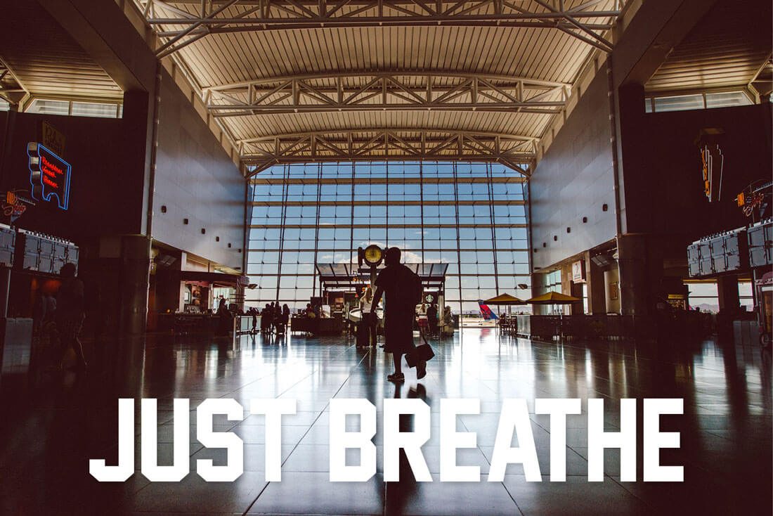
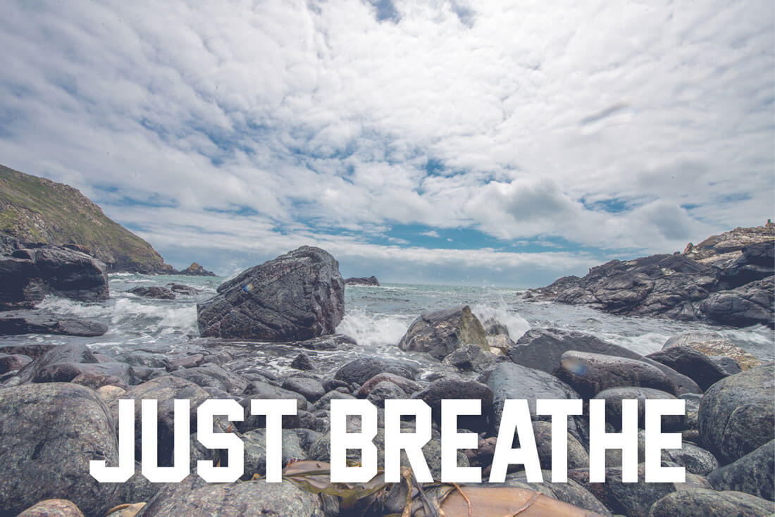
An important part of thinking about how a typeface makes you feel is what other elements are around it. This can be anything from images to color to other typefaces. Different combinations can leave the user feeling very different things.
Think about something like a simple sans serif. Often these typefaces are rather neutral and will take on the meaning of their surroundings. Look at the two images above, for example. Do you feel differently about each one? The typeface is the same in each image, but the takeaways are quite different. In the airport scene, you might feel rushed and worried, but with the beach rocks, the mood is calming.
How Does Your Audience Feel?
There’s also an element you can’t control when it comes to typography and mood. That’s how your audience feels about your content and your typeface options.
Let’s use the often-made-fun-of Comic Sans as an example. Most designers would not touch it. They’d smirk and laugh if one of their peers created a project with it. On the other hand, Comic Sans is a popular typeface. You’ll find it everywhere from church bulletins to amateur newsletters to simple signage.
Where you might think there’s a real design issue here, there is a group of people that don’t have the same problem. And that can happen with any typeface.
Users will come at a design from lots of different perspectives. Consider your audience ahead of time and try to predict what experiences and feelings they will bring to the design. How will they feel about your typography choices? Can you make decisions that will fall more in line with what they might want or expect from the project?
While you won’t find a perfect solution every time, considering how your audience might feel is a practical consideration.
5 Typefaces No Respectable Designer Will Touch
Choosing – or not choosing – typefaces should be fun. We’ve all had that eye roll moment where a perfectly good design was ruined by a silly or just outright over-used and misused typeface. So just for fun, here are five typefaces that we know you wouldn’t get caught using:
- Papyrus: This is a hard fit for any design, and comes with serious readability concerns.
- Jokerman: Any version of a typeface that has polka dots, spikes and flourishes is downright ridiculous.
- Times New Roman: The default typeface of word processors and 10th grade English papers. It’s OK as a typeface but might infer a hint of laziness.
- Impact: If you want to yell at users — “This is so important you must read it now!” – then go for it. (This was a perfectly great typeface … until memes ruined it.)
- Comic Sans: Enough said.
Conclusion
Your mood, the mood of your audience and the mood of typography all combine to create an overall feeling for a project. While it’s a lot more than just type, the way characters look are important.
Take that into consideration when planning projects and work to establish a mood for your audience that works with the design and communicates text in a clear, readable way using appropriate typography. And if you stumble along the way – don’t worry, it happens – learn from those mistakes and rethink the process with the next project.
Stock images courtesy of Stokpic.