What Is Hierarchy in Typography?
Typography is not just about choosing attractive fonts; it’s about effectively organizing content to guide the reader through a text in a meaningful way. Hierarchy in typography is a critical tool that helps designers achieve this goal.
It shapes the way information is perceived and understood, ensuring that the most important elements catch the eye first. It’s an important concept that all types of designers should know about.
In this comprehensive guide, we explore the concept of hierarchy in typography, its fundamental components, practical applications, and tips for mastering typographic design to enhance communication and engagement. Let’s get started.
What is Hierarchy in Typography?
Hierarchy in typography refers to the arrangement and presentation of textual elements in a way that clearly indicates the order of importance.
It involves differentiating sections of text using various typographic techniques to guide the reader’s attention to where it is most needed. Effective hierarchy makes documents easier to scan, understand, and navigate, enhancing both the usability and aesthetics of the design.
Every medium that involves text needs some form of typographic hierarchy. From websites and mobile apps to newspapers and corporate reports, effective use of hierarchy can make or break the communication process.
In digital design, consider the additional layer of interactivity; clickable elements, like buttons and links, should be easily identifiable, often through the use of color and size to signify actionability.
The Importance of Typographic Hierarchy
Typographic hierarchy is essential for several reasons:
- Enhances readability: It organizes text so that readers can effortlessly move from one element to another based on their relevance and importance.
- Improves user experience: A well-structured document or webpage can significantly enhance the user experience by making information easily accessible.
- Communicates effectively: By establishing a clear hierarchy, designers can communicate key messages more effectively, ensuring that the most critical information stands out.
- Creates visual interest: Beyond functionality, hierarchy adds aesthetic value to a design, making layouts more dynamic and engaging.
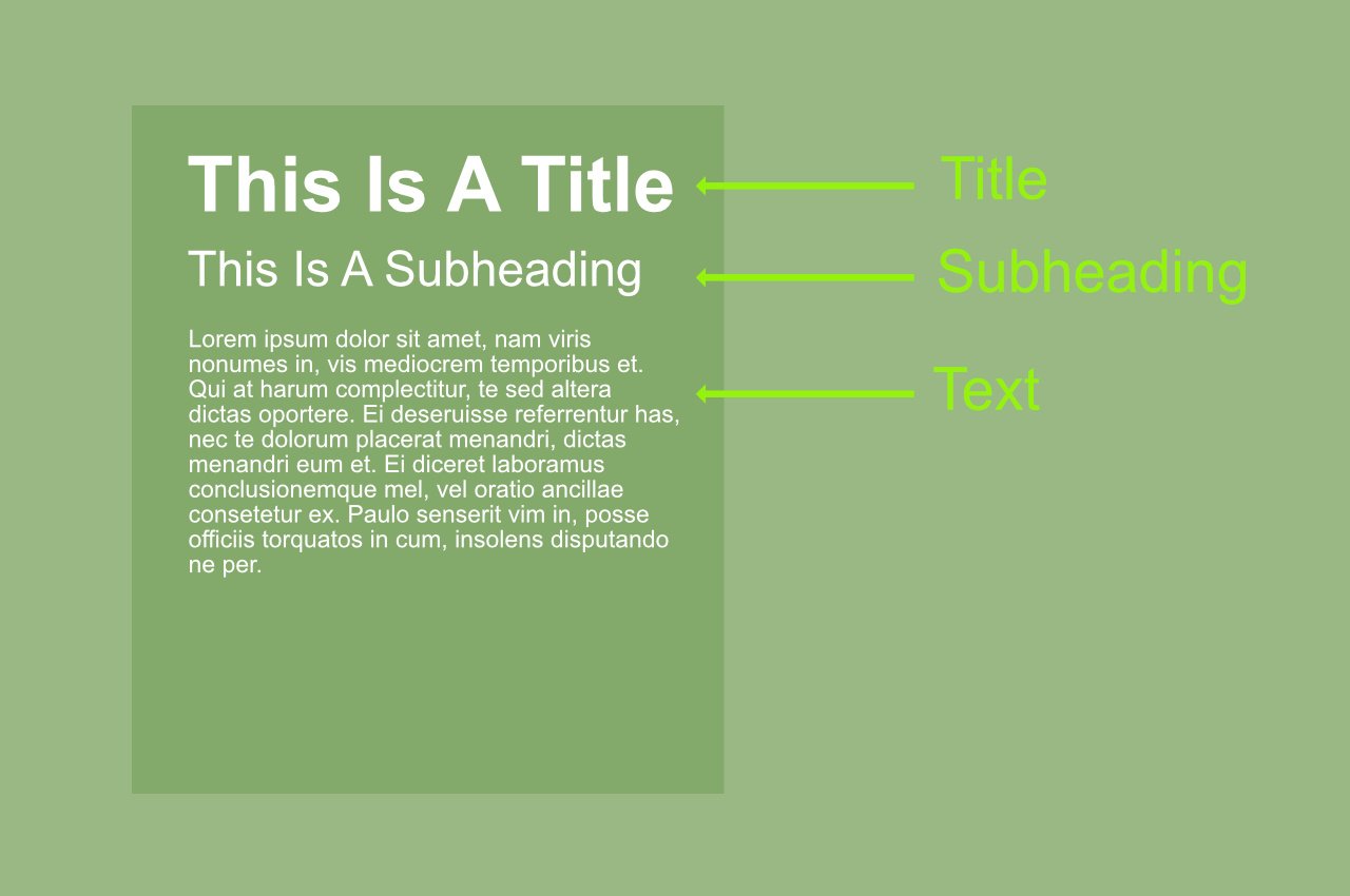
Elements of Typographic Hierarchy

(Credit: Lillian Pham)
Creating a visual hierarchy involves manipulating various typographic elements to create levels of importance. These elements include:
Size
Larger text is often perceived as more important, making size one of the most straightforward tools for creating hierarchy. Headlines, typically the largest text on the page, immediately draw attention.
Weight
The weight of a font, from light to bold, can significantly impact its noticeability. Bolder fonts are usually used to highlight important information.
Color
Color can attract attention and trigger emotional responses. Using contrasting colors or more saturated shades can help important information stand out.
Typeface
Varying typefaces within a design can help differentiate between types of content. Selecting distinctive fonts for headings, subheadings, and body text can clarify the structure of information.
Spacing
Adjusting the spacing around text, including margins, line spacing (leading), and letter spacing (kerning and tracking), can affect how text is read and perceived in terms of its importance.
Position
Where text is placed on a page can affect its perceived importance. Typically, information placed at the top or in prominent positions is considered most important.
Developing Effective Typographic Hierarchy
(Credit: Honk Creative)
The process of developing a typographic hierarchy involves thoughtful planning and understanding of content structure. Here are key steps to consider:
Analyze the Content
Start by understanding the content at hand. Identify the key messages, supporting information, and any secondary content. This analysis will guide how you apply typographic techniques to differentiate sections.
Define Levels of Importance
Establish clear levels of importance among the textual elements. Generally, you’ll need primary, secondary, and tertiary levels, corresponding to headings, subheadings, and body text.
Apply Typographic Techniques
Utilize the elements of hierarchy—size, weight, color, typeface, spacing, and position—to visually distinguish between levels of text. Consistency in these elements across similar levels of text is crucial for maintaining clarity.
Tips for Mastering Hierarchy in Typography
1. Keep It Simple
Start with the most basic elements—size, weight, and spacing—before introducing more complex elements like color and typeface variations. Overcomplicating the design with too many focal points can confuse the reader and dilute the primary message.
2. Be Consistent
Maintain consistency in how typographic elements are used throughout your design. Consistent use of type treatments helps create a coherent visual language that makes navigation intuitive for the reader.
3. Test Your Designs
Always test your typographic hierarchy with actual users to see how effectively the text guides them through the content. User testing can provide invaluable insights and help you adjust your designs to improve clarity and impact.
4. Consider Accessibility
Design with accessibility in mind to ensure that your use of hierarchy helps users with visual impairments or reading difficulties navigate the text easily. Use sufficient contrast, scalable text sizes, and clear font choices to enhance readability.
5. Learn from Others
Analyze and learn from successful designs to understand how effective hierarchy is employed. Magazines, websites, and books can offer inspiration and practical examples of how typographic hierarchy can be innovatively applied.
6. Experiment
While understanding and following typographic rules is crucial, experimenting with unconventional layouts and typographic treatments can yield creative and effective solutions. Sometimes, breaking rules in a thoughtful way can set your work apart.
7. Use Visual Anchors
Employ visual anchors such as boxes, lines, or images to complement the typographic hierarchy. These elements can help define a reading path and emphasize important parts of the content, reinforcing the hierarchy.
8. Highlight Key Information
Make key information stand out by using distinct colors or bold typefaces. This is particularly effective for dates, names, or any critical data that should catch the reader’s eye immediately.
9. Adjust Hierarchy for Different Media
Consider how your typographic hierarchy will translate across different media and devices. A hierarchy that works on a desktop may need adjustment for mobile devices to ensure legibility and usability.
10. Balance Negative Space
Use negative space wisely to enhance the readability of your text and to prevent visual overload. Well-placed whitespace can make your content more approachable and easier to digest.
11. Employ Typographic Pairing
Master the art of font pairing to further define hierarchy. Combining complementary typefaces can help delineate different text elements clearly and add a layer of sophistication to your design.
12. Dynamic Text Sizing
Implement dynamic text sizing, especially in digital contexts, to ensure that hierarchy is maintained regardless of screen size or user preferences. Responsive typography adapts to provide the best user experience possible.
Conclusion
Mastering the art of hierarchy in typography is not merely about making text legible; it’s about organizing content in a way that both informs and engages. As a designer, your goal should be to craft experiences that guide the reader naturally through the narrative, using every tool at your disposal to enhance communication.
With practice, attention to detail, and a deep understanding of typographic principles, anyone can transform mundane text into a compelling, easy-to-navigate visual hierarchy.