What’s the Deal With Em and Rem?
With all the talk about designing for responsive websites, two little words keep cropping up – em and rem. But what are they?
Em and rem, along with pixels, are units and methods to measure and resize type. Em and rem are relative, rather than static, units and are being used more and more for responsive web design schemes. Let’s dive into this concept today and explain things a little more clearly!
Where Did Ems Come From?
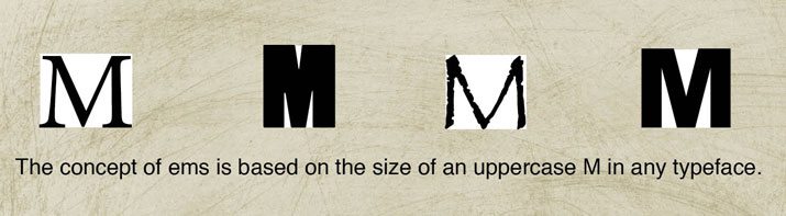
Ironically enough the term “em” originates with print design. An em is the size of an uppercase M in any typeface, making the size relative to the font.
Many print designers are familiar with em (and their counterpart en) when it comes to spacing. An em space or en space – which is the size of an uppercase N – is often used to make words and spaces look better in big type. The same is true of em and en dashes – or the long and short dash.
This theory of proportionate spacing is the same for web design. When it comes to digital layouts, em is defined in a similar but more precise way: An em is the size of type as computed relative to the type size of the parent element.
Rem is an evolution of em. These “root ems” function very much like em with one exception: rem is the size of type as computed relative to the type size of the top level “html” element rather than a parent element.
Understanding Em

Em essentially works like percentage values, making a letter the same “size” despite typeface or size. Because of this sliding scale nature, em are called relative units. (Other relative units include percent and pixel, as compared to absolute units such as picas, points, and inches.) This approach is a popular solution for measuring type but doesn’t work as well for other measures such as spaces or margins.
The advantage of using em as a basis for type sizing is that by changing just the parent size, you can change all of the type sizes simultaneously. This option also helps all users get a similar experience when viewing a site – whether using different browsers online or using different devices – because some older browsers will not resize text set in pixels. The result?
No matter how you view the type on a site, it looks as intended — zoomed in or out or on different devices.
The challenge to using em is that you must know (and remember) the parent size because it is the basis for how the rest of the type will behave.
Here’s an example of how em might break down with a 14px parent font size:
- 1 em = 14 pixels: This is the parent type, based on a common type size for main body copy
- .5 em = 7 pixels
- 1.5 em = 21 pixels
- 2 em = 28 pixels
What’s the Difference With rem?
Rem ultimately function in the same way, but there is no defined parent font size. The root html element defines the relationship with the rem, meaning that you would define a font size on the html element and define rem units as percentages of that. The font size will always be relative to this root html size, rather than adjusting as you nest multiple containers with differing sizes.
After you get past the math, using rem can be a much more straightforward way to maintain proper and even type sizing.
When first introduced, there was some resistance to rem because they were not universally supported by browsers. This is no longer a concern; rem works on all the major, modern platforms.
How Do Pixels Fit In?
But what about pixels – the common unit everyone seems to understand? Pixels were the original unit of type measure for digital design and are still used. But their use is become less common when it comes to type because designers want the added usability experience associated with em and rem.
Think of it this way: Pixels offer a great deal of control for the designer/developer but very little control for the user. Defined pixel sizes are just that – defined – and do not change based on user environment. While they may be easy to use in the creation process, they can cause issues in the final product.
Jumping from pixels to em (or rem) is not that difficult and if you are having a hard time getting your mind around it, check out the Pixel to Em Calculator to get an idea of how they compare.
Conclusion
Now that you have a better understanding of the different units used to measure and scale type in digital design, what should you use?
The answer is not simple. My recommendation is to use what you are comfortable with and what works best for each project. Em and rem are much more fluid measures and will work more consistently in projects, especially responsive ones. Pixels are still the preferred unit for many when working on mockups.
You might find that having all these tools available is the best solution.