10 Popular Trends in Newsletter Signup Forms
The art of the newsletter signup form is one that you may interact with more often than you think. Email marketing is one of the best and most-used ways that brands interact with customers. And it all starts with a simple sign up.
From pop ups to full-page forms, newsletter signups are everywhere. Many of us click through without consciously thinking about the design, but a well-designed form encourages that action in the first place. Some of the best-designed forms in the email signup landscape are from retailers, which are using emails to sell to customers directly. So how can you create a signup that looks fresh? Here are 10 ideas.
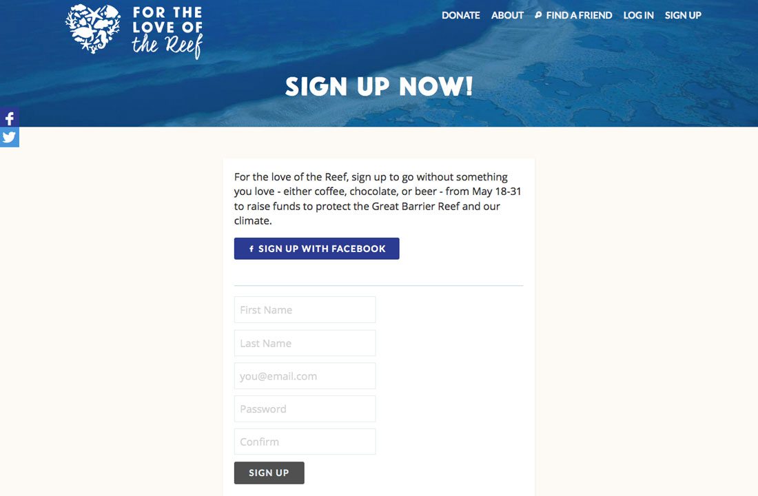
1. Keep It Short
Your signup form should do just one thing – ask for a user’s email address. It’s simple. It’s easy and hopefully it will encourage users to perform this action. Even if you need more information about users, start with just an email address; follow up with and ask for more information later.
This two-step process will give you more flexibility in the design and help create a reason to engage with users again a few days after the initial contact.
2. Give the User Something
What’s actually going to make someone give you their email address? You have to give something in return.
This gift can be in the form of a freebie from your site, a physical gift you send them (stickers are a popular option) or excellent content that users will want to get in their inbox. You also need to give them assurance that you won’t sell, market or spam their inboxes.
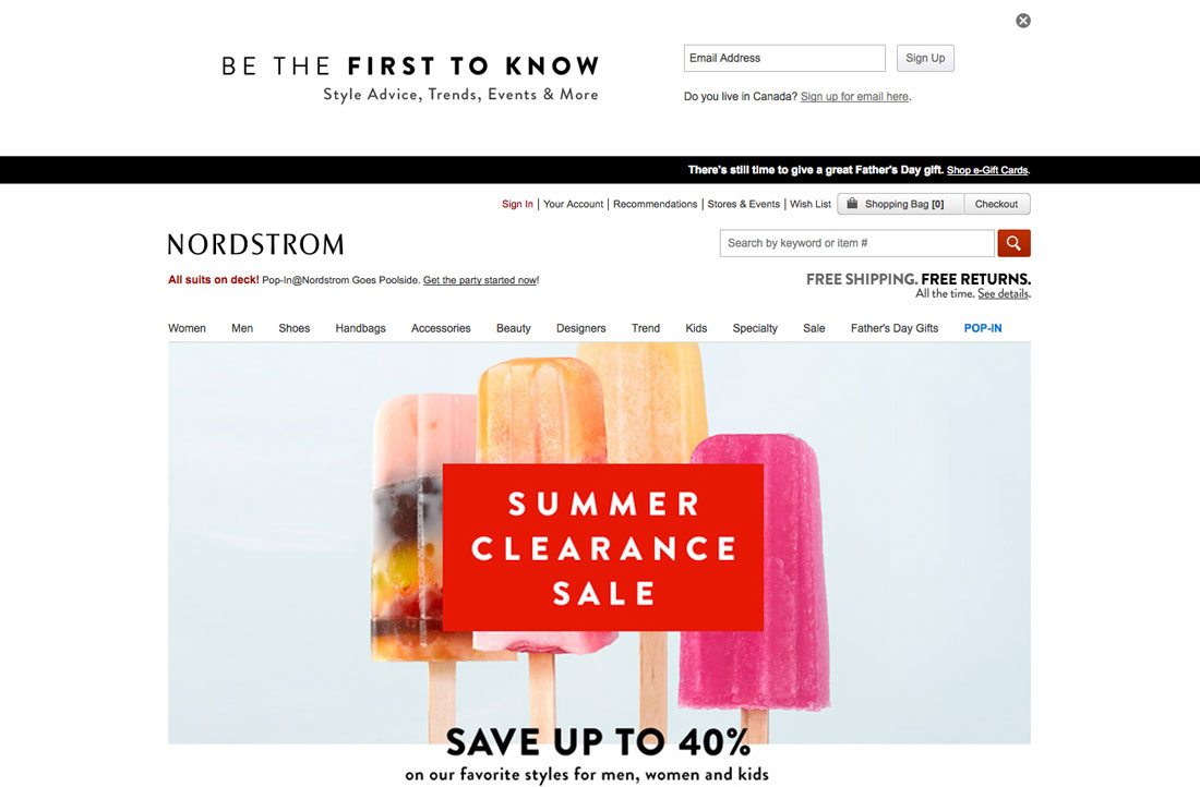
3. Share Signup Stats
More and more sites are displaying signup stats near or with the signup form and it’s a great idea. These numbers can legitimize signing up for a newsletter in the first place and can give you the content you need to create a fun visual or infographic.
Who else or how many other people are signed up? Is it worthwhile? Showing the value of the signup can help convert users. Just pick your wording based on audience size –make users feel like part of an exclusive club (small numbers) or like they will miss what everyone else already knows (large numbers).
4. Design It
A form that looks bad – odd colors, misspelled words, poor images – might scare users away from your sign up. Would you want to share information with a company/brand/business that communicates in this way? Do you feel like your information would be safe with them?
A well-designed signup form includes the same elements as any other good design. Just think about it as a card or other small-format piece.
Focus on simple typography, focused color and a direct message to make the most visuals. It should be easy to scan and fill out in just a few seconds to grab users and get the maximum number of signups.
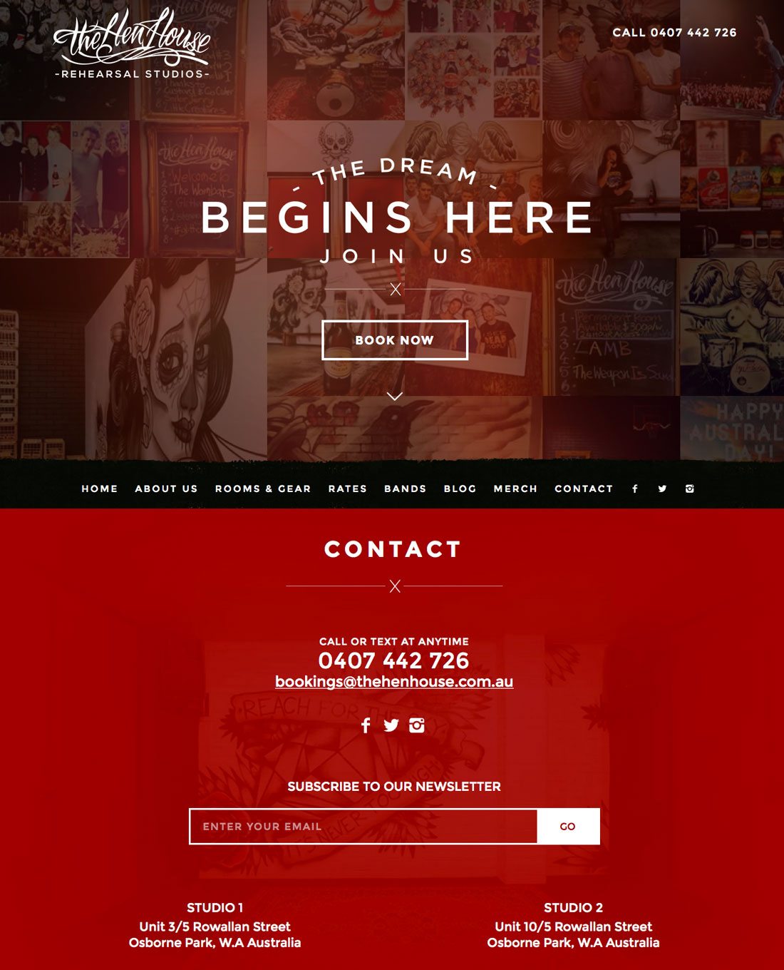
The Hen House (above) uses a two-step design that works beautifully for the signup. The homepage includes a “Book Now” button and a cool scrolling animation takes you to the end of the page where you can enter an email address. Simple, fun and engaging.
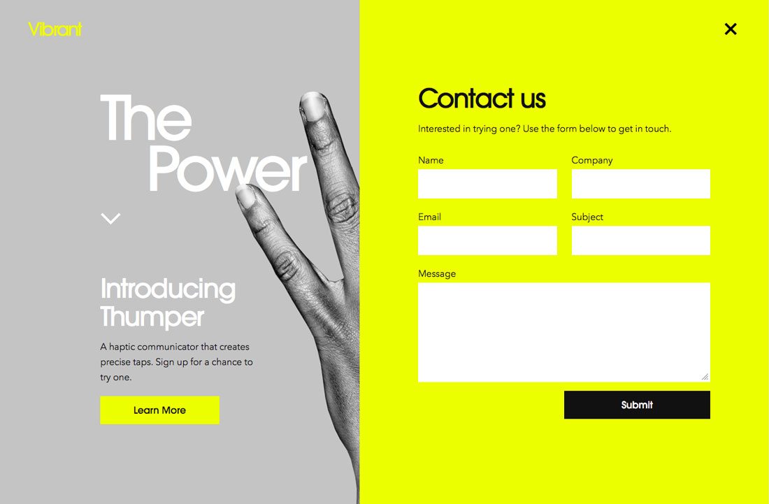
5. One Column Formats are Easy
The form needs to be simple. It does not get much simpler than a single column format. (This also works great when thinking about responsive designs.) The other major benefit of a single colum design is ease of use. If you include multiple fields in multiple columns, some users can miss or forget to fill in certain elements, resulting in an error.
Keeping everything together in a single column can eliminate confusion. It can also help you design more succinctly.
6. Use a Button
Buttons are your design friend. Use them! Design them with color and flair so that users want to fill in the form and click or tap that button.
It’s OK to design a button that is large in scale next to the signup form. Users might want (and need) the visual reminder that they have to submit the information they have filled in for you to get the form. Consider a fun extra with the button too, so that it further engages users. A simple animation or hover effect can add just a little bonus that makes your site memorable.
While we are mentioning buttons, it is hard to ignore the Facebook/Twitter/other social media signup. These buttons are popular options to make signups quick and easy. If you go that route – we won’t get into the pros and cons here – opt for a rather standard button design for social signups so that each user knows with a quick glance that this method is available.
7. Make it Mobile-Friendly
A small box — think a little smaller than the screen of your phone – is about the right size for any signup form. The shape might change by device but will likely be more vertical or square for mobile devices, but could expand to a more horizontal orientation on desktops.
But all the information needs to clearly fit on a single screen without scrolling up and down or left and right. Every field needs to be large enough to tap and type in with ease. Users will abandon your form if it is a pain to fill out; this is especially true for mobile users with even shorter attention spans.
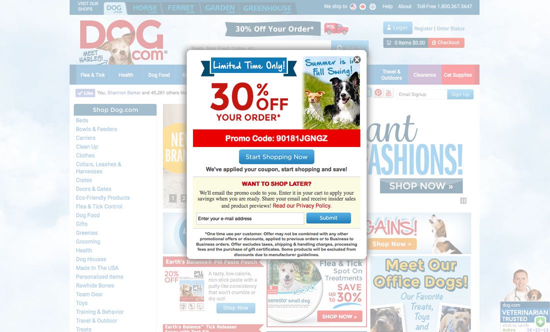
8. Pop It Up
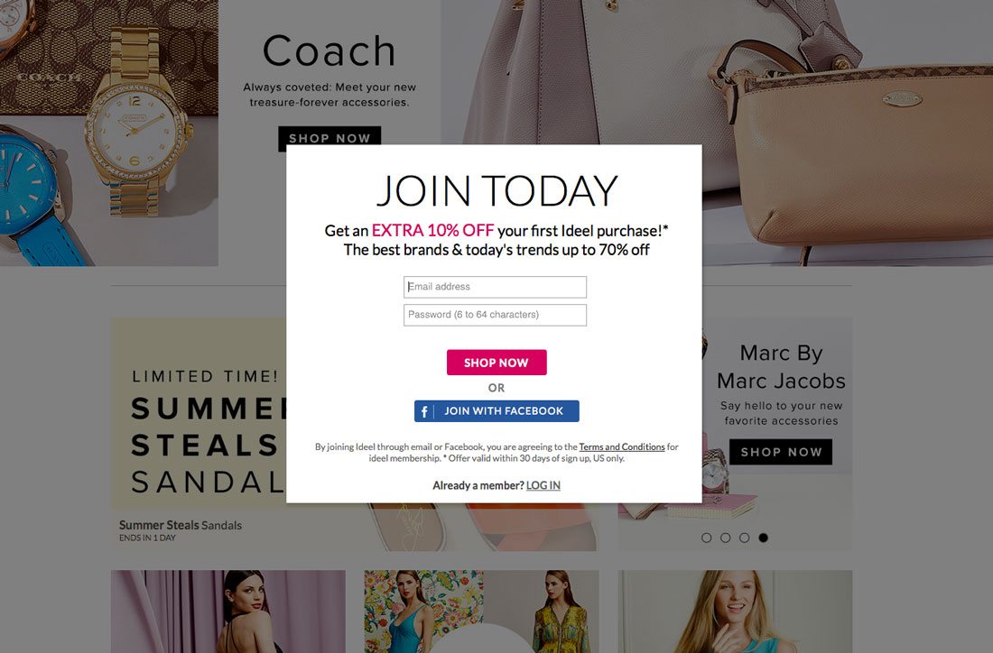
Pop up forms, once the bane of users, are starting to see increased popularity. They are often designed in one of two ways:
- Pop-up in the center of the screen. The design is often for a smallish box that includes a simple design with some transparency so that you can still see the website beneath it.
- Bottom corner signups are also starting to show up all over the place. They also include simple designs – even minimal with a white box and black type – that appear in the bottom corner of the screen. Use a little CSS to hide and show the box on hover after a few seconds so that users aren’t frustrated by an obstruction to the viewing area.
9. Show Some Personality
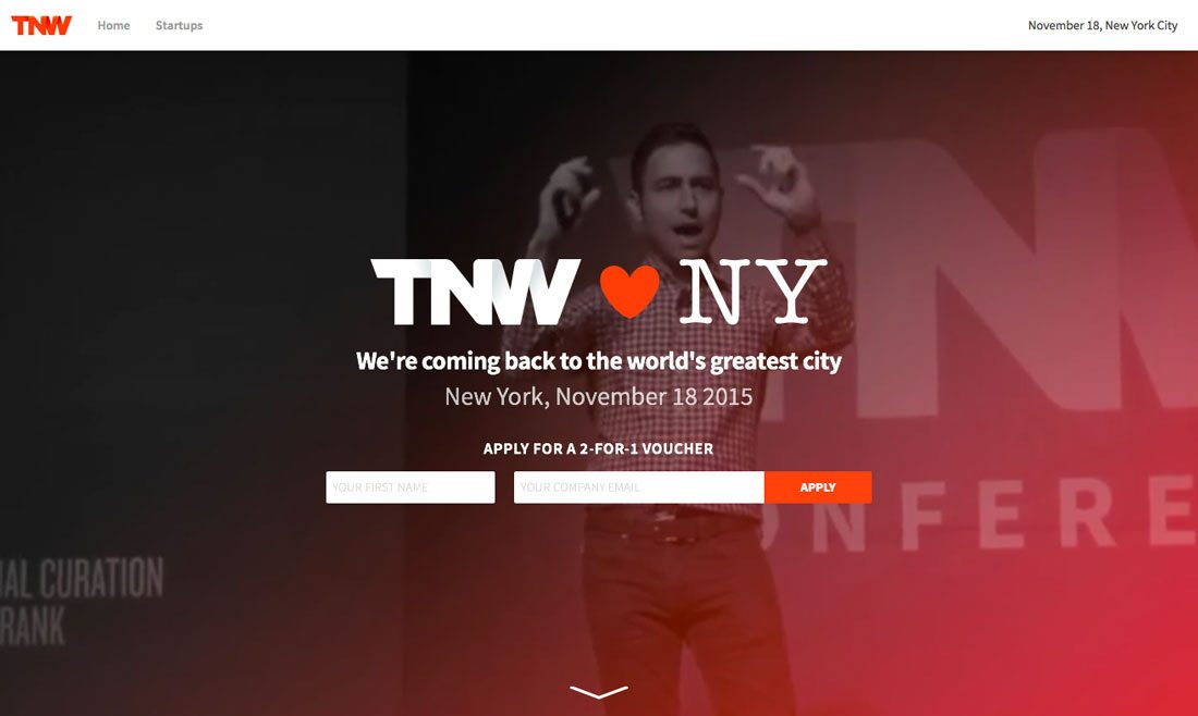
While many of the forms we have talked about feature a more minimal style – this is partially due to the trendiness of minimalism in general – whatever style of signup form you choose should showcase the personality of your brand.
A high-color or big-image design can work for a signup form. Include language and a call to action that uses the same voice as your brand. It’s acceptable to be fun and light if your customer base already expects that from you. Note the form for The Next Web – it uses a background video. Any of the techniques you use for other projects can be implemented in your signup form (or page).
10. Direct Users to Your Site When Finished
The design does not end when a user completes the form. An important part of the form design is what happens next. Direct users to your site so they can continue to interact.
Also consider how to handle users that don’t give you information. If the form is left unfilled what happens? (Nothing is more aggravating than getting stuck being unable to view a site unless a form is completed.)
Conclusion
We looked at a few different versions of email signups here, and the trends in designing the most effective form possible. Did you catch the theme? It all boils down to simplicity. In that initial contact, ask the user for one bit of information – an email address.
And then design away. Think small and scannable. Create a form that’s more like a playing card with a sharp image and single bit of information. Users will thank you, hopefully in the form of email signups!