10 UI Patterns That Users Still Love in 2026
Good interface design isn’t about constant reinvention. It’s about evolution with purpose.
Every year, we see new tools, frameworks, and ideas in digital design. Yet, for all the experimentation, some things never fade. Certain UI patterns continue to endure because they’ve earned user trust.
They’re familiar, predictable, and intuitive, qualities that remain just as valuable in 2026 as they were a decade ago.
Designers who understand which patterns work and why can innovate confidently without confusing their audience. These patterns are the foundation of web design best practices, creating the sense of rhythm and reliability that users expect.
In this post, we explore some of these tried and tested UI patterns that have stood the test of time.
1. The Sticky Navigation Bar
Sticky navigation has been around for years, and it’s not going anywhere.
Keeping a navigation bar fixed to the top or side of the screen improves accessibility and reduces friction, especially on long-scrolling pages.
What makes this pattern timeless is how it adapts. In 2026, sticky navbars have evolved into dynamic, context-aware elements.
Instead of staying fully visible at all times, they minimize or transform based on user behavior. For instance, when users scroll down, the navbar may shrink to a minimal state; when they scroll up, it expands again.
Whether on an e-commerce site, a SaaS dashboard, or a personal portfolio, this pattern reinforces user experience consistency by being both visible and unobtrusive.
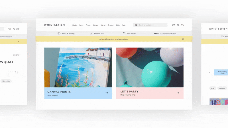
2. The Card Grid Layout
Cards are one of the most flexible and recognizable UI structures. They group related content into manageable, scannable blocks, helping users process information quickly.
From product listings to news feeds, the card grid layout remains a designer’s best friend.
The continued success of this pattern comes from its adaptability. Cards work beautifully across devices and screen sizes, automatically stacking or rearranging to fit any viewport.
They’re also ideal for integrating visuals, text, and interactive elements in one compact unit.
In 2026, card grids are becoming smarter through personalization. AI now helps tailor card layouts dynamically based on user preferences or past behavior.
3. Infinite Scrolling (Used Wisely)
Once controversial, infinite scrolling has matured into a pattern that works beautifully when designed with intention.
It keeps users engaged by loading new content seamlessly as they browse, eliminating the need to click through multiple pages.
The trick is to balance engagement with control. Poorly implemented infinite scroll can frustrate users who want to reach the footer or find specific items.
The best modern implementations use intelligent breaks, sections that pause the scroll to provide structure, or “Load more” triggers that give users breathing room.
In social media, content-heavy news sites, and portfolio platforms, infinite scrolling encourages exploration. When paired with sticky navigation and visible progress indicators, it enhances usability rather than hindering it.
The pattern’s longevity comes down to psychology. Users love momentum. As long as it’s combined with clear structure and responsive loading, infinite scroll continues to be one of the most satisfying UI experiences available.
4. The Split-Screen Layout
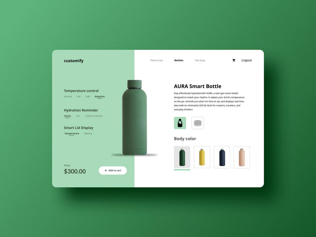
The split-screen layout continues to thrive as digital experiences become more dynamic and personalized.
It’s a simple yet powerful pattern that divides the screen into two complementary sections, often used to present a contrast, comparison, or two simultaneous actions.
Originally popularized in landing pages, split layouts have now found homes in product configurators, storytelling interfaces, and responsive dashboards.
They help balance text and visuals while maintaining a clear flow of information.
In 2026, split layouts are becoming interactive. Users can drag dividers to adjust proportions, expanding one section while minimizing another.
The appeal of the split layout lies in its symmetry and clarity. It communicates duality, showing choice, diversity, or before-and-after states.
When paired with smooth transitions and adaptive design, it creates a strong visual identity while keeping the experience intuitive.
5. The Floating Action Button (FAB)
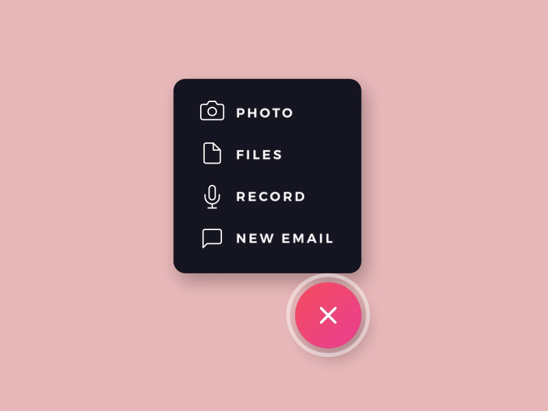
Few patterns have had as lasting an impact on mobile UI design as the Floating Action Button. Initially championed by Google’s Material Design, the FAB continues to dominate because it simplifies interaction.
It gives users a single, prominent way to perform a primary task, like composing a message, adding a note, or creating a new file.
In 2026, FABs have evolved beyond simple circles. They can now morph, expand, and reveal context-based options depending on what the user is doing.
For instance, a design tool might turn its FAB into a mini menu when tapped, offering relevant shortcuts without cluttering the interface.
What makes this pattern so effective is its balance between visibility and efficiency. The button is always accessible but never intrusive.
It embodies user experience consistency by giving users a dependable anchor for key actions across devices and apps.
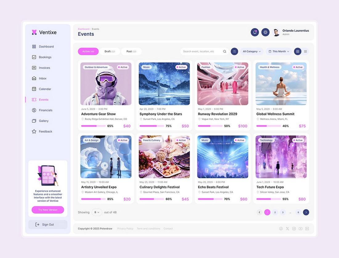
6. The Collapsible Sidebar
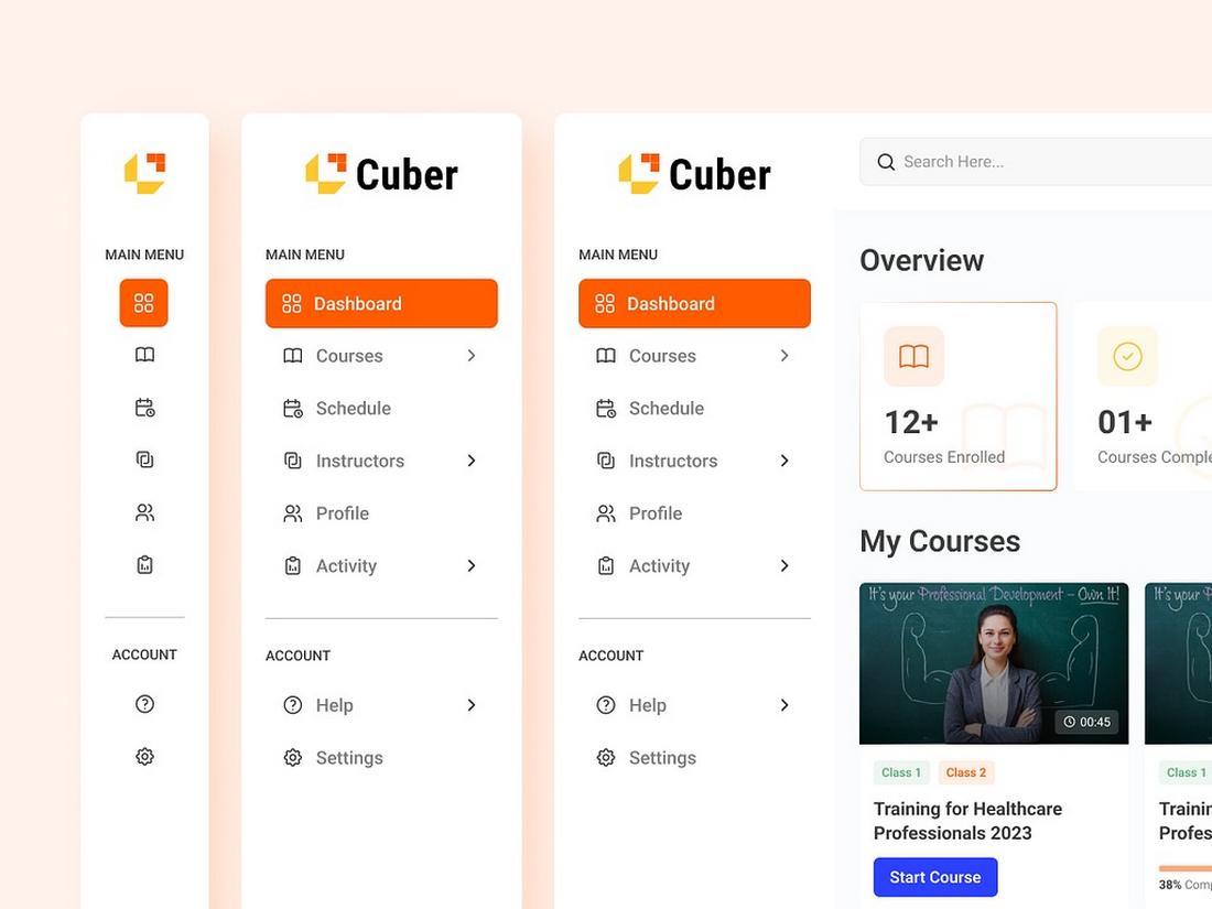
The collapsible sidebar has become one of the most dependable layout structures in digital design.
It gives users easy access to navigation or secondary tools while keeping the main workspace clean and focused.
In 2026, this pattern remains essential across apps, dashboards, and productivity platforms. It’s the perfect balance between utility and simplicity.
Users can quickly expand the sidebar when they need more options and collapse it when they want an uncluttered view.
Modern implementations go beyond simple hide-and-show behavior. Intelligent sidebars now remember user preferences, adapt their content based on context, and even personalize shortcuts through AI.
For example, a design app might automatically surface recently used tools or suggest features based on a user’s workflow.
7. Onboarding Walkthroughs
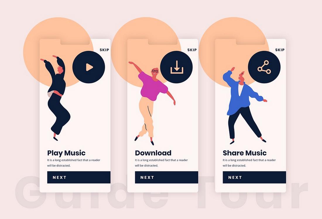
The first impression still matters, and onboarding walkthroughs remain one of the most loved and relied-upon UI patterns for guiding new users. Done well, they bridge the gap between curiosity and confidence.
In 2026, onboarding has become more conversational and adaptive. Instead of static tours or tooltip pop-ups, interfaces now use micro-interactions and guided prompts that respond to user behavior.
For example, a productivity app might detect hesitation on a new feature and trigger a quick visual hint at the right moment.
Video micro-tutorials, progress indicators, and contextual tooltips are now standard components of this pattern.
Some onboarding flows even use gamification, badges, streaks, or milestones to encourage engagement without overwhelming users.
The goal has shifted from teaching features to helping users achieve early success.
This focus on action-oriented onboarding creates lasting engagement while maintaining user experience consistency across devices.
8. Dark Mode Toggles
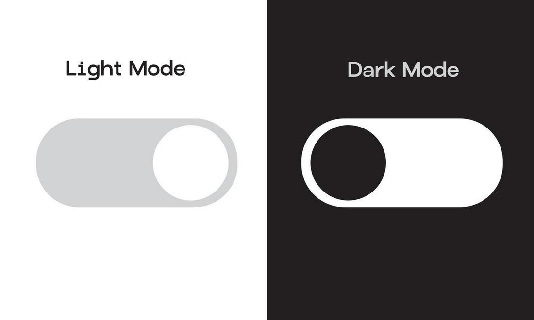
Dark mode is no longer just a stylistic choice; it’s a usability feature that users actively expect.
The dark mode toggle has cemented its place among essential UI patterns, giving users control over how they experience light, color, and contrast in digital environments.
What makes this pattern enduring is its blend of comfort and personalization. Users can adapt the interface for their context, bright daylight, low-light environments, or simply personal taste. It’s an accessibility feature as much as an aesthetic one.
In 2026, dark modes have become more nuanced. Designers now employ adaptive lighting logic that automatically adjusts tone, saturation, and contrast based on time of day or ambient brightness.
Dark mode also helps conserve battery on OLED screens and reduces visual fatigue. It’s a small detail that makes a big impact on both usability and perception, reinforcing a sense of control and comfort that users value deeply.
9. Search-as-You-Type
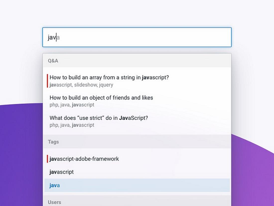
Instant feedback has become the new norm in digital interaction, and search-as-you-type remains one of the most powerful examples of that shift.
This pattern enhances efficiency by returning real-time results as users type, saving clicks and reducing frustration.
In 2026, the search-as-you-type pattern has evolved with the help of AI and natural language processing.
Instead of simply matching keywords, search now interprets intent. It can correct typos, predict questions, and surface results that combine structured data with contextual understanding.
For example, an e-commerce site might start showing categories, trending products, and visual previews before the user even finishes typing.
Meanwhile, in productivity tools, search-as-you-type doubles as a command palette, helping users find functions, files, or collaborators instantly.
This pattern persists because it aligns perfectly with how people think. It mirrors the natural rhythm of exploration, turning every keystroke into a moment of feedback.
10. Adaptive Feedback Systems

Adaptive feedback systems are the backbone of clear, intuitive interaction. Whether it’s a subtle animation, a confirmation sound, or a success message, these responses reassure users that their actions have been understood.
In 2026, feedback systems have become richer and more context-aware. Micro-animations guide attention without distraction, while adaptive tone and language adjust to user sentiment.
For example, a health app might provide gentle encouragement after missed goals instead of generic alerts.
This pattern now extends to haptic and auditory feedback too. Wearables and mobile devices use vibration, sound, and light pulses to communicate success, warning, or status in tangible ways.
The secret to good feedback design is empathy. It’s about understanding how users feel in a given moment and responding appropriately.
This evolution reflects a larger truth in digital design: clarity and reassurance never go out of style.
In Conclusion
Whether it’s the sticky navbar that keeps users grounded or adaptive feedback that reassures them, these patterns endure because they reduce uncertainty.
Users crave comfort in the digital world. Familiar interactions build trust, and predictable patterns allow innovation to shine where it matters most, content, storytelling, and emotion.
The best designers know how to evolve UI conventions without breaking them.
Innovation doesn’t mean starting from scratch. It means rethinking the familiar in ways that feel new, purposeful, and human.