Google Material Design: Everything You Need to Know
You probably keep hearing the phrase “material design” popping up in conversations. The concept is pretty new; it was introduced in the summer and references a new design language from the folks at Google.
But material design is more than just an idea; it is likely to cause designers to completely rethink web and app design processes. Sites are already beginning to role out design schemes using Google’s material design documentation. So now is the time to learn what it’s all about and if a material design framework is in your future.
What is Material Design?
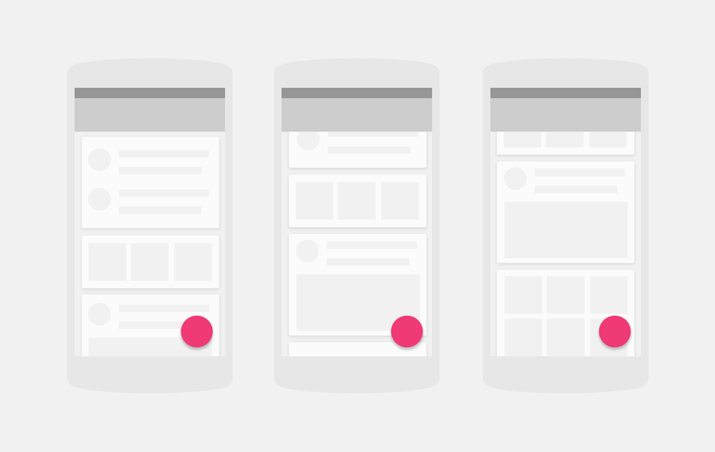
Material design is a visual language created by the design team at Google to help designers create websites and apps that are accessible, practical and usable. The concept is based off a living document that is publicly available. The documentation is constantly updated to reflect changes in scope and technology.
Material design is based on a set of goals and principles that are easier to think about than accomplish. (But that’s ok. The idea here is to think more about design and how to improve it.)
Material design goals:
- Create a visual language that synthesizes classic principles of good design with the innovation and possibility of technology and science.
- Develop a single underlying system that allows for a unified experience across platforms and device sizes. Mobile precepts are fundamental, but touch, voice, mouse, and keyboard are all first-class input methods.
Material design principles:
- Material is the metaphor: Visual cues should be grounded in reality
- Bold, graphic, intentional: Basic design theory (use of type, grids, space, scale, color and images) should guide visuals
- Motion provides meaning: Moving objects or actions should not disrupt the user experience and provide coherence
The guiding factors for material design are many. (The documentation is quite impressive.) It breaks down into a variety of specific concepts and treatments. Google has come up with a set of “rules” for how to create animation, style, layouts, components, patterns and usability.
All of these guidelines start with an understanding of the basic physical, transforming and movement properties of material design. The guiding theory is that material is based in reality, where objects reside in an almost 3D space. In terms of aesthetic, it falls between the scale of flat design and skeoumorphism.
Color and Typography
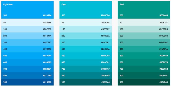
Material design color concepts borrow quite a bit from the flat design trend. The palettes are bold and bright. Typography follows the flat theme as well with simple sans serifs.
“Color is inspired by bold color statements juxtaposed with muted environments, taking cues from contemporary architecture, road signs, pavement marking tape, and sports courts,” according to material design documentation. “Emphasize bold shadows and highlights. Introduce unexpected and vibrant colors.”
What’s nice about the color concepts is the use of distinct contrast. In every example, you can see “Design School 101” theories in action. Google provides a complete color palette with downloadable swatches. Color concepts are so basic that you have to wonder if Google thinks designers have forgotten color theory.
Typography guidelines are equally basic. A default font for all applications – Roboto, the default for Android applications — is provided with a download link as well as a ladder for font usage.
Layout and Design
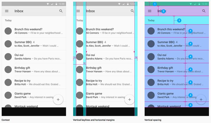
The basic layout and design structure of material projects is born from print design concepts. Designers are encouraged to create and use a baseline grid and mathematical structure to the placement of elements.
The layout further breaks down into regions that suggest how and where to place elements for optimal user interaction. (There are guidelines as well for how large elements should be.)
And every concept has a downloadable template for creating for Android. The risks are ending up with a design that is too cookie-cutter or having an app that looks “too-Android” pushed out for those who love iOS.
Common Elements
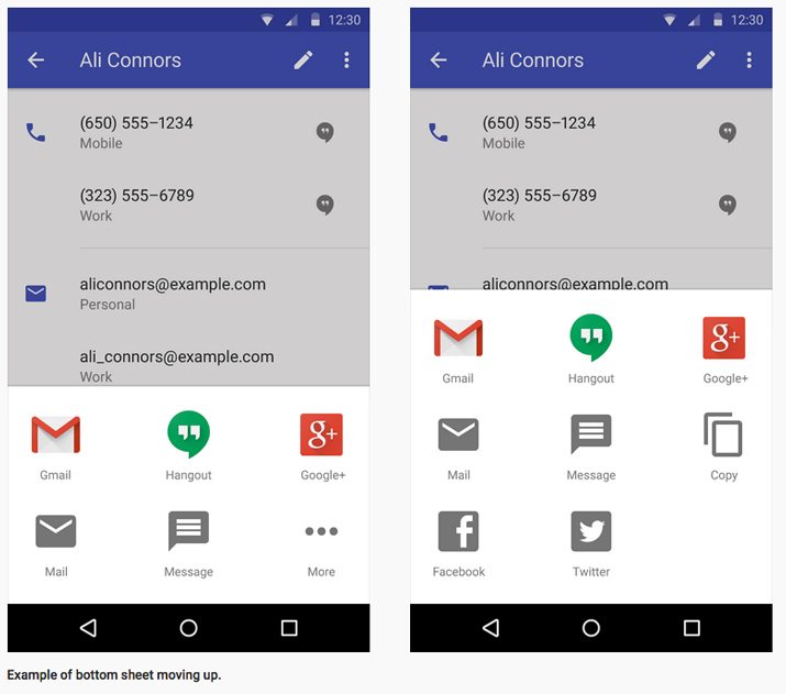
Ever element in material design is described in detail. From how to create it to where to should appear on the screen, it would be hard to visualize something that’s not here. (The list includes 19 components to be exact.)
- Bottom sheets
- Buttons
- Cards
- Chips
- Dialogs
- Dividers
- Grids
- Lists
- List controls
- Menus
- Pickers
- Progress and activity
- Sliders
- Snackbars and toasts
- Subheaders
- Switches
- Tabs
- Text fields
- Tooltips
Designers who like the look of featured components can even download an Adobe Photoshop of Illustrator file containing all the elements and Android system icons. The sticker sheets come complete with styles and adhere to the suggested grid.
Usability and Interaction
Material design documentation opens our eyes to patterns for interaction and usability and accessibility concerns in a way that is quite useful. While many of the actual aesthetic properties may feel basic to experienced designers, some of the usability and interaction concepts are things that need consideration.
The section of interaction patterns is especially useful. It details a set of ideas to make some elements universal across designs. (Think about things like how to write out a time or date or how search should work.) These are some of the most basic tools that users expect to work and for them to function in a specific way for all users is a definite benefit.
Accessibility is another real concern and one that material design documentation outlined and provided nice options for. Thinking about users that might interact with a web design in a way that does not include sound or color, with high contrast enabled, with a magnified screen, without a visible screen or with only voice control or even a combination of these elements can account for a significant user population.
10 Material Design Resources

Material design is popping up everywhere. There are plenty of things to download right from Google but others are developing ways to use it as well. Here are a few resources to help you explore material design concepts.
- Google layout templates for mobile, tablet and desktop frameworks
- Material design for Bootstrap
- Angular.js Material Project
- Polymer Designer
- Materialize Front-End Framework
- Material color palette
- Material Interaction
- Material design on Android checklist
- Material design Sketch template
- Free material UI kit
Material Design Gallery
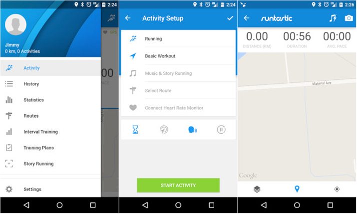
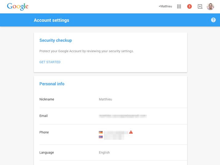
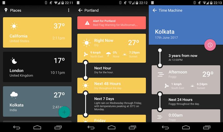
As with every trend and concept, there are plenty of websites and mobile apps already using the concepts outlined in material design. Here are five examples that showcase the principles and how designers can work with and experiment with the concepts.
Runtastic Running and Fitness
Google Settings
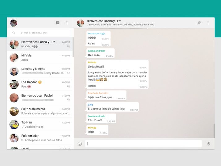
Evil Rabbit

Weather Timeline
Conclusion
The concept of material design is a good one. The guidelines are clean and fresh. But most experienced designers probably don’t need this level of guidance. Within the documentation, almost every idea includes a downloadable cheat. Do we really need that much help?
The documentation is fun to read, makes you think and is a preview of things that will soon flood the web. Play with the concepts, but don’t feel married to them. Design, especially when it comes to trends and technology, is changing as fast as we can imagine it.
Like every other design trend, framework or concept, you have to decide for yourself if the concepts are usable in your projects. Do you see yourself using material design? Why or why not? Let us know in the comments.