How to Design One-Tap Microinteractions
Microinteractions are the “secret sauce” that make apps and websites shine for users. These tiny details make it easy to set an alarm, press a button or simply better understand how to work with a digital product.
The secret is that the best microinteractions are elements that the user probably doesn’t even think about. They happen in an instant – often with just one tap on a mobile screen. Despite the small nature of the interaction, hence “micro,” the value is immense to users as these engagements become more integrated with daily activity.
How do you design one-tap microinteractions that will delight users? Here are a few ideas.
Animate a Button

Do you remember the first time you noticed the Facebook like in Messenger? You tapped the “thumbs up” icon and it grew in the box to the person you were chatting with. Did it make you smile? Did that little bit of movement give you a bit of delight?
Simple animation, before the tap to encourage it or after the tap to show the microinteraction is working is a sure-fire way to create something users want to tap. Small animations provide information about what’s happening so users feel comfortable and confident about their roles in the feedback loop.
Don’t
The animation should be as simple as the microinteraction itself. Keep movements simple and fluid and, quick to start and finish. Adding a rating on IMDb follows this principle; hover over the rating and quickly see the number of stars to add as you move over each. Tap to click to finish and confirm the action.
Provide Options
It’s a lesson in UX that goes back to grade school and kindergarten love letters. Do you like me? Check yes or no.
Great microinteractions can be designed using that same concept. Give users two quick choices. Tap to initiate (or stop) an action; tap to toggle. Users want to make choices and feel in control of digital experiences, but they don’t want to be bogged down with multiple screens to get there.
Create Immediate Action
The best way to ensure that users interact with your microinteraction? The result should be immediate. The desired result should:
- Happen with a single tap
- Provide the desired action within 0.1 seconds
The immediacy of microinteractions are vital to their success. Because the nature of these elements is small, any delay in action will annoy users. (Just think how frustrating it would be if it took three taps to turn off an alarm or if there was a 2 second delay to silence the ringer on a call during a meeting.)
The quick toggle between a like (or unlike) or follow on Instagram is a perfect example. That’s how fast your microinteraction should be.
Design for Repetition
One of the things that makes microinteraction different from some other interactive elements in your user interface is that they will be used over and over again. Microinteractions are typically not designed for one-time use. (How many times have you tapped the Instagram heart-shaped like button in the last hour?)
Design for this repetitive action, but the action shouldn’t feel like a repetitive motion. While that might sound like a lot to take in, it comes down to the intuitive nature of the tap. Is it obvious and natural? If a user doesn’t have to think about an action, they’ll never find it repetitive to complete.
Using commonly accepted user patterns, animations and icon styles will help guide the way you design microinteractions. Don’t reinvent the wheel here; make it easy for users to complete tasks with one tap, and without having to scratch their heads over how to do it.
Make it Readable and Relatable

Here’s the step that gets forgotten way too often – instructions inside microinteractions need to be readable and relatable.
Readable refers to any text or instructions as they relate to the microinteraction. Words need to be easy to see and scan. From a design perspective, selecting a good typeface and ensuring there is enough space around words and plenty of contrast between lettering and the background are key. Stay away from condensed, thin or novelty typefaces that aren’t easy to read at a glance.
Relatable refers to text that reads in the same way people talk. Uncommon language or awkward phrasing should be avoided. Instructions inside form fields that vanish as a user begins typing is a great example. This is particularly true when the wording uses a tone or voice that the user expects of the brand or website they are interacting with.
Focus on Details
A microinteraction is one of many design details that will make up your interface. You need to take particular care with every one of them.
Microinteractions should feel like part of the overall design. But you have to think about these tiny actions in other ways too. From color choices to the size of elements a user needs to interact with, these details will encourage action or cause users to abandon the design for something else.
As you would with any other design element, create a set of style and design rules for microinteractions within an app or website so that actions are consistent throughout the design and easy for users to find and engage with. The tinier the element – or interaction – the more important details become.
Keep it Simple
Saying it a million times isn’t enough – keep it simple. There are just too many designs that are too hard to use. You might think it is cool, but users won’t. They like predictability, consistency and simplicity.
The easier it is to interact with something the more likely users are to actually tap a button. That’s why one-tap actions are so important. How do you know if your design is simple enough? It needs a defined structure with a feedback loop for actions, simple instructions and visuals, and a message that’s communicated clearly and is easy to understand.
Don’t Stop Developing
Designing microinteractions is an evolutionary process. Because this is such a new concept, it’s changing all the time. There are new ideas and new ways to create something users want to tap.
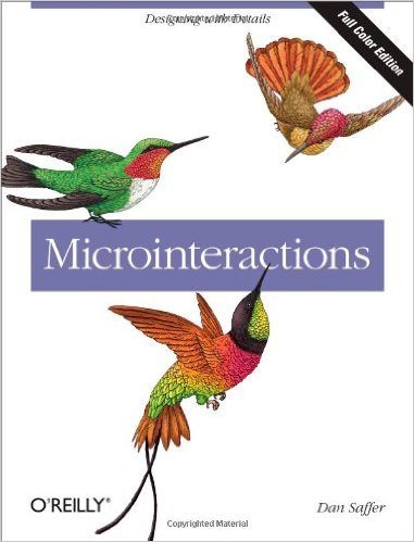
Staying on track with the evolution of microinteractions goes back to the basics that Dan Saffer first defined. (He also wrote one of the most authoritative books on the topic, “Microinteractions: Designing with Details.”) Microinteractions include a four-step process starting with a trigger action, rules for how the interaction works, a feedback loop so the user knows something happened and loops and modes that dictate how future interactions will work or what comes next. Keep that in mind and you’ll be on the path to microinteraction success.
Conclusion
There are a lot of pieces to designing something so small. So, don’t think you can create a microinteraction in five minutes and move on. Designing a microinteraction takes special consideration and planning.
Remember, the best microinteractions generally work with a single tap and are elements that users don’t even think about engaging with, although they will on a regular basis.