5 Design Tricks to Make Your Mobile UX Shine
Have you looked at your website analytics lately? Chances are a significant portion – maybe even more than half – of your users are coming to your website via mobile device.
Whether you are focusing mobile efforts on a website or app, you need to ensure that the design creates a stellar user experience for every one of those mobile users. You don’t have to start from scratch to do it either. Thinking about the mobile user and how they interact with the design will help shape the way your interfaces look and function.
Here are five design tricks you can use to help make your mobile UX one that users love.
1. Streamline Navigation
Those old-school mega navigation menus aren’t doing you any favors – especially when it comes to mobile. Mobile users might have the shortest attention spans of any group of users. They want to open the website or app and find what they need right away.
Design navigation menus with just a few options – look at your analytics to see what the majority of users are looking for or navigate to first.
Fewer options will take less screen space, allowing you to incorporate more room in the design, which is ideal for touch and readability.
While we won’t argue the merits of the hamburger icon here, pop out navigation is a pattern that users are accustomed to. Just make sure that if you plan to pop or slide-out the navigation menu, that there’s a clear visual identifier for users.
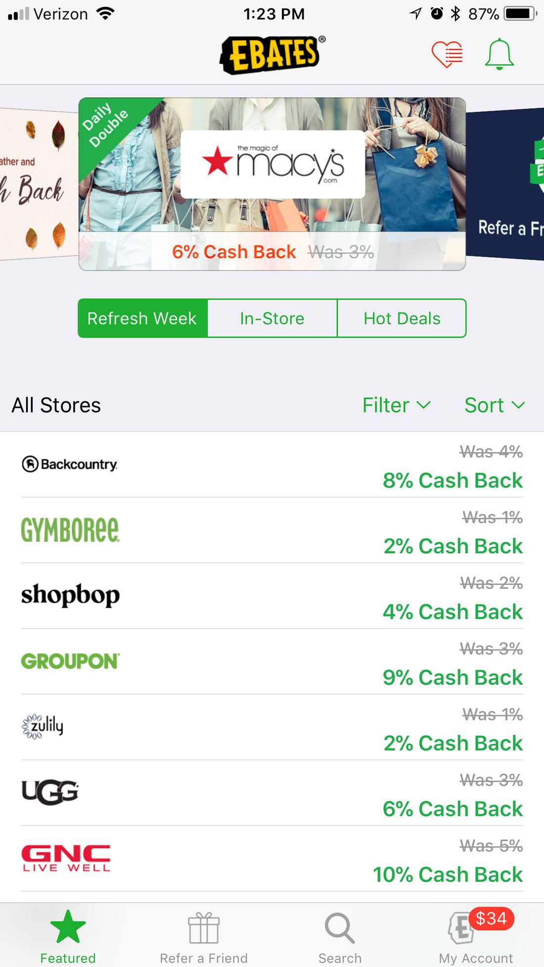
The Ebates app uses two levels of navigation: One that’s a list of their top deals and another that’s your bookmarked list of favorite stores (in the hamburger/heart icon). Neither option feels heavy. It almost looks and functions like content. The entire design is navigation without feeling overwhelming.
2. Think in Gestures (And Haptics)
Mobile users interact with their devices quite differently than desktop users. Your user interface should account for this.
The design should take advantage of gestures to perform certain actions. An interface that uses common and intuitive controls will delight users.
These gestures include:
- Tap and double tap
- Press
- Hold
- Drag and drop
- Scroll (single and two-finger)
- Zoom in and out
- Swipe
- Flick
When it comes to mobile gestures are the new clicks.
And while you are thinking about touch interactions, don’t forget about haptics. That subtle “bump” from your wearable or that vibration from your phone in a pocket are haptic notifications, mechanic simulations of touch using vibration or motion.
The trick to haptic is that the interactions are subtle and quite unobtrusive. While the user might know there’s a notification, other people often will not. The touch interface is becoming more common all the time and seems to be getting a positive response from users.
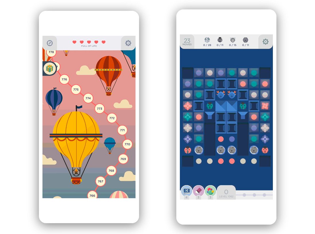
The Two Dots game, for example, uses a bump each time you clear dots in a certain way. The soundless option makes for discreet game play and provides a delightful experience for users.
3. Make it Conversational
People like to feel like they are speaking with and interacting with other people. Thankfully for designers, a touch of artificial intelligence and chatbots can help create those interactions so you don’t have to be on standby for live chat sessions 24 hours a day.
There are three ways to create a conversational UI:
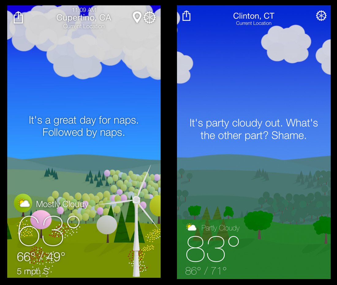
- Write copy throughout your interface that has a more personal touch. From long text blocks to tiny bits of microcopy, text should have a personality, such at the WTFWeather app, above. It should be read in the way people speak. Be careful of sounding overly formal or robotic in your messaging.
- Use messaging features or chatbots to create instant interactions with users. This can be a great customer service tool and also help create customer loyalty if someone is always there to help them through problems.
- Integrate a voice user interface into the design. Siri and Alexa are household names thanks to voice interfaces. The other bonus to integrating voice commands? It will make your website or app more accessible.
4. Animate It

It seems like there are animated elements on almost every website you visit. And that’s by design. Animation can bring a design to life.
Animated elements are highly engaging because they grab user attention and can help show users how to better interact with a design. (It goes back to the classic idea of “show, don’t tell” when creating a design.)
Google Maps, for example, is packed with little animations. Pay attention next time you use it.
Nick Babich, for UX Planet, has a great primer on uses for animation in mobile UI design. He outlined three key uses for how to use motion well.
- For system status: Use animation to show a loading status, for refreshing content and for notifications.
- For navigation and transitions: Use animation to help users move between different types of content, to establish visual hierarchy between elements and to show a change of state.
- For visual feedback: Use animation to show acknowledgement of an action or to help visualize the result of an action.
5. Onboard Well and Use Forms Properly

Particularly with an app, onboarding is vital to user loyalty.
Think of the last game you downloaded. Did you jump right in? Or did you need a quick tutorial to ensure success?
An interactive onboarding experience for apps will help users learn how to make the most of the features included in the user experience. A fun option will help transition them to loyal users as well. Keep the onboarding tutorial short and make sure to include a frequently asked questions or help section so users can go back to it if they have trouble.
With mobile websites onboarding is less of a primary concern, but signup or registration forms might be an issue. Forms on mobile devices need to be simple and easy. Users don’t like bulky complicated forms.
Streamline forms for mobile to increase conversions. (You can always ask for additional information later.)
Look at the simple starting point for GoodRx, above. It only asks for the medicine you want to know more about. The form is the focus and it’s super simple.
Ask for just one bit of information – an email address. That’s all you need to start a relationship with a user. If your site or app requires logging in, stick to an email address and password.
Design the form so that boxes are easy to fill in (from a size standpoint) and consider ditching any auto complete functions to decrease the chances of mistyped email addresses. One more trick? Use a social login form when you can to simplify the process even more. Users are accustomed to this process and it is easy for them … and less likely to have errors for you.
Conclusion
The mobile user experience is one of the most important things you need to think about when building your website or app. And mobile user needs continue to change all the time.
Create an interface that’s easy to use and takes advantage of modern technology and features to create something users will want to engage with over and over again.