Design Trend: Modern Tappable Targets (And How to Do It)
A solid tap target can make or break your mobile website or app. The size, shape, location, and overall design of the button or link determines whether a user successfully completes an action or not. It might seem like a small thing, but can be one of the most important elements of a design.
Modern tappable targets are easy to recognize, work in an expected manner, and encourage engagement.
Today we’re looking at how to design them, ways to craft effective call-to-action items, and considerations around color and font choices.
Gradients and Color
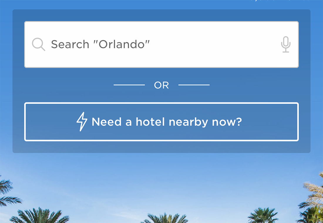
One of the biggest design trends that you may notice when it comes to buttons and other tappable targets is color. Gradients and bright colors are the norm.
These attention-getting choices help users recognize a tap target and bring attention to the action on the screen.
At one time almost everyone was designing buttons and tap elements in red or orange, but that has really given way to other colors, particularly gradients.
Blue, purple, and green gradient tappable targets are some of the most popular design choices right now. They work great with light or dark backgrounds (or modes), making this a viable option for designs where users may have control over the default color scheme.
Size Matters
The size of tap targets is more than just aesthetic, it’s equally important in terms of accessibility.
Most guidelines for the size of tappable elements recommends at least 44px. This is roughly the size of the average adult finger pad.
That’s not to say that all visual elements much be at least this size, but you should ensure that the full tappable area around an element exceeds this size. (Think of how annoying it is to close a minuscule “x” on an in-app ad, often resulting in clicking the ad itself by mistake.) Adequate tappable areas resolve this issue.
Accessibility guidelines for Level AAA success note that the size for “pointer targets” must be at least 44 by 44 CSS pixels with a handful of exceptions, related to link context.
Design Visual Affordances
Does a tappable target look like something a user is supposed to touch?
While this might be a super simple concept, it is often forgotten. Visual affordances that use well-known and recognized patterns and design elements make it easier for users to know what to do with an interactive element when they see it.
Common visual affordances for tappable targets include:
- Underlines or different colors for inline text links
- Drop shadows or inside shadows for objects
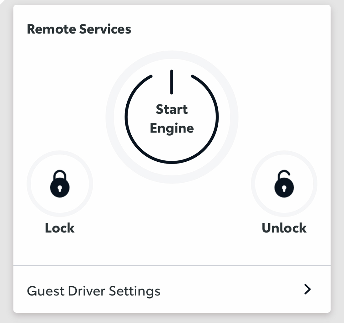
- Rounded corners or circles
- Elements with actionable text, such as “Login” or “Submit”
- Separated location in a column without other objects on either side
Create Hover and Focus States
Hover states are a widely recognized option for interactive elements on desktop devices. When the mouse moves over an item that can be clicked, it may change color, move, or react in a way different than before.
These actions don’t really work for mobile tap targets because there is no mouse or cursor to move around the screen. But that doesn’t mean they aren’t equally important.
Hover states are important for desktop versions of a design. In terms of mobile, this microinteraction evolves to an active state that shows if/when a button or tap element is active or “pressed” in a tactile manner.
It further relates to focus states as an accessibility tool when users navigate to a tap target via keyboard or screen reader. A focus state will show what target is currently selected such as highlighting the active box in a form or an off/on toggle to certain elements in the design (such as the keyboard opening).
Padding is Sufficient
Unless you are designing a dark pattern, you probably want to ensure that users tap the intended target, not a nearby object. Sufficient padding around each tappable element can solve this potential problem.
In addition to making the tap element at least 44px, include at least another 8px of space all the way around the tap area. An even better practice would be to use padding equal to half of the size of the tap element around it. This helps prevent accidental tapping.
Text is Readable and Actionable
The text in the design of tappable elements provides context for action and interaction.
A couple of things are trending when it comes to the look of text instruction.
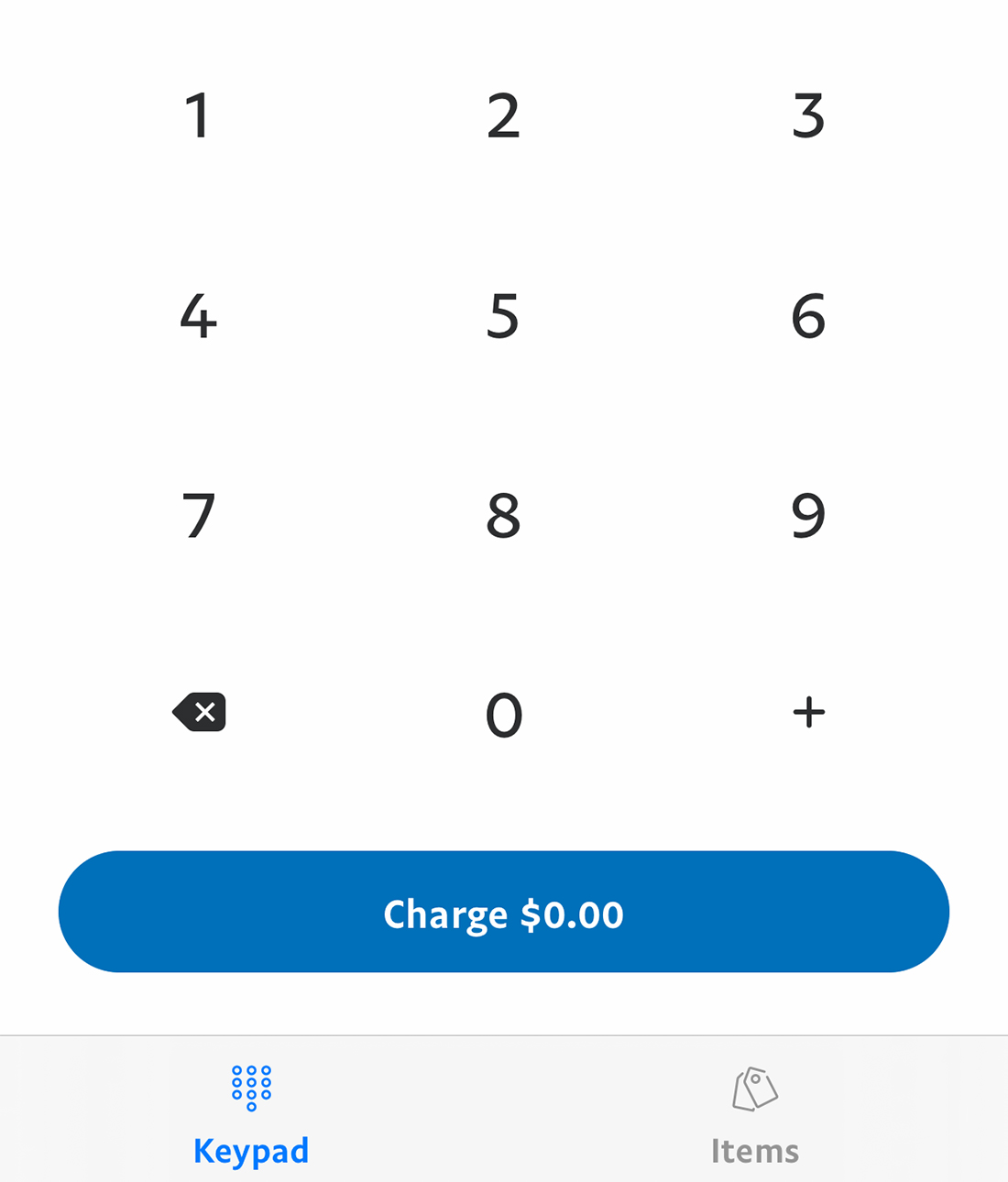
- Buttons and tap elements use title case
- Fonts are simple, in a regular or medium style
There are considerations when it comes to writing the UI copy as well.
- Text is directly actionable and tells users what will happen next, even if it is a little longer than “Click Here”
- But eliminate any unnecessary words
- Avoid jargon or cute language and be direct
- Be consistent and use the same terms across the design (do users “sign in” or “log in”?)
Halo Targets Around Links
Text links don’t follow all the same rules as other tappable elements, but the design should include equal consideration.
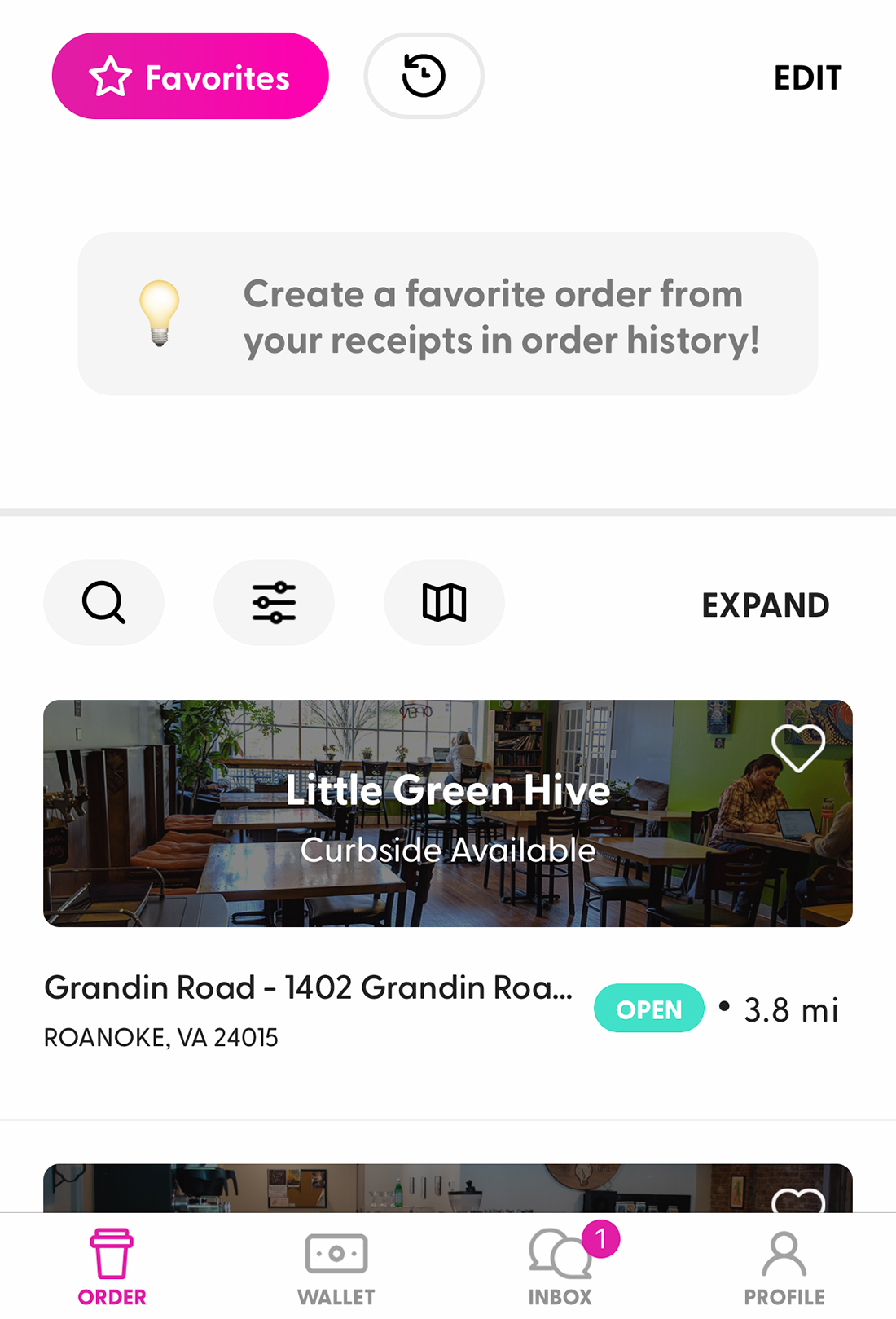
The first thing to think about is how often you use in-line text links. These can be harder to tap on small screens and the more links there are, the more likely it is those tap areas could overlap and cause users to engage the wrong link.
The best advice is to use them sparingly and use more button-style links if you can.
The next best advice is to create an extended halo or a tap area around the text link to make it easier to tap effectively. This is common with text links in the menu or links in the footer. (It makes less sense in the main body copy.)
WCAG accessibility guidelines offer a little more guidance on inline targets:
“targets can appear anywhere on a line and can change position based on the width of the available screen. Since targets can appear anywhere on the line, the size cannot be larger than the available text and spacing between the sentences or paragraphs, otherwise the targets could overlap. It is for this reason targets which are contained within one or more sentences are excluded from the target size requirements.”
Tap Targets Can (and Should) Have Hierarchy
Your design might include several types of tappable targets, each with its own look and feel.
This design hierarchy is becoming increasingly common with this or that button choices or levels of tappable targets based on website or business goals.
What does the design hierarchy of tappable targets look like?
First, determine how many levels you need. For most projects, a primary and secondary option is enough, but some projects go into third- and fourth-level click elements.
Set a style for each. Start with the primary design. It is likely a color/gradient button. This is the element you want users to tap first. The secondary design should be similar to the primary button but includes one of the following changes: Ghost style, less contrast color, or smaller size. Third- and fourth-level buttons can use those same changes.
Buttons at the top of the hierarchy should have the most contrast and be the largest in size and decrease proportionally based on the desired use.
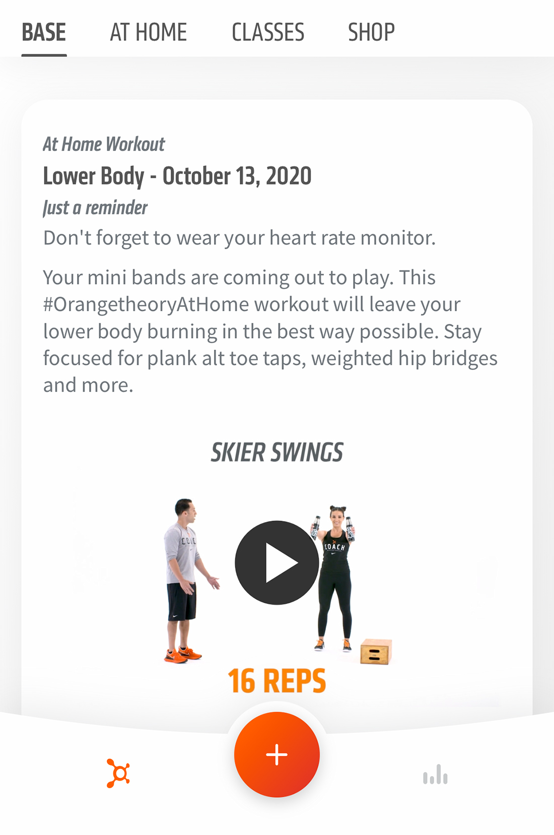
Are there tap elements that you want users to see first and interact with? Use tappable elements with a clear visual hierarchy to establish user flow and intent.
Tap elements should have a design with size and prominence that’s obvious to users that it should be touched (note the center orange + button above). Size might be one of the most important considerations in terms of helping predict user intent.
A word of caution: While tap target hierarchy is a good thing, too many options can create user frustration. It’s a delicate balance that should be tested.
Conclusion
Yes, we are still designing for thumbs. This remains true no matter how large (or small) phones are. Tappable targets can be anything from buttons to controls to text links with the commonality that users engage with them to make the website or app work as designed.
A good tappable target looks like something that should be touched (or clicked) and perform an action that’s expected by the user.
Sadly, designing these elements is often a forgotten part of the design process. Don’t fall into that trap with your projects.