7 Tips for Designing for Oversized Touchscreens
Touchscreens are everywhere. But they aren’t just on your phones and tablets. Designing for the oversized versions of touchscreens – think desktop computer size and larger – can present a unique set of challenges.
How do you design for something so big, when you are so accustomed to thinking about thumb regions for screen design? Here’s a guide to thinking about oversized touchscreens and how to create something that users with interact with on an even larger touch scale.
1. Use Natural Gestures
There’s a reason “swipe right” and “swipe left” are so popular – they are natural hand movements and gestures.
When thinking about oversized screens, consider more than finger actions. Think about the entire hand. Most users will have to reach out to tough larger touch screens because they will be affixed to a wall or table, rather than hand-held.
You want the screen to be comfortable to touch, and movements should happen as seamlessly as on a mobile device. But think about touch action. Swipes might be a little more exaggerated than on a smaller screen and taps might come with slightly more pressure or force.
Scrolling is a little less comfortable – moving arms up and down repeatedly can lead to fatigue – to think about ways to get users through the content without a lot of up and down motion.
Another natural “gesture” to think about is eye-scanning. Some oversized screens are too large for the user to take in all at once. Design for eye movement – top to bottom and left to right – to ensure that users see the most important information and understand how to engage with the design.
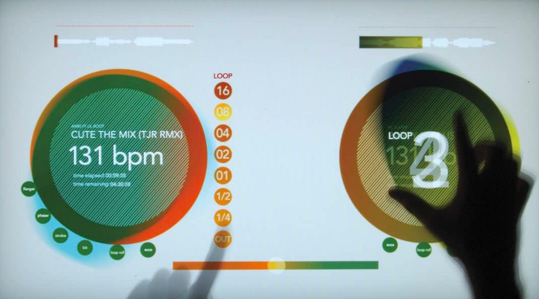
2. Scale Up Text and Graphics
This doesn’t happen as often as it should – designers have to dramatically scale-up visual elements to display on oversized screens. A bigger screen doesn’t mean more stuff (the opposite can actually be true). Think of it as a different user experience. Content, including text and graphics, have to be scaled up for oversized screen design because:
- Users tend to interact from a greater distance and still need to see and distinguish between elements.
- Users need to be enticed to come to a screen, such as a kiosk, from far away.
- Users need to see visual cues that help them identify a screen for public use.
- Screen elements need to be navigable and clear without instruction.
- Touch targets need to be easy to see and create obvious interaction.
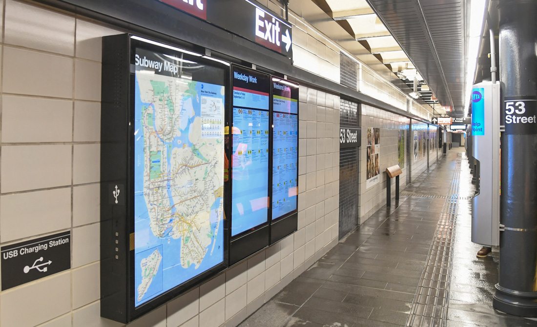
3. Make Sure Navigation is Always Accessible
Most users engage with oversized touchscreens from the same mindset as visiting a website for the first time. A design that mimics that experience will be easy for users to jump in and interact with.
Create a navigation pattern for these devices that is always accessible. Use a format that’s similar to commonly-accepted website patterns, such as across the top of the screen or in a sidebar.
Make sure that navigation doesn’t go away when different content is accessed. While the home screen design might just include large navigation buttons without a traditional navigation menu, all other screens should have the more traditional navigational format for ease of use.
Try to minimize typing-based inputs as much as possible on these screens. Keyboards can be awkward and slow, requiring extra physical effort on the part of the user. But if you do have keyboard-based inputs, include a keyboard toggle command in the navigation, so that users can easily show and hide the keyboard as needed.
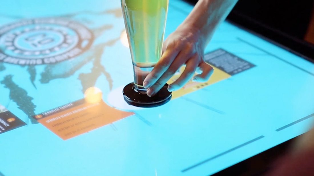
4. Don’t Create Too Many Choices
The bigger the screen, the more overwhelming choices can be. Think of buttons and interactions as a game of this or that, which gives users one decision to make at a time. The trick here is that they pick between two elements.
One of the nice takeaways from this concept is that it makes you simplify the design. With only two choices per screen, design elements and visual clutter is reduced, creating a more usable interface.
When designing the choices, make sure the action is equally clear. How does a user select this or that? Buttons should be obvious and large enough to touch with ease. Use a small animation to help draw the eye to interactive elements, or to the more popular user selection.
Simplified choices are important due to the size of the screen as well. Remember that the entire screen may not always be in a user’s field of vision, which can limit choices in itself. If you streamline choices ahead of time, you don’t have to worry about the environment eliminating user options for you.
5. Consider Privacy
Just because a user walks up to a kiosk screen in a public place, doesn’t mean that person wants everyone to know what he or she is doing.
Keep in mind that the bigger the screen, the more likely it is that others can see what the user is doing. That’s a big consideration when it comes to asking for sensitive information or data on a touch display.
To combat this, often a touch-based design will include smaller pop-up boxes for forms or data entry so that content isn’t as visible from a distance.
6. Disconnect from the Web
This might be the most important design concern when it comes to oversized touch screens – they need to work with, and without an internet connection.
Think about it: Many oversized screens are in public locations or smaller ones such as movable kiosks or large tablets, are portable. This can impact access to the internet and whether a connection is working or not. The design has to work even when not connected.
Make sure that all of the tools to run the design, from JavaScript to font libraries to data collection, are stored locally.
7. Design Buttons for Obvious Interaction
The design needs to show users how to interact with the screen. Not every user will immediately spot a touch screen at first glance.
Use visual cues such as animation and buttons to help guide users through the process. Most oversized screens are a one-time interaction or engagement point for users, and every interface is a bit different. The easier you can make it to use, with more commonly understood elements, the more likely users will be to engage in the design.
Many designs include screen areas that are fully activated on touch, such as a start screen. Include a button to cue the interaction anyway. It doesn’t take away from the design and tells users how to work the device.
Use descriptive microcopy, such as “touch here to start,” to guide users through the process. While these elements might seem overly obvious, how to use an interface isn’t always second nature to all users. Make it easy.
Conclusion
Do any of your design projects require the use of oversized screens? They are becoming more popular everywhere. Even if you haven’t had such a project yet, chances are you might get one in the future.
While most of the design principles are the same as other interface-based designs, adjusting for size and scale of large screens can be uncomfortable for many designers. When you see these screens in public, make a point to stop and interact with them to see what design elements and interactions appeal to you.