7 UX Design Tips for Mobile Apps
Do you have a mobile app project in the works? What’s your design plan? Have you jumped straight in, or stopped to consider the experience that the end user is going to have when they first open the app?
It might be worth thinking about an aesthetic featuring carefully considered user experience techniques. Many of the concepts that we’re seeing in website design apply to mobile apps as well, but they might take on a slightly different shape or form to better fit the smaller screen size.
Here, we’re going to look at seven great options and examples that you can apply to your own mobile app design.
1. Bold, Stark Typography
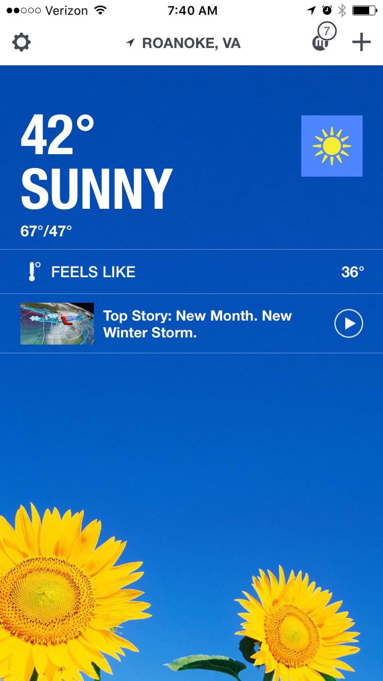
Simpler type is easier to read on a small screen, particularly against backlighting or in subpar environmental conditions. This fact alone helps drive why simple sans serif typography is the go-to option for mobile apps.
And while thin was in a few years ago, the pendulum has swung so that designers are opting for thicker stroke widths and bolder type options. Size is also important as well. More apps are using splash screens with oversized type or home screens with bold lettering against a contrasting background to help users engage and navigate through the app.
What’s nice about this trend is that there is a distinct focus on readability. (Which is the point of all text, right?) The one part of this trend to be cautious of is using too many all caps words or phrases. While all caps can be a nice option for a single word, such as “SUNNY” in The Weather Channel app above, this can get cumbersome for longer text blocks.
To use this trend keep two things in mind:
- Typography and language should be simple.
- Contrast between the background and lettering should be intense for maximum readability.
2. Layers and Depth
Material Design has been highlighted over and over again as one of the top design trends to watch this year. And there’s good reason.
First, it is the design platform that Google has adopted. When a giant goes full-in with something, plenty of others are sure to follow. (And they are.) Second, it’s a highly intuitive concept with an easy to use interface design that’s also easy on the eyes.
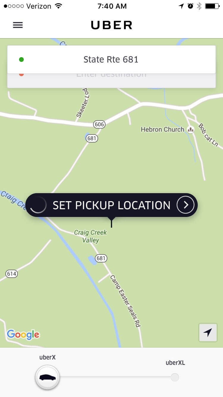
One of the most striking parts of Material Design is in creation of layers to help users interact with the design. It’s the one piece of material that’s really popping up in interfaces everywhere, including in Apple apps.
The trick to making these layers work is subtlety. Layers stack with small (nearly invisible, but natural looking) shadows to differentiate elements. These layers are interaction cues as well. The base layer or background is the information portal and the topmost layers include interaction tools.
Look at Uber, above, for example. The map is at the bottom of the screen. Tap the pickup location button to set an address or move to the address layers above to change locations. Each layer give the user multiple ways to work with the app.
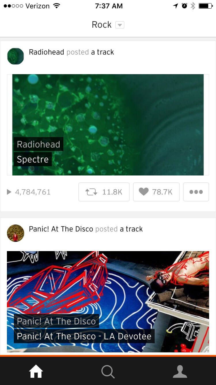
3. Monotone Color Schemes
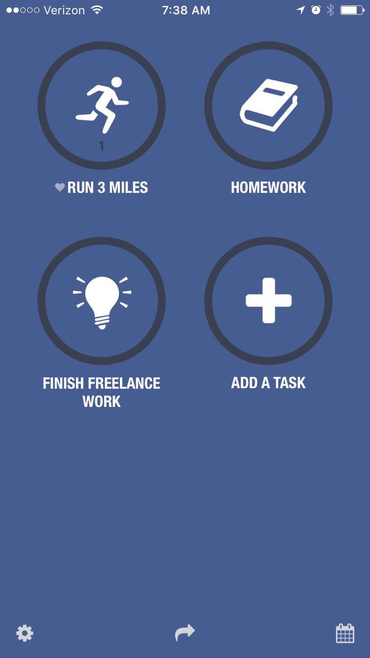
Use of a single color with black and white accents is a great way to create visual interest on a small screen. Opt for a bright, bold or unusual color option to stand out the most. Or build in several such options into the interface and give users control over the color scheme.
That’s just what the Streaks app, above, does. The concept is so simple – set goals and the app will remind you to check off the tasks. The user can set a background color based on task group and simple notifications remind you of things you should be doing.
The color, iconography and simple type are a striking combination that are easy to read and engage with. The design is so sleek it almost makes you want to add more tasks to your to-do list.
4. Focus on Micro-Interactions
And speaking of interactions, every good app includes seamless micro-interactions. Micro-interactions are those little cues that might go unnoticed but are an essential part of how users interact with or rely on specific apps.
Micro-interactions should be designed to help the user do something. From a text message notification to an alarm to a social media “like,” these little divots are everywhere. And they should do one thing: Delight the user.
In the most simple of terms micro-interactions tend to do three things:
- Communicate feedback, such liking something in Instagram
- See an action, that same “like” result in the heart turning red
- Helps the user do or see something, such as a notification that your image has been liked
5. Cards, Cards and More Cards
While the card revolution might have started with Pinterest, the aesthetic keeps gaining momentum thanks in part to Material Design and adoption by massive websites such as Facebook and SoundCloud (above).
Cards are a great way to organize and develop massive amounts of content in a way that’s easy to digest. Each element is a unit that does a single thing in the design. What’s nice about these units is that each one can actually do something different.
So a card might allow you to watch a video and the next card in the sequence links to another app and the card after that includes a long-block of text to read. The other bonus to cards, particularly in apps, is that they are so easy to use. Most apps divide the screen in half for two cards, such as SoundCloud, or use a one card per screen format so that anything you touch takes you to the desired element. (No worries about “fat fingers” here!)
6. Simple Navigation
Hidden menus, pop-out navigation and big buttons are a big deal. The number of apps with home screen navigation is dwindling. Almost everyone is moving to a hidden style to make the most of every inch of valuable on-screen space.
And users don’t seem to mind. They’ve adopted the idea of a button to show navigation pretty easily. The trick is making sure that when this navigation element is viewed it is highly functional.
Slack is one of the best examples of this. It actually has navigation that pops out from the left and the right of the screen. The main app functionality comes out of the right side (above), but navigation specific to your channel is in the left menu.
7. Touches of Animation
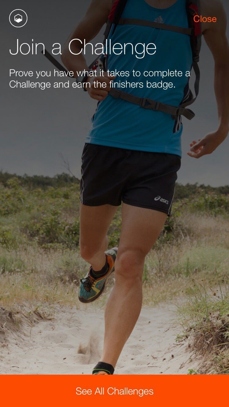
Flashes of animation are that extra special touch that can make your app feel extraordinary. Animation can add to usability, provide focus for the user and serve as a point of delight.
Because you can’t necessarily account for where users will access an app – and what kind of internet connection they might have – it’s important to build in animations that are small, lightweight and don’t rely on connectivity.
Strava is packed with tiny animations. (So tiny that you might miss them if you don’t pay attention.) There are cool transitions between screens, such as the challenge option shown above. Map points include a pulsing animation and you can actually watch your dot move along paths as you track activity.
Conclusion
When you are considering new ways to bring life to a mobile app, look first to the digital design trends of the day and then think about how to apply them on a smaller scale. What might surprise you is that thinking smaller, might actually include designing bigger (in terms of scale anyway).
What trends in app design are you most enamored with? Are there other trends you just want to go away? Let me know on Twitter (tag @carriecousins and @designshack), I am always looking for new ideas to try … and avoid.