12 Tips for a More Accessible Website
Making your website accessible to everyone is not only a moral duty, it’s a legal obligation. Many organizations, including the International Olympic Committee, have been sued for not making their websites accessible enough. With 50 million Americans suffering from some disability or other, improving your site’s accessibility makes clear commercial sense too.
It’s not just those labeled as ‘disabled’ who stand to gain either. Research suggests that 57% of adult computer users will benefit from enhanced accessibility of some kind. Only 19% of websites currently meet the most basic accessibility requirements, so you can really stand out from the competition by making a few changes to your site.
In this article, we explore 12 ways in which you can make your site more accessible. Some methods are very cheap and quick to implement, others require a little more time and financial investment, but you should think of them as business opportunities. With the internet so central to all of our lives these days, it’s unfair that some people are being left behind.
1. WAI-ARIA
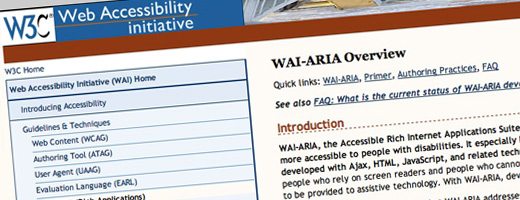
When improving your site’s accessibility, your first port of call should be a set of documents, published by the Worldwide Web Consortium, called WAI-ARIA. These documents basically set out the ways in which developers should add metadata to HTML for improved accessibility.
2. Progressive Enhancement
Progressive enhancement means designing a website in a layered fashion so that everyone can access the most basic functions and users with better bandwidth and advanced browsers can see an enhanced version. Sites built using a strategy of progressive enhancement can be read much more easily by screen reading software, used by people with a range of disabilities.
3. Alternate Content
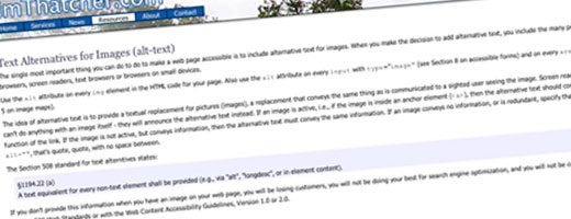
It’s absolutely vital that you provide a text equivalent for non-text content in your site. Images and videos need alt tags, so that people using screen reading software can find out exactly what’s on a page. Links need relevant title tags too.
4. Captions
As well as alt tags, images, audio and video clips need captions, so that the visually impaired know exactly what they’re looking at. If you’re uploading videos or podcasts, provide a paragraph of text summarizing its contents, or even better, provide a full transcript. Don’t forget, captions really help with SEO too.
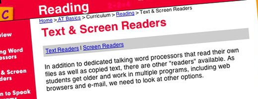
5. Screen Reading Software
Most blind and partially sighted people use screen reading software when browsing websites. One of the best ways to make sure that your website is accessible to them is to try using the same software yourself. Turn off your monitor and run the software to find out exactly what your site’s saying to these valuable readers and potential customers. If the software starts spouting gibberish, you know you need to make some changes!
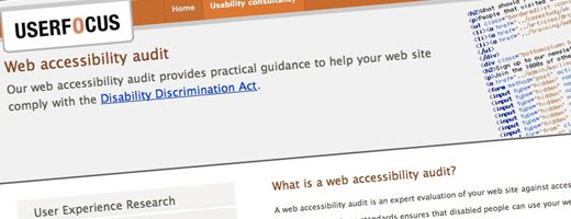
6. Audit
No amount of accessibility testing you do yourself can compare to having a real specialist cast their expert eye over your site. There are a number of companies and individuals who will carry out an accessibility audit for you, telling you exactly which changes you need to make.
7. Usability Testing
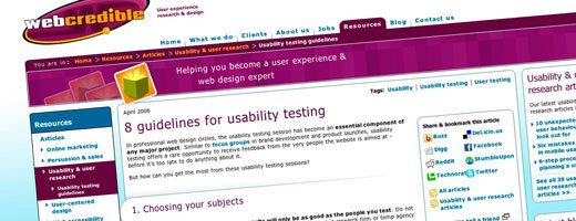
Usability testing is another valuable way to identify potential accessibility problems with your site. Get a group of people with a range of different needs to try your site out for real, navigating around and performing tasks. They’ll be able to tell you in detail about any problems they encounter, lots of which, you’re bound to find, will not be included in WAI-ARIA guidelines.
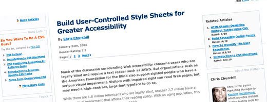
8. Stylesheets
When you’re building or redesigning your site, make sure that your stylesheets permit variable font sizes and never use fixed fonts. You’d be amazed by how many users, from old people to those with slightly poor eyesight, resize their fonts on a regular basis.
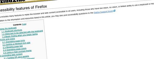
9. Font Controls
Firefox and Internet Explorer users can enlarge fonts but lots of people are not aware of this and others still are using older browsers that do not have this capability. For them, consider embedding font resizing controls into your site.
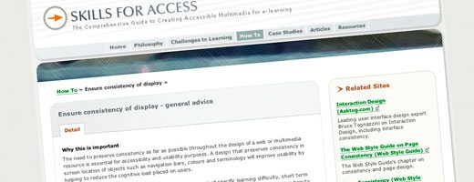
10. Consistency
Consistency in design from page to page is really important for people who can’t take in a whole page at a glance, and those using screen readers. If you’re site’s consistent, with the same things in the same place on each page, they’ll be able to get to navigate around much more easily. Sighted users often find consistency beneficial too.
11. Text for Navigation
Avoid using images for navigation on your site, at all costs. Use text instead. Screen readers can understand it and it’s much easier to resize. If your navigation controls can’t be enlarged, make sure they’re written in a clear font, at least 16 point in size.
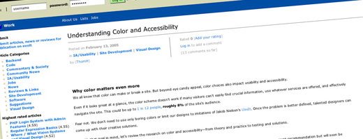
12. Colors
Using different colors in websites is great, but you have to consider how they work together to create a clear image. Foreground and background colors must contrast sufficiently and you can forget about using light-grey text it’s difficult enough for people with 20-20 vision to read. Links must be a different color from the rest of the text on your site, preferably blue and always underlined.
Conclusion
Accessibility is an often overlooked aspect of web design, but it’s something that should be at the core of your design process right from the start when you’re wireframing a layout. Without sounding too self-serving, ensuring that your website meets the standard for accessibility means one thing: more happy customers. And you know what that means!
Use the comments below to tell us if you agree with the tips above and how you’ve made your site more accessible.
