Accessibility

Advice on how to make your websites and design projects perfectly accessibile to any person, device, or place.

Designing Accessible Forms: Small Fixes, Big Impact

Accessibility / 20 Jun 2025

Designing Accessible Forms: Small Fixes, Big Impact

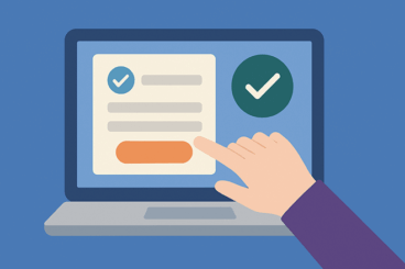
Accessible forms are a crucial part of inclusive design.

They help ensure that everyone, whether using a keyboard, screen reader, voice input, or assistive device, can complete the same tasks as any other user.

But too often, forms are designed without considering how users of all abilities will experience them. The result? Frustration, mistakes, and even abandonment.

The good news is that improving form accessibility doesn’t require a complete redesign. In fact, small adjustments can make a huge difference.

In this post, we’ll explore practical ways to make your forms more accessible, easy to use, and user-friendly for everyone.

Color Accessibility Beyond Contrast: Designing for Color Perception

Accessibility / 9 Jun 2025

Color Accessibility Beyond Contrast: Designing for Color Perception

When discussing color accessibility, contrast tends to be the focus, and for good reason.

High contrast between text and background improves readability for users with low vision. But accessibility goes beyond just contrast ratios.

You also need to think about how people perceive color, especially users with color vision deficiencies or cognitive differences that affect how color is processed.

Designing with inclusive color in mind means understanding how people see and interpret color differently. It’s about using color in a way that communicates clearly, even when hue alone isn’t enough.

In this post, we explore how color perception works, why it matters in design, and what you can do to make your designs more inclusive and effective for everyone.

Designing Accessible Email Templates That Work Everywhere

Email Templates / 7 Jun 2025

Designing Accessible Email Templates That Work Everywhere

Email remains one of the most powerful tools for communication, but its effectiveness hinges on one important factor—accessibility.

A well-designed email should be easy to read, navigate, and engage with for everyone, including people using screen readers, those with visual impairments, and users on mobile devices.

Today, accessibility isn’t just a nice-to-have feature; it’s expected. But creating an email that works for every reader across every device and platform is no small feat.

Between countless email clients, dark mode preferences, and accessibility standards, designers and marketers need to be more intentional than ever.

In this post, we’ll explore the key elements of email UX and designing accessible email templates to make sure your message gets through clearly and inclusively.

Voice UI & Accessibility: Designing for a Screenless World

Accessibility / 4 Jun 2025

Voice UI & Accessibility: Designing for a Screenless World

We’re entering a world where screens are no longer the only way people interact with technology.

From smart speakers to voice assistants on phones and wearables, Voice User Interfaces (VUIs) are reshaping how we search, shop, and connect.

And with that shift comes a growing need for designers to think beyond the screen, especially when it comes to accessibility.

Designing for voice isn’t just a matter of function. It’s about inclusion.

For many users with visual impairments, mobility limitations, or cognitive challenges, voice technology opens up new ways to engage with digital content independently. But for voice to truly be accessible, it must be thoughtfully designed.

In this post, we’ll explore the role of voice interfaces in accessible design, the challenges they present, and how to create voice experiences that are inclusive, intuitive, and effective in a screenless world.

Why Accessibility Improves SEO (And Why You Should Care)

Accessibility / 28 Jan 2025

Why Accessibility Improves SEO (And Why You Should Care)

Website accessibility and SEO go hand in hand. They basically share the same goal of creating a user-friendly, easy-to-navigate website that is accessible to a wider audience.

However, most websites on the Internet are still not fully optimized for accessibility. According to a survey, 88% of 63,000 websites were found not to be compliant with web accessibility guidelines.

Thankfully, the awareness of the importance and many benefits of web accessibility is on the rise. Today, we want to shed some light on yet another benefit of optimizing a website for accessibility—SEO!

That’s right! Web accessibility helps improve websites for search engines in many different ways. Here’s how.

Dark Mode and Accessibility: Finding the Right Balance

Accessibility / 22 Jan 2025

Dark Mode and Accessibility: Finding the Right Balance

It didn’t take long for the “dark mode” to become a requirement for every user interface design. What started out as a design trend turned into a must-have feature for offering a comfortable user experience.

Due to its popularity, every type of design, from the UIs of operating systems on computers to websites, mobile apps, and even print designs now features a dark mode option.

According to a survey by Android Authority, 81.2% of 2,514 users claimed they prefer dark mode on their phones over light mode. It’s quite effective on desktop as well. After switching to a dark mode theme, a company was able to reduce the bounce rate by 60% and boost pageviews by 170% on their website.

But not everyone gets it right. Dark mode design is more than about adding a black background to a design. It’s about improving accessibility while balancing aesthetics at the same time. This process comes with some challenges as well.

In this post, we explore the importance of implementing dark mode in designs and discuss the benefits and the challenges that come with it. Let’s dive in.

Beyond Alt Text: Overlooked Accessibility Features You Should Be Using

Accessibility / 14 Jan 2025

Beyond Alt Text: Overlooked Accessibility Features You Should Be Using

When it comes to creating accessible designs, we always think of the basics, like adding alt-text, translations, and color palettes. But there’s more to accessibility than those basic features.

Creating an accessible website involves using clear navigation, easy-to-understand multimedia, color contrast, and elements that can be used by all. Unfortunately, most of these accessibility features often go overlooked.

In this post, we want to highlight the importance of these underused accessibility features and explain why you should implement them in your website and UX design projects to create more accessible experiences.

Let’s dive in.

10 Rules for Designing for Inclusivity & Equality

Accessibility / 20 Mar 2023

10 Rules for Designing for Inclusivity & Equality

Designing for inclusivity and equality is a core principle of many designers. You want to create something that puts people first and is intended to be for everyone.

With that guidance in mind, Inclusive Design Principles is a codified set of seven rules for inclusive design. Here, we’re going to look at those principles, plus three more, to help you design for inclusivity and equality.

Designing for inclusivity and equality takes forethought and conscious practice. Seeing things that aren’t part of your everyday circles can be hard. So learning more about how to approach this whole space is a great place to start.

Pros and Cons of Live Chat in a Web Design

Accessibility / 12 Sep 2022

Pros and Cons of Live Chat in a Web Design

Live chat has become the go-to customer service solution for many websites. Users can log in and immediately “talk” with someone about whatever they need help with.

Live chats can be text-based or include a video call. The key reason it is used is to connect with customers immediately and help provide a better customer service experience. But there’s a catch – not all live chat is actually a conversation with a person.

Here’s a look at the pros and cons of live chat in your web design projects.

10 Reasons Why Alt Text Matters

Accessibility / 4 Jul 2022

10 Reasons Why Alt Text Matters

If you aren’t using meaningful alt text in website projects, you are committing a crime on the internet. This tiny element has a big function, and comes with a huge impact on usability, readability, and accessibility.

If you thought that alt text was only for the purposes of accessibility, think again. It can help Google better understand your content, provide important context for what your page is about, and help readers navigate.

Here’s a guide to creating alt text that will help create more impact and a better user experience on your website.

8 Ways to Design Clever Error Messages

Accessibility / 24 May 2021

8 Ways to Design Clever Error Messages

Question: What happens when someone gets lost on your website or when someone stumbles upon a bad link or missing content?

Answer: They get to see your 404 page.

Now here’s the real question: Is that 404 page a well-designed Easter egg that will help users on their journey or did you forget to add design or informational elements?

Clever error messages and 404 pages are a website design art form. Some designers sneak these little nuggets in, to surprise and delight users. One thing is common, good error microcopy and design can actually help users connect with the content when they might otherwise bounce, making it important to use this element to your advantage.

Love, Hate & Pop-Ups: How to Use Them Well

Accessibility / 6 Apr 2021

Love, Hate & Pop-Ups: How to Use Them Well

The first response you’ll hear from others about using pop-ups on your website is a long sigh.

Many people discount the idea before it really gets off the ground, but when done well, pop-ups are a valuable conversion tool for websites. (Note the phrase “when done well.”)

They get a bad reputation because so many people use them poorly or implement pop-ups with dark patterns that trick and annoy users.

A good pop-up is actually helpful and helps users on their website journey. Let’s dive in and learn how you can still use these well.