25+ Best Billboard Fonts
Make a bold statement with our collection of billboard fonts, designed to grab attention and convey messages with impact. These fonts are perfect for large-scale advertising, ensuring readability and standout appeal from a distance. Ideal for designers and marketers who aim to make a powerful visual impact in their outdoor advertising campaigns.

Austral Slab Billboard Font
The Austral Slab Billboard Font is a unique, hand-drawn typography tool created by Antipixel. With its uneven outlines and strokes, this distinctive f...

Action Hero Font
Lend some cinematic flair to your designs with the Action Hero Font, a hand-drawn typeface inspired by the high-octane action movie posters of the 198...

Nezuko Casual Billboard Font
The Nezuko Casual Billboard Font is a remarkable asset in the world of typography. Strikingly different from common typefaces, it stands out for its r...

Sumac Bold Billboard Font
The Sumac Bold Billboard Font is a typographic marvel designed to optimize visual appeal and readability. It’s a hefty, welcoming typeface that ...

Pro Made Font
Pro Made Font lets your words take center stage with its high-impact, attention grabbing style. It’s a condensed display font designed to pack a...
Dope Unique Logo Font
A solid contender for your cash, Dope is a perfect typeface for creating logos, monograms, posters, and headlines. It comes packed with three weights,...

Sunrise Waves Font
The Sunrise Waves Font invigorates your design with a splash of beachy positivity. This unique font exudes a relaxed aesthetic with noticeable imperfe...
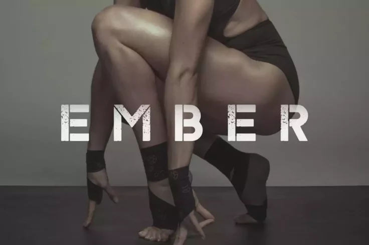
Ember Typeface
Ember is a poster stencil font that comes in two different styles that will fit in well with digital and print designs. It has a rough post-apocalypti...

Nordin Condensed Sans Serif Font
Nordin is a creative sans serif font that features an uncommon letter design. The narrow condensed look also adds another unique look to the font desi...
Crux Minimal Display Logo Font
Next up we have crux, a contemporary typeface for minimalist logotypes, headlines, and other display purposes. It offers two styles: Normal and Outlin...

Longway Vintage Serif Font
Introducing the Longway Vintage Serif Font, a typographical asset that exudes an unmistakable retro vibe. It’s an all caps serif font, making it...

Malrin Classic Font
Introducing the Malrin Classic Font, a beautifully chunky retro typeface that exudes groovy vibes and a touch of psychedelic flair. Inspired by the ic...

Logam Luxury Sans Serif Font Family
Logam is a minimal sans-serif font that features a simple luxury design. It includes a set of all-caps letters in regular and italic styles. The font ...

Royal Lodge Billboard Font
Royal Lodge – Display Sans Serif Font can be the game-changer in your creative endeavors. With its fun, trendy yet powerfully bold aesthetics, i...

Rushway Handwriting Billboard Font
Boasting a raw intensity, the Rushway Handwriting Billboard Font makes a bold and rebellious impression. The font’s vibrant, dynamic strokes and...

Etna Title Font
Etna features a bold design with thick letters. You can use this font to craft attractive headlines for all kinds of print and digital designs. It als...
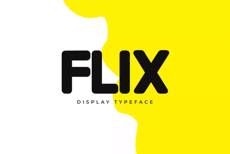
FLIX Font
Flix is a modern and versatile display title font that is ideal for branding and design projects. With its curved edges and smooth letter design, Flix...

Bismark Tall & Narrow Font
Creating ripple effects in design realms, Bismark Tall & Narrow Font is a standout addition to any designer’s toolkit. This all-caps typefac...

Fritz Title Font
This big and bold rounded font is simply perfect for crafting titles to attract attention. It will especially work well for fun and entertaining poste...

Summer 0f 76 Multi-Line Font
Welcome to the Summer of ’76, a multi-line font designed to bring back memories and the unique style of the 70’s. This sophisticated font ...

Cred Typeface
Cred is a minimalist and a stylish flat font that comes with all-caps letters, numbers, and more. The font is available in both regular and corroded s...

Postress Serif Billboard Font
Bring your designs to life with the visually striking Postress Serif Billboard Font. With its condensed serif design, this font exudes a bold and dist...

Flight Dot Matrix Font
Boasting a uniquely modern yet nostalgic feel, the Flight Dot Matrix Font is a remarkable typographical tool that speaks to a bygone tech era. Its des...
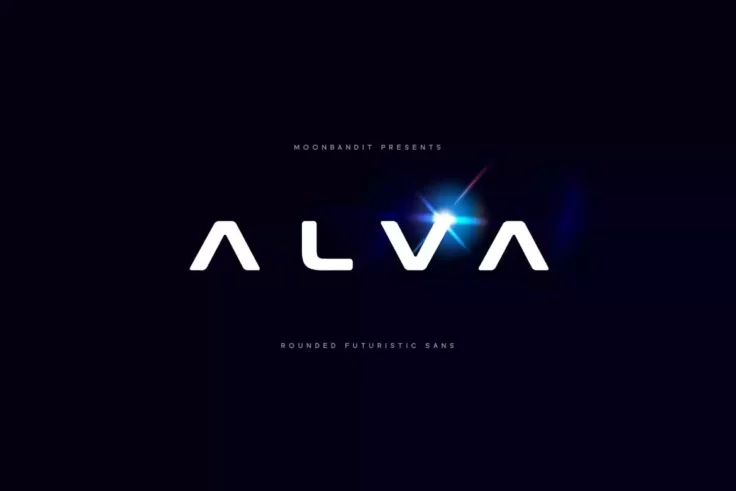
MBF Alva Futuristic Font
Presenting Alva, an attention-grabbing futuristic font that’s big, bold, and beautifully balanced. This typeface has been specifically designed ...

Vogue Modern Billboard Font
Step into the world of high-fashion aesthetics with VOGUE, a cutting-edge all-caps display typeface. It brims with a character all its own, marrying m...
FAQs About Billboard Fonts
What Are Billboard Fonts?
Billboard Fonts are typefaces specifically designed for use on billboards and large-scale advertising displays. These fonts are characterized by their high legibility and impact at great distances and varying speeds, especially for viewers in moving vehicles. Billboard fonts often have bold, clear, and simple letterforms, ensuring that the text is readable and eye-catching from afar. The design of these fonts takes into account factors like size, spacing, and contrast to maximize visibility and effectiveness in outdoor advertising.
These fonts are used across various industries for outdoor marketing campaigns, road signs, and large-scale banners, where capturing the audience's attention quickly is crucial.
How Can You Choose the Right Billboard Font for Your Project?
Choosing the right Billboard Font involves considering the nature of your message and the context in which the billboard will be displayed. For messages that need to be quickly absorbed, opt for fonts with simple, clean lines and avoid overly decorative elements that can hinder readability. The font size, weight, and color contrast against the billboard background are also critical factors to ensure the text stands out effectively.
It's also important to consider the distance and speed at which the majority of viewers will see the billboard. For high-speed areas like highways, choosing fonts with even more significant weight and spacing can enhance legibility. Testing your font choice in a scaled-down version of your design can provide insights into its effectiveness before the final application.
Are Billboard Fonts Only Suitable for Outdoor Advertising?
While Billboard Fonts are optimized for outdoor advertising, their clear and impactful nature makes them suitable for various other applications requiring high visibility and legibility. This includes indoor large-format displays, event signage, posters, and any promotional material where quick message delivery is crucial. However, their bold and straightforward characteristics may not be appropriate for all types of communication, especially those requiring a more subtle or nuanced approach.
When used in digital formats or smaller print materials, it's important to adjust the font size and spacing to maintain readability and aesthetic balance.
How Do You Pair Fonts with Billboard Fonts in Design?
Pairing fonts with Billboard Fonts in a design project involves selecting complementary typefaces that balance the boldness of the billboard font without competing for attention. A common approach is to pair a bold billboard font with a more restrained sans-serif or serif font for body text or secondary information. This creates a visual hierarchy, directing the viewer's attention to the most important message first, followed by supporting details.
Ensuring sufficient contrast in font weights and styles can prevent visual clutter and enhance the overall readability of the design. Keeping the number of different fonts to a minimum can also help maintain clarity and cohesion in the message.
What Are the Best Practices for Using Billboard Fonts?
Best practices for using Billboard Fonts include prioritizing legibility and impact in your design. Keep word count to a minimum to ensure that each word can be made as large and clear as possible. Utilize ample spacing between letters and words to prevent crowding, which can reduce readability at a distance. Additionally, consider the color contrast between the text and the background to ensure the words pop and grab attention.
It's also crucial to adapt the font size and spacing based on the viewing distance and the speed at which your audience will pass by the billboard. Testing your design mockup under similar viewing conditions can help you make necessary adjustments before the final implementation.