25+ Best Victorian Fonts
Step back into the grandeur and intricacy of the 19th century with our victorian fonts collection. These fonts are characterized by their elaborate details, decorative elements, and historical charm, perfect for projects that require a touch of antique elegance.

The Royal Consort Font
Welcome to the world of ornate lettering with “The Royal Consort”, our latest vintage victorian typeface. Adored for its decorative, class...

Omnivorous Font
With its Victorian-era inspiration, the Omnivorous decorative font effortlessly brings a touch of elegance and historical charm to your designs. Ideal...

Lost Volution Font
Introducing Lostvolution, a fresh take on classic, decorative Victorian typography. This vibrant new font breathes life into typographic design, offer...

Swashington Hand Drawn Decorative Font
Featuring a mix of modern-day charm and vintage nostalgia, Swashington is a painstakingly created decorative font that will look good on projects need...

Phillnesia Font
Phillnesia Font is an artistic interpretation of architectural solidity and vintage elegance. Drawing inspiration from the Victorian era, this typefac...

Veinline Script Font
Veinline script font is a unique fusion of past and present. Inspired by artefacts from the late 1800s to the early 1900s, it carries an aura of nosta...

Sea Horse Vintage Decorative Font
Sea Horse is a perfect choice for anyone looking to add a touch of vintage charm to their designs. This poster font is inspired by the typography and ...

Bifaser Victorian Font
Introducing the Bifaser Victorian Font, a gorgeous typographic display of the captivating beauty of the Victorian era. This classic font delicately ca...
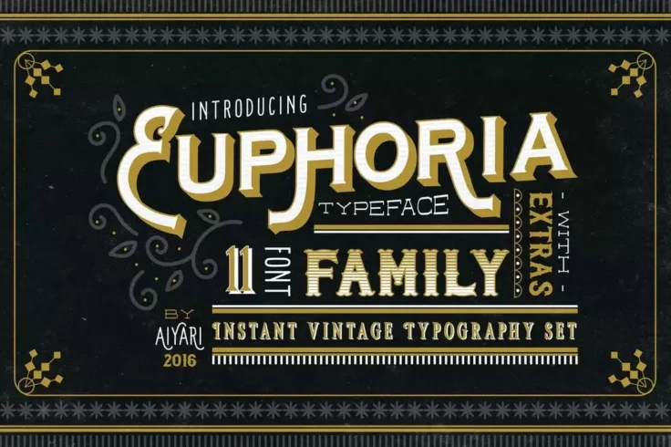
Euphoria Vintage 3D Font Family
Euphoria is a family of 11 different fonts. It includes various styles of fonts such as outline fonts, gradient fonts, Victorian-style fonts, and 3D-l...
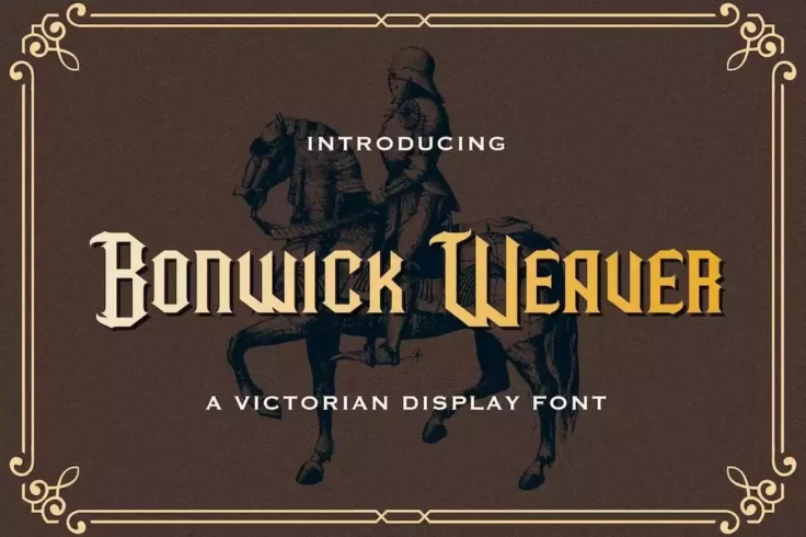
Bonwick Weaver Victorian Era Tattoo Font
Inspired by Victorian-era typography, this unique font comes with a tattoo-style letter design. It has lots of creative ligatures, alternates, and var...

Epique Victorian Font
Step back into the extravagant era of high tea and horse-drawn carriages with our Epique Victorian Font. Emanating rich sophistication, this typeface ...

Victorian Heritage Font
Introducing Victorian Heritage Font, a classic typeface designed to infuse your projects with a vintage charm. This font classically pairs your design...

Vuarlest Victorian Font
Presenting Vuarlest, a serif font imbued with a distinctive vintage flair, inspired by the Victorian era. This classic font aligns harmoniously with v...

Hadfim Victorian Font
Welcome to the wonderful world of Hadfim – the Victorian-era inspired typeface that beautifully balances modern minimalism with a touch of vintage e...

Salmon Victorian Font
The Salmon Victorian Font exquisitely merges the rustic charm of the Victorian era with a contemporary grunge appeal. Its calligraphy-driven style bri...

Aquero Font
Introducing Aquero, an elegant, vintage decorative font designed to infuse a playful, nostalgic charm to any design canvas. Envisaged with a touch of ...

Morning Glory
Morning glory is yet another font that’s been designed inspired by Victorian day culture and fashion. It includes both uppercase and lowercase l...

Victorian Letterhead Font
You are cordially invited to the world of Victorian Letterhead, a vintage-inspired font trio that effortlessly encapsulates the charm of the 19th cent...

The Sign Shop Font
Debuting the Sign Shop font, a creative collaboration by Peter Bielous and Neuron. The creators drew inspiration from the opulence of the Victorian er...

Nicolas Font
Nicolas Font: a distinctive blend of refined Victorian era sophistication mixed with modern usability and diversity. Inspired by the graceful design e...

Iorek Byrnison Font
The Iorek Byrnison Font, with its infusion of raw power and soul, is inspired by the memorable character from The Golden Compass film. The presence of...

Miztar Font
Meet Miztar, a vintage Victorian font that is as unique as it is stylish. Elegant and versatile, this decorative typeface effortlessly captures the sp...

Dragon Font
The Dragon font is a beautifully crafted Victorian Font Typeface that showcases a unique calligraphy style. The striking aesthetic makes it an excelle...

Victorian Font Collection
The Victorian Font Collection is a must-have for embracing a nostalgic flair in your designs. This stunning opentype font enables you to recreate an a...

Macron Font
The Macron Font is a brilliant blend of Victorian and tattoo stylistics, exuding a unique charm that stands out in any creative project. This complex ...
FAQs About Victorian Fonts
What Are Victorian Fonts?
Victorian Fonts are typefaces that reflect the typographic styles popular during the Victorian era, roughly spanning the 19th century. These fonts are characterized by their ornate and decorative details, intricate embellishments, and often elaborate swashes. Victorian Fonts encapsulate the period's aesthetic sensibilities, featuring a mix of gothic influences, classical forms, and the whimsical flair of Art Nouveau that emerged towards the end of the era.
These fonts are commonly used to evoke a sense of historical elegance and sophistication. They are ideal for projects that aim to capture the Victorian era's essence, such as themed event invitations, period-specific publications, branding for luxury products, or any design work that requires a touch of antique charm.
How Can You Use Victorian Fonts in Your Design Projects?
Victorian Fonts can be effectively utilized in a variety of design projects to add historical elegance and ornamental flair. They are particularly well-suited for projects that require a touch of vintage or classical aesthetics, such as wedding invitations, restaurant menus, branding for boutique businesses, and packaging for artisanal products. When incorporating Victorian Fonts, balancing their decorative nature with the overall design is essential to ensure readability and aesthetic harmony.
Given their intricate designs, Victorian Fonts are best used for headlines, titles, or decorative elements within a layout, complemented by simpler fonts for body text to maintain legibility.
Are Victorian Fonts Suitable for All Types of Projects?
While Victorian Fonts can add a distinctive charm to various design projects, their highly decorative nature may not be suitable for all contexts. For modern, minimalist, or corporate designs that require clean lines and straightforward typography, Victorian Fonts might not align with the desired aesthetic. However, for projects that benefit from a vintage, ornate, or classical look, Victorian Fonts can be an excellent choice, adding depth and character to the design.
It's essential to consider the project's tone, audience, and objectives when selecting a Victorian Font, ensuring that it enhances the design's overall theme and message.
How Do You Pair Fonts with Victorian Fonts in Design?
Pairing fonts with Victorian Fonts involves selecting complementary typefaces that balance the design and ensure readability. A common strategy is to use a Victorian Font for headlines or key visual elements and pair it with a more legible, restrained font for body text. Classic serif fonts or simple sans-serif fonts can provide a clean contrast to the ornate Victorian Font, creating a visually appealing hierarchy.
When pairing fonts, consider the contrast in weight, style, and texture to ensure a cohesive and harmonious design that allows the Victorian Font's unique characteristics to shine without overwhelming the content.
What Are the Best Practices for Using Victorian Fonts?
Best practices for using Victorian Fonts include using them sparingly to accentuate key design elements without compromising the overall legibility and coherence of the design. Due to their elaborate details, Victorian Fonts are most effective when used for short texts, such as titles, headings, or branding elements, where their ornate features can be appreciated.
Ensuring sufficient contrast between the Victorian Font and the background, as well as between the Victorian Font and any accompanying text, is crucial for maintaining readability. Testing the font in various sizes and applications is also important to ensure that its decorative qualities translate effectively across different mediums, from digital displays to printed materials.