10 Tips for Designing Presentations That Don’t Suck
PowerPoint has produced more bad design in its day that perhaps any other digital tool in history with the possible exception of Microsoft paint.
In this post we’re going to address the epidemic of bad presentation design with ten super practical tips for designer better looking and more professional presentations. Along the way we’ll see a number of awesome slide designs from Note & Point along with some custom examples built by yours truly. Let’s get started!
Not a Designer?
Most of the content on this site is targeted specifically towards professional designers and developers, or at the very least those interested in getting started in this field. This post however, is for everyone that has ever created a presentation. Whether you’re a student, the leader of a self-help group, or a corporate executive pulling in six figures, the second you open up Powerpoint or Keynote, you become a designer whether you like it or not.
You’ve chosen a visual tool to communicate and should therefore take the time to learn a thing or two about visual communications. One of the major reasons for this, especially for people in the professional business world, is that your colleagues will subconsciously make judgements about you based on the visual appeal of your presentation.
Follow the ten tips below and see if you don’t start getting comments about your awesome presentation design skills. Just watch out, if your co-workers notice you getting good at it they’re likely to start asking for to help with theirs!
1. Don’t Use a Built-In Theme
To illustrate this idea I opened up Powerpoint, grabbed an actual default theme at random and threw some type on it. This workflow is nearly identical to that of countless presentation designers and the result is a typical presentation slide that I’ve seen countless times throughout college and my career.

Here’s a design secret, this slide sucks; as do many of the default themes you’ll find in Powerpoint. Granted, they’ve definitely improved the offering in recent years and Keynote (Apple’s presentation software) has some awesome templates, but you shouldn’t view these as the go-to method but rather a last resort if you need to create a presentation in record time.
The point here is that something custom makes a much stronger statement. Your colleagues know and use the templates in Powerpoint and they’ll recognize immediately that you didn’t put any work into the aesthetics of the slides.
I know for non-designers leaving behind templates may seem a bit radical, but you can do it! Just be sure to read the other tips below before striking out on your own. Otherwise you might end up with something much worse that even the Microsoft designers could come up with (and that’s saying something).
2. Use Quality Photography
Photography is one of the single best ways to make your presentation look awesome. It’s also one of the single best ways to make it lame. The “business people on white background” look is nice, but it’s overdone and tends to look a bit stock art-ish or flat out cliche.
Further, just because a picture is on a white background doesn’t mean it’s a good photo. Stop using ugly or awkward photography just to have something to put on the slide. Remember that no photo is better than a bad photo.

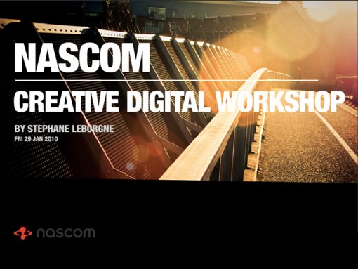
As an example, compare the slide above with the one below. See the difference? The image in the slide below is unique, attractive, and void of cliches. Don’t get stuck in a pattern of using cheesy stock art when you can nab free high quality photos that make a much stronger visual statement.
Finding Free Photos
Where are these amazing photos you say? For starters, check out Stock XCHNG, a free stock photography website with tons of content (good and bad). Also, did you know you can run a Flickr Search using only creative commons licensed content? These photos are free to use and many only require attribution, which can come in the form of a simple slide thrown in at the end of your presentation with a link to the photo sources.

As an example, the photo above is from Lauren Tucker, and is a Flickr Creative Commons item.
3. Solid Colors Rock
You don’t always need a fancy photo or crazy custom background to make a presentation look professional. Using a strong palette of solid colors can make for an awesome presentation.

The slide above is a perfect example of using very plain design and little effort to create something that actually looks really nice. Whether you’re a designer or not, you could make this right?
The key here is to be very cautious about your color choice. Something too bright bright and fun will blow the audience’s eyes out. Also make sure to use plenty of contrast in your secondary color. A crash course in color theory will go a long way.
If you need help building color palettes, check out the free tools below.
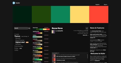
Kuler
Kuler is the quintessential online color tool. Choose from thousands of awesome pre-built color schemes or generate your own with advanced but user-friendly tools.
Piknik
Piknik is one of the most basic color tools on the planet and definitely one of my favorites. Simply move your mouse around to change the color, scroll to change the luminosity and click to copy the values to your clipboard.
I use this daily when building websites to get a feel for what a color will look like when it covers the whole screen, which makes it perfect for presentation slides as well.

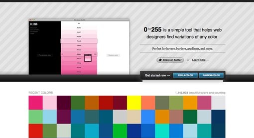
0to255
0to255 is another one of my favorites and is an amazing tool for finding variations of a color. This makes it perfect for hovers and borders in web design but it can also be great for finding an accent color for typography or other elements in a presentation.
4. Typography Speaks Volumes
Non-designers frequently stress out about finding the proper typeface for a presentation, and for good reason. The right font can me make or break your presentation. Typography is a major art form in the design world and it can really set the stage for what you want to say.

Remember that typefaces can communicate a mood, a point in time, or any number of other factors. Instead of browsing your font list and looking for “something cool,” instead think about the message you want to convey.
Consider the fonts below as an example of how typography can communicate just by virtue of its design. Old style serif fonts tend to fee formal and professional while sans-serif fonts feel modern and clean.
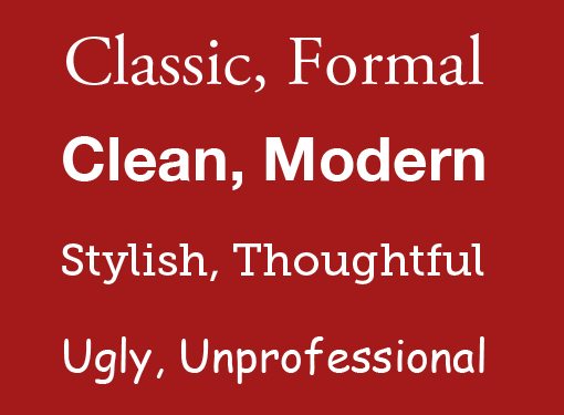
The biggest mistake that people make with fonts in presentations is assuming that the first three font styles listed above are boring. This causes them to jump to something like the font on the bottom because it feels more unique and interesting.
If you’re not a professional designer, remember that the first three styles above aren’t boring, they’re safe. They’re great looking typefaces that have been professionally designed to make you look good and that’s exactly what they do.
Never be afraid of standard-looking fonts. Using them can help ensure that your design remains inside the realm of clean and professional and away from cluttered and ugly. Notice how the slide below uses relatively “boring” fonts but varies the size and weight to add visual interest and create something that is ultimately quite non-boring.

The Trick to Using Fun Fonts
Now, to take that frown off your face I will say that you don’t have to avoid cool fonts 100% of the time. There is a time and a place to throw in something fun, just know that you should use these types of fonts wisely and springily.
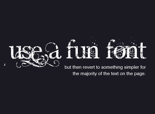
As the image above illustrates, one great trick for using crazy fonts is to only implement them in a headline while leaving the rest of the text plain. When you have too much of a complicated font or start mixing complex styles, what you get is an impossible to read mess. Above we’ve left most of our messaging in a typeface that you can actually read while still bringing plenty of awesomeness to the page with the headline.
5. Watch Your Readability
While we’re on the subject of typography, you should always be aware of how readable the type is in your presentations. Sometimes the amazing photography tip from #2 will leave you in a situation like the one below.

Here we have a really captivating image, but it’s wreaking havoc on the readability of our text. Even if we make the text bold and try different color variations, it still comes up short. This can be immensely frustrating to new designers.
The solution however is quite simple: use tip #3 (solid colors rock). By creating a simple color bar behind the text we increase the readability by leaps and bounds and still maintain a stylish looking slide.

This is an extremely common tactic carried out in a number of different ways. Check out the examples below for some inspiration.
Skinny Bar

Fat Bar

Paper Scraps

6. Simpler is Better
This is a major stumbling block for non-designers. The problem stems from a basic misunderstanding of what a presentation slide should be. In most cases, the slide should not be the ultimate source of content and information. Instead, the speaker is what makes the presentation valuable. The speaker should provide the vast majority of the content, information, insight, bad jokes, etc.
After all, if the presentation slides contain all the information begin conveyed, then why would the audience even need a speaker? You could just provide everyone with a download link and bid them a good day.
I’ve seen far too many people give presentations with slides that look like the one below:
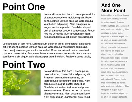
You might think I’m being facetious with my design but trust me I’ve seen slides that were far worse. Presentation slides are not to be confused with magazines. You can’t cram this much content onto a slide without completely losing the functionality. Even if you organize all of the information nicely and create a beautiful slide, you’ve still missed the mark.
Again, remember that your speech is the reason you’re up in front of people. The presentation should serve as a drastically simplified visual aid that, when flipped through, would present a rough outline of your speech.
Use your slides to grab and hold the audience’s attention through attractive visuals. People get bored easily listening to speeches and having something pretty to look at helps us focus.
Keeping your slide contents simple also discourages you from simply reading your speech from the slide. It’s a cliche example but I have in fact seen multiple presenters place every word of their speech on the slide and then simply read it off. As boring as normal speeches are, hearing someone read to you for twenty minutes is even worse!
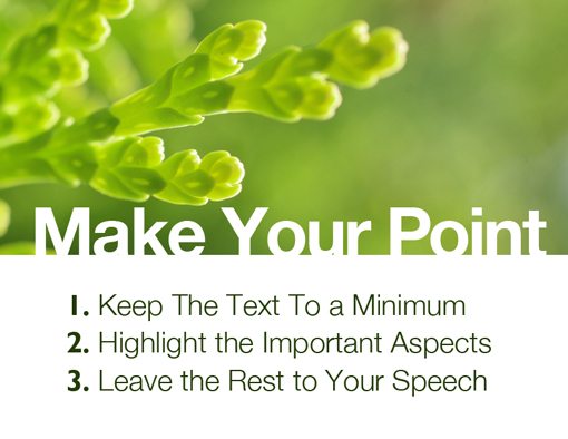
Notice how the slide below pulls you in with an incomplete statement. The graphic no doubt reinforces the answer but we won’t know unless we actually listen to the speech to see what the answer is! This is an excellent example of using a slide as a visual aid that strengthens your presentation rather than serving as a giant printout of your speech.

7. Avoid the Bullet Point Plague
Several presenters have become aware of the “reading from your slide” problem and pompously proclaim that they just can’t stand it when people do such a thing, which is why they use bullet points.
Bullet points are magical (marketing folks freaking love bullet points). They are a great way to say everything you need to say in a convenient list form. All of the most complex ideas ever composed by mankind can be placed into a bulleted list and even the dullest of individuals will suddenly see the light… right? Not quite.
Bullet points are in fact a great tool to convey the most important parts of your speech. It’s a familiar format that clearly separates ideas and is easy to digest. So what’s the problem?
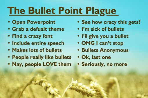
The problem is that, like any good tool, bullet points can be abused. Presenters often get carried away and begin to repeat the mistakes of the previous tip only in bullet form.
Placing forty-two points on a single slide is exactly like using multiple paragraphs; doing so kills the usefulness of the slide. Remember that bullet points are supposed to convey the important information. To do that effectively you must actually make a decision on what you think is important vs. what should just be left to the speech.
Check out how the slide below uses three bullet points to convey factual statistics. Numbers are particularly hard to take in and remember unless you see it written down so using these as bullet points is a great place to start.
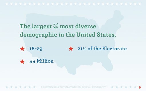
Keep it simple and remember that even the bullets don’t have to be self-explanatory. Again, that’s what you’re there for.
8. Create Clear Focal Points
No matter what you’re designing, it’s important to consider how you want to direct the viewer’s attention. Don’t leave it up to chance, instead structure the experience in the way that you believe best facilitates the message.
Notice how the slide below used color to direct your attention to specific areas. The words in yellow stand out considerably from the rest of the content and therefore tend to draw your attention more.
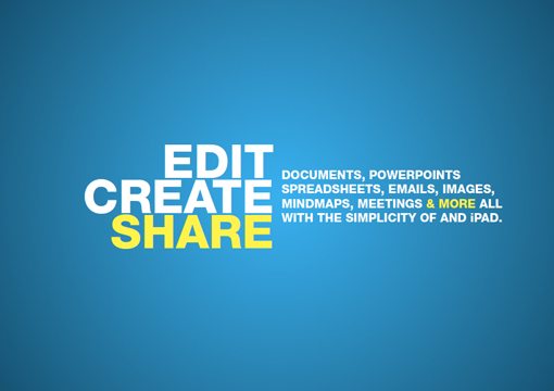
With text you can use color, size, typeface style or boldness to create clear focal points. Keep in mind that it’s a good idea to have one primary focal point (like the word “share” above) followed up by one or two secondary focal points that aren’t quite as strong.
Note that text isn’t the only way to create strong focal points. Photographs and illustrations are also great ways to bring the viewer’s attention to a given area. Notice how the child’s eyes in the slide below really catch your attention and then gradually bring you down the headline as you move on.

For more information on designing with faces, check out our complete guide.
Ultimately, remember that the lack of clear focal points can cause a viewer to quickly lose interest. When something is designed well it gives people a clear idea of where you want them to look, even if only on a subconscious level.
9. Create a Captivating Cover
The cover slide is often either skipped entirely or shown for only a second in many presentations. However, a good cover design is a great way to set the tone for the entire presentation.
Until that slide is shown, the audience has no idea what to expect from your visual aid. Creating a beautiful cover and leaving it up while you introduce yourself and your speech can really start things off on a positive note and give the audience a psychological heads up to pay attention because they’re about to see some awesome slides.

Creating an attractive cover also provides you with the start of a visual theme that you can carry on throughout the rest of the presentation. This helps the presentation seem cohesive and professionally done rather than the random and scattered feel of seeing a completely different design on every slide.
As an example, check out the beautiful cover design above by Fabio Sasso at Abduzeedo and then look at the sample content slide below to see how he applies this dirty grunge theme to the rest of the presentation.

It’s often a good idea to design a cover along with a few different blank content slides that you can use throughout the entire presentation. You can then carry out a unified design and save yourself a lot of design work by having two to three blanks to pull from.
If you’re not a designer, then it can be intimidating to try to create a beautiful cover. In these circumstances, refer to tips #2 and #4 from part one and let professional photography in conjunction with simple typography handle all the work for you.
#10 Make ’em Laugh
Every good speaker knows that one of the single best ways to keep your audience interested is through the use of humor. Unfortunately, not everyone can make an audience bust a gut like Bill Cosby or Brian Regan.
Whether you suck at delivering witty one liners or are a natural born comedian, it helps ease the pressure to let your slides handle some or all of the humor. This way you can be perceived as funny without worrying about screwing up the punch line.

Remember that your goal doesn’t have to be audible laughter from the entire room. Even the occasional smile from a few audience members goes a long way because it shows that they’re actually paying attention!
My best advice in this area is to try not to pour the humor on too thick. The audience will notice if you seem to be trying too hard. Find the most boring or complicated parts of your speech and break them up with a funny slide or two.
Be sure to always consider your audience carefully when deciding what sort of humor is appropriate. Offending the audience is far worse than boring them.
If you find that you’re not a particularly clever person with either pictures or words, try inserting a simple comic that illustrates your point effectively. Just make sure the comic is a quick, near instant read and not something with lots of dialog spread across four panels.
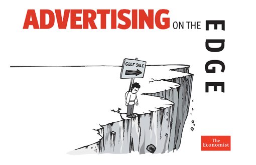
Again, notice how the example above is effective in setting a lighthearted tone to the presentation even though it is unlikely to actually make anyone actually burst into laughter.
Conclusion
To sum up, let’s take a quick look at all ten tips for designing presentations that don’t suck from both articles.
- 1. Don’t Use a Built-In Theme
- 2. Use Quality Photography
- 3. Solid Colors Rock
- 4. Typography Speaks Volumes
- 5. Watch Your Readability
- 6. Simpler is Better
- 7. Avoid the Bullet Point Plague
- 8. Create Clear Focal Points
- 9. Create a Captivating Cover
- 10. Make ’em Laugh
I hope you’ve found these tips practical and easily implementable. Ultimately the goal here was to show you that you don’t necessarily have to be a professional designer to create great looking and effective presentations. Leave a comment below if you want to join the discussion and share your own tips and tricks for better slide design.