A Practical Guide to Designing With Faces
One of the principal functions of professional design, if not the central function, is to draw the attention of the viewer. Everyone has a message that they want to get across, but getting people to actually stop and take that message in is no easy task.
Designers are therefore tasked with attempting to use every human’s natural attraction to aesthetic beauty in such a way that it becomes possible to capture the attention of an audience almost without them even realizing it.
With this goal in mind, faces are a magic design element.
Why Are Faces Magic?
The answer to this question is multi-faceted and deeply psychological. There are countless scholarly studies that indicate the factors related to facial attractiveness. These include symmetry, bone structure, etc.
However, in the context of a photograph or piece of art, the face doesn’t always have to be attractive or even remarkable in any way for it to grab our attention. This indicates that there is something deeper.
Perhaps society has simply programmed us to look others in the face. Or maybe we have some deep need to relate to the world around us and objects that seems face-like is easier to relate to than something decidedly non-human.
No matter what the solution or combination of solutions may be, the truth remains: we like to look at faces.
Leveraging Faces in Design
Possessing this knowledge as a designer arms you for a variety of situations. Obviously, as we’ve already discussed, faces are awesome for grabbing the attention of a viewer. However, they also play a huge role in how the viewer reads the page, interprets the message, feels about the design, and even the emotion they walk away with and remember later.
Let’s look at a few specific ways you can leverage faces in your designs.
Breaking the Z
Many professional marketers with lots of abbreviations after their names and lots of zeros on their paychecks have it in their heads that people will always view a page in a “Z” pattern. These marketers love to remind silly designers of this fact when they are presented with an ad layout that doesn’t conform to this idea.
After all, people read from left to right and top to bottom. It’s therefore natural for them to process information in this regard.
This is absolutely a true statement. People will have a tendency to read a page in such a manner… unless other factors stand in the way of that tendency. As a designer, you should be able to easily control how you want someone to read your designs.
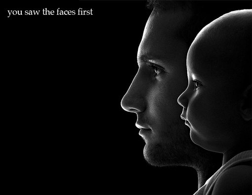
As an example, consider the following image:
Given the knowledge that people read in a “Z” starting at the top left of a page you would conclude that the words on this page are the very first thing you see. However, they aren’t are they? (Note that scrolling on a website can ruin this idea as the image is revealed from top to bottom regardless of intent.)
Though a few exceptions will no doubt arise, most people will will have a tendency to first look at 1) any faces present and 2) the item with the greatest volume of space. Interestingly enough, there is a high likelihood that these same objects will be the last thing you look at before moving on.
In the image above I used huge faces and small text to completely ruin your Z-pattern tendencies. The typical pattern here would be: faces, text, faces, move on. The text simply isn’t as visually interesting so your eyes will inevitably end up back on the faces.
Directionality
When you put a face in your design, make sure you think about what you want to accomplish with it and whether or not the face you chose is getting the job done.
One of the key considerations here is directionality. The direction the face is looking is among the most powerful tools you can use to accomplish a specific goal.
For instance, in the previous example, the faces are essentially looking at empty space. Consequently, they’re really doing a poor job of getting the viewer to read the message. Sure the viewer might get around to it, but this is really in spite of the faces rather than because of them.
Follow the Eyes
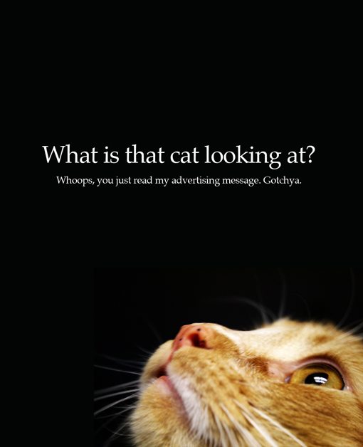
Let’s take a look at a similar example that has been structured to better take advantage of the magic of faces.
Here we have a face that’s actually being put to good use. Remember that the goal is to get your message across. As before, the face grabs your attention but this time rather than leading you astray, it throws your attention straight at the headline, which is inevitably read, often by accident.
One of the key rookie mistakes you’ll see designers make with faces is having them look out of the ad. By doing this, you grab the viewer’s attention but then let it wonder outside of the page where it’s likely that the person will move on without ever reading your message.
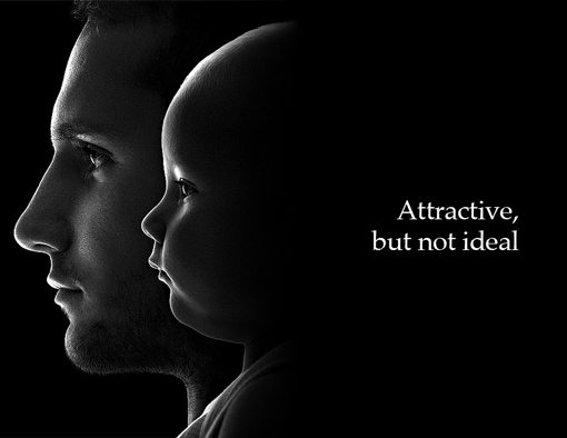
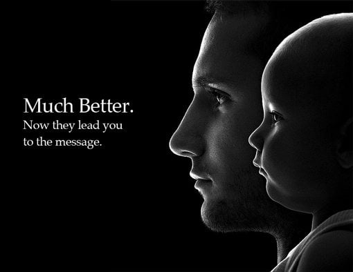
To illustrate, let’s go back to the photo of the man and the baby.
Here you can see that, although the first example is still quite aesthetically pleasing, the faces aren’t really helping out as much as they could be. The second example does a much better job of guiding you to the message.
Notice how I also moved the text up to eye level in the second example. Remember that it’s their eyes that you are subconsciously following. When performing the layout I was tempted to center the text vertically but this proved to be a much stronger visual statement.
Eye Contact
Using faces as an arrow that points to your message is incredibly effective. However, though this trick diverts attention fairly well, it doesn’t always grab attention as well as direct eye contact.
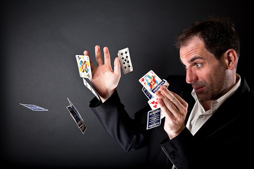
When someone looks straight into our eyes we almost can’t help but to look back. As designers, the primary way we can use this is to attempt to make the viewer feel something through the expression on the face.
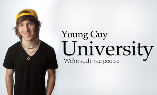
Happiness, anger, confusion, comedy, lust and more are all easily relatable through facial expressions and are particularly effective when coupled with eye contact.
You can see this in countless ads and websites for corporations, schools and other professional entities trying to convince you that they have a welcoming environment and lots of friendly people.
You also see the same technique used in much more dramatic situations. Overly serious facial expressions can do everything from sell sports drinks to inspire guilt-driven donations.
Abstract Faces
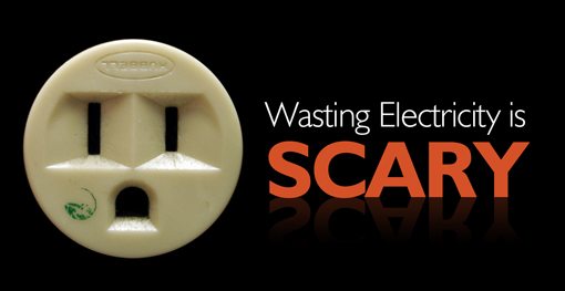
Keep in mind that literal faces aren’t the only way to draw a viewer’s attention. The suggestion of a face in a more abstract way can be just as powerful and often even more amusing.
Whether it’s a common household object or a clever composition of objects, look for ways to infuse faces into your designs.
Play around with both obvious facial suggestions and subtle hints. The viewer doesn’t even have to consciously be aware of the similarity to be drawn to the image.
Conclusion
The basic message here: faces are magic. As a designer, you have few more powerful visual weapons at your disposal.
Just as the skillful wielding of faces can greatly increase the effectiveness of your designs so too can the casual misuse of faces can significantly reduce the appeal of a design. Remember to always pay attention to your intentions for the use of the face and whether or not that intention is being met through both expression and directionality.
Leave a comment below with a link to something you’ve designed that uses faces in a very intentional manner. Explain your intention and why the photo succeeds in meeting that purpose.
