3 Rock Solid Website Layout Examples: Coded
Recently on Design Shack we featured an article titled “10 Rock Solid Website Layout Examples“, which broke down some common layouts into simple silhouette wireframes so you could easily apply them in your work.
Today I’ve chosen three of these layouts and converted them to live, responsive web pages with some HTML and CSS. They’re all super simple and easy enough for many beginners to take on, plus we’ll be using an awesome framework to do the heavy lifting.
Skeleton: A Boilerplate for Responsive Web Design
In yet another recent article, I went over how to use the Skeleton Framework to build web pages that are “responsive”, meaning they respond well to just about any size browser window. Responsive web pages look great on huge flat panel monitors, tiny smartphone screens and everything in between.
Since I enjoyed using it, we’ll be using Skeleton once again today to turn these simple layouts into fully responsive web pages. It’ll be so easy that we can cover three in a single post, let’s get started!
If you’re following along, be sure to download the Skeleton Boilerplate first!
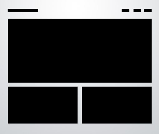
Three Boxes
The first one is an incredibly simple yet effective way to make images the real hero of your home page. The majority of the page is taken up by three large photos that could be either static images or dynamic slideshows.
The HTML
The image above has five obvious elements that we’ll need to create: the logo (top left), navigation (top right), big image and two smaller images. The first thing we need to do is create a div for each and decide on some widths.
The Skeleton Boilerplate uses a sixteen column system so to split the area into two sections we use the classes “eight” and “columns”. Similarly, if we want the content to stretch all the way we just use “sixteen” instead.
<div class="container">

	<div id="logo" class="twelve columns add-bottom">
	</div>

	<div id="nav" class="four columns">
	</div>

	<div id="bigphoto" class="sixteen columns add-bottom">
	</div>

	<div class="eight columns add-bottom">
	</div>

	<div class="eight columns add-bottom">
	</div>

</div><!-- container -->
Now we have to populate our divs with content. We’ll just use text for the logo area and toss in an unordered list for the navigation that we can float left to force the elements into a horizontal layout. Finally, for the others we just need some placeholder images.
<div class="container">

	<div id="logo" class="twelve columns add-bottom">
		<h2>Design Shack</h2>
	</div>

	<div id="nav" class="four columns">
		<ul>
			<li><a href="#">Home</a></li>
			<li><a href="#">About</a></li>
			<li><a href="#">Contact</a></li>
		</ul>
	</div>

	<div id="bigphoto" class="sixteen columns add-bottom">
		<img src="http://lorempixum.com/940/430/city/1" />
	</div>

	<div class="eight columns add-bottom smallphoto">
		<img src="http://lorempixum.com/460/230/city/2" />
	</div>

	<div class="eight columns add-bottom smallphoto">
		<img src="http://lorempixum.com/460/230/city/3" />
	</div>

</div><!-- container -->
The code here is pretty straightforward, as promised we’ve just thrown in some basic content. The one thing that you need to be sure to catch is the “add-bottom” class that has been attached to several of the divs, this is a Skeleton feature that simply throws in a bottom margin.
The CSS
For the most part, the CSS is just making sure that navigation menu works properly. This is accomplished with a float and some margins. I’ve also done some voodoo on the images to make sure they resize to adapt to different browser sizes.
These styles should go in the “Layout.css” file.
body {
	padding-top: 40px;
}

#nav ul li {
	float: left;
	margin-left: 30px;
	line-height: 40px;
}

#bigphoto img, .smallphoto img {
	max-width: 100%;
	height: auto;
}
Extra Media Queries
Skeleton takes care of most of the media query issues so our page already responds decently to browser resizing. However, there are a few quirky issues that can and should be addressed. In the “Layout.css” file, browse down to the media query section and paste this code in.
/* iPad Portrait/Browser */
	@media only screen and (min-width: 768px) and (max-width: 991px) {
		#nav ul li {
			margin-left: 15px;
		}

	}

	/* Mobile/Browser */
	@media only screen and (max-width: 767px) {
		h2 {
			font-size: 2em;
			margin-bottom: 0;
		}

		#nav ul li {
			margin-right: 15px;
			margin-left: 0;
		}
	}
First, we take a little bit of the margin out of the menu items, no biggie. Next, when the page gets even smaller, we reduce the h2 size and change the menu margins to adapt to a new left-side layout.
Demo
We’re all done with our first layout! Here’s a preview and a live demo to check out. Watch how nicely the layout evolves as you change the size of your window.
Live Demo: Click to Launch

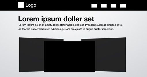
3D Screenshots
This one uses a very common effect where you create a lockup of a few screenshots from your website and arrange them to give the appearance of a 3D space. The mockup for the screenshots is done in Photoshop so you really only need one big image and some text. It couldn’t be easier!
HTML
This one is pretty similar to the last one so I’m going to vary things a little bit from that original outline just a bit. In the end we’ll have a fairly different looking page than the last one.
<div class="container">

		<div id="wrapper">
			<div id="logo" class="twelve columns add-bottom">
			</div>

			<div id="nav" class="four columns">
			</div>
		</div>

		<div class="sixteen columns add-bottom">
		</div>

		<div id="bigphoto" class="sixteen columns">
		</div>

	</div><!-- container -->
As you can see, there’s a curveball here in the form of an extra wrapper, this will allow us to put in that dark bar behind the content at the top of the page. After that, everything is nice and simple and we just need two full width divs.
<div class="container">

		<div id="wrapper">
			<div id="logo" class="twelve columns add-bottom">
				<h3>DS</h3>
			</div>

			<div id="nav" class="four columns">
				<ul>
					<li><a href="#">Home</a></li>
					<li><a href="#">About</a></li>
					<li><a href="#">Contact</a></li>
				</ul>
			</div>
		</div>

		<div class="sixteen columns add-bottom">
			<h1>Lorem Ipsum Doller Set</h1>
			<p>Lorem ipsum dolor sit amet...</p>
		</div>

		<div id="bigphoto" class="sixteen columns">
			<img src="screenshots-1.jpg" />
		</div>

	</div><!-- container -->
CSS
This time we need a much bigger chunk of CSS. What we’re basically trying to do here is make the container a large white box floating over the darker body background color. This involves adding a few extra styles to both the body and default container.
Also, since the navigation now has a dark background color, we need to change the text to white so that it’ll be visible, which of course turns into extra steps for styling links and hover states. The rest is pretty much identical to what we did last time.
body {
	padding-top: 20px;
	background: #888;
}

.container {
	background: white;
	padding: 20px;
	margin-bottom: 20px;
}

#wrapper {
	background: #444;
	height: 40px;
	color: white;
}

#wrapper h3 {
	color: #fff;
	line-height: 40px;
}

#wrapper a {
	color: #fff;
	text-decoration: none;
}

#wrapper a:hover {
	color: #fff;
	text-decoration: underline;
}


#nav ul li {
	float: left;
	margin-left: 30px;
	line-height: 40px;;
}

img {
	max-width: 100%;
	height: auto;
	margin: 0; padding: 0;
}
Extra Media Queries
Just like last time, I want to go through and tweak the layout of the smaller sizes a bit. This time I wanted to illustrate how you could fundamentally change an element so I made the navigation and logo area drastically different. We’ll see what it looks like in the demo below but basically I ditched the black bar and turned the logo into a circular element through the use of rounded corners.
/* iPad Portrait/Browser */
	@media only screen and (min-width: 768px) and (max-width: 991px) {
		#nav ul li {
			margin-left: 15px;
		}

	}

	/* Mobile/Browser */
	@media only screen and (max-width: 767px) {
		h1 {
			font-size: 2.5em;
		}

		#wrapper {
			background: white;
			margin: 0;
		}

		#wrapper h3 {
			background: black;
			text-align: center;
			width: 50px;
			height: 50px;
			line-height: 50px;
			-webkit-border-radius: 25px;
			-moz-border-radius: 25px;
			border-radius: 25px;
		}

		#wrapper a {
			color: #000;
			text-decoration: none;
		}

		#wrapper a:hover {
			color: #000;
			text-decoration: underline;
			margin: 0px; padding: 0px;
		}

		#nav ul li {
			margin-right: 15px;
			margin-left: 0;
		}
	}
Demo
That wraps up our second layout. Again, be sure to check out the live version so you can see the differences in appearance between the full and small versions.
Live Demo: Click to Launch

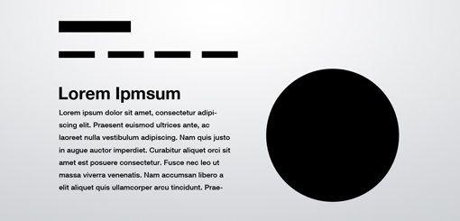
Featured Graphic
This one is great for showing off icons, screenshots, logos or anything else that looks great in a big circle. Again we’ll find that the layout work is almost effortless and the result feels unique and interesting.
HTML
This go around we’re putting the logo and navigation on different lines, then splitting the width of the next row between the big circle image and the text.
Notice that instead of splitting the content with two “eight columns” classes, I used and eight and a seven. Then I inserted a blank spot with an “offset-by-one” class.
<div class="container">

	<div id="logo" class="sixteen columns">
	</div>

	<div id="nav" class="sixteen columns">
	</div>

	<div id="theText" class="eight columns">
	</div>

	<div id="bigphoto" class="seven columns add-bottom offset-by-one">
	</div>

</div><!-- container -->
The content here is all stuff we’ve seen before, a header tag for the logo, ul for the navigation, a couple of paragraph tags and an image. That’s all it takes, a little styling and we’ll be wrapping up this post!
<div class="container">

	<div id="logo" class="sixteen columns">
		<h3>Design Shack</h3>
	</div>

	<div id="nav" class="sixteen columns">
		<ul>
			<li><a href="#">Home</a></li>
			<li><a href="#">About</a></li>
			<li><a href="#">Portfolio</a></li>
			<li><a href="#">Contact</a></li>
		</ul>
	</div>

	<div id="theText" class="eight columns">
		<h1>Lorem Ipsum</h1>
		<p>Lorem ipsum dolor sit amet...</p>

		<p>Lorem ipsum dolor sit amet...</p>
	</div>

	<div id="bigphoto" class="seven columns add-bottom offset-by-one">
		<img src="http://lorempixum.com/400/400/city/1" />
	</div>


</div><!-- container -->
CSS
The biggest thing to note here is that I didn’t actually insert a circular image. Instead I threw in a square image and used CSS border-radius to round the corners. Sure, some older browsers may show a square image, but I can definitely live with that as it won’t break our layout in the least.
Note: I just realized that this trick only works in Webkit, if you want a rounded image in Firefox and elsewhere, you’ll have to make one manually in Photoshop.
body {
	padding-top: 40px;
}

#nav ul li {
	float: left;
	margin-right: 30px;
	line-height: 40px;
}

#theText {
	margin-top: 60px;
}

#bigphoto img{
	max-width: 100%;
	height: auto;
	-webkit-border-radius: 200px;
	-moz-border-radius: 200px;
	border-radius: 200px;
}
Extra Media Queries
For the media queries on this page the only thing we needed to fiddle with was the vertical positioning of our paragraphs. As the page gets smaller, we need less and less of a top margin.
/* iPad Portrait/Browser */
	@media only screen and (min-width: 768px) and (max-width: 991px) {
		#theText {
			margin-top: 20px;
		}
	}

	/* Mobile/Browser */
	@media only screen and (max-width: 767px) {
		#theText {
			margin-top: 10px;
		}
	}
Demo
Here’s our last demo page! As you can see, the big circle image gets thrown below the paragraph in the mobile version; a simple and effective redistribution of the elements.
Live Demo: Click to Launch

Conclusion
As you can see, our rock solid layout examples can be converted to HTML and CSS with very little effort. Through the use of Skeleton, we were even able to make the layouts responsive to different browser sizes using only a few extra lines of code.
I hope you enjoyed this tutorial and find it useful for future projects. Feel free to steal my code and use it as you see fit!