Zen Grids: A Responsive Grid System Built on Sass
Building grids was moderately complicated before responsive design, these days they can be downright intimidating. When you dive into a complex layout, it’s easy to get lost in all of the math and percentages. Sure, the hardcore nerds among us love to play with this stuff, but some developers just want to get to work!
Today we’re going to look at an awesome grid system that will help you set up your responsive grids with very little effort. It’s semantic, built for responsive design, completely flexible to the way you work, and powered by Sass. Meet Zen Grids.
See It in Action
If you want a sneak peek of what we’re building today with Zen Grids, click on the link below.
Demo: Click here to launch.
What is Zen Grids?
I know what you’re thinking, “Another freaking grid system!?” Zen Grids is different though. Right, they all say that. This one really is worth a look though.

There are lots reasons that I think Zen Grids is a really great tool that you should check out, here are a few of them:
None of the Stuff That You Hate
There are plenty of reasons to hate grid systems. Ugly, non-semantic class names, a crapload of seemingly redundant but somehow necessary divs; the list goes on and on. Zen Grids doesn’t have any of that stuff though. You set up your document how ever you want and it plugs perfectly into your workflow.
Built on Sass
I know this is a downside for many of you, but it’s a solid plus for me. Sass is the reason that Zen Grids can be semantic. The SCSS files take care of all of the math and allow you to apply the grid mixins when and wherever you want them.
Responsive Friendly
Technically, I wouldn’t call Zen Grids a responsive grid system (though it does bill itself as such) because it really doesn’t come with any media query features built in the way that Bootstrap does.
I would call it a fluid grid system because it’s built on percentages. That being said, it’s easy enough to hook Zen Grids up to some of your own media queries and make it responsive.
Easy as 1, 2, 3
Zen Grids is really, really easy to use. 1 import statement, 2 variables, and 3 mixins. This is all it takes to build a basic layout. In my experiments, I pushed that to four mixins (you need an extra one for nesting), but that’s still not half bad considering the complexity that can be achieved.
Before You Begin
I’m going to dive in and teach you how to use this sucker, but before we get into that, a little setup is required. First, you need to make sure you have Sass and Compass installed.
Get Scout
If you’re comfortable with Ruby, Terminals and Shell Scripts, this should all be fairly straightforward. For the rest of us, I recommend simply downloading Scout and calling it a day. Scout is free, open-sourced, and cross platform. Point it at a folder containing SCSS files and it’ll automatically compile them to CSS. Codekit and LiveReload are even better, but they’ll cost you.
Get Zen Grids
Once you’ve got Sass and Compass set up, grab Zen Grids from GitHub. Download the .zip and toss everything but the “stylesheets” folder. This is where you’ll find the SCSS files that will power your grid.
Getting Started
To begin, I recommend digging into your download and finding the “_grids.scss” file. Take it out and put it in a new project folder, then create a new SCSS file and import it.
/*Create a new .scss file and import the grids file*/
@import "_grids.scss";
That’s it, now we’re ready to build a grid!
Start a Container
To begin a new grid, you will need some sort of container. I don’t consider this to be a pain at all given that I typically do this even without any sort of third party grid system.
<div class="container">
</div>
Here I’ve created a div with a class “container,” but remember that I promised that Zen Grids would plug into your specific workflow. This means that the container can be anything you want. Use a section instead of a div, change the class to “main,” go nuts. It doesn’t really matter!
Now pop over to your SCSS and include the zen-grid-container mixin using standard Sass syntax.
.container {
  @include zen-grid-container;
}
What this does is tell Zen Grids that you want this item to become a container. While you’re at it, you might as well set a width and center the div.
.container {
  @include zen-grid-container;
  width: 90%;
  margin: 0 auto;
}
Set the Variables
Now it’s time to set the variables for the column count and gutter. I like to do this inside of the container class because we’ll be changing it up later and it’s easier to keep straight this way.
To start, set zen-column-count to 3 and zen-gutter-width to 10px. Obviously, this will give us a three column layout with a gutter of 10px between each column.
.container {
  $zen-column-count: 3;
  $zen-gutter-width: 10px;
  @include zen-grid-container;

  width: 90%;
  margin: 0 auto;
}
Create Some Content
Next, we’ll want to create some HTML content. Since we’re just learning how to use Zen Grids, I’m going to use some super generic content here as an example. Here I created three divs, each containing a simple paragraph:
<div class="container">
  <div class="one">
    <p>Block 1</p>
  </div>
  <div class="two">
    <p>Block 2</p>
  </div>
  <div class="three">
    <p>Block 3</p>
  </div>
</div class="container">
Keep in mind that these class names are completely arbitrary and only numbered to help us keep track of everything throughout the examples. You have complete freedom to use whatever class names you choose. Yours should reflect standard semantic practices.
Basic Block CSS
Again, purely for the sake of the demo, I’ll apply some generic styling to each block of content that we create. This will help us see what’s going on with each block.
.one, .two, .three {
  height: 200px;
  font: 14px/190px Helvetica, sans-serif;
  text-align: center;
  border: 1px solid white;
}
Flow the Content
We have three divs to work with and we’ve already set up three columns, so let’s assign a div to each column. Doing this requires the zen-grid-item mixin. Here’s what it will look like in our SCSS.
.one {
  @include zen-grid-item(1, 1);
}

.two {
  @include zen-grid-item(1, 2);
}

.three {
  @include zen-grid-item(1, 3);
}
What’s going on with this syntax? Here’s a handy chart to help you out:
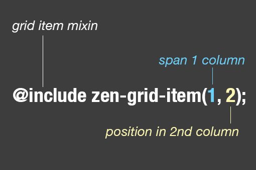
As you can see, the first number determines how many columns the item will span. The second number determines the position of that item. In our example above, we positioned the three divs to slots 1, 2 and 3 consecutively.
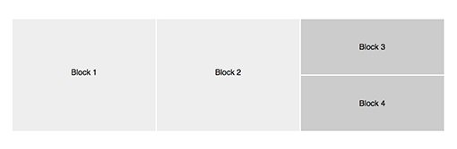
This creates a simple grid split up into thirds with each block of content occupying a third:

Let’s Get Complicated
All right, now we know the basics of how this thing works, so let’s jump into a much more complex layout. Instead of three blocks of content, we’re going to have eight. We’ll use different containers, new rows, and even some nesting just to push our test to the limit.
HTML
This time we’re going to toss in a big chunk of HTML. We’re still using the same basic setup as before, the only real complication is that the “nested” container is actually sitting inside of our other container.
<div class="container">
  <div class="one">
    <p>Block 1</p>
  </div>
  <div class="two">
    <p>Block 2</p>
  </div>

  <div class="nested">
    <div class="three">
      <p>Block 3</p>
    </div>
    <div class="four">
      <p>Block 4</p>
    </div>
  </div><!-- end nested -->
</div><!-- end container -->

<div class="container2">
  <div class="five">
    <p>Block 5</p>
  </div>

  <div class="six">
    <p>Block 6</p>
  </div>
  <div class="seven">
    <p>Block 7</p>
  </div>

  <div class="eight">
    <p>Block 8</p>
  </div>
</div><!-- end container2 -->
To make the blocks of content look good this time around, here’s the styling that we’re going to use:
.one, .two, .three, .four, .five, .six, .seven, .eight {
  height: 200px;
  font: 14px/190px Helvetica, sans-serif;
  text-align: center;
  border: 1px solid white;
}

.three, .four {
  height: 100px;
  font: 14px/100px Helvetica, sans-serif;
}
Nesting
Like before, we start off with three blocks of content. The tricky part though is that the third block of content is actually a nested container of its own, which contains two other blocks. Setting this up is actually really easy.
Just like before, use zen-grid-item(1, 3) on the “.nested” class, but also include zen-nested-container() to indicate that this will be a nested container.
.one {
  @include zen-grid-item(1, 1);
}

.two {
  @include zen-grid-item(1, 2);
}

.nested {
  @include zen-grid-item(1, 3);
  @include zen-nested-container();
}
No problem right? Now we add blocks three and four into the nested container. Keep in mind that the nested container will also contain three columns, so I want blocks three and four to each take up three columns (they’ll be full width and stacked on each other).
.one {
  @include zen-grid-item(1, 1);
}

.two {
  @include zen-grid-item(1, 2);
}

.nested {
  @include zen-grid-item(1, 3);
  @include zen-nested-container();
  background: #ccc;
}

.three {
  @include zen-grid-item(3, 1);
}

.four {
  @include zen-clear();
  @include zen-grid-item(3, 1);
}
Take a look at the code for block four here. To start off, I used the zen-clear() mixin. This is how you create a new row. Without this, blocks three and block four would occupy the same place.
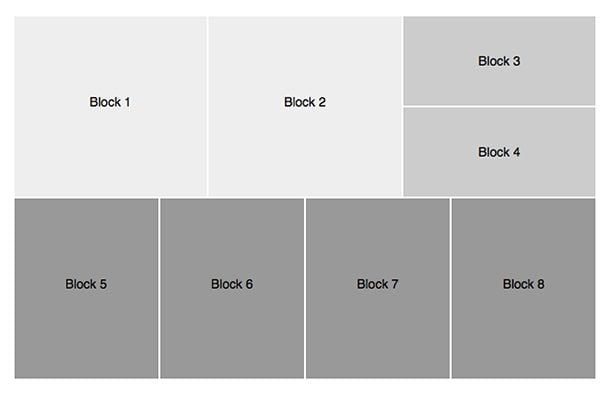
Here’s the effect that this has on our layout:
Nice! This is exactly what we were shooting to achieve. Our content is split up into three blocks with the far right block being split into two sub-blocks. All without a single bit of math!
Changing the Grid
We’ll finish here by coding up container2. This container holds four blocks of content, and I’d like to flow them all next to each other, but our setup only has three columns… what now?
The answer is of course that we need to reset our variables when we set up the new container. I wasn’t sure if Sass would handle this correctly when I first tried it, but it seems to work perfectly. Here’s the code:
.container2 {
  $zen-column-count: 4;
  $zen-gutter-width: 10px;
  @include zen-grid-container;

  width: 90%;
  margin: 0 auto;
  background: #999;
}

.five {
  @include zen-grid-item(1, 1);
}

.six {
  @include zen-grid-item(1, 2);
}

.seven {
  @include zen-grid-item(1, 3);
}

.eight {
  @include zen-grid-item(1, 4);
}
As you can see, we went with four columns and a 10px gutter this time around. We then set each block of content to one slot in width and positioned them consecutively across the columns.
There we go, a decently complex layout using only a few easy to apply mixins. For the flexibility offered by this tool, it really doesn’t get much easier than this folks.
Make It Responsive
Before I said that it was easy to make our grid responsive. Thus far it’s fluid, so it resized based on the widow size, but it doesn’t ever reflow. Let’s fix that with a quick media query:
@media screen and (max-width:700px) {

  .container {
    $zen-column-count: 1;
    $zen-gutter-width: 10px;
  }

    .one {
      @include zen-grid-item(1, 1);
    }

    .two {
      @include zen-clear();
      @include zen-grid-item(1, 1);
    }

    .nested {
      @include zen-clear();
      @include zen-grid-item(1, 1);
      @include zen-nested-container();
      background: #ccc;
    }

      .three {
        @include zen-clear();
        @include zen-grid-item(1, 1);
      }

      .four {
        @include zen-clear();
        @include zen-grid-item(1, 1);
      }

  .newtest {
    $zen-column-count: 2;
    $zen-gutter-width: 10px;
  }

    .five, .seven {
      @include zen-clear();
      @include zen-grid-item(1, 1);
    }

    .six, .eight {
      @include zen-grid-item(1, 2);
    }

}
Here I created a media query for 700px and completely reflowed the layout to accommodate the narrower viewport. Here’s what it will look like after the breakpoint.
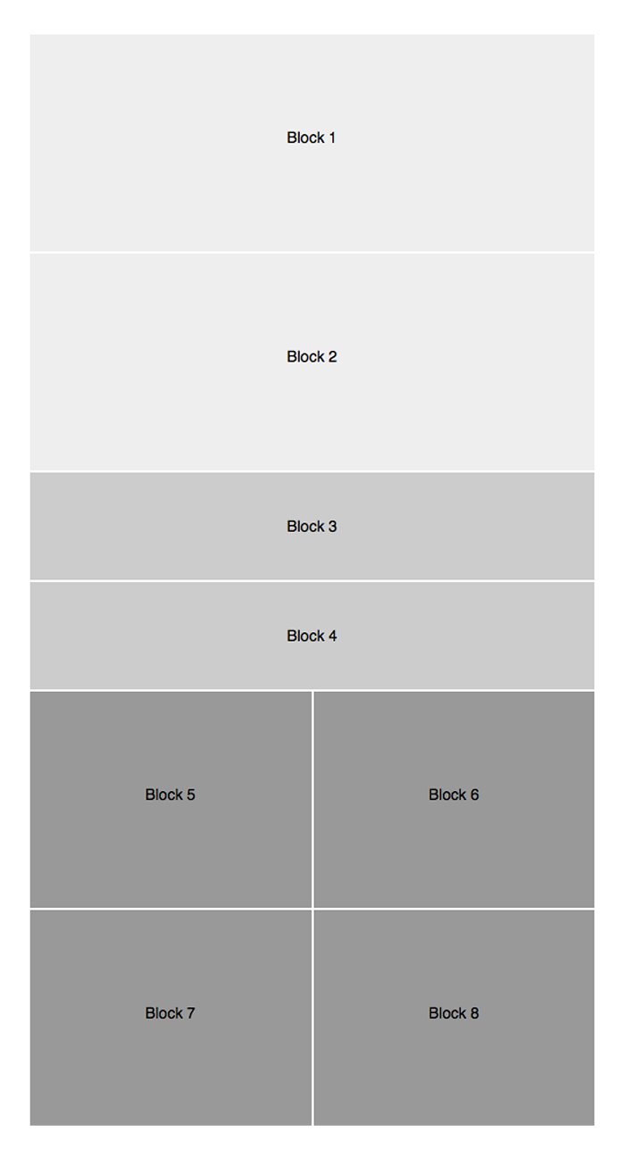
How great is that? We just pulled off a remarkably complex, responsive layout without any math while avoiding constricting, non-semantic class names. That’s a pretty serious feat.
Cheat Sheet
We covered a lot of stuff above so let me break it down for you in a nice little cheat sheet:
- Set Container: @include zen-grid-container
- Set Nested Container: @include zen-nested-container()
- Set Column Count: $zen-column-count: 2
- Set Gutter Width: $zen-gutter-width: 10px
- Set Item Span and Position: @include zen-grid-item(1, 1)
- New Row @include zen-clear()
What Do You Think?
So that’s the Zen Grids system. Personally, I think it’s a really helpful little grid system that works quite well. What do you think? Would this save you a lot of time and effort in your responsive workflow or would it add a lot of unnecessary complication to it? Leave a comment and let me know.