Glossary of Design Jargon – New & Old (Part 1)
Ever get confused about some of the designer lingo? (It can happen to designers and non-designers alike.) The jargon of design has evolved over the years, no doubt leaving some of you shaking your heads!
We are going to break down some of the terminology, by design type, in hopes of making it easier for both designers and clients to communicate more effectively. Here’s a guide to what it all means with 12 terms each in the categories of general design, and web design. Come back later this week for terms related to print design and type design.
2 Million+ Digital Assets, With Unlimited Downloads
Get unlimited downloads of 2 million+ design resources, themes, templates, photos, graphics and more. Envato Elements starts at $16 per month, and is the best creative subscription we've ever seen.
General Design
There are quite a few words that are used universally when it comes to design projects – printed and online. These terms can be the difference between communicating easily with other designers or clients and struggling to understand each other.

Alignment: The position of elements within the margins. This can apply to text, images or other elements. There are four types of alignment: Left, right, justified and centered.
Color palette (color chart): The defined set of colors that are acceptable to use in a project. Each color should have a set value rather than a name such as red, purple or mint. There is no set number of colors in a palette; they often vary by project and include three or more hues, shades and tints.
Copyfitting: The process of adjusting type size, tracking and line spacing to make it fit in the desired space. Copyfitting techniques can include manipulations to the font (size and spacing) or editing to make the words fit.
FPO (for position only): This is a placeholder image, typically low resolution, that is used to hold a certain shape or size before the final image is ready.
Greeking: Changing display properties to speed up the redraw rate on a screen so that images and text show quickly as gray boxes is called greeking. This will make images and type unreadable. Some designers use this term to refer to an image or text not properly linking to a document, also resulting in a gray box.
Hero image: The biggest, boldest image or graphic in the design. This often-oversized image is the focal point of a design.

Negative space (white space): The unused space around your design is referred to with these terms. White space is generally defined as space outside the text and image areas while negative space is often part of the overall design scheme. Both should be thought of as intended spaces and planned out.
Pantone: The Pantone Matching System is a proprietary color system created by the Pantone company and is commonly called just “Pantone.” The standardized system allows designers to “speak the same language” in terms of color for a variety of publishing options.
Proof (paste-up, wireframe, mockup): An early copy of a design project that is used to look at concepts, check for errors and serve as a tool for checking the status of a project.

Reverse: Using type and color in the opposite way you would expect, such as white type on a black background. Reverse also refers to the negative of an image.
Rule: Thin lines used to distinguish parts of the design. Rules can stand alone or be used around objects, such as to frame a photo or outline text.
Vector (vs. raster): The vector format uses lines, shapes and mathematical formulas to create images. The benefit to vector formats is the creation of images and shapes that can be resized without a loss of quality. Vector is the preferred format for logo design. Raster formats use pixels (tiny squares) to create images; they are resolution dependent.
Web and Digital Design
When it comes to web and digital design jargon, some of the terms seem to be changing all the time. Some of the newest jargon comes from design trends and popular techniques.
Anti-aliasing: This technique is used to smooth out the edges of fonts and objects built in raster format.. The process is automated using common software.

Banner: The large image or item at the top of a web page. A banner can be information related to the website and contain a logo or navigation information or an advertisement (banner ad) that appears across the top portion of the page. Banner ads are commonly the width of the screen (or the largest ad at the top of the screen) by 120 pixels deep.

CAPTCHA: This acronym for Completely Automated Public Turing Tests to Tell Computers and Humans Apart is used to protect sites from bots. A CAPTCHA is commonly used when filling out a form or other data entry. The open-source technology is common and has a variety of test formats (words, numbers and questions).
Favicon: A small 16 by 16 pixel image next to the URL of a website in the browser menu bar and alongside bookmarks. The tiny image is used to make your website more recognizable. Favicons are a common web design element.
Flat: This design trend took off in late 2013 and continues to be popular. The flat design style is minimal, using simple techniques, type and almost no design effects or tricks. Apple adopted an almost flat design style for iOS 7 and other popular sites, including Facebook and Google+ use flat styling.
Lorem ipsum: Placeholder or dummy text that uses a variety of characters at varying “word” lengths to give you an accurate feel of what type will look like in a text block.
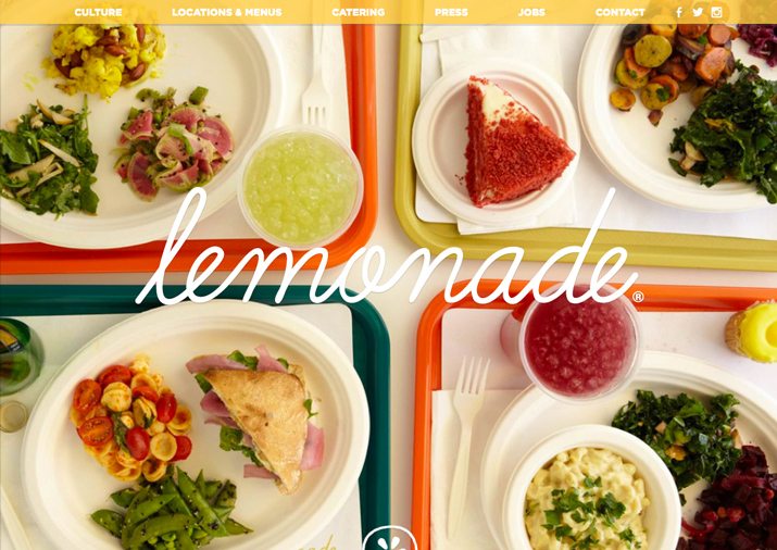
Parallax: Parallax is a technique where layers of content are designed to work and move together. Background, middle and foreground images are created and designed to move at different speeds so that elements on the screen move. It is a common and trendy scrolling technique. (Learn more in a recent Design Shack article.)
Responsive design: This concept of web design makes it possible for a single site to render well and properly on a variety of devices (desktop, tablet and mobile) at different sizes. The benefit is having a single site with a common user experience.

RGB: The color mode for digital design that uses combinations of red, green and blue to make colors. In the RGB model, every hue uses these colors to create every color.

Slider: This popular technique uses a large block (often based on jQuery) to rotate multiple images (and text) in one location on the site. Sliders can run automatically or based on clicks or taps.
Tag: Code attached to a specific item that provides instructions for formatting. One of the common references is “alt tag,” which includes information about an image in text form.
UX (user experience): The most important term in web and digital design is user experience, or how the design works. UX includes everything about how someone interacts with a digital element, from behavior to emotion to attitude.
Trendy Phrases
Sometimes jargon evolves with time. Here are four trendy words you should know.
Contour: Much like a rule, this refers to something which is outlined. But this type of shape is more fluid and helps to create a 3D effect.

Skeuomorphic: A style that tries to make elements on a flat surface look and feel three-dimensional. These elements used design “tricks” such as shadows, beveling and gradients to achieve the desired effect.
Structured: Designs that use geometric shapes and standard proportions are called structured. (Think about a logo such as Fort Worth Museum, that uses multiple squares.)
Translucent: This effect is much like frosted glass, with one layer on top of another that allows some of the background image to come through. Colors and shapes of the image will come through but without definition.
Conclusion
We could go on and on with even more jargon related to design. And in fact, we will. Make sure to look for “Glossary of ‘Designer’ Words, New and Old (Part 2)” for terms related to print and typography design.
Hopefully this primer has helped you understand the lingo of design a little more. What other words are you hearing more often these days? Do you know what they mean? Share with us in the comments.
Image Source: SamahR.
