2014 Will Be Year of Parallax
A somewhat bold prediction: 2014 will go down as the year of parallax. Before you downplay this reemerging trend, think about it. With developments in HTML, CSS and jQuery, and more people running on high-speed internet connections it is not a stretch to think this nifty technique will really explode this year.
Parallax scrolling effects are fun, user friendly and allow for new types of creative thought in the website design process. The end result is a technique that can be fun to create and can create a highly visual and interactive experience for users.
2 Million+ Digital Assets, With Unlimited Downloads
Get unlimited downloads of 2 million+ design resources, themes, templates, photos, graphics and more. Envato Elements starts at $16 per month, and is the best creative subscription we've ever seen.
What is Parallax?


Parallax is a technique where layers of content are designed to work and move together. The way it works is that background, middle and foreground images are created and designed to move at different speeds so that elements on the screen move.
Parallax can work with a click or scroll function (called parallax scrolling) and elements can move up and down or side to side. In some parallax designs all of the elements move in unison so it appears that you are moving from one screen to the next. Other parallax designs allow for multiple moving parts in such a way that almost creates active animations.
Parallax effects are not new. They have actually been around for years. (Think video games and animated gifs.) But until recently these effects were at a minimum cheesy and often borderline ridiculous. The technique was difficult to create and get to work well and designers and developers mostly stayed away from it.
But Apple again helped lead the charge to make this technology more prevalent, using parallax effects in the launch of iOS 7 last fall. And plenty of designers followed suit, with parallax scrolling effects popping up all over the web and in a variety of apps. But this time around the technique was much more refined and provides a memorable user experience.
This Will Be a Breakthrough Year


An emphasis on user experience is why parallax effects will really take off this year. The technique can be used to create a quite memorable website without a lot of clicks. Parallax scrolling effects can create a sense of mystery for the user as a “story” unfolds. With each new movement, something new unfolds for the user. This effect can create intrigue and a desire to continue interacting with a website. (Always a bonus for those of you tracking time on site.)
Parallax offers a different approach to showcasing content and design. Designers are experimenting with parallax because:
- It’s fun
- It creates a new and distinct user experience
- It encourages visitors to stay longer
- It appeals to our sense of curiosity
- It is a new way to create a visual story
Great Effects on ‘One Page’

Parallax effects works in harmony with another web design trend – single page design. You can create different screens of content that look and act almost like different pages but are actually all on a single page.
Some of my favorite parallax scrolling “pages” include effects that make for distinct viewing experiences. Often the color will change when you get to new content, or an image swap occurs. Cyclemon does a great job with this effect in a super simple way. With each scrolling screen the user gets a new background (in a distinct color) and new style of bicycle in the foreground. The site is robust but never bogs down. You can scroll through each of the 19 “screens” quickly or use the light navigation on the right side of the page to jump sections. (Which nicely, shows you everything you skipped in a flash.)


The New York Times has also been one of the leaders in parallax design with notable features such as “Tomato Can Blues” and the award-winning “Snow Fall.” The newspaper website does a great job of using parallax to tell a story with motion, text, video and images. In “Tomato Can Blues,” the comic book style images come to life with simple motion thanks to parallax. In “Snow Fall,” the longform story is told with a mix of effects that keep you moving through the content.
Parallax Plusses
While there are distinct advantages to a variety of different design styles, parallax has some of its own. Simple, the effects can be a lot of fun. That alone will likely engage users.
Cool effects will make users take notice. But parallax techniques can have other benefits as well:
- Distinct storytelling style: With all the emphasis on content, this style of creating content that tells a story is a viable option.
- Calls to action: Parallax effects can be used to tell users what you want them to do. From clicking a link to filling in a form or buying an item, parallax effects can lead users to a direct action.
- Engagement: There’s no doubt that sites with effective and well-designed parallax effects have higher land longer engagement times with users.
- Feature a product: You can use parallax effects to show a product. Think about the 360-degree views of items on some retail sites. Let users really see an item before buying.
Parallax Tips


Parallax effects are not for every type of site. You need to know what you want to get from this technique before using it just because it is trendy.
And while parallax effects can get complicated in a hurry, the best advice is to keep things simple. Decide what effect you want to use and stick to it throughout the site. Provide pointers for users if there is any question as to how the site works. (For example, if a scroll makes something move left to right rather than up and down, let users know.)
Use parallax to tell a story. It is hands-down the best use of the technique. Make sure your effects mirror actions that users would make while interacting with your content.
Be aware of weight on the site. With so much happening in the background and code, everything on this type of site design should be properly optimized. Scale images properly, keep your code clean and make sure your site loads quickly.
Point users in the right direction. Calls to action should be clearly labeled on the screen with easy to use instructions.
Pitfalls of Parallax
While there is some debate over whether all users like parallax effects or not – the obvious answer is no, you can’t please everyone all the time – there are a few downsides to think about. Parallax websites can get heavy quickly, do pose some SEO issues, are often incompatible with responsive design frameworks, don’t allow for internal page linking and don’t work all that well for hefty content.
A heavy parallax website should be avoided. If the site does not load quickly, users will not wait around to see your content. Create the site as leanly as possible, taking special care with images and effects.
Search engine optimization takes a major hit with single-page websites of any kind. Because the nature of the site is simple there is not a lot that can be done to beef up keywords, create links and contribute to search. Where you can see a SEO boost is through social media, because sites that are unique and different tend to be shared.
When it comes to responsive design and mobile, parallax is not quite there yet. Often you need a large screen to really see the effects. Parallax is also a technique that works best for a project with a narrow scope. With too much content, it can get overwhelming quickly.
5 Great Parallax Sites
Atlantis World’s Fair

Express Solicitors

Mario Kart

Minhacidade.me

Soleil Noir

Conclusion
Thanks to its fun and simple nature, parallax design techniques are something we are going to continue to see more of as the year progresses. The number of sites already using some form of parallax actions is growing daily with more designers trying their hands at movable effects.
It is a trend that I am enjoying. I love visiting a site for the first time and really wanting to play with the content to see what happens next. Parallax speaks to my generally curious nature and the added element of storytelling makes this type of website design more fun.
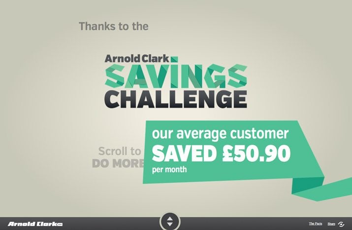
Image Sources: Ben the Bodyguard, Honda CRV, the Black Eye Project, Dangers of Fracking, Arnold Clark and Tinke. (I recommend clicking though the images mentioned to really get a feel for the full scope of how each site’s parallax works. The screen shots do not fully convey the beauty of how these sites work.)


