12 Killer Tips for Designing in the Browser
How do you mockup a website?
The typical workflow starts in Photoshop and then transitions over to HTML and CSS to mimic the original PSD as best as possible. However, there is a growing trend in web design to scrap the Photoshop step in favor of creating the initial comp right in the browser with your favorite editor. I’m sure right about now your head is buzzing with reasons why this approach would limit your design, but there’s actually a lot more you can do right in the browser than you might think. This article will provide you with the tools and tricks you need to create brilliant, working mockups as your very first step in the design process.
The Argument
Meagan Fisher of 24ways.org makes a compelling argument for designing in the browser. While I don’t share her disdain for Photoshop (I love Photoshop more than any other piece of software on the planet), I do agree with some of her other points. Fisher argues that a static image doesn’t really give you the true feel of a website like a live page does and that designing in the browser forces you to focus on content organization before design which can help ensure better accessibility and appropriate hierarchy of information.
We’ll use Fisher’s article as a diving board for our tips on how to become a pro at creating fantastic in-browser mock ups that are nearly ready to go when (and if) the client gives you the green light.
Tip 1: Start Basic & Use a Grid
As I stated above, throwing in and organizing all the content unstyled allows you to create a design that fits your content rather than vice versa. Using a grid-based framework can radically reduce development time and helps ensure your layout is rock solid.
Resources:
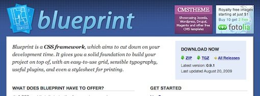
For more information on grid-based web design, check out our article on CSS frameworks.
Tip 2: Get a Good Editor
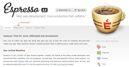
If you’re coding sites by hand, a professional web editor is the cornerstone of your workflow. I personally use (and absolutely love) Espresso from MacRabbit. It has all the little features I want like snippets and auto-complete as well as the big features I need like being able to see live changes to a browser preview as I type code. You should shop around and find the application that suits your needs best. Here’s a quick list of editors to get you started:
- Aptana: Mac, Windows Linux (by far my favorite free option)
- Komodo IDE: Mac, Windows, Linux
- NetBeans: Mac, Windows, Linux
- Coda: Mac (a worthy Espresso alternative)
- Text Wrangler & BBEdit: Mac
Tip 3: Placing a Shadow on an Element
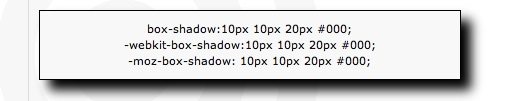
Photoshop is no longer the only way to get a decent shadow on the web. Many (but not all) major browsers now support CSS3 and with that support comes several new features for creating advanced designs. One of the most useful features is box-shadow, which allows you to add shadows to certain items using only CSS. The format of box-shadow is box-shadow:5px 5px 20px #000000. These values allow you to adjust the width and length of the shadow as well as its blur radius and color.
Resources:
Check out CSS.flepstudio’s article on the box-shadow effect for more on how to use this feature.
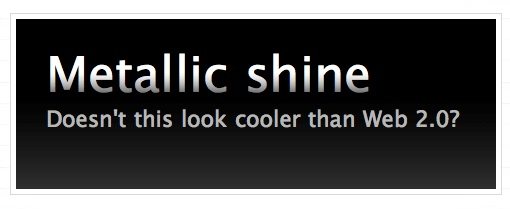
Tip 4: Shadowing Text
If you want to place a shadow on text, use the text-shadow function as demonstrated on this Kremalicious tutorial. The format for text-shadow is text-shadow: 1px 1px 1px #000. The first two values determine the offset of the shadow (x and y respectively), the third value determines the blur radius and the final value allows you to change the color of the shadow.
This function can be applied to create more than just shadows. The tutorial above will show you how to use text-shadow to create a letterpress effect, a glow effect, and even a fiery text effect.
Tip 5: Rounding Corners
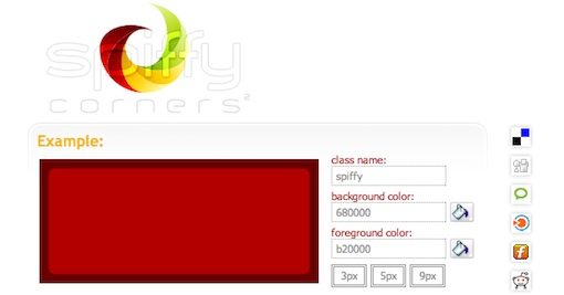
Rounded corners are another feature that has finally been adopted into modern CSS. You can accomplish CSS rounded corners in both Safari and Firefox using the border-radius function. Simply set the -moz-border-radius and/or -webkit-border-radius to a given value in pixels to adjust the roundness of the border on a given item.
Resources:
For more rounded corner tutorials than you can shake a stick at, check out CSS Juice’s roundup of 25 Rounded Corners Techniques with CSS.
Tip 6: Building a Color Scheme
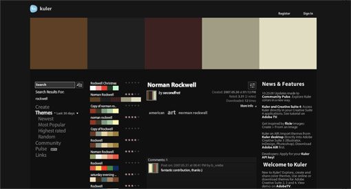
Photoshop provides a nice way to visualize and experiment with different colors, but there are also a plethora of free color scheme resources on the web. In my opinion, the best of these is Adobe Kuler. Kuler not only provides the best interface around for creating beautiful color schemes on the fly, it also gives you access to a huge library of pre-made, searchable color schemes. Want to give your website an autumn look? Just type in “fall” and you’ve got over 2,600 schemes to choose from. Kuler makes it super easy to create an amazing color scheme that you can drop right into your CSS (which in turn makes it simple to change and experiment with on the fly).
Resources:
For more neat color tools, check out our article on 25 Awesome Tools for Choosing a Website Color Scheme.
Tip 7: Text Gradients
If you’re crafty, you can actually apply a gradient to live text in the browser. What strange voodoo is this you ask? Cruise over to WebDesignerWall to check out their tutorial on the subject. Essentially, you put a span around the text you want to apply the gradient to and then set the background of the span to a repeated PNG of the gradient. Of course, to make the PNG, you’ll have to use an image editor (yep, you knew you’d have to resort to good old Photoshop every now and then).
Tip 8: Using RGBA to Screen Colors

CSS3 implements a new feature called RGBA (“A” meaning alpha). Using the “A” value, you can set the opacity of a fill. This handy feature not only allows you to easily create color schemes using a single color with different alpha values, but also allows you to actually create transparent items that reveal the artwork behind them similar to reducing the opacity of a layer in Photoshop.
Resources:
Check out Oncemade’s article on The Right Way to Declare RGBA Colors.
Tip 9: Know Your Web Fonts
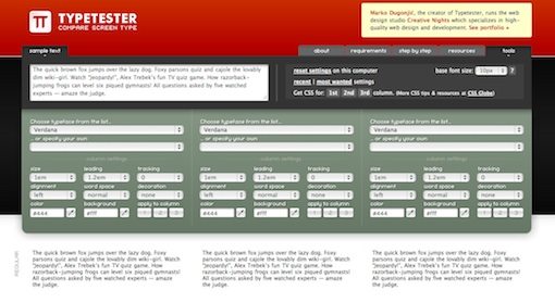
Don’t fall into the trap of using the same two fonts on every single site you design. Change things up by taking advantage of the full range of web safe fonts. Typetester is a great tool for doing just that. It lets you preview blocks of text in various fonts and settings (size, alignment, tracking, etc) right in your browser. The best part is that when you find the settings that you like, Typetester will export the CSS for you.
Tip 10: Get Even Better Fonts

Creating text as an image in Photoshop gives you the freedom to use any font you wish without worrying about compatibility. Unfortunately, this method results in text that isn’t selectable or searchable. However, it’s not that difficult to get around this problem. These days, there are several solutions for installing custom fonts with live, selectable text on your site using the @font-face command.
Resources:
Get amazing fonts on your site in minutes with our step-by-step TypeKit tutorial.
Tip 11: Stock Art is Your Friend
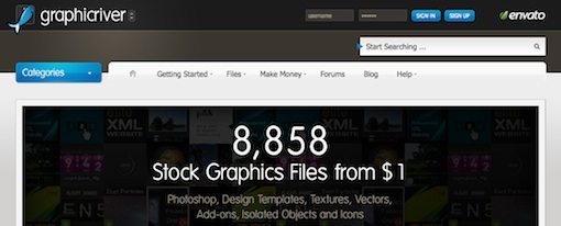
It is often the case, especially with initial mockups, that you need a quick button, icon or other graphic that you don’t necessarily want to build from scratch. Stock art sites like GraphicRiver are bursting with web elements that are ready to drop into a site, many with no Photoshop changes required! Even if you can easily build the items yourself in an hour, dropping a buck on a great piece of art and having it ready to go in 2-3 minutes is pretty enticing.
Tip 12: Use Browser Testing Tools
I know so many of you simply can’t wait to write a scathing comment about how several of the techniques above (shadows, rounded corners, etc) only work in certain browsers and are therefore unusable. Which is exactly why I always seek to present both sides of an argument. The folks in favor of developing in the browser present these techniques as evidence that you can accomplish a lot outside of Photoshop but are perhaps a little too eager to dismiss the fact that several browsers will receive a drastically different experience due to lack of support.
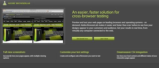
The point is, no matter how you go about developing a website, you should always know exactly how major browsers will render your site. Then you can make an informed decision about which browsers, if any, are acceptable to leave behind. To accomplish this feat, check out Adobe Browserlab. This amazingly useful utility allows you to preview a site on multiple browser an operating systems in real time. The only downside is that you might actually realize how bad your sites render in certain browsers, which inevitably leads to hours of cursing and head scratching.
Conclusion
Well what do you think? Are you ready to cross over and start creating comps armed only with a text editor and browser? Or are you like me, confident that a coroner will have to pry a Photoshop software box out of your cold dead fingers before you’ll let go? Obviously, there are no absolutes here. Few professional designers create mockups without any help whatsoever from an image editor. The question then becomes, on the initial draft, where do you think most of your time is best spent? We’d love to know. Feel free to use the comments to take a stand and defend your position to the death. As for me, this conclusion seems to be getting more and more macabre so I’d better stop here.